Areal, a Refresh of Arial For Are.na, and For You
ONLY FREE FONT IS TRUE FONT
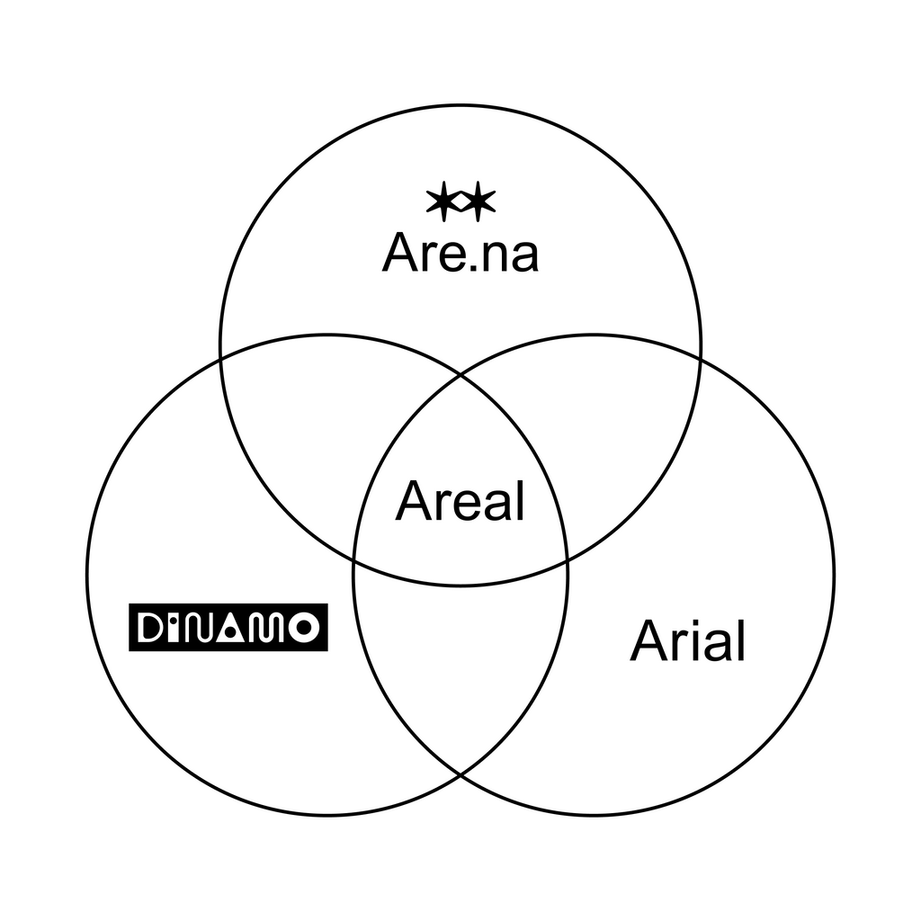
The typeface you see today across Are.na is Areal, our “revival” of Arial, entirely redrawn, rebuilt, and customized from the ground up just for them. Now, exactly a year after the project launched, we’re releasing it into the wild. As of today, ABC Areal is publicly available, for free, for everybody.
The project started as an on-and-off conversation between Johannes and Cab who met back in 2019 during a visit to a distillery in Sweden. They instantly felt that doing something together would be fun, but they were not really sure what that should be. One evening Cab mentioned that they had just spent a year completely rewriting the back-end and code base of Are.na — but because all the functionality and the public-facing design had stayed the same, nobody would ever feel or notice any difference. Nobody would congratulate them on the hard work. Still, they were happy about having put so much time in, there was beauty and satisfaction in making things better, even if invisible to most.
Looking at the design as something to make better next, the conversation naturally turned to making a custom typeface. The curveball was that Arial, the typeface they had been using for the past 15 years, still felt like the perfect font: a less snobby alternative to Helvetica.
The question became, “If we want to make a new font for Are.na, and they already have the perfect font, how can we update Are.na’s identity with a meaningful gesture?”.
An utmost challenging period of conceptual deadlock and cluelessness followed, until Cab told Johannes about a performance art he had seen: a piece by Kristin Lucas called Refresh. In that piece she legally changes her name to the same name as a means to start over, reboot, and take a fresh look onto herself. This was it! The spirit of that piece became the foundation for Dinamo’s and Arena’s long simmering collaboration.
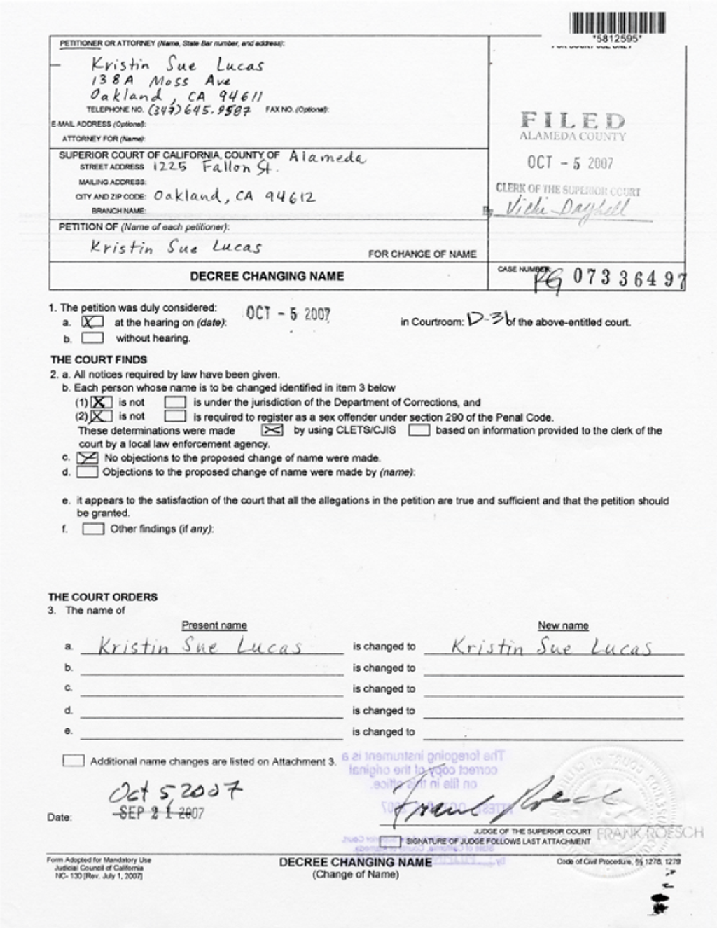
In Kristin's words "I am here to be born again as myself, or at the very least, the most current version of myself."
Arial’s transformation in the digital age
Unlike the older analog typefaces that usually get the revival treatment, Arial has always been a digital typeface, born in the computer age. So there are no pre-digital artefacts, no antique books, record covers or posters to base a revival on. It was commissioned by IBM in 1982 and designed by Robin Nicholas and Patricia Saunders at Monotype.
A story goes that IBM wanted something Helvetica-shaped for their new laser printer, since Helvetica belonged to Linotype and was already being used by Xerox on theirs. In 1992, Arial was included on the Windows 3.1 operating system, making it a default font on millions of first personal computers. Then in 1996, Arial 2.82 was picked by Microsoft as one of the “core fonts of the web”, becoming one of the only typefaces early web designers had to work with.
And it was this web version of Arial that we decided to use as the starting place.
Heavy archeological lifting
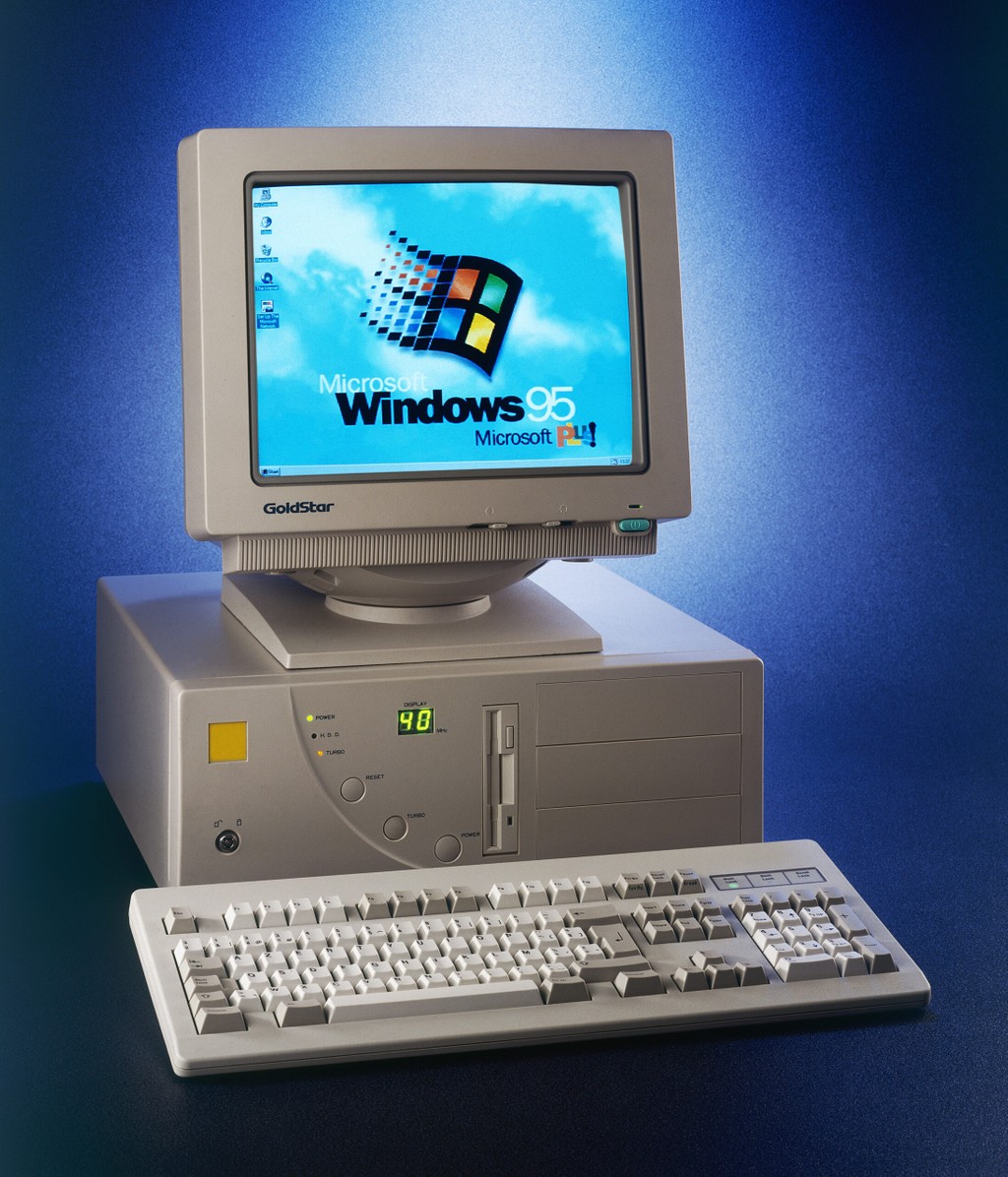
Rebuilding Arial meant treating 30 year old software like a full blown archeological site. And digital files are fragile! They take damage, vanish, and are very hard to recover. To find that specific version of Arial, we had to work with computer technology archivists to get access to some of the first personal computers and operating systems still capable of running it. With their help, we found a way to screenshot Arial in its initial internet-era form. Screenshots of exactly the version that was present when the doors of the internet opened to the general public became our virtual blueprint: we digitally traced the sample characters we now had access to in the most faithful way, and that became the basis for Areal.
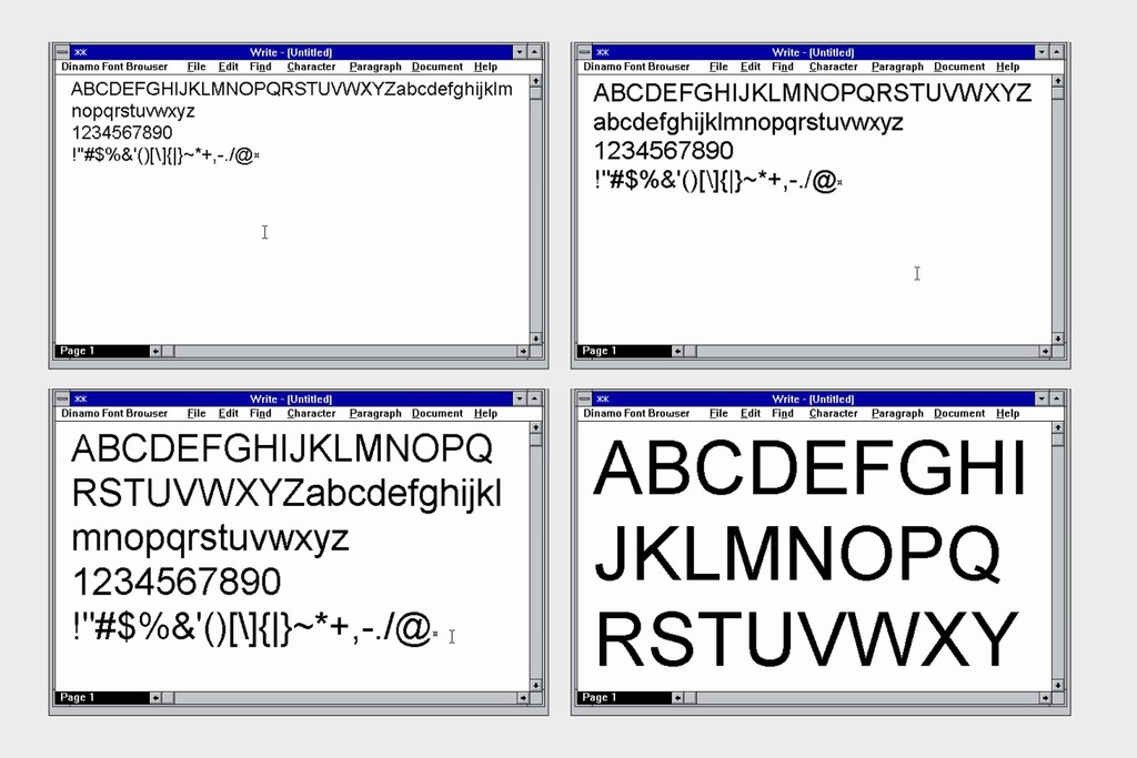
As every typeface is a record of the technology of its moment, the environment it was made in, and the working conditions behind it, Areal is its own snapshot of 2026. So you can see this as just another snapshot in a much longer timeline. Call me Romantic, fine.
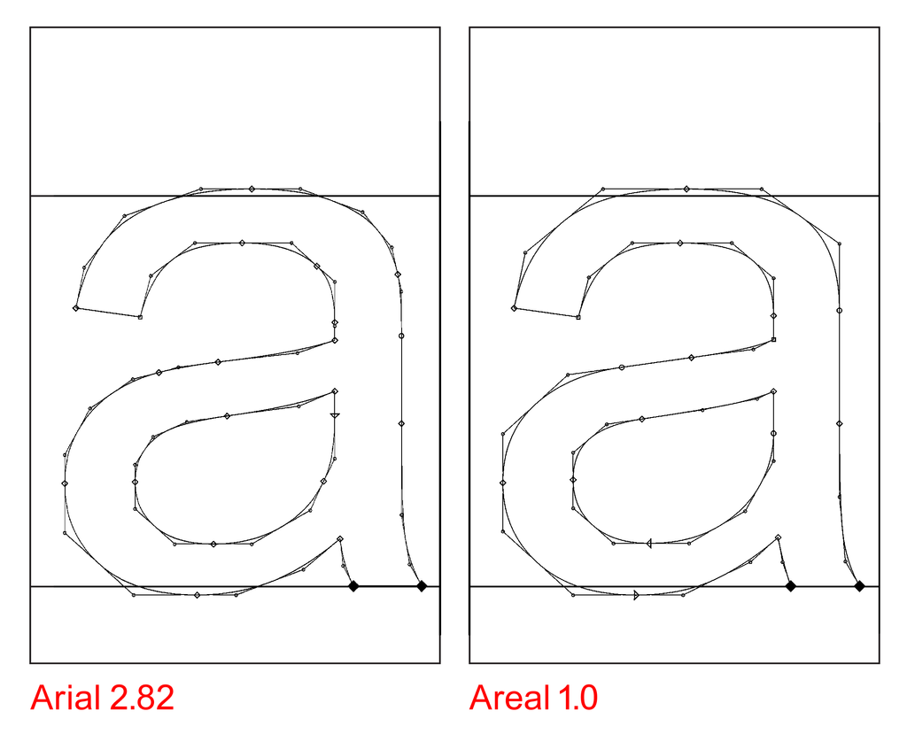
Areal, of course, isn’t to be confused with Arial, though the goal is that you hardly notice the difference. Looking at Arial and Areal should feel like refreshing a browser page, or waking up on new years day. It’s the same, but it isn’t.
Technical details
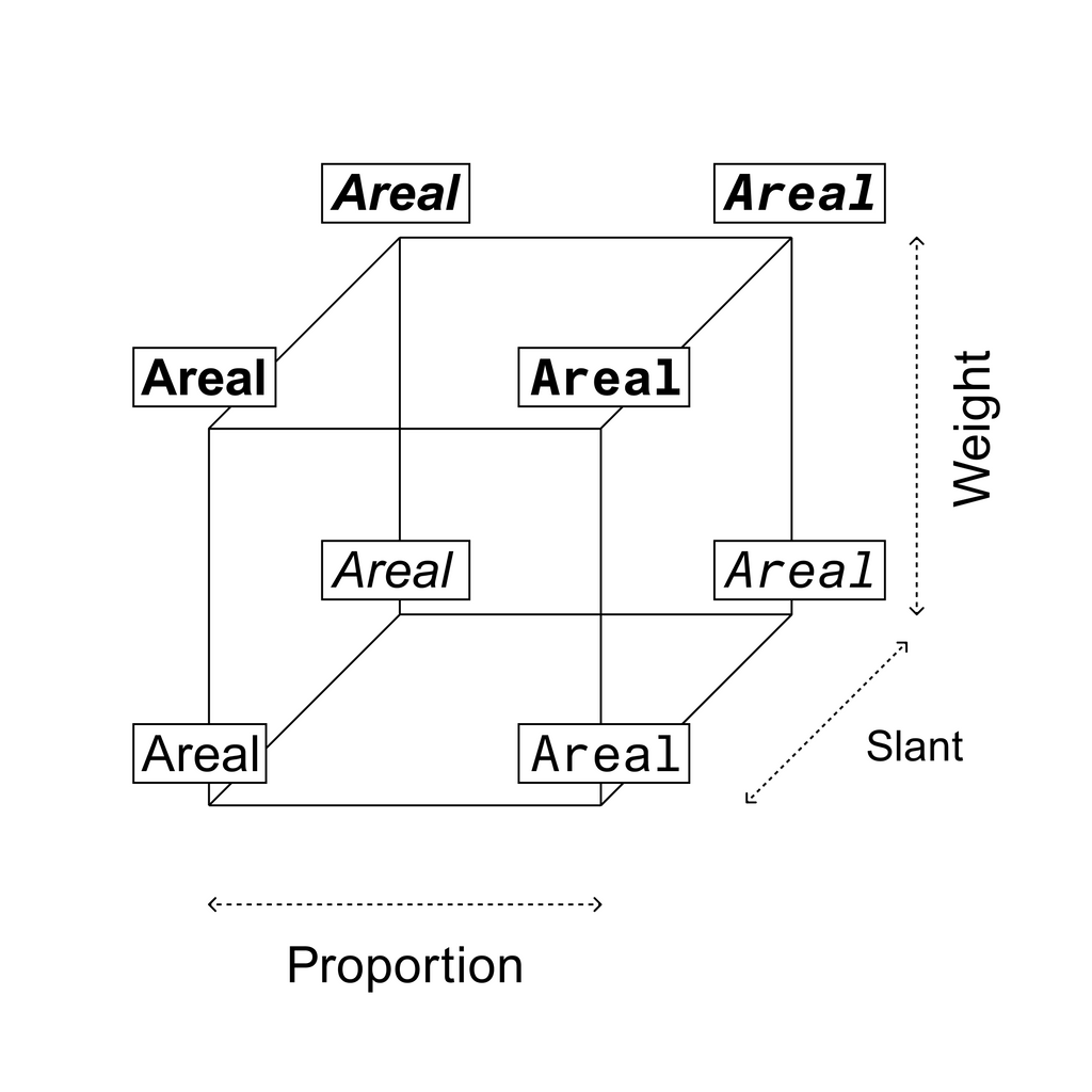
Areal is especially tailored to Are.na and to how we all use websites today. The typeface keeps Arial’s familiar silhouette but rebuilds the outlines throughout: stem thicknesses have been streamlined, missing characters filled in, and the overall design consistency has been improved across weights. We added ligatures the original never included, and a small set of Are.na-specific characters (the stars!). And not to forget, Areal goes beyond Arial’s own design space by breaching into Mono and Semi Mono territory. All of this is packaged as a very-able Variable Font, for light weight file size and full control over all parameters.
Darkmode optimization was another thing we took seriously. As Are.na is consumed online via desktop or mobile browsers, improving the typeface to device-reality felt like a given. The variable font version of Areal carries a darkmode axis that kicks in automatically depending on whether Are.na is enjoyed in light or dark mode. In simple words, it corrects the performance of white text on black background, meaning it makes everything easier to read for the human eye.
But I see that you want to hear more!
You know, the curious thing is: when light shapes are set on a dark background, the letterforms bloom and read heavier than they measure. They look unintentionally blurry, and nobody likes that! So this axis corrects that effect and trims that surplus weight without changing the width of the characters — therefore keeping every word in place.
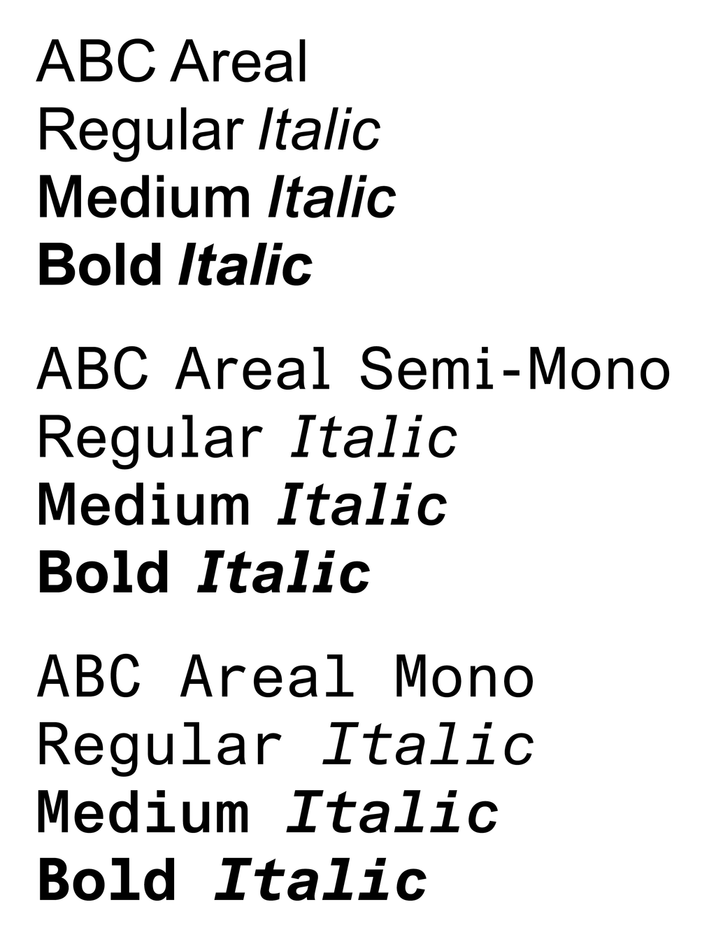
Today, we’re publishing this font for free <3
For this project to come into existence, a whole bunch of stars really had to align. It’s serious, silly, necessary, unnecessary, all at the same time. We feel blessed to be able to carve out time for collaborations like this one from time to time.
The response to this project was overwhelming, and many people asked for access to Areal early on, wanting to use it in their own projects. And we love the idea of Areal’s journey continuing in the hands of the community.
When thinking about how to publish it, publishing it as a free font, free to download and free for everybody to use, felt like the only right way, given the history and soul of the project. So that’s what we decided to do.
Nothing without a great team
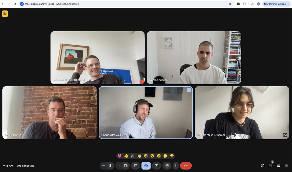
Thanks to our friends Cab, Daniel, Damon and Meg at Are.na for inviting us into their world. This project was truly special. We got an opportunity to revisit a piece of font-history with the best partners and even though the process was tedious it always felt light hearted.
And a special thank you goes to the whole team who made this possible and that’s alphabetically Fabian, Fabiola, Ferdinand, Hugo, Johannes:
Fabian Harb, head of fonts, coordinated font development side of the project
Fabiola Mejía, type designer who did all the heavy lifting (!), and traced characters alongside Johannes
Ferdinand Ulrich, design historian, contributed research into Arial’s history
Hugo Jourdan, font engineer, the font character screenshot facilitator
Johannes Breyer, had dinner with Cab which initiated this project, which he also then had to lead
We hope you enjoy using Areal!
Love, Dinamo
It’s totally working.Johannes Breyer