THE RETURN OF ABC Gravity - Five new weights later
When the first version of Gravity came out in 2021, the world looked different, and we were interested in different things. Back then, the question we wanted to answer was: how wide can we go?
The typeface we set out to design was meant to cover “all the widths in this world,” and the challenge had to be completed in one single, obscenely heavy weight. Our usual mix of self-sabotage and play.
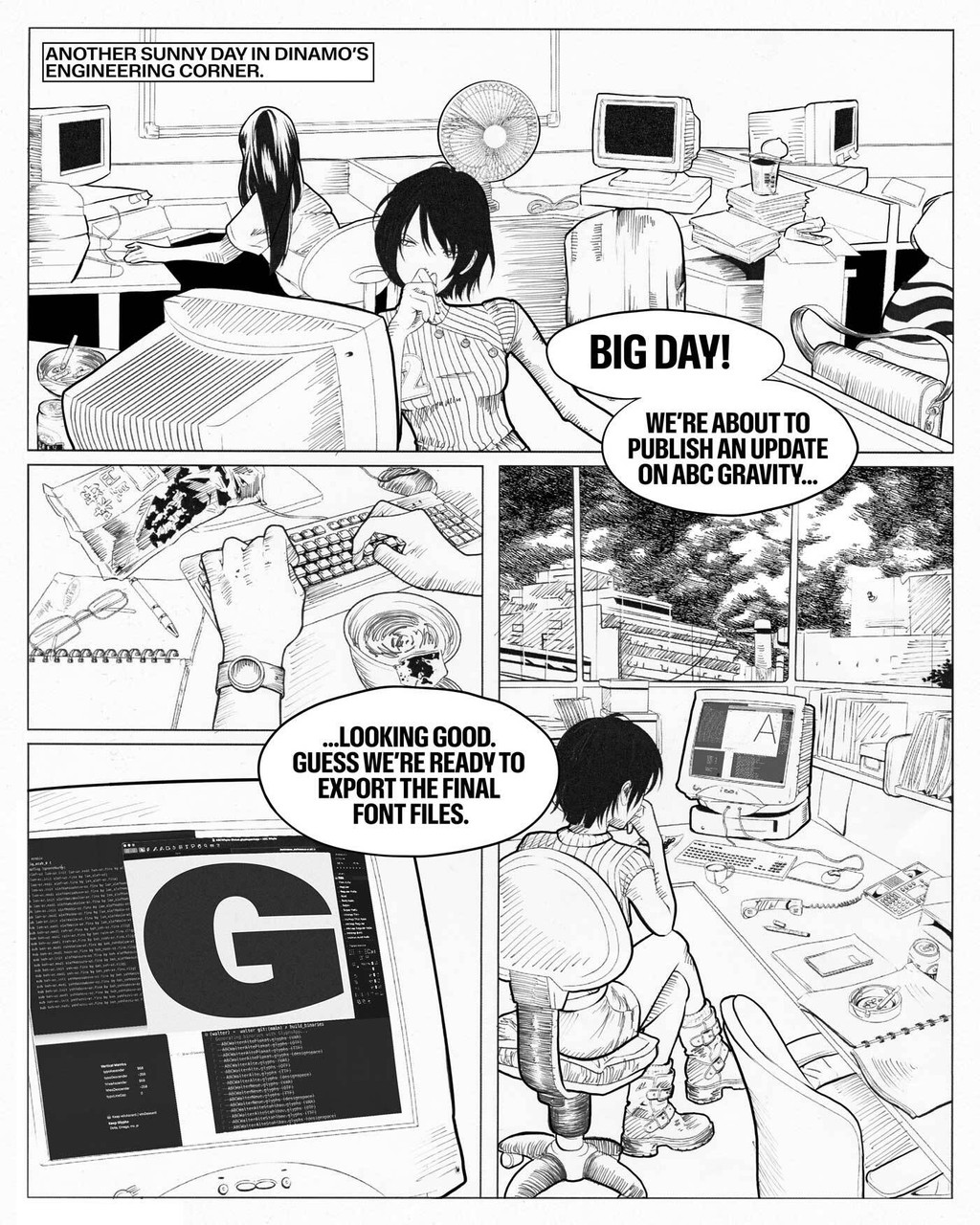
Gravity’s new campaign is a 10 part comic, entirely hand drawn. This is Panel 1. Scroll down for the rest. (:
People blessed with the task of designing movie titles, billboards, or responsive websites — anything that needs to take up very little space, cover enormous amounts of it, or, worse, both — became fast friends with this morally flexible typeface.
From print publications like GQ Korea and Dazed, cultural institutions like the Berlin Opera, and athletic giants like the NBA and Nike, to (finally) the Kardashians: Gravity became local and global news.
But times have changed, and so have our aspirations.
Gravity Today
We've returned with a massive update that we started working on right after the release of the first version. Like everyone else, we had become obsessed with weight.
How light could we go?
Gravity was put on a drastic diet and emerged with a full range of weights. Having opted for the non-Ozempic, slow, sustainable road to body recomp, the process took around two years and yielded long-term results: six manually calibrated weights for each width.
Head Nutrition Coach during the process was Fabian Harb. Connor Davenport did the drawing. Words of affection and assurance by Mike Nigra. Engineering by Hugo Jourdan.
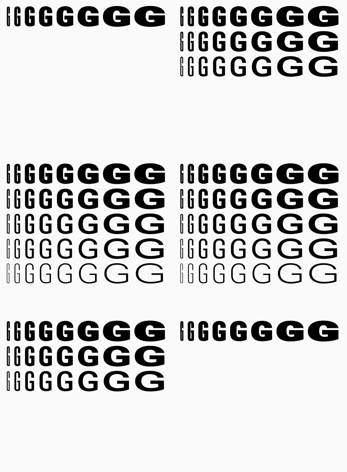
Everything previously known as “Gravity” is now “Gravity Ultra.” And sitting below, we have five new weights: Hairline, Regular, Medium, Bold, and Black.
The Return of Gravity
To celebrate this release, we want to shed light on what’s going on in the engine room of a type foundry. Long after the type designers have left the office to indulge in a round of indoor padel, the lights in the engineering corner are still on (flickering).
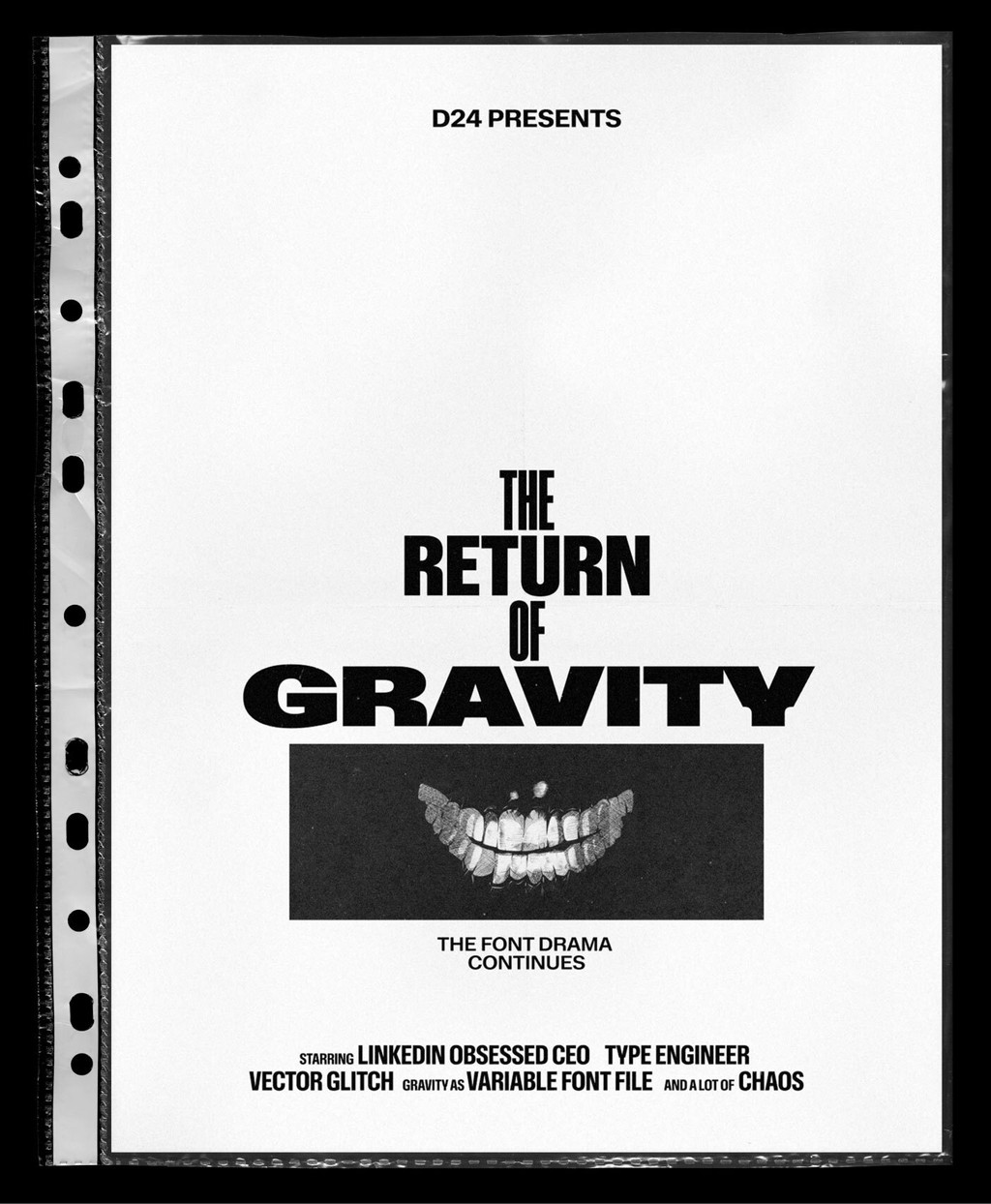
D24 is an independent entertainment company that’s behind some of the biggest box office blockbuster font releases.
Endless hours are spent fixing curves, re-placing components, removing bugs, re-writing feature code… tedious, mysterious tasks that in sum make sure everything works perfectly in terms of the Font-as-a-Software. The battle of man vs. machine never stops.
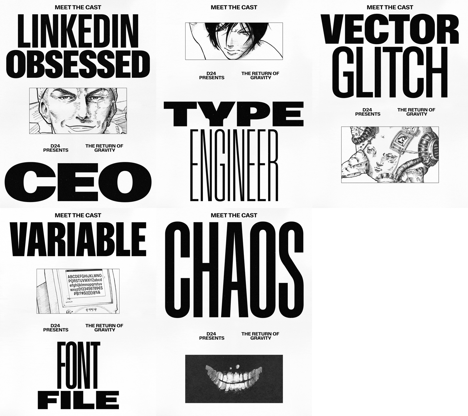
Chapter one: Release Day
It’s crunch time! The closer to release day, the more tense things become between the people involved. Personal drama is not the exception, it’s the rule!!
So what are these font-misfits up to on release day of Gravity 2.0? Please see for yourself...
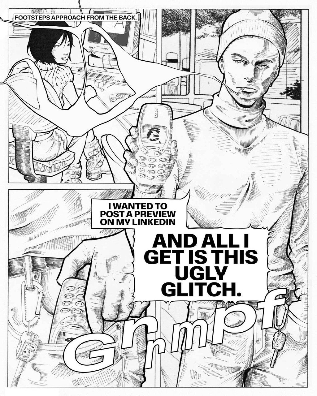
Panel 2
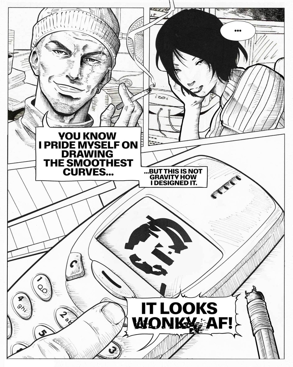
Panel 3
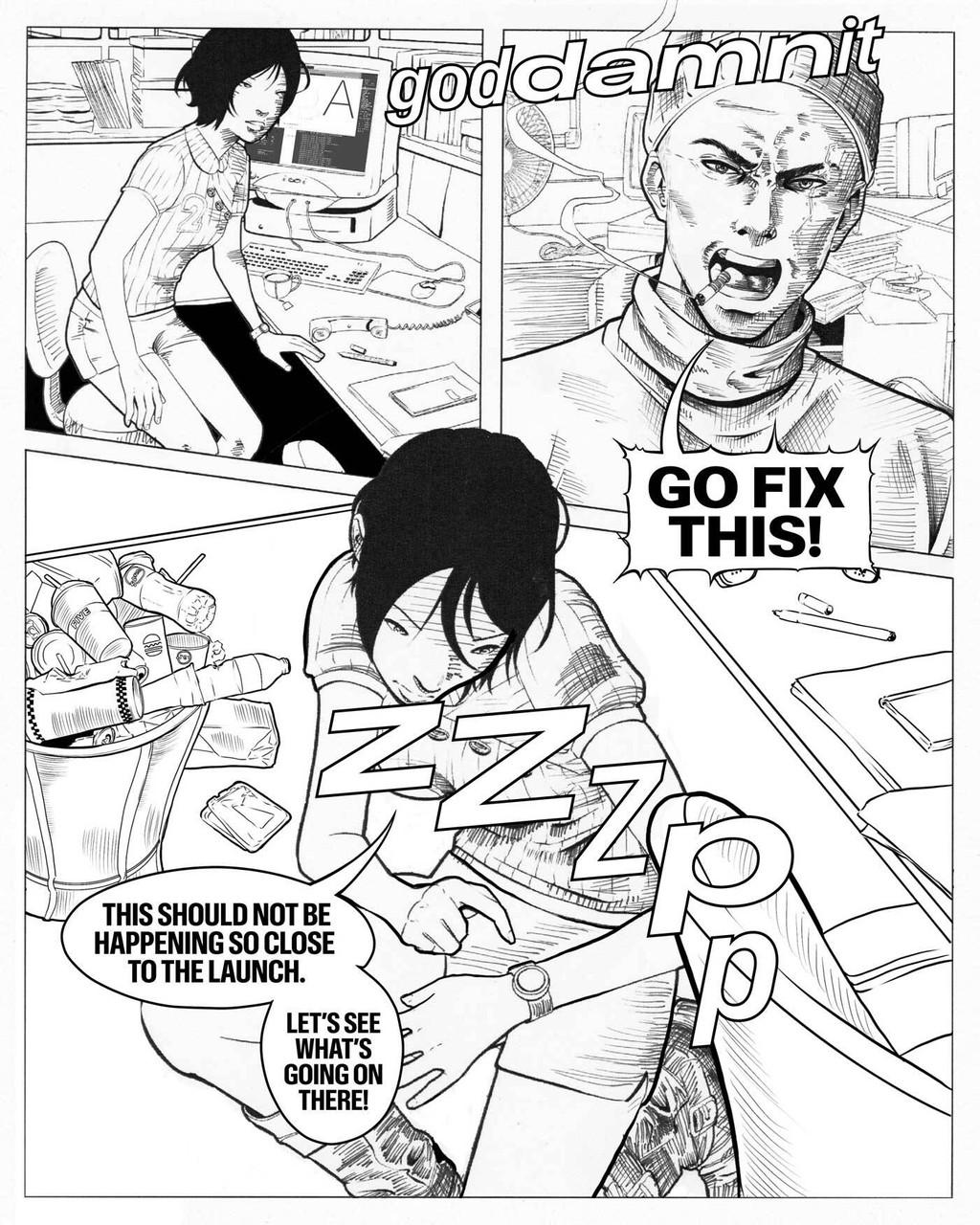
Panel 4
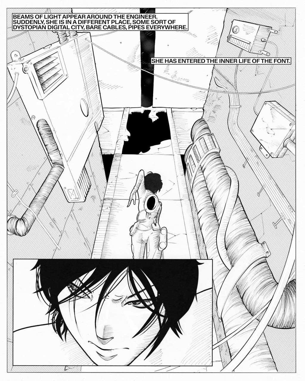
Panel 5
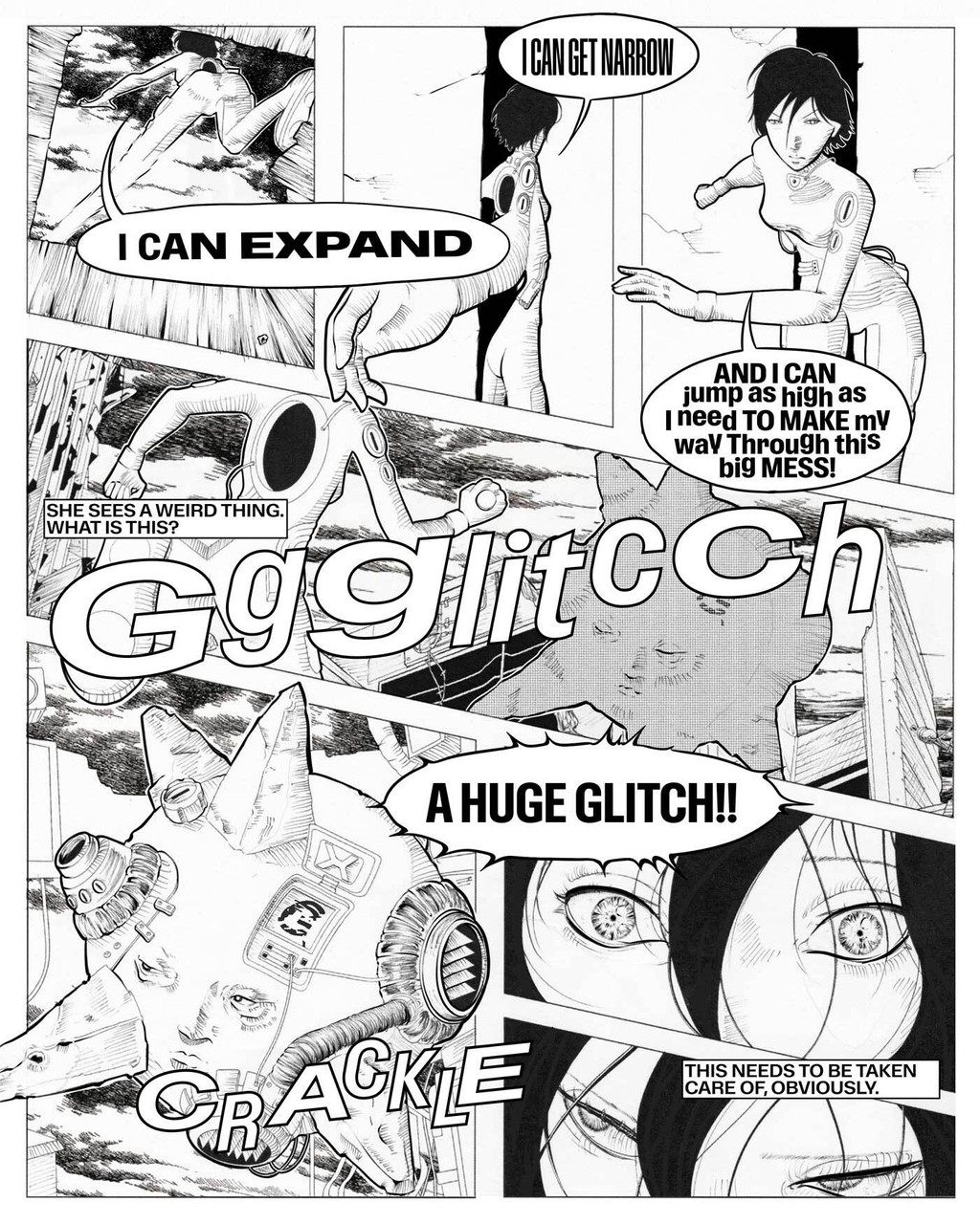
Panel 6
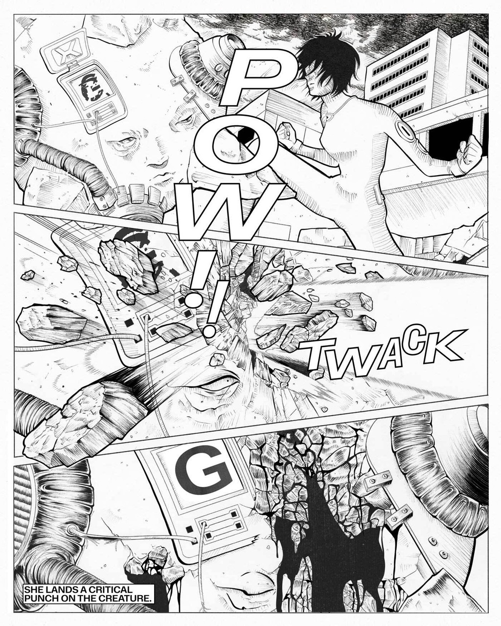
Panel 7
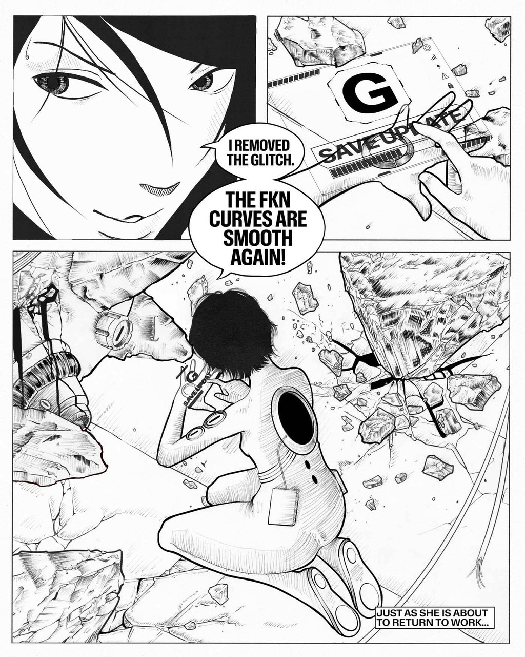
Panel 8
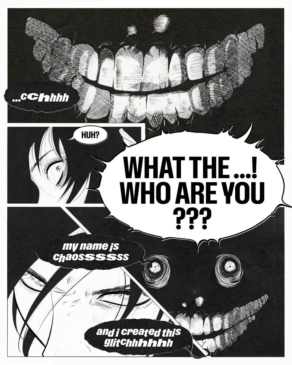
Panel 9
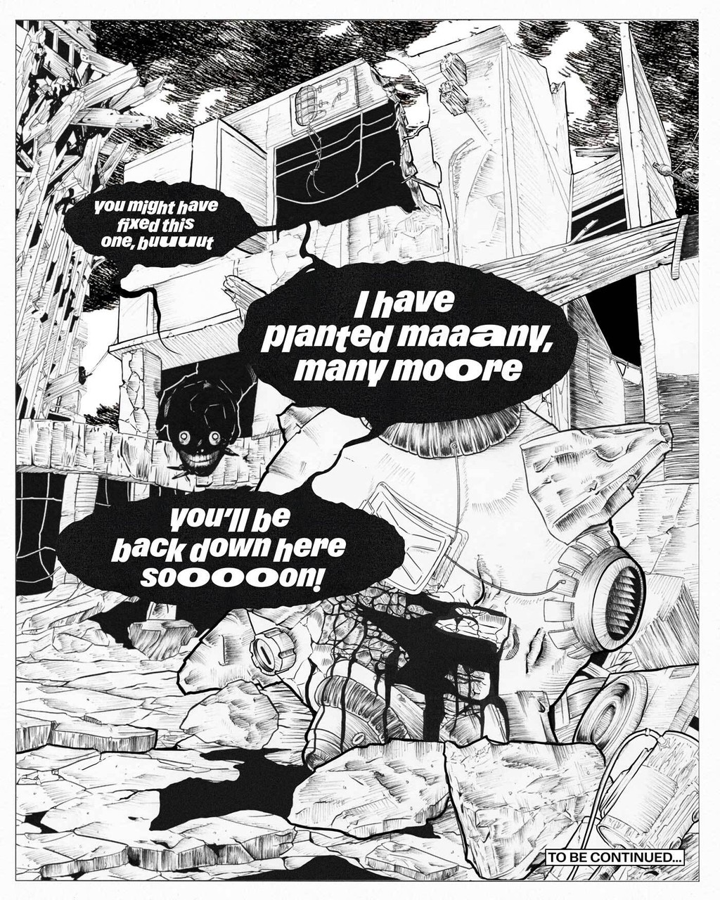
Panel 10
1.5 years of Sharpening pencils
To pay homage to the diligent caretaking of font engineering, the entire campaign, too, was drawn by hand by Dinamo’s own Melanie Schmidt. As usual, she showed off her incredible craft — not a single AI agent was involved.
In her own words: “For the font engineer, I immediately thought of Heather Mason from Silent Hill 3 — effortless nonchalance until everything falls apart, and then she locks in. Narratively, I wanted a small twist, inspired by games like Undertale. Granted, the reveal isn’t exactly earth-shattering, but every good story deserves at least one ‘????’ moment. Visually, the illustrations owe a lot to Takeshi Obata of Death Note, whose obsessive precision permanently altered my brain chemistry — he taught me that something can feel finished and still deserve another pass. So every line was refined digitally before I switched to analogue for the shading, because apparently I enjoy making my life unnecessarily difficult.”
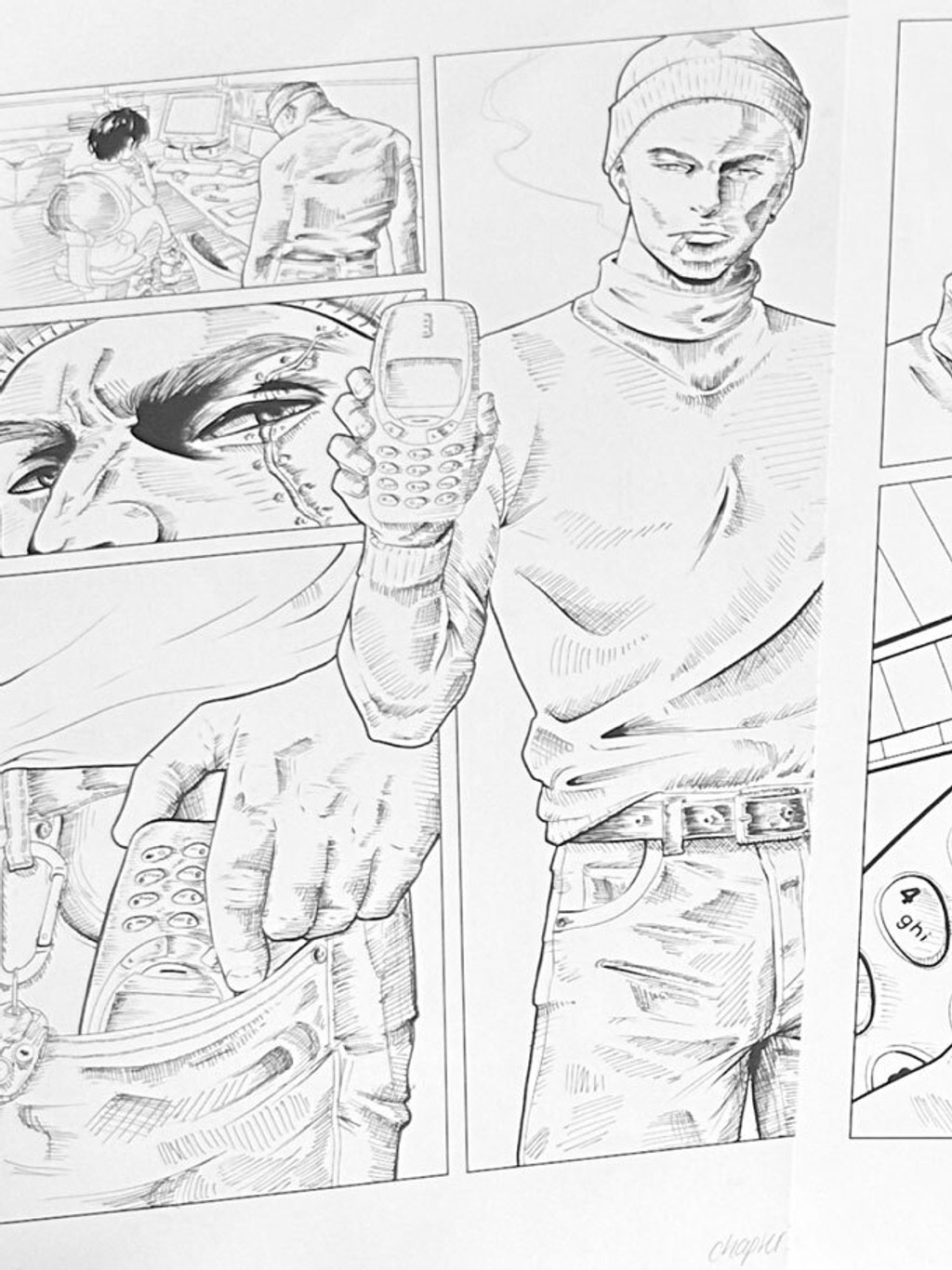
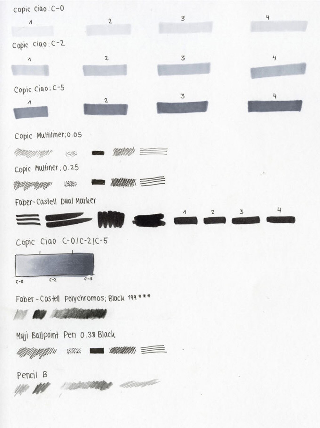
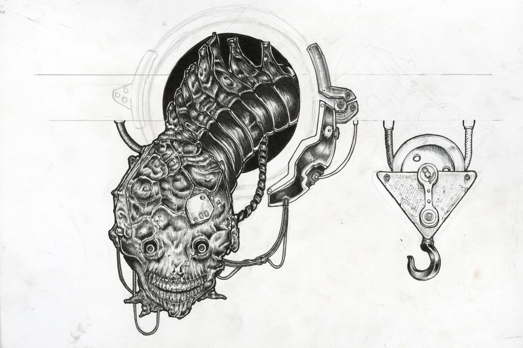
We can all agree that the lion’s share of credits shall go to Melanie. What’s left of the credit pie is split between Johannes and Kristin, who took care of the script, and our friend and serial collaborator Lucas Hesse, who turned our drawings and engine room into motion graphics. The little bit of graphic design you can find sprinkled in here was done by Lucas and Johannes.
Gravity Basics
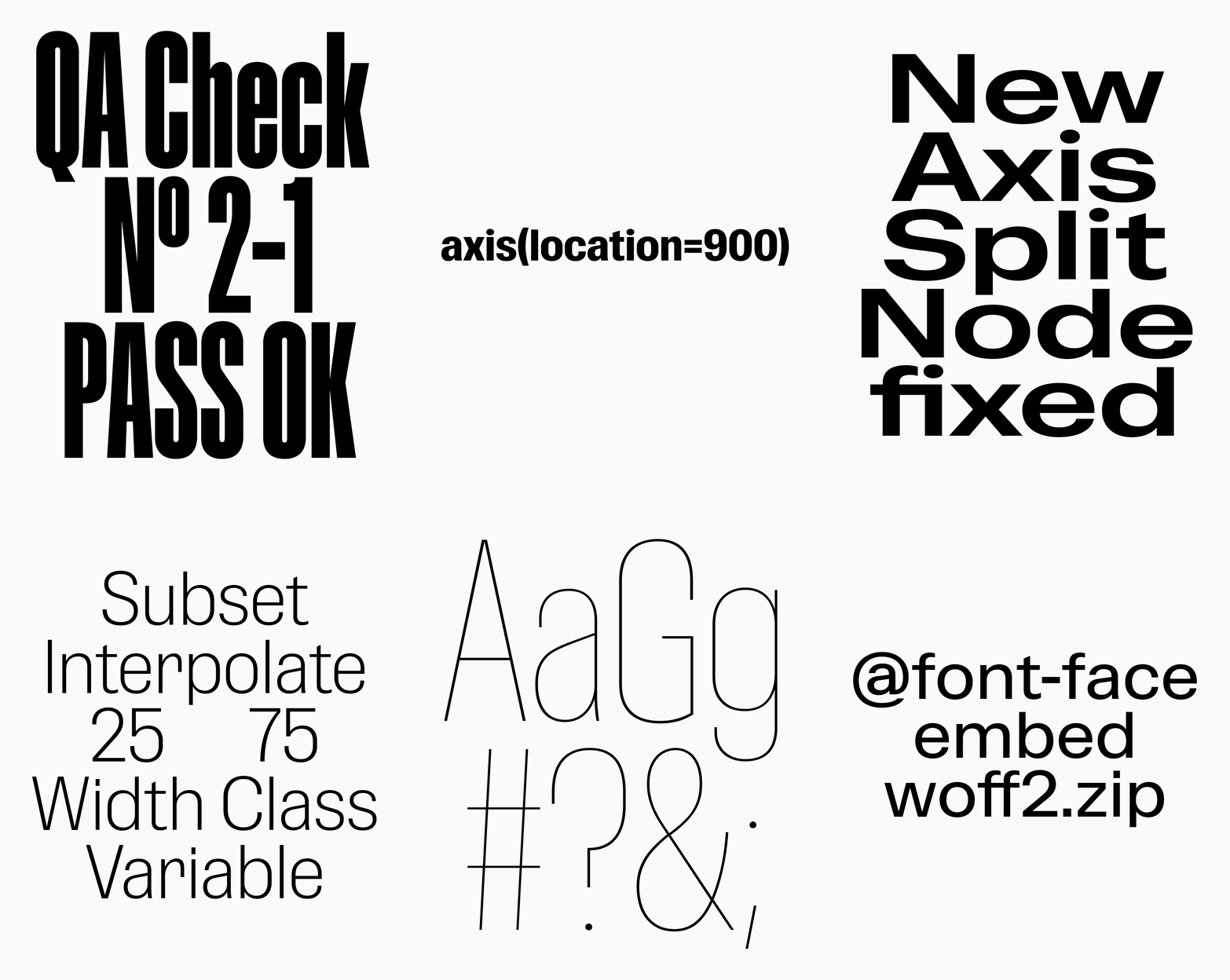
Aesthetically, Gravity shares a community garden with Compacta, Information, and Impact, the famous titling bad boys of the ’60s and ’70s. But we drew our design in a much softer way, a touch more open and friendly. We pushed the moment where the curves have to become straighter and more rigid — because of the density of the width — as far down the width axis as possible. Once you’re past “Condensed,” things get warmer instantly.
Alternates & Features
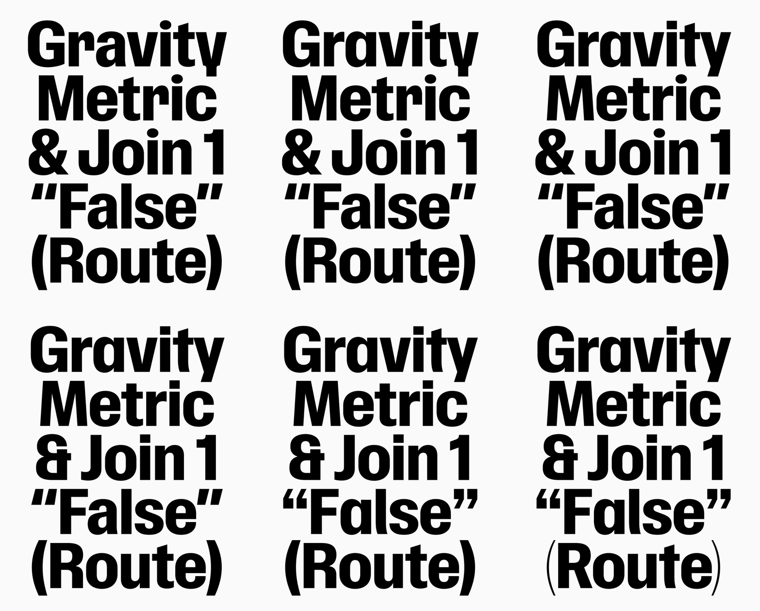
We filled the character set up to the brim with stylistic variations. The alternate G and R, the “square punctuation,” and the “sharp character” group are my favorites — each of them, when applied, changes the flavor of the typeface quite visibly. (And you can create and download your own custom version using our free Font Customizer tool.)
Additionally, we implemented a couple of rather unorthodox features: for example, one that shortens the characters, allowing for very tight display settings. Very functional. And another one that makes characters jump over the baseline or hang from the top. Very silly!
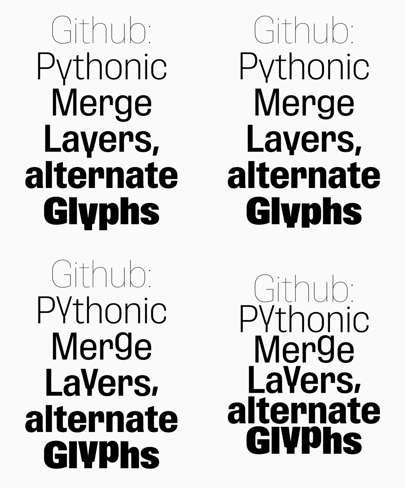
And there’s more baked into the font, simmering. Waiting for you to lock in, create, export.pdf.
Housekeeping
At last, firmly holding a metaphorical iron broom, we cleaned up the width axis and decided to say bye-bye to some of the intermediate steps that weren’t really adding anything other than making the family harder to navigate (and more expensive to buy). The width range is as extreme as before, but there’s less clutter in the middle. From the previous 12 widths, only the 8 most handsome have survived. The Hunger Games of type design.