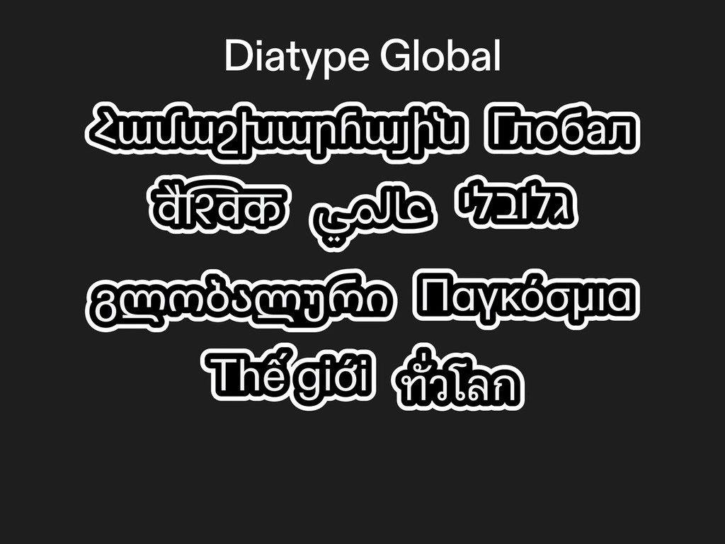
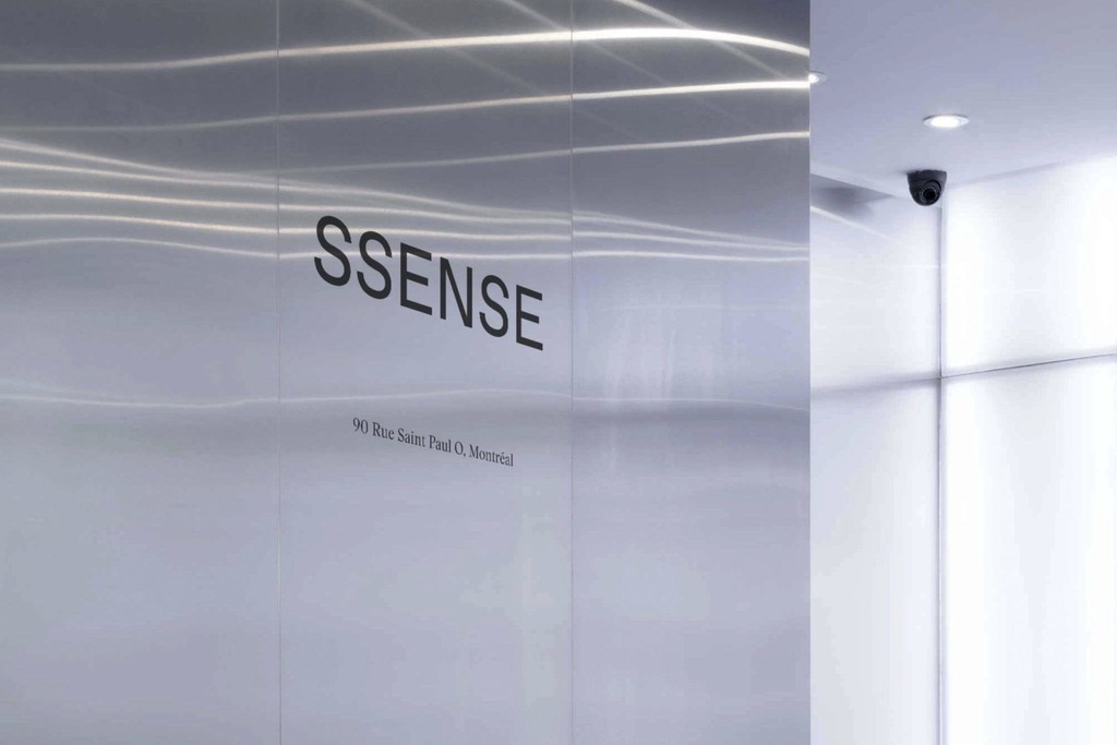
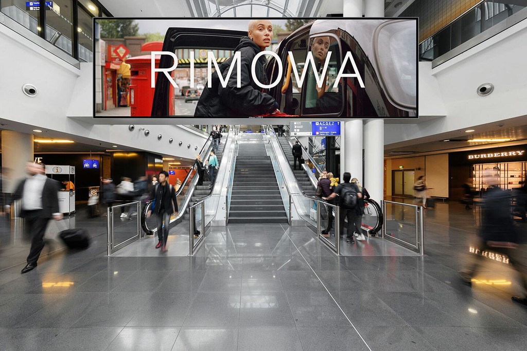
Customized Diatype for GOAT
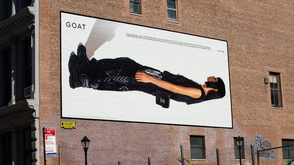
Custom Typeface · Bespoke · Screen Optimization · Variable Font · GOAT · 2022
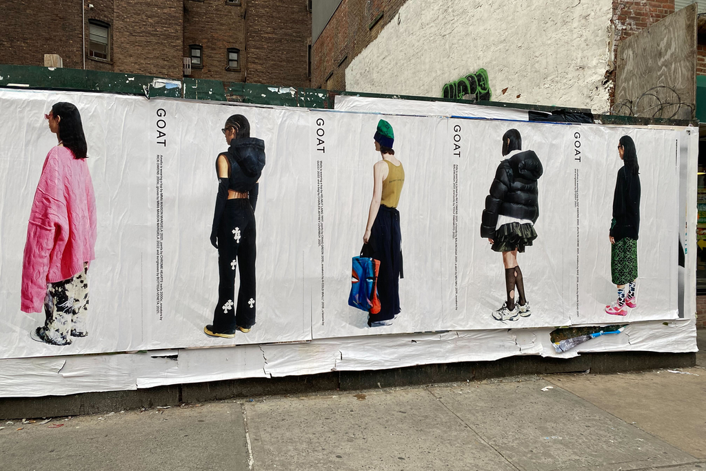
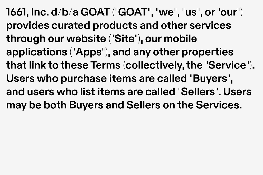
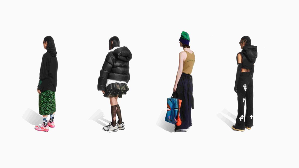
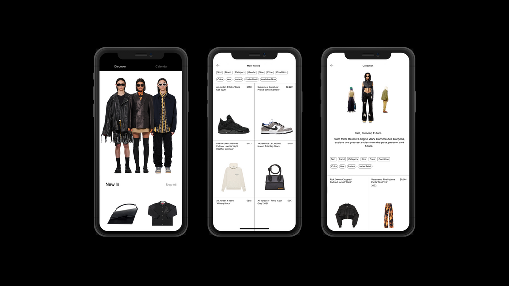
Since its founding in 2015, GOAT has become the leading marketplace for sneakers, and has expanded to offer apparel and accessories from streetwear and luxury brands. Committed to design and timeliness, the global platform’s brand is clean and functional.
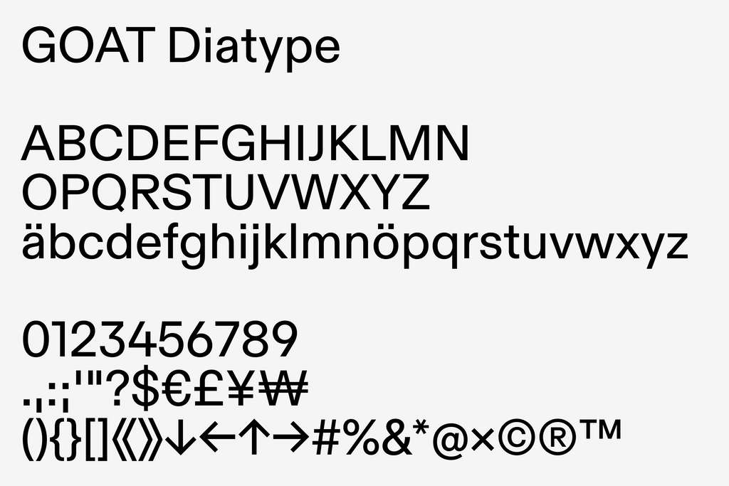
Our custom typeface takes the bones of our own ABC Diatype and reduces them to the max. Creating a subtle yet confident tone. One that lets the products do the talking.
The Customization
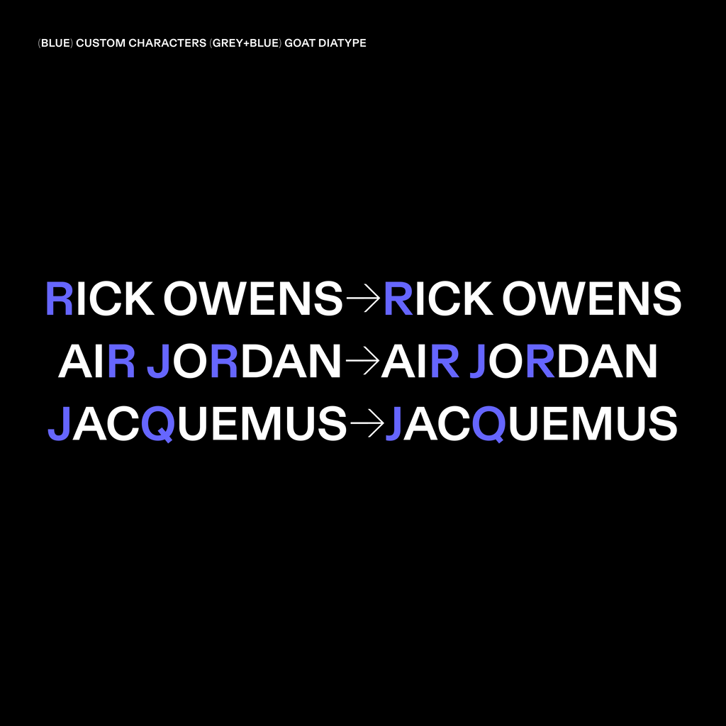
ABC Diatype is a warm yet sharp grotesque, ideal for reading on screen. To create GOAT Diatype, we streamlined its reduced forms to the max. Straightening things like the R’s leg and shortening the Q’s tail. This blunt reduction creates an edgy, contemporary vibe. Well-suited to detail-orientated fashion labels.


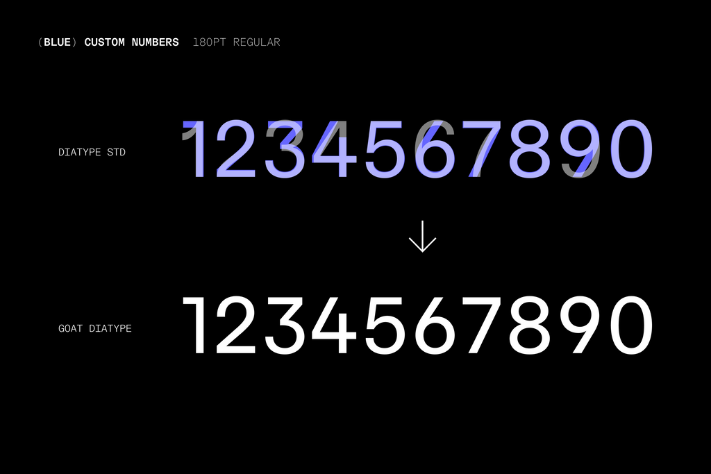
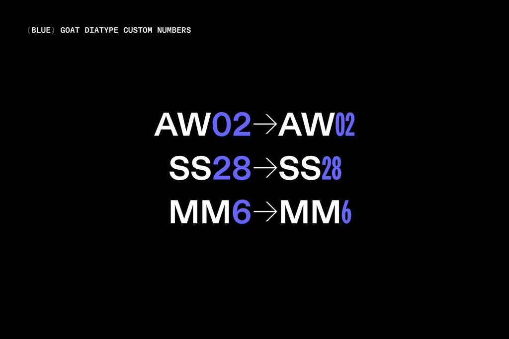
Numbers also play an important role for GOAT — just think of the importance of release dates and models in sneaker culture. So we created bespoke numerals for the brand, with straighter angles that feel fresh and contemporary.

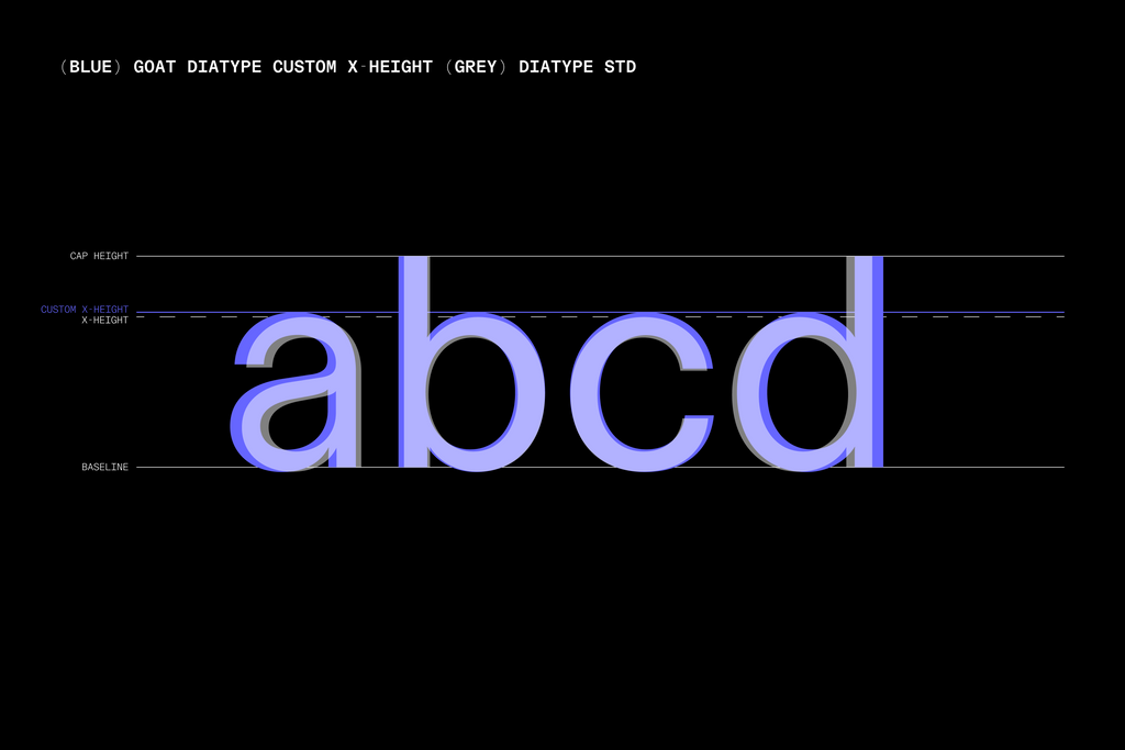
Lastly, we tweaked the x-height of the font, to optimize it for digital displays. This custom x-height also matches the brand’s former type ratio — so the new design was way easier to implement across GOAT’s platforms.
Bespoke Variable Axes
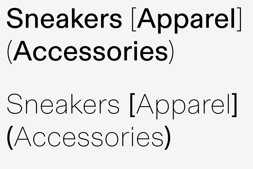
The labels you can buy via GOAT care about details. Things like stitching. Collar lining. Outsole. Vamp. Material. We brought this spirit into the font’s variable behavior. Pump up the weight, and the punctuation automatically becomes light. Make characters lighter, and the punctuation is heavy.
These moments add an elegant, unique identity to an otherwise minimal and heavily reduced brand.
Bespoke Currency & Punctuation
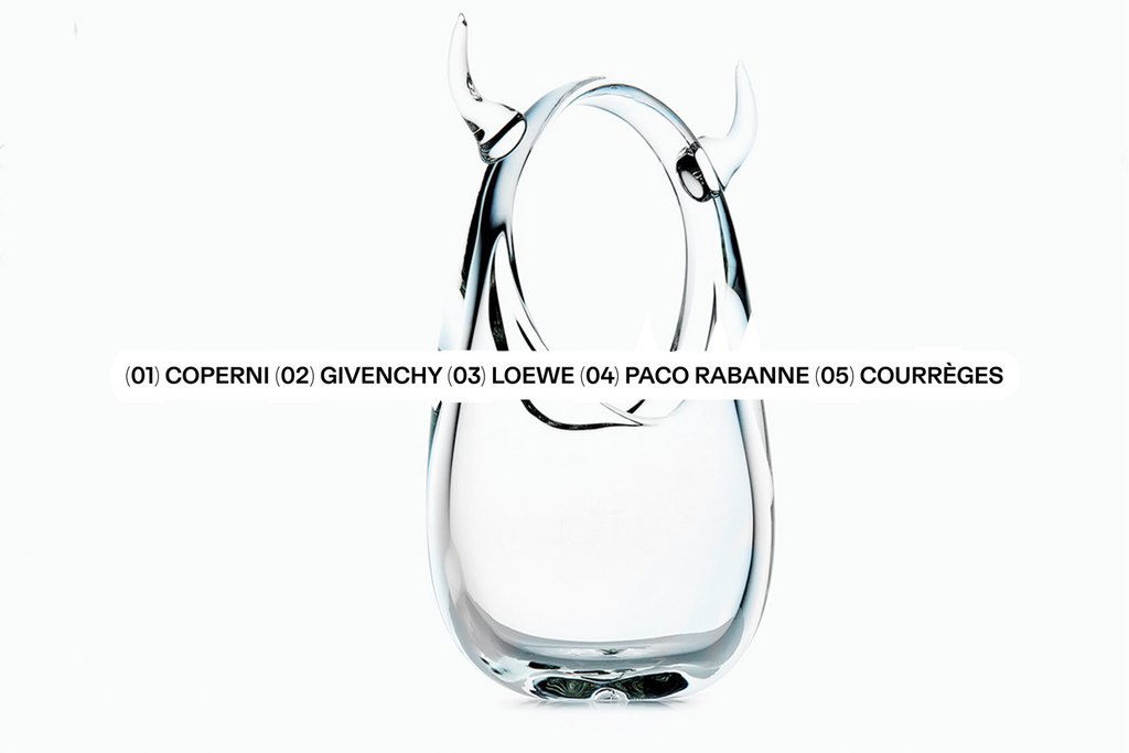
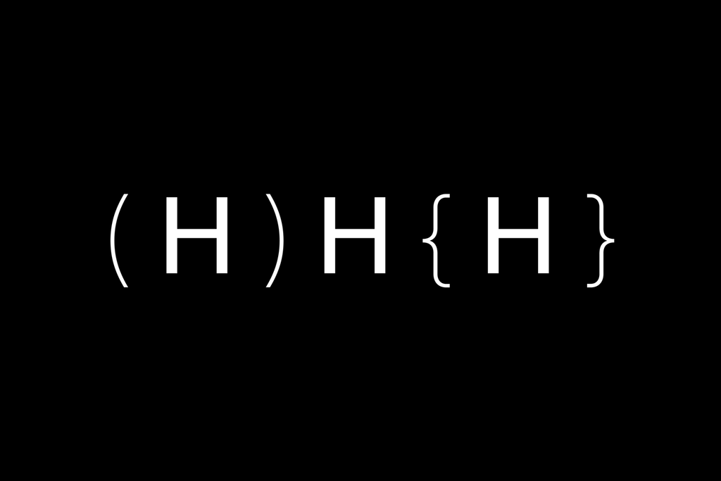
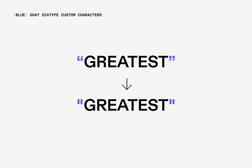
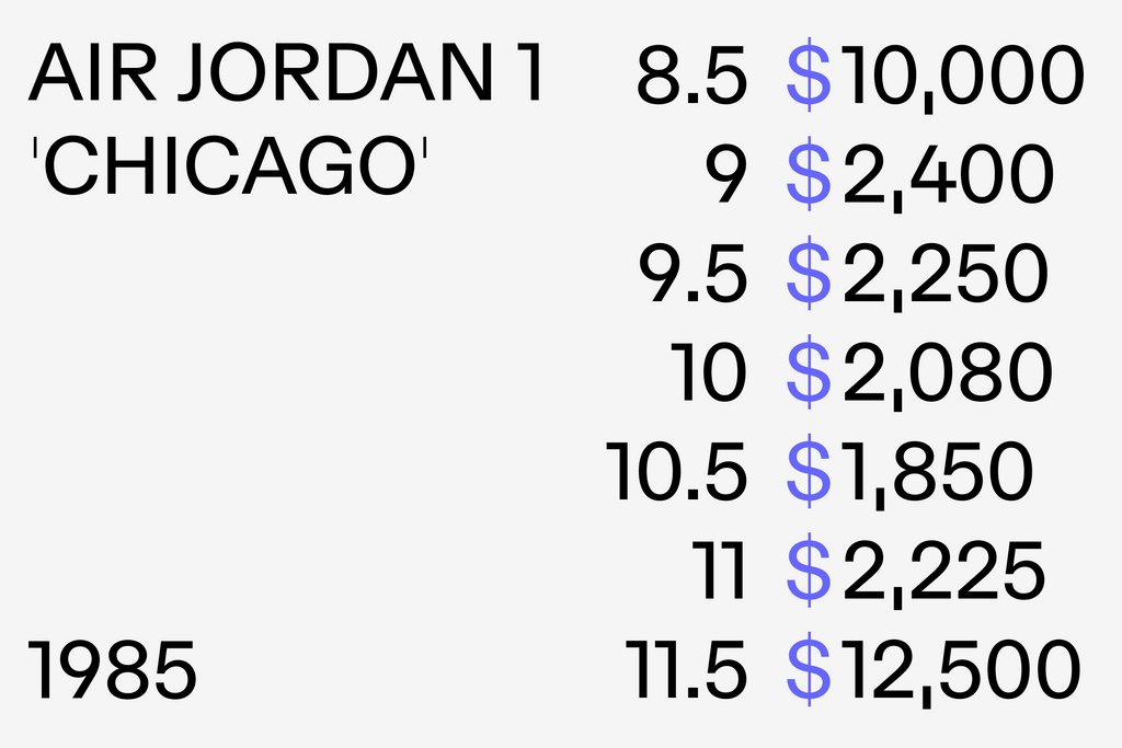
We also put a lot of care into creating a bespoke set of arrows, punctuation, and currency symbols, as they’re used so prominently across GOAT’s sales platforms. They’re simple and streamlined. Elegantly brutal.

Custom Alternates
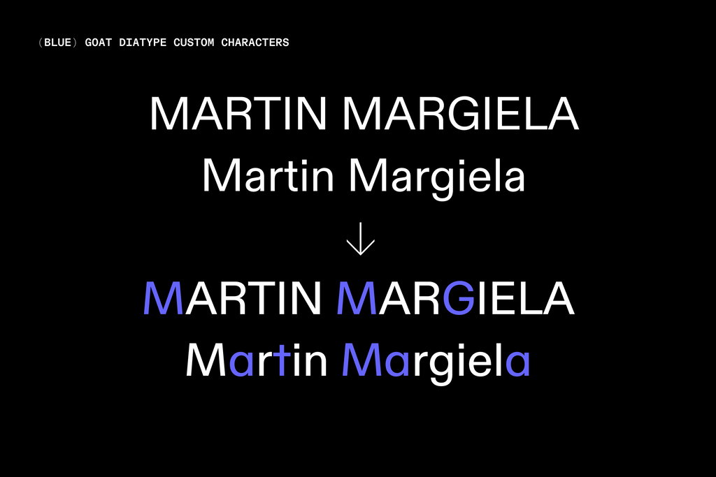
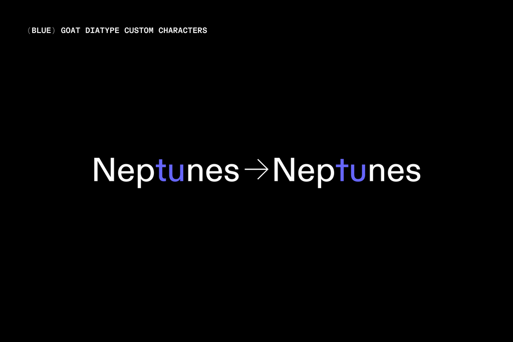
Custom alterates reduce letterforms to their most fundamental strokes. A single story a and schoolbook G, as well as a straight-t and flat terminal u, are available for moments of intense minimalism. Options for narrow numbers allow for interesting pairings whenever more flavor is needed.
That’s Everything <3
Thank you to everyone at GOAT for this beautiful collaboration, including Charles LeGrand, Christopher Diaz-Mihell, Josh Webman, Laura Tolomelli, Roberto Rodriguez, and Sen Sugano! As well as the talent orbiting around them: Larissa Kasper, Rosario Florio, Samuel Bänziger, Michel Egger, and Chi-Long Trieu. And a huge thank you to Creative Director Samuel Guillope-Weissler for bringing us into this special project. We always appreciate when clients care as much about the details as we do.
Credits
Art Direction and Design: Samuel Guillopé-Weissler and the team at GOAT
Type Design: Dinamo (Renan Rosatti & Fabian Harb)
Mastering: Dinamo (Renan Rosatti)
Campaign Photography: GOAT
