That’s Marist, Gaisyr, and Walter —

Welcome to the latest issue of our newsletter, where we’ll continue to share the latest ongoings at the studio. Browse our archive.

Was this forwarded to you? Sign up now! (◠‿◠)

Hey Friend,

We’re releasing three beautiful typefaces into our retail library today: Marist, Gaisyr & Walter.

That’s two serifs and one multi-generational sans with fingerprints all over Switzerland. Healthy serif to sans balance here I come.

You may have noticed them in our Early Access area already. It’s where customers can request to use a typeface before its widespread release. Today, all three are officially available for everyone. I’ve written up their stories especially for the occasion.

ABC Marist

Designed by our core family member Seb McLauchlan, Marist is a warm and robust re-examination of the Old Style genre first imagined by Nicolas Jenson in 1470.

Forget the Metaverse for a moment. Imagine instead a quiet library with stained glass windows and stacks of books, a place where time seems to slow down and the mind has space for careful traveling.

Read the whole story behind this mystery serif.

Choices.

True italics

Prominent serifs and wide uppercase proportions that take their time 🐌

Marist: The Gathering™

Close up using the archeology tools we were able to source around Hermannplatz

This image was hand-photoshopped by me for you without any help of AI

Marist space cookie

ABC Walter

A long-standing, joint scholarly effort by Dinamo and Omnigroup, Walter comprises of Walter Alte and Walter Neue, two related yet ideologically opposed families celebrating author and design educator Walter Käch.

Our point of departure has been Käch’s tool for teaching students how to draw letterforms: The triple styles of Walter Alte are a faithful study of his lessons, while Walter Neue is an extension, update, and digitally-minded interpretation.

Read the full-length family biography.

Walter Neue (hard) core characters

Stem and style analysis, for the mathematician’s eager eye only

Walter Käch, Schriften, Lettering, Ecritures: The Principle Types of Running Hand and Drawn Character, 1949

Walter payback card anyone?

Hey Walter 🥰

ABC Gaisyr

Gaisyr is a beautiful typeface with Dinamo house-style Butterfly Serifs. It takes its point de départ from sketches by the early 18th Century royal typographer for King Louis XIV, Jacques Jaugeon.

Close your eyes and imagine the King sitting in his garden, maybe a bit sunburned, surrounded by butterflies and low hanging citrus fruit, sipping on a (glass bottle) of Coke®. You have now entered the world of Gaisyr.

Read the full scroll.

Spot the difference 👆🏻

Youthful ligatures and spring-like Small Caps

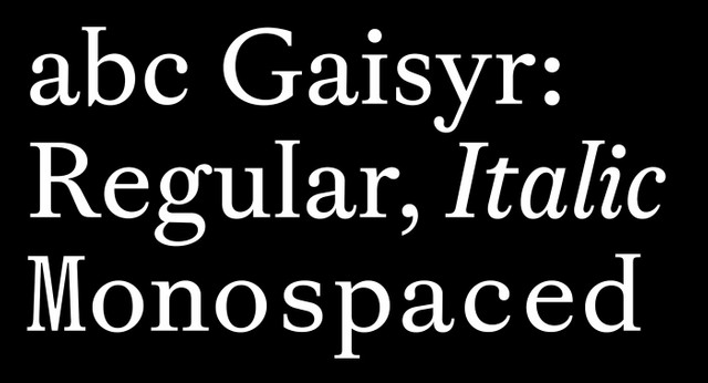
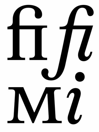
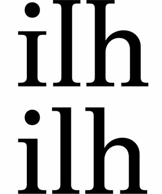
ABC Gaisyr resides in the neighbourhood of “Romain Du Roi,” the typeface of King Louis XIV — or the King’s own 'lil custom font, one might say. The heavily rational design was drawn by Jaugeon, based on a grid and with geometric construction.

But the punch cutters who produced the font were still in the mindset of free-styling: They translated the sketches onto metal by eye, and with rudimentary measuring.
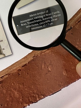
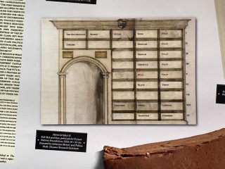
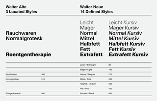
It’s the tension between strict geometry and a loopy, hand-held interpretation (think of the King after an evening inspecting his distillery) that lives on our own lines for Gaisyr.

Tired: Lepidoptera

Wired: Butterfly serifs

That’s it! And don’t forget: You can customize these fonts with your favorite alternates before check out using our Font Customizer tool.

Let me know what you think.

Love,
Dinamo x

Dinamo Typefaces GmbH, Glasower Str 44-47, 12051 Berlin
Copyright ©2024, All Rights Reserved