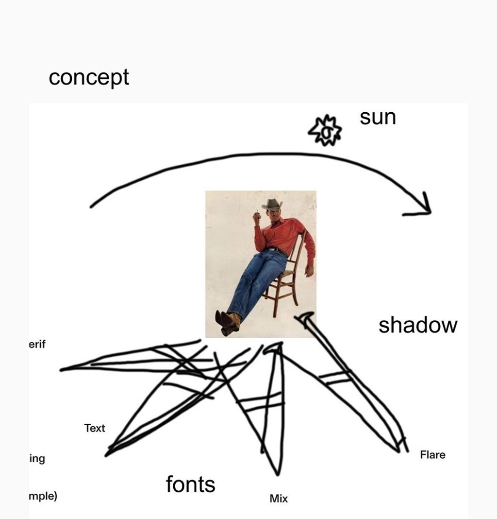
horsegiirL b2b Arizona Compressed
In the Club with horsegiirL b2b ABC Arizona Compressed
When we released Arizona in 2021, it was the first typeface to merge multiple genres into a single unified, family. Serif, Text, Mix, Flare, and Sans – all in one font file. Even the haters respected the move.
Today, we’re returning to the dust-blasted highway of imagination by adding two Compressed and Condensed subfamilies to Arizona’s very-able-toolbox.
And we brought a special guest to the party, Berlin-based DJ, artist and singer horsegiirL.
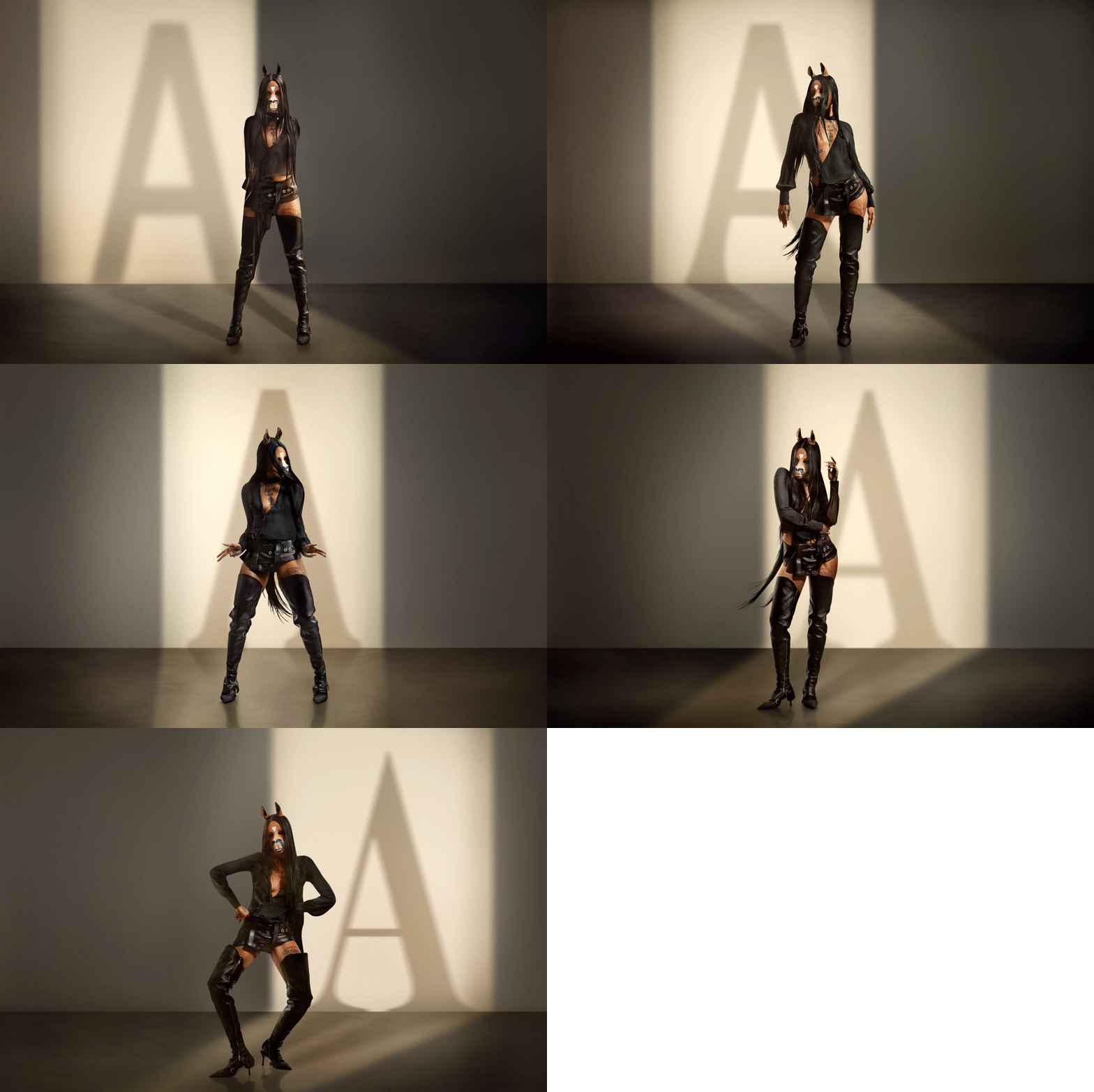
TYPE FACE
This re-release moment called for a special celebration. Early ideas around western themes, cowboys or cowgirls didn’t feel too inspiring: the subject of our campaign needed to embody the same hybrid spirit as our half sans, half serif Arizona. No stone around the city of Berlin (and its clubs and nearby countryside stables) was left unturned until we found the perfect match:
horsegiirL, who’s famously half human, half horse, had to be the face of this type face.
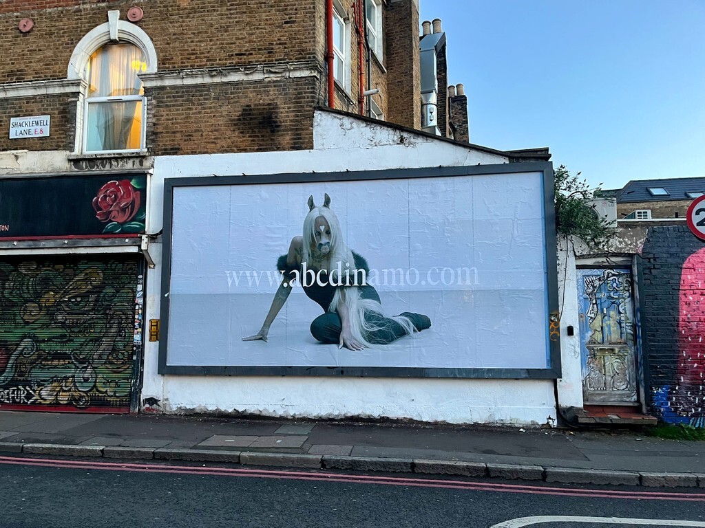
Dinamo x horsegiirL spotted in London
Starting this week a couple of billboards and posters will appear across Berlin, London and New York – Dinamo’s first printed out-of-home PR situation!! Scroll down for the full credits and go hire all these people for big payday projects.
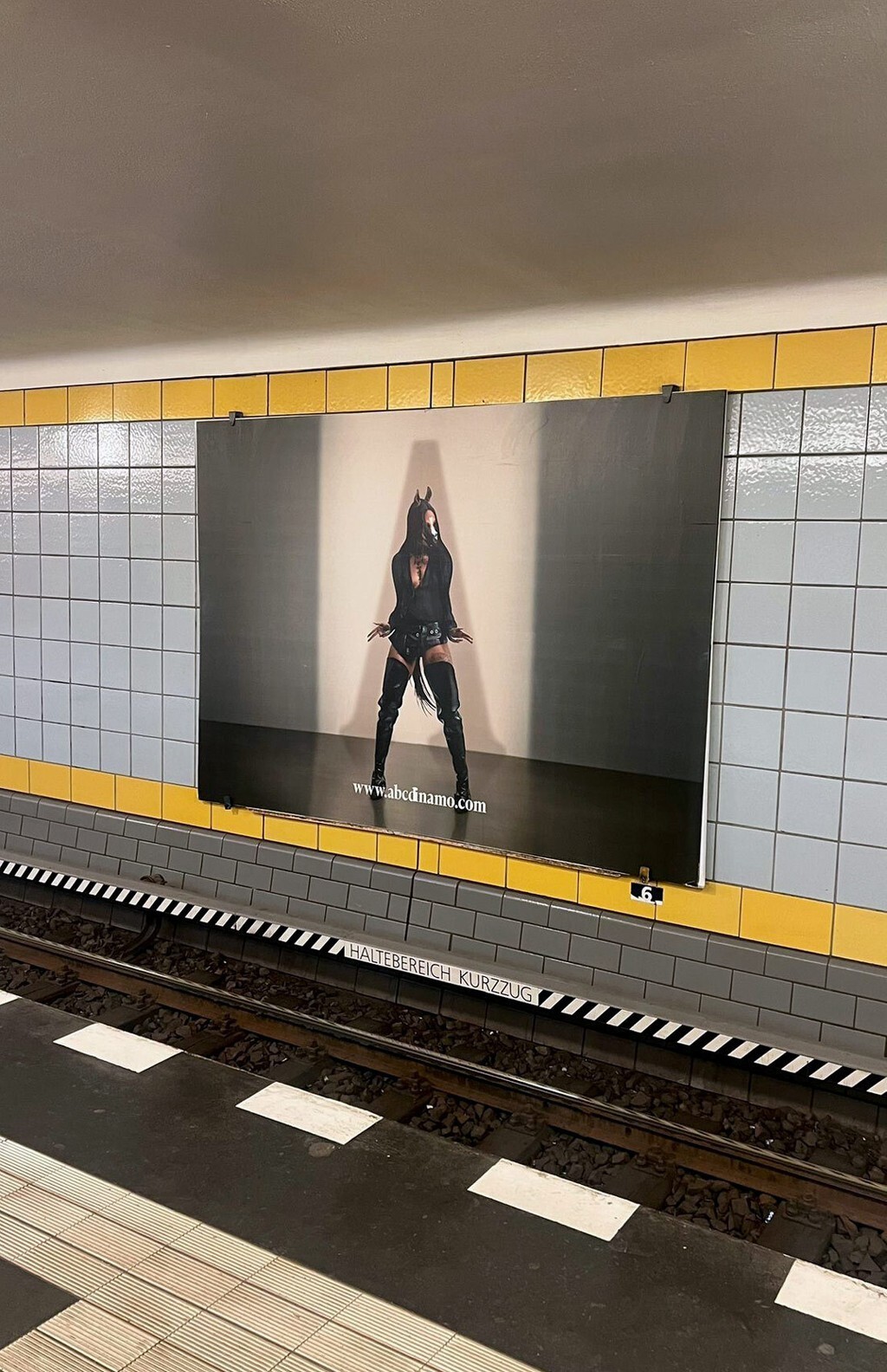
Berlin U8 Hermannstrasse
In the News(paper)
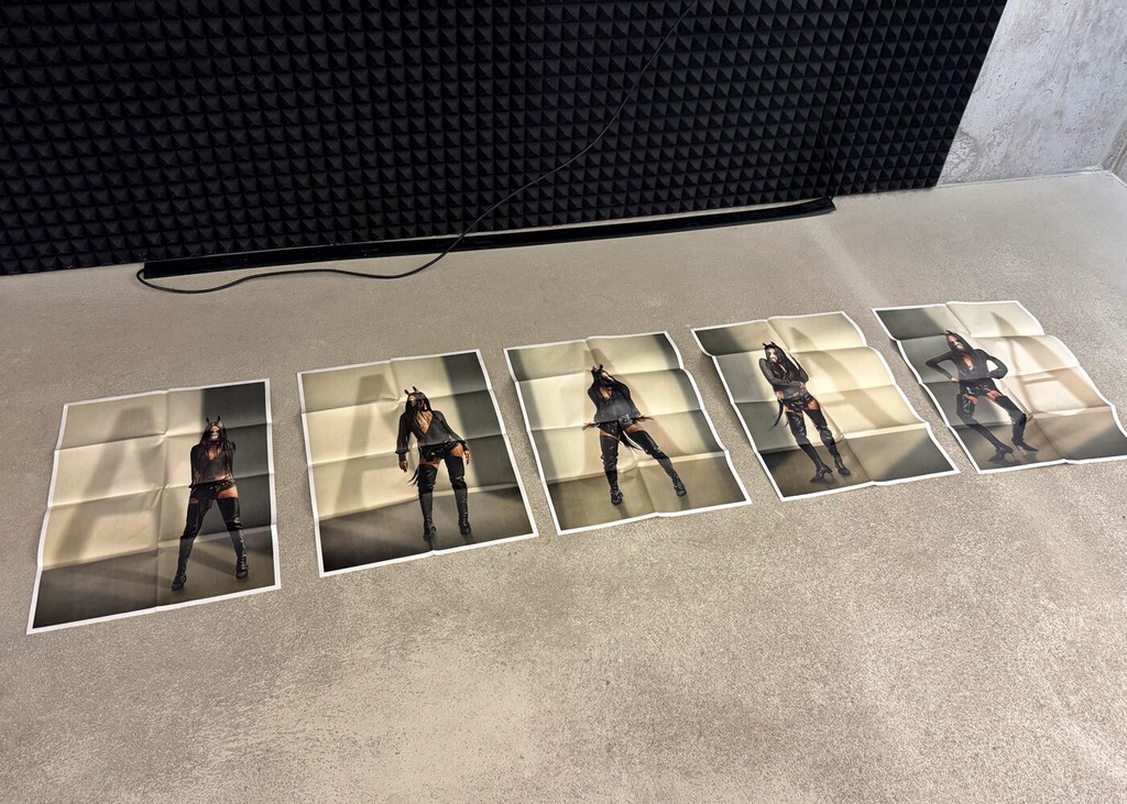
Then, inspired by teen magazines that come with a foldout poster in the middle, we designed a newspaper that works in the same way. Five loose sheets, five posters, half type specimen, half reader. Slap it on your wall! Or, when flipping through the pages on a table in front of you, you get rewarded with nice, unintentional combinations of text and image.

BACKED BY SCIENCE
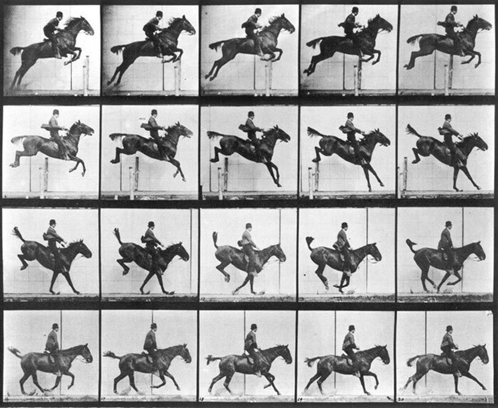
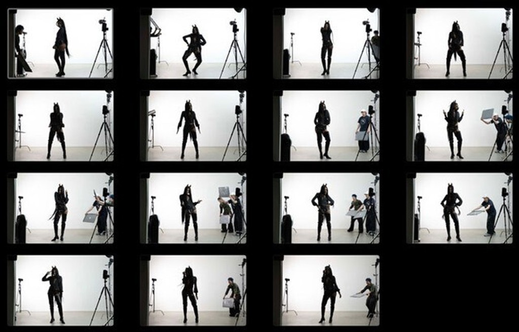
How it happened. With a team lead by veryes and Tereza Mundilová, we took an awful sounding idea – a hot desert sun casting alphabetical shadows – very seriously and came up with this formula:
Arizona = half sans, half serif
Arizona = variable font
Variable font = moving font
First moving image = moving horse
HorsegiirL = half horse, half human
Conclusion: horsegiirL = Arizona.
Done. That was enough work for the day.
Eadweard Muybridge, 1887
Tereza Mundilová and veryes, 2026
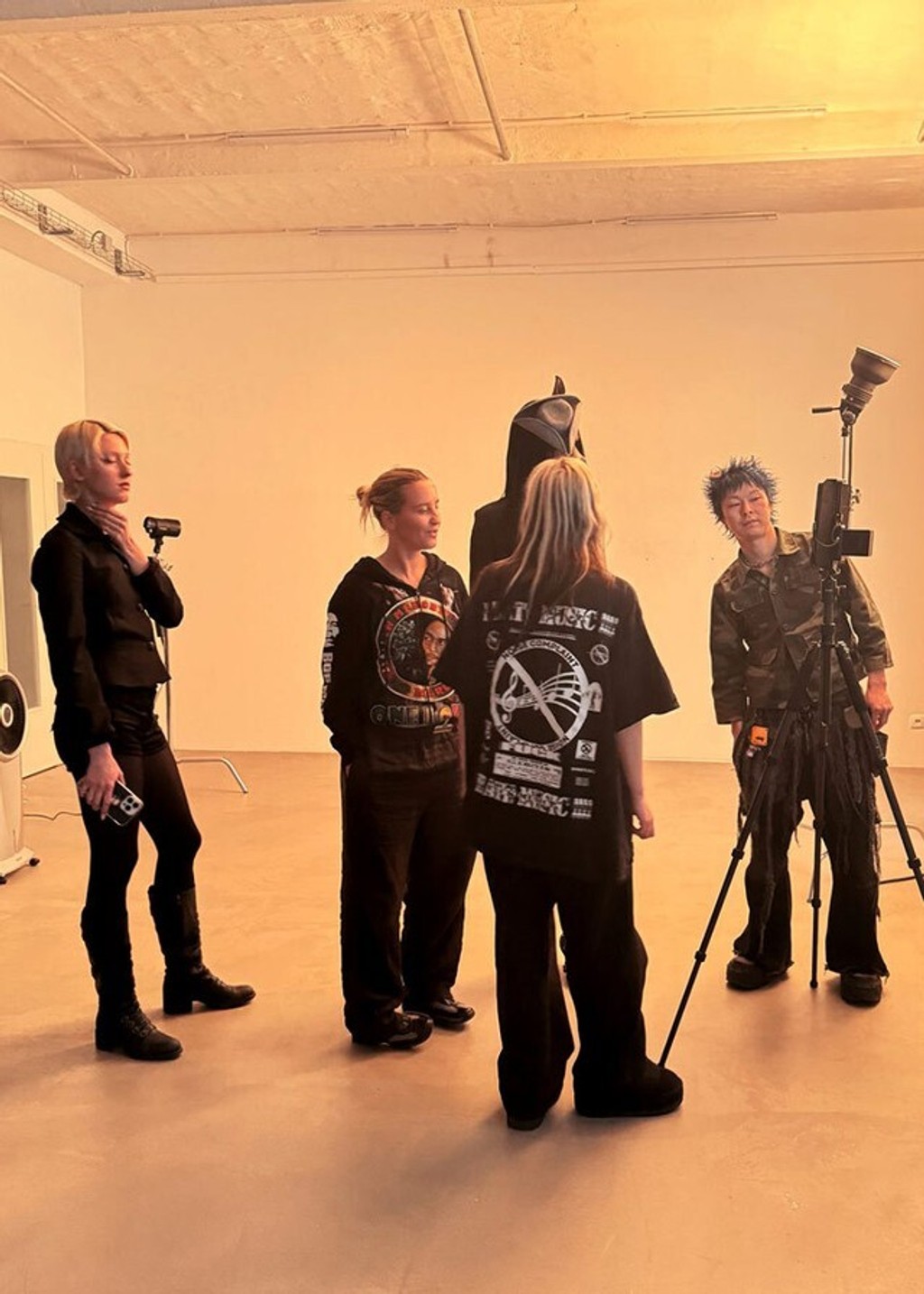
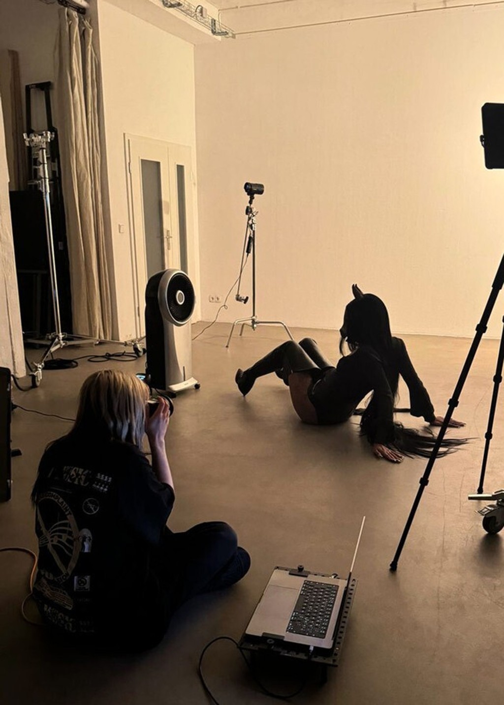
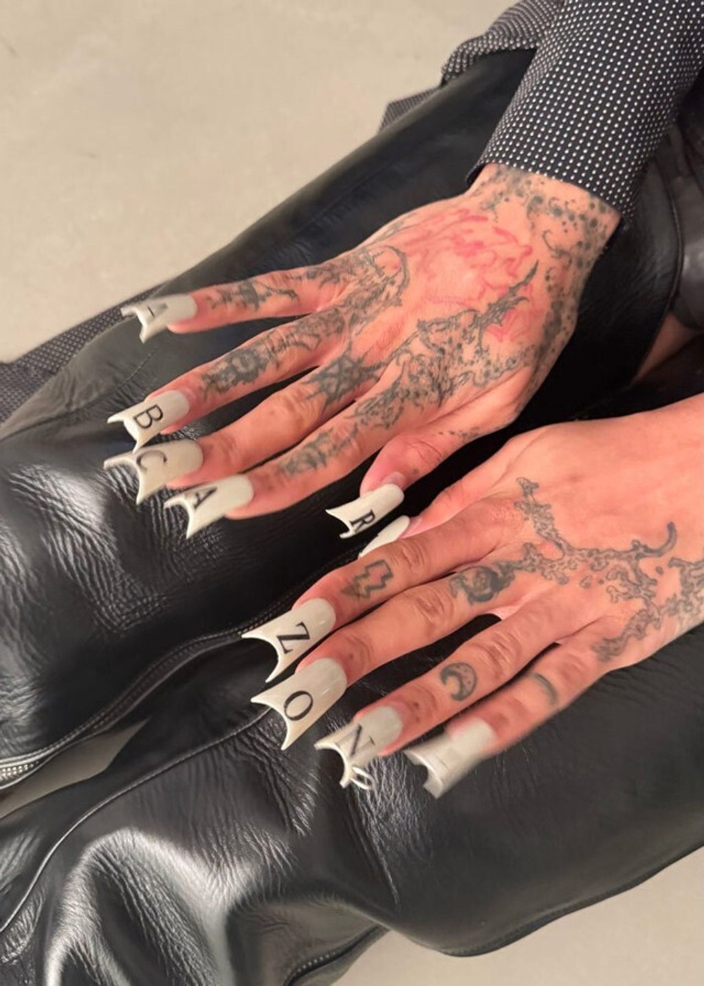
FONT FICTION FEVER DREAM
If I were still a player in the Game of Graphic Design, oh I would have loved the many possibilities Arizona carries inside its horse-sized font-belly. I imagine myself at a small round marble bistro table, laptop open, ten different potions freshly applied in random order to the dark area below my eyes. I instantly hit a custom shortcut and launch InDesign, or Figma, or whatever. (Certainly not Canva.)
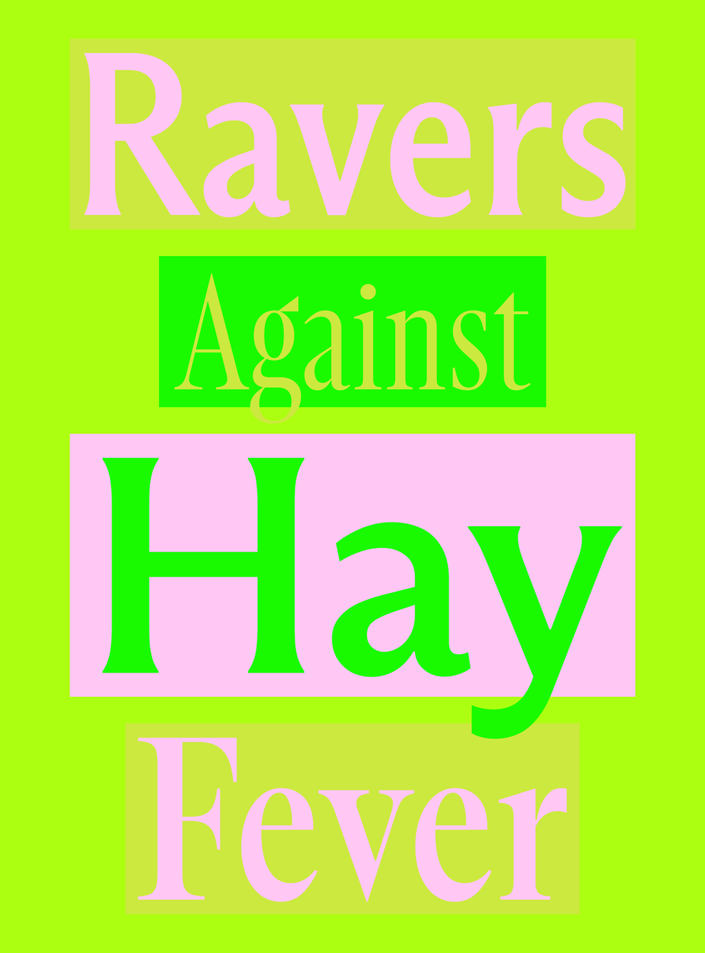
Anonymous designer, 2026
I got this design thing I’m working on, a big commission. I’m inspired. I prioritize. And in between, I drink water. The audience is mixed, the product range is wide. So I need to express a whole bunch of things. Let’s do this!
I’m dragging around those variable sliders and I’m presented with a range of styles I can mix and match; from Serif to Sans, to Condensed. I feel elastic. I’m making some of it Bold.
I experience a state of flow as I’m sprinkling in a bit of Italics.
Can I really design an entire project on a single font, adjusting its parameters as I please, and have everything always look right together? It seems so. I send my invoice and take a whole month off.
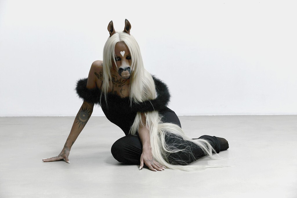
Asked if she wants to be the face of the campaign (essentially becoming Dinamo’s first true type face), she revealed her big beautiful teeth and, after torturing us with a long pause, sighted yeeeeeehs.
I’m not sure we’re compatible anymore
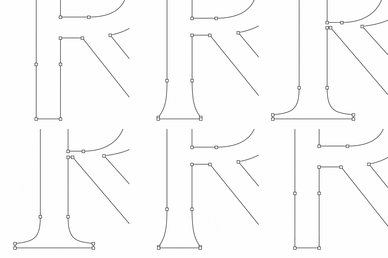
One thing that made designing Arizona a bit hard (to put it mildly) is that everything needed to stay interpolatable. In·ter·po·lat·able. Shapes that you want to reveal need to be collapsed into obscurity, so they don't show when they shouldn't — but can emerge to form beautiful Flares and Serifs when needed.
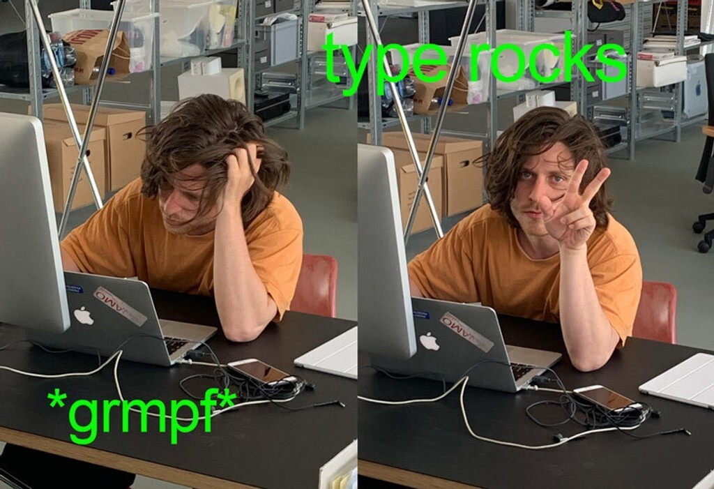
It required Elias to place each vector point thoughtfully and to carefully smooth over bezier curves so they look good whether static or animated.
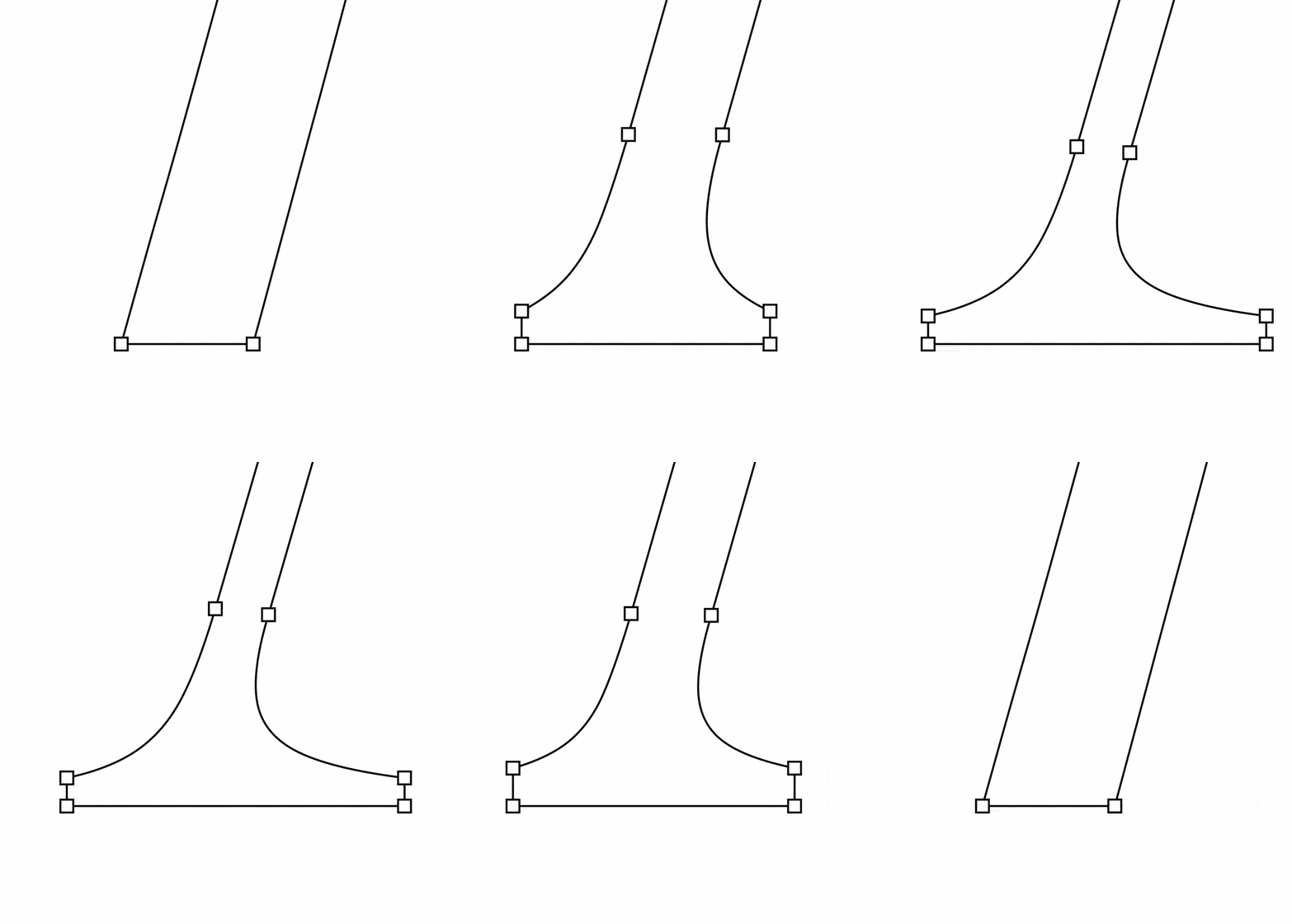
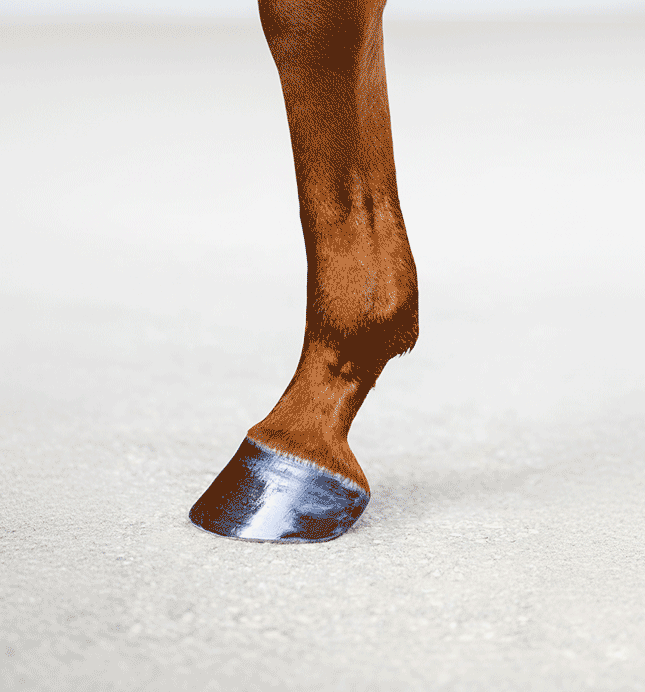
Actual photo of Elias’ left foot
A-A-Arizona then and NOW
Back in 2021, Arizona quickly became a go-to for designers seeking a type system that’s equal parts expressive and precise, and fully adjustable.
On one end, Arizona Serif features high-contrast, pointy forms with a Renaissance-meets-modern feel. On the other, Arizona Sans offers a straightforward grotesque with a humanist touch. In between lie Arizona Flare (nearly-but-not sans), Arizona Mix (chunky and low-contrast), and Arizona Text (a classy text face).
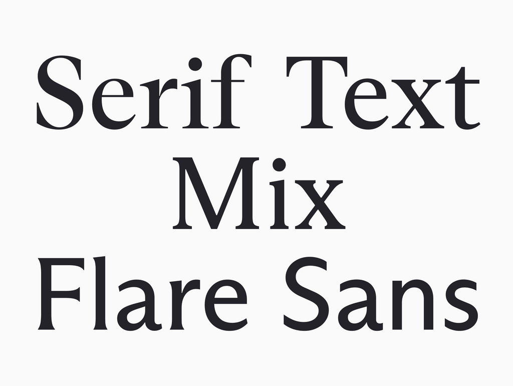
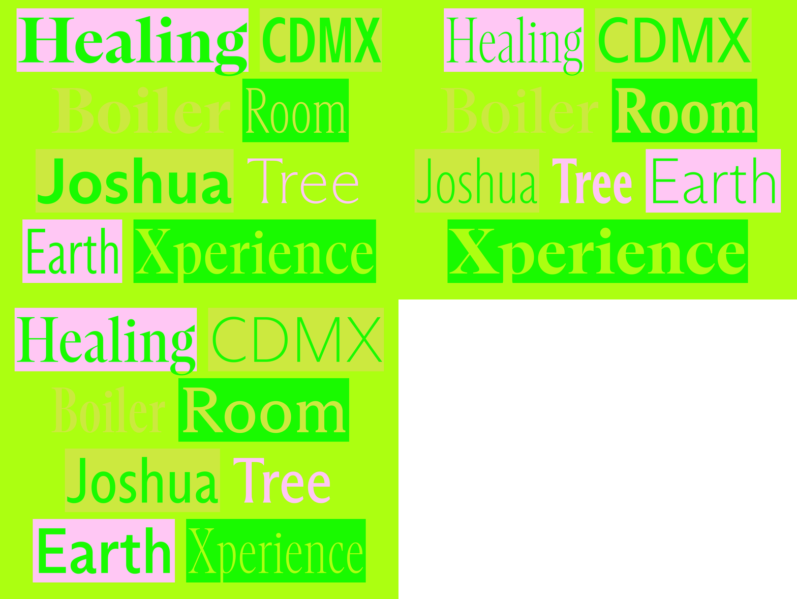
Today and with the introduction of new Compressed and Condensed styles, Arizona offers even greater versatility and new ways to achieve strong, tightly-set headlines or compact, small-size body copy.

One width (2021)

Three widths: Compressed, Condensed, Normal (2026)
CREDIT WHERE CREDIT IS DUE
Nothing without the amazing team <3
Campaign: Dinamo & veryes
Creative Direction: Dinamo (Johannes Breyer)
Art Direction: veryes (Moritz Lösel, Tim Lindacher, Simone Cihlar, Johannes Schreiner, Jannis Maroscheck)
Photography: Tereza Mundilová
Lighting assistant: Simon Schreiner
Production: veryes
Styling: Theresa Gross
Hair: Soh Kogasaka
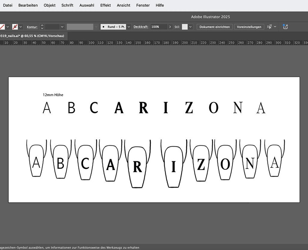
Nailart: Camilla Inge Volbert
Make up: Henriette Aue
Post production: RGBERLIN, kniv retouching
Typeface: Arizona (Elias Hanzer)
Motion: Aljoscha Burtchen
We hope you’re as excited as we are!! :)
Love,
Dinamo