Typeface Customization for ICA London
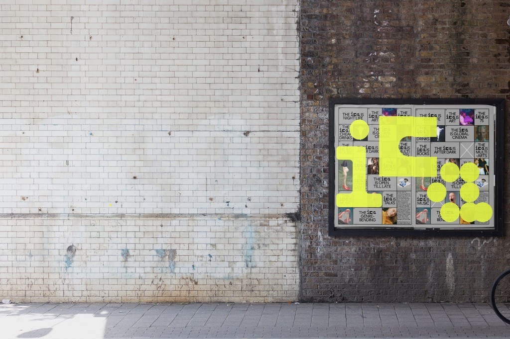
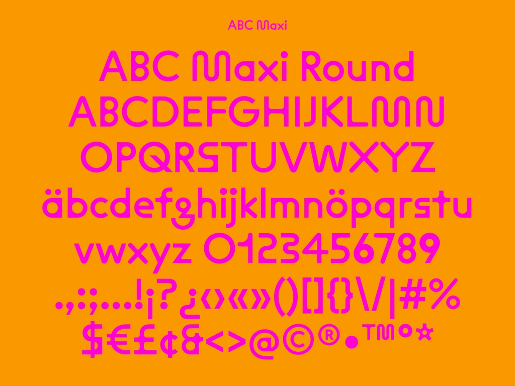
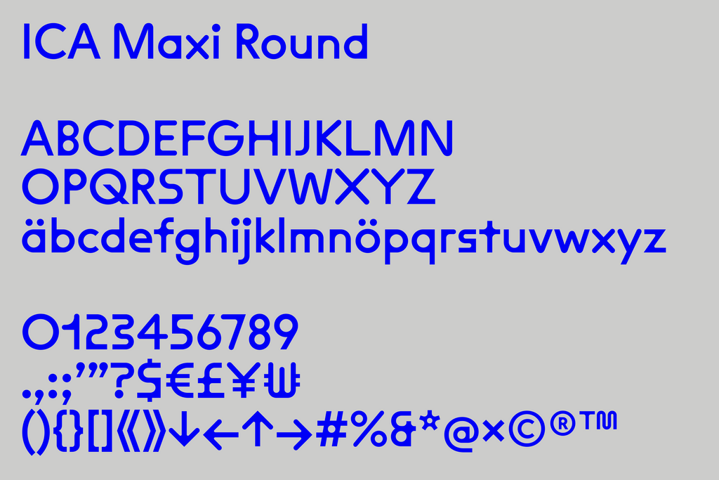
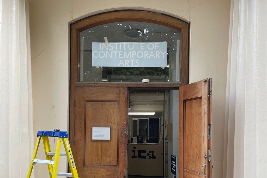
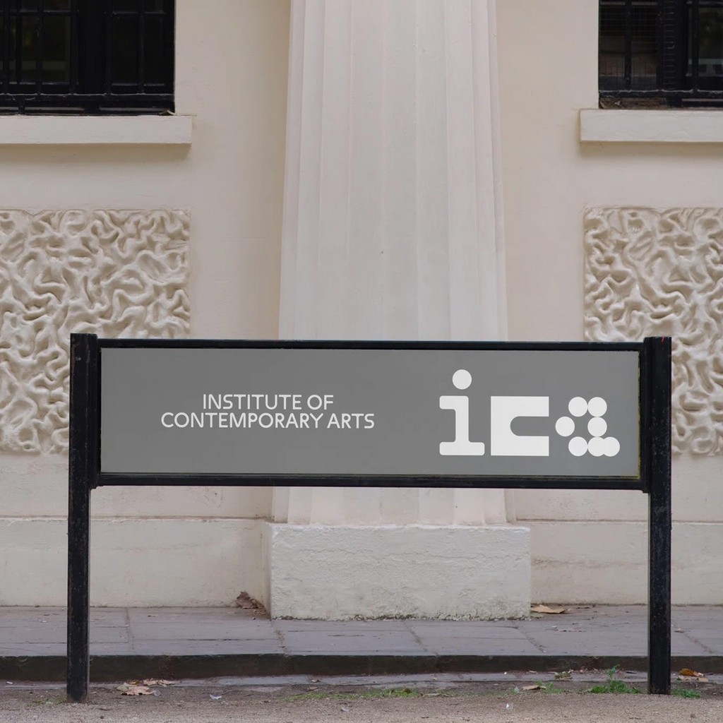
Art director Chris Chapman asked us to customize our Maxi Round typeface for his new identity for the Institute of Contemporary Art (ICA) in London. As a future-facing institution that stands for newness and difference, Maxi Round’s playful, unexpected forms feel like a great partner for the brand.
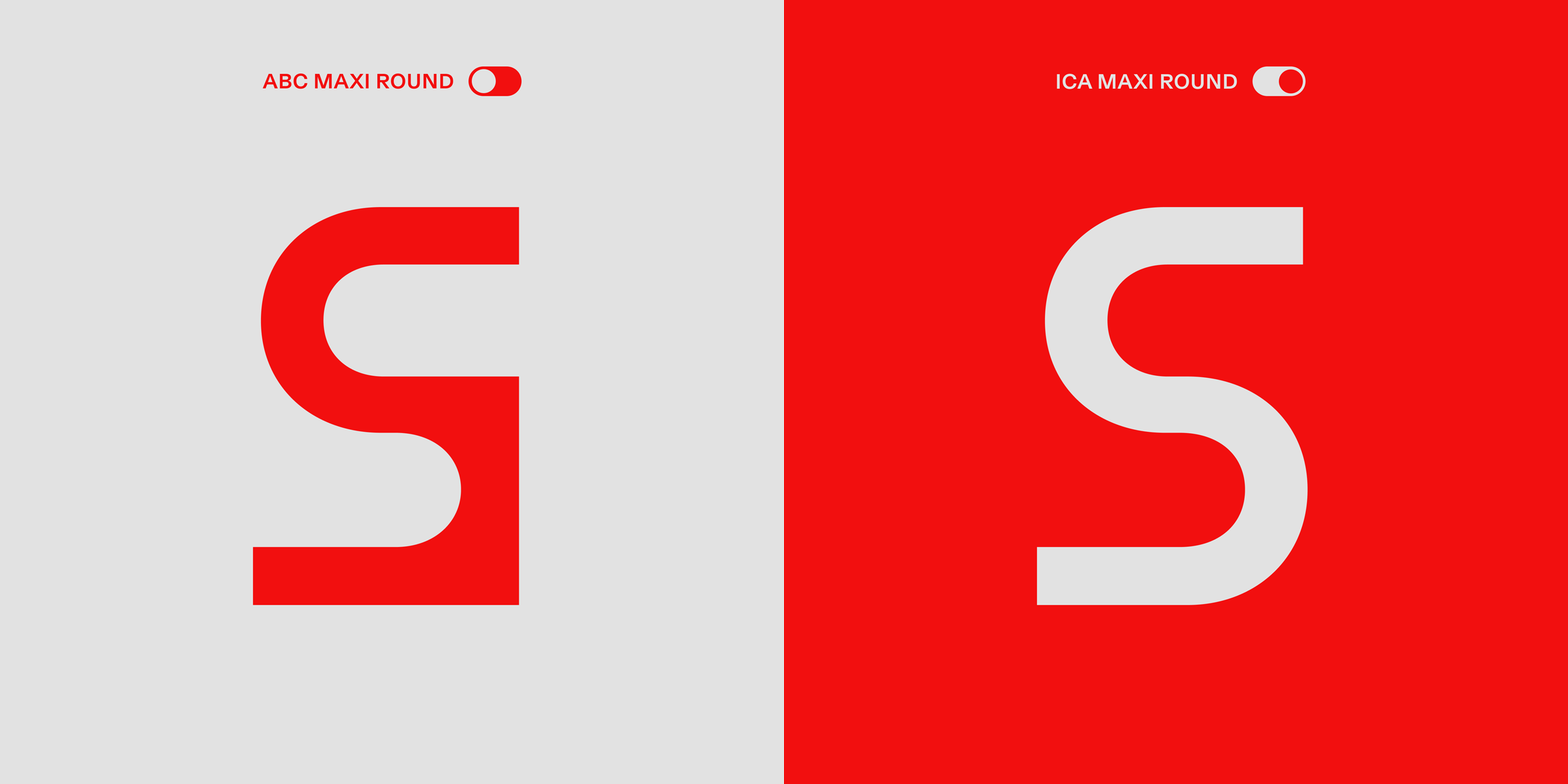
Our customization focused on toning down four key characters: M, N, S, and g. This keeps the playful vibe of Maxi alive but lets other branding elements — like logo and photography — take centre stage.
The Customisation
Maxi is a warm type system of spaghetti movements and angular strokes. Its underlying skeleton references mid-century and post modern Swiss design.
For ICA Maxi, we streamlined a couple of especially loud moments in the typeface, so that it could work in the broad range of contexts needed for the art and culture institution. We smoothed the bottom angles on the uppercase S and firmed up the corners of the uppercase M and N. Overall, the flavor of the font family is retained. But everything feels a little bit simpler.
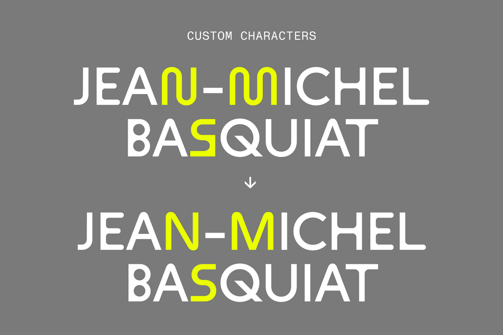

Our new M is based on the same shape construction found in our original A and W.

We also created a single-story g to replace our standard binocular version. We think it lends the typeface a cleaner, more direct feel.

Weights
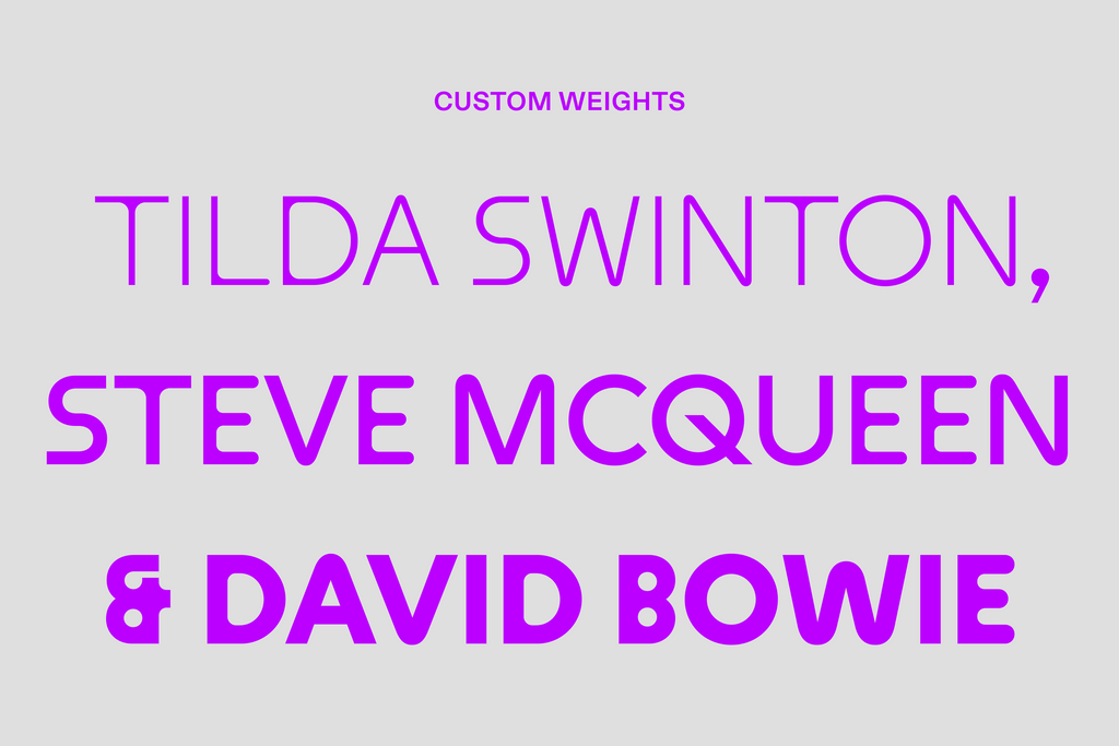
The ICA uses ICA Maxi in three weights: Light, Normal, and Bold. So we added three weights to our custom characters, pumping up the rounded corners and thinning them out to complete both sides of the spectrum.
Bespoke Name
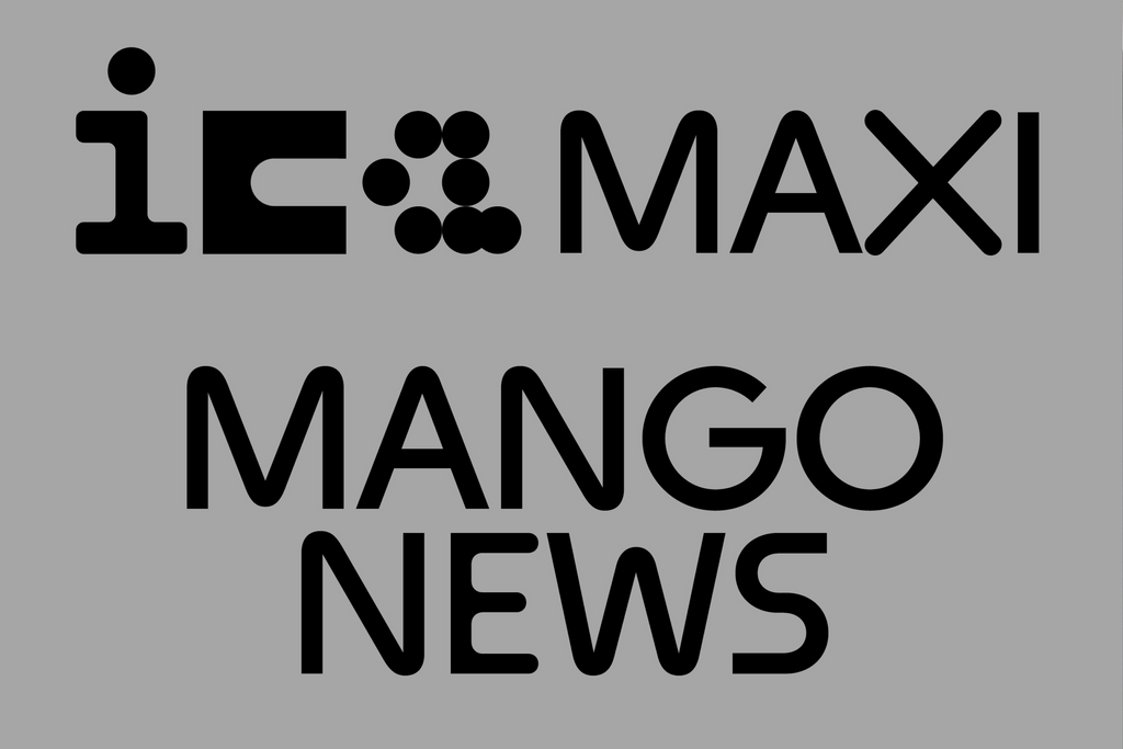
To help the ICA’s in-house designers keep track of their font files, we gave the new typeface a bespoke name: ICA Maxi. With the prefix “ICA” added to the font, it’s easy for everyone to find the correct files.
Font Pairing
We recommended our Diatype typeface as a solid pair for Maxi. The text friendly grotesque is warm and sharp, ideal for reading on screen. And we think its honest, raw shapes match nicely with similarly honest Maxi. The ICA uses Diatype across its identity for body copy.
A Note from the AD
We had the pleasure of collaborating with London-based Chris Chapman on this project, the Art Director behind the ICA redesign. Here’s what he had to say about Maxi and our customization:
“The ICA is and has always been a progressive institution that brings together the different and new. We tried to reflect this in the logo, bringing together different forms, not fully synthesizing them. Maxi felt like a great fit as it also had composite forms, rounded and angular. But we knew that the font would have to work in a wide range of contexts so opted to standardise some characters.”
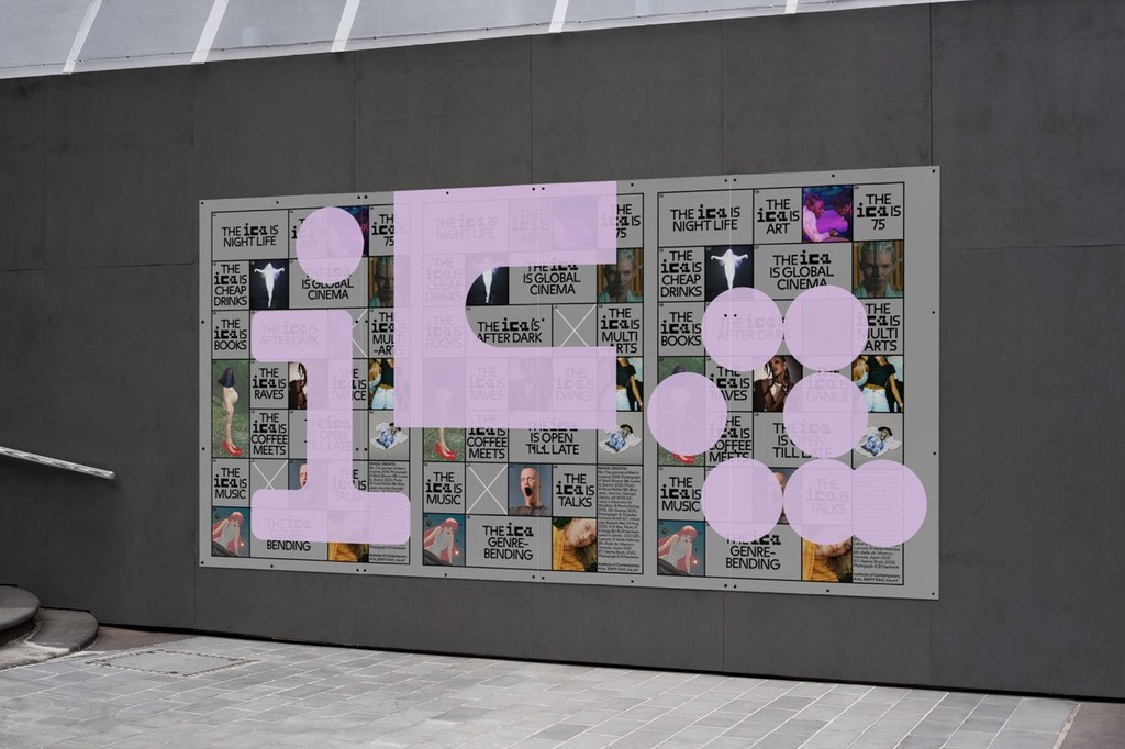
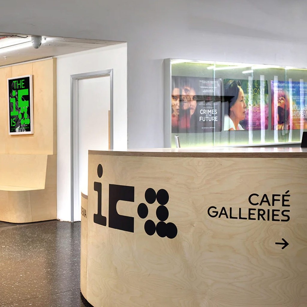
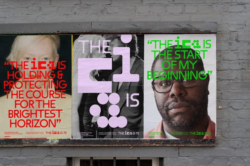
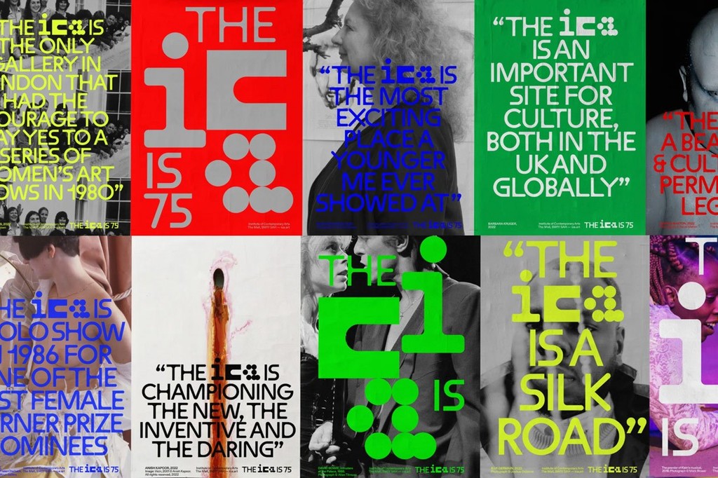
The ICA is...
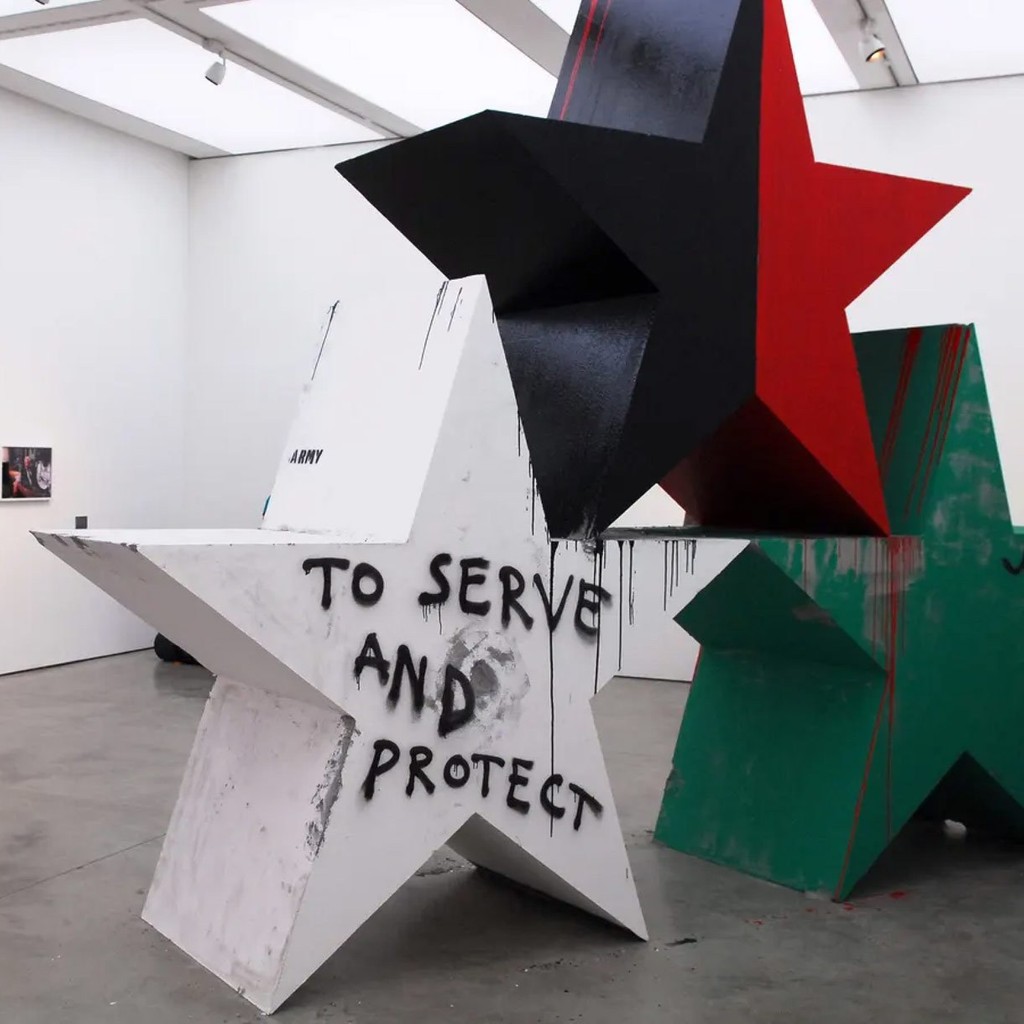
The ICA is known for supporting radical art and culture through its diverse programme of exhibitions, films, events, talks, and debates. Here’s a look at some of its collaborations in recent years.
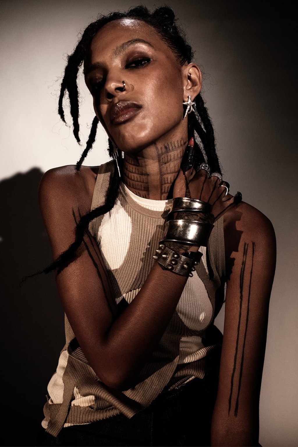
ALEWYA, 2022 Photograph ©Chieska Fortune Smith
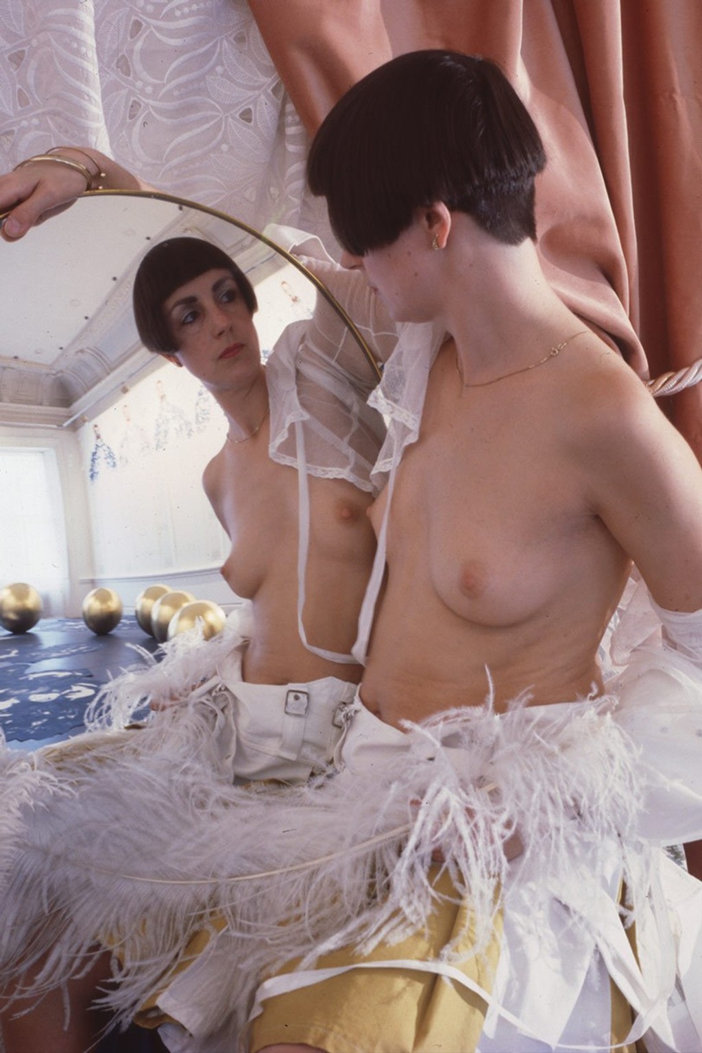
HELEN CHADWICK Photograph ©Estate of
Helen Chadwick, Courtesy Richard Saltoun Gallery London & Rome
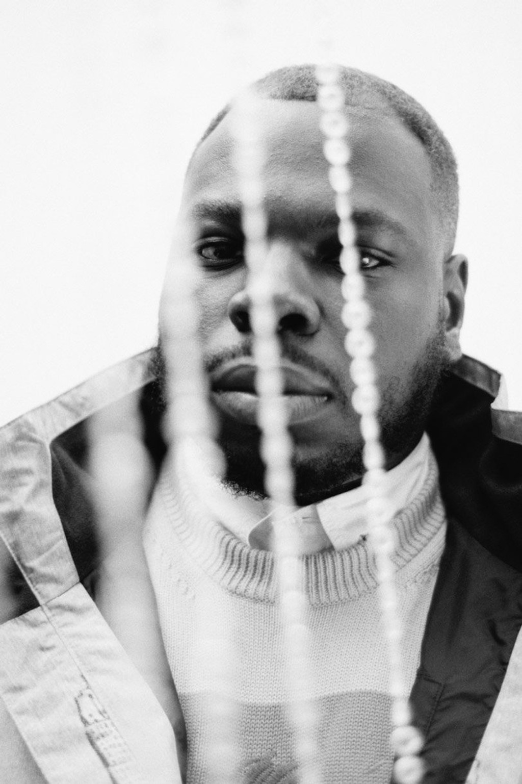
R.I.P. GERMAIN, 2022 Photograph ©Joshua Osborne
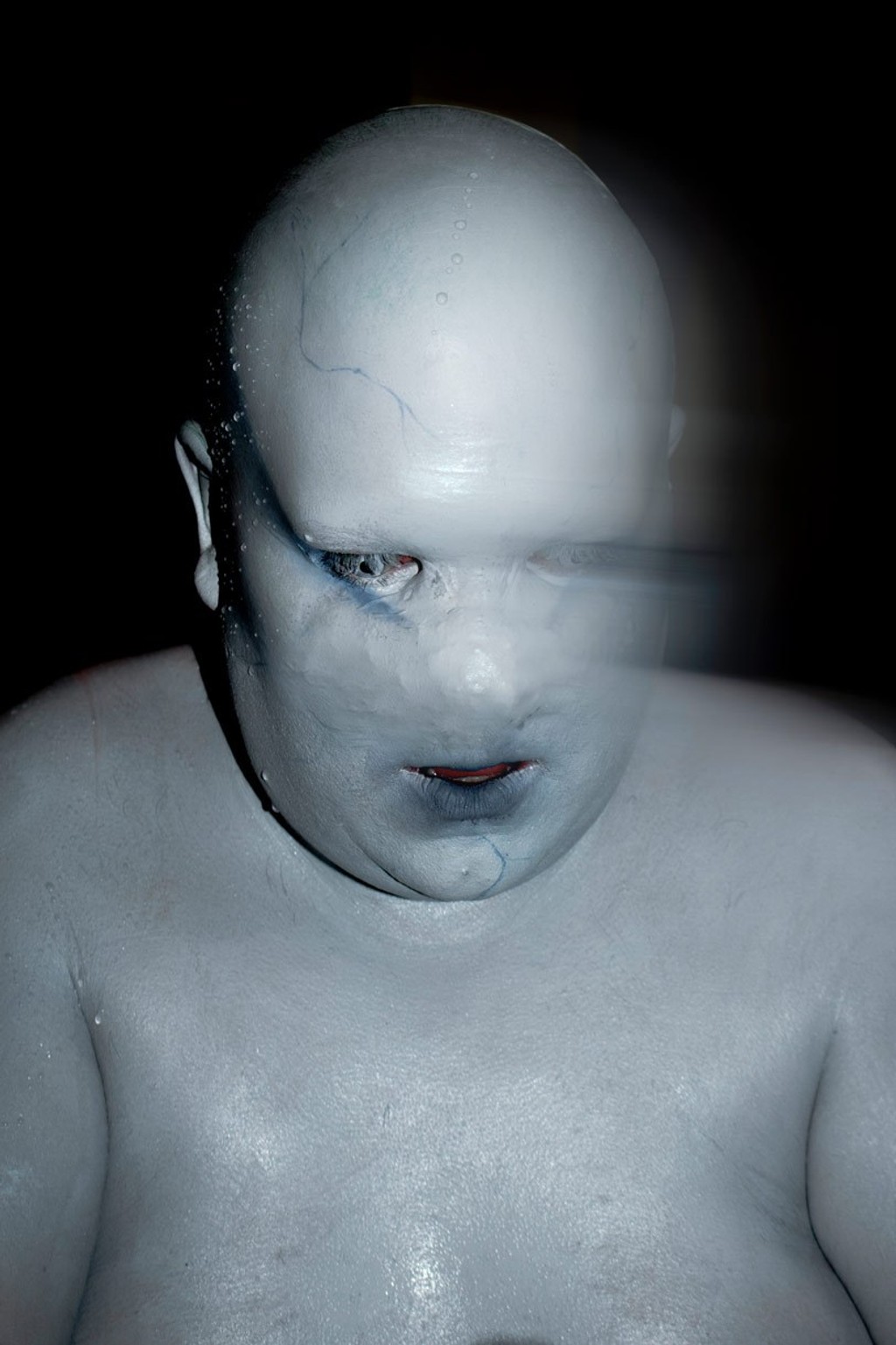
LEWIS G. BURTON, 2022 Photograph ©Fecal Matter
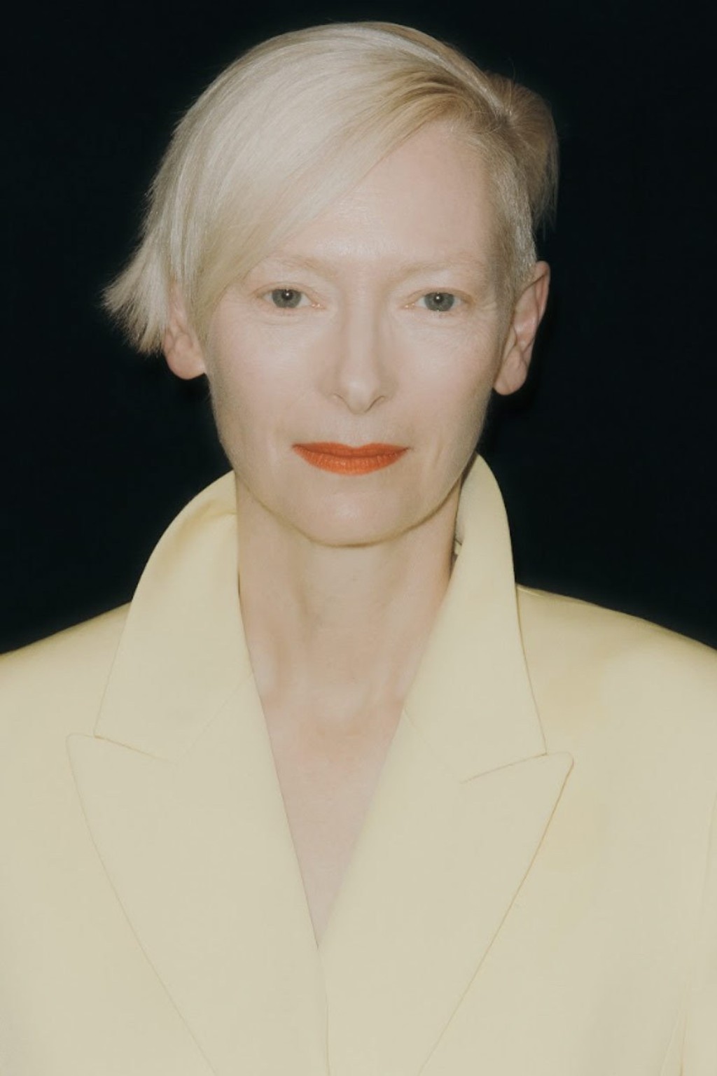
TILDA SWINTON, 2022 Photograph ©Diana Pfammatter
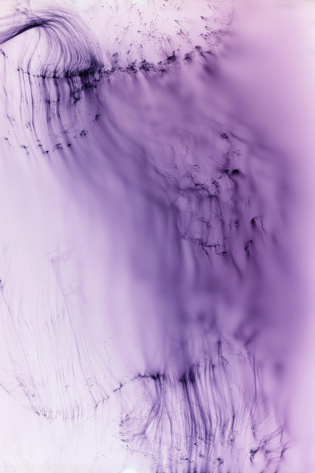
WOLFGANG TILLMANS Freischwimmer 102, 2004
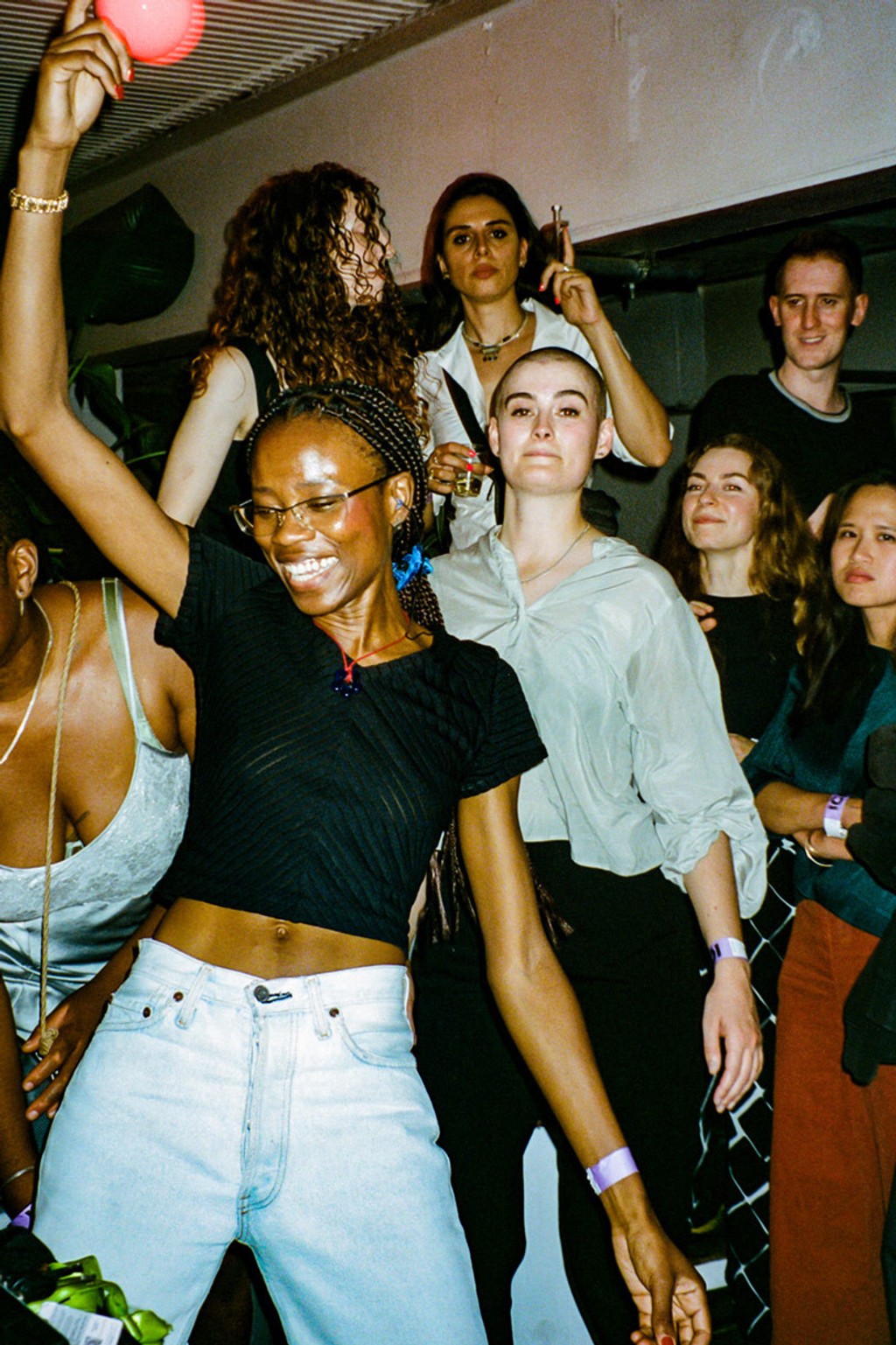
25 August 2022, ICA Bar Photograph ©El Hogg
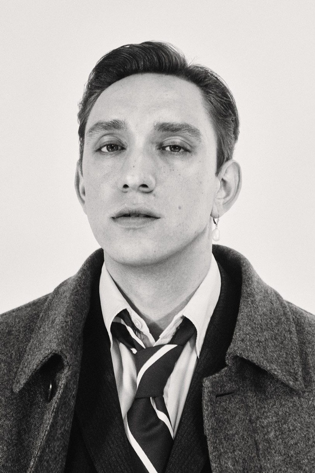
OLIVER SIM, 2022 Photograph ©Casper Sejersen
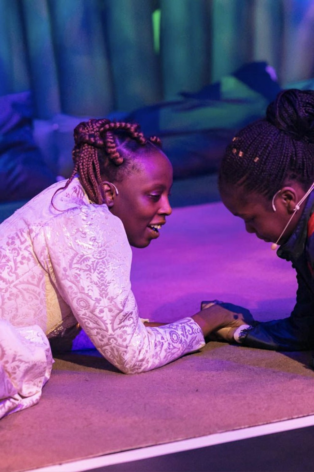
The premier of Klein’s musical,
- Photograph ©Mark Blower
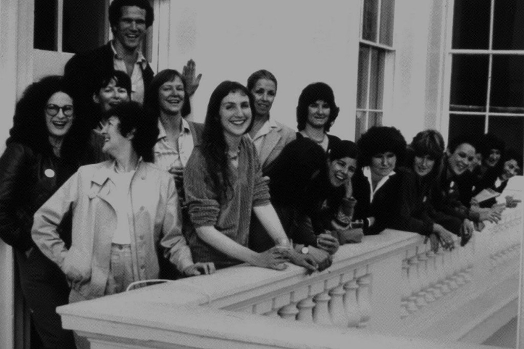
CATHERINE ELWES, 2022 Photograph ©Unknown
That's Everything ♡
We feel truly blessed to see Maxi become the face of this world-renowned culture centre. Many thanks to Chris Chapman, Beatriz Cóias, Rebecca Lewis, and David Kolbusz for bringing us on board.
Credits
Art Direction and Design: Chris Chapman, Beatriz Cóias
Creatives: Rebecca Lewis, David Kolbusz
Animation: Jack Collis
Type Customization: Dinamo (Johannes Breyer with Ethan Cohen)
Maxi Design: Dinamo (Johannes Breyer & Fabian Harb with Andree Paat)
Mastering: Dinamo (Renan Rosatti)
Campaign & Photography: Philip Vile, Chris Chapman
