Guest Essay: GIRL FONTS by Claire Marie Healy
Welcome to our latest guest takeover issue of The Dinamo Update. For these special mailings, I invite artists, writers, and other friends to think about fonts from a cultural or social perspective. And this time, London-based writer and editor Claire Marie Healy takes on the rise and fall of what she dubs “the coquette font” in our moment of girl vocab & bow-festooned TikToks.

Claire at her studio on Hackney Road
Claire’s desk
Claire is a discerning voice in film, fashion, and — with her multi-media girlhood studies project — all things girl related. I first got to know her when she was editor of Dazed Magazine and through her writing for AnOther, the British Film Institute, and The Guardian. She’s also Contributing Books Editor at A24 (the brains behind that dance floor tome) and published her first book, Look Again: Girlhood, with the Tate. Today, Claire investigates the world of font coquetry and how the Copperplate Script genre came to be so synonymous with girlhood. She’s also got a hunch where the trend is headed next. So over to Claire.
When Did the Copperplate Become Coquette?
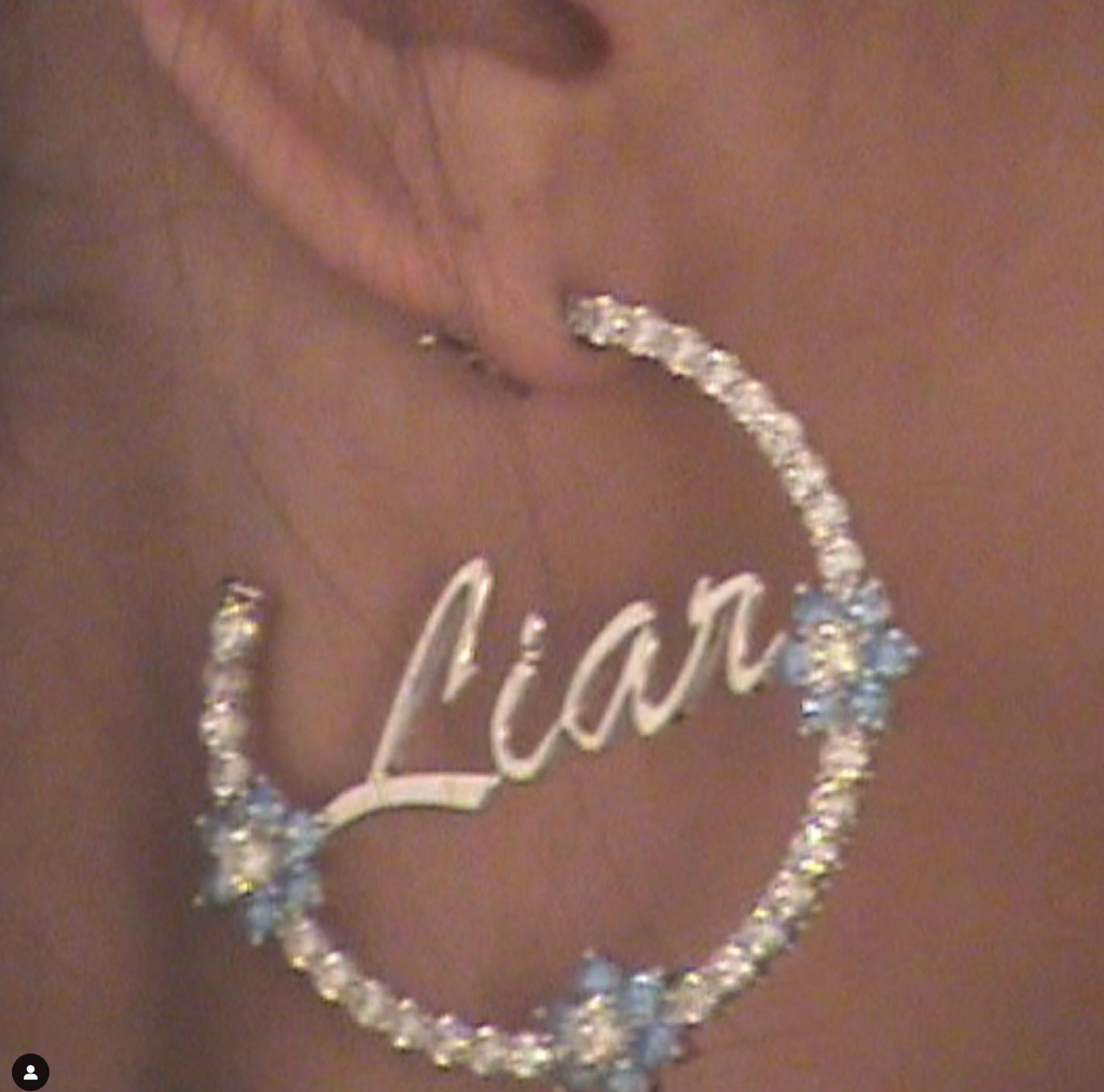
Think of Copperplate Script typefaces as instant formula for girlhood: powdered milk for hyper-feminization; refined like sugar. Florid, laboured, swirly, the style’s repetition across different formats — film title sequences, promotional posters, diamantéd t-shirts made in China — iterate the kind of watertight meaning in culture that feels long set-in-place. But while the association with a certain ultra-femininity is well-established, this wasn’t necessarily always the case. Deriving from a centuries-old historical context, it was Copperplate Script’s use in the movies that gave us its current legibility as what I like to call, simply, the coquette font.
A brief lesson for those in this tweet’s camp. Coquette: an old word meaning a woman who trifles with men’s affections; one who is given to flirting or coquetry. These days, coquette is an aesthetic trend displayed through the explicitly girlish that reached new heights in 2023, a period dubbed by many as “the year of the doll”. The impact of the trend has been discussed by critics as a force for ill, encouraging anything from self-infantilization in grown women, to a certain kowtowing to men in heterosexual relationships. As I have previously argued for Dirt, however, contemporary forms of coquette still contain some of the mischief-making, and lack of respect for men, of the original meaning.
Back to Copperplate Script. The exact origins of its own hyper-femme slant are — like the looping, ornate, totally-extra lettering itself — somewhat difficult to make out. Drawn from the calligraphy style, and so-called after the “copper plates” they were etched into for reproduction, its predominant trait is that its line transitions quickly from thick to thin, depending on the direction the pen is moving: that is, each letter progresses with elegance, because true elegance is never feeling rushed. The technique of copperplate printing dates from the 16th century, though in terms of the writing style, the term refers to the styles of writing that penmanship masters developed in the 18th century (reproduced in copperplate engravings). As a calligraphic style, rather than a typeface, copperplate scripts are firmly associated with men with names likely to end in The Elder, and who are very much dead.
At the same time as such handwriting styles are flourishing among the guys, however, the culture at large is on a precipice of a “Great Masculine Renunciation”: a movement in which men gave up their “brighter, gayer, more elaborate, and more varied forms of ornamentation, leaving these entirely to the use of women.” This is why men stopped accessorising, and it’s also the seeds of the decorative being associated with femininity.
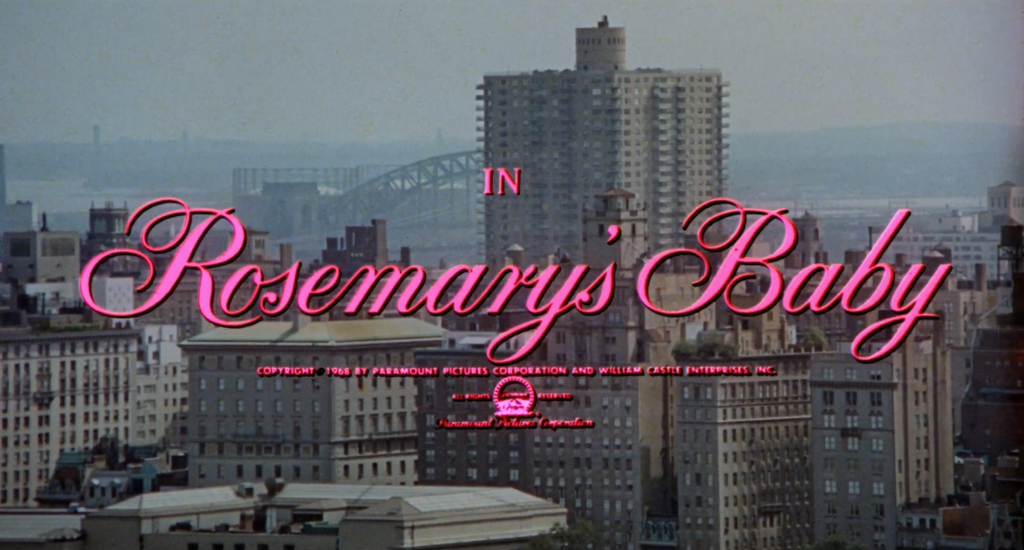
If you’ll allow the jump-cut, I date the moment that Copperplate Script’s prestigious masculinity becomes legible as acutely coquette as 1968. That’s not to say that such ornateness and fussiness had not previously registered as feminine: earlier examples of the genre are spotted in the title cards of romantic films marketed to women, for instance, or — as is oftentimes the case now — straight-up period pieces. But it took the opening beats of a certain smash-hit movie, released that year, to take this style to another extreme: crafting a moment in which romantic notions of girlishness — as obedience, smallness, domesticity — become recognizable as a dangerous trap.
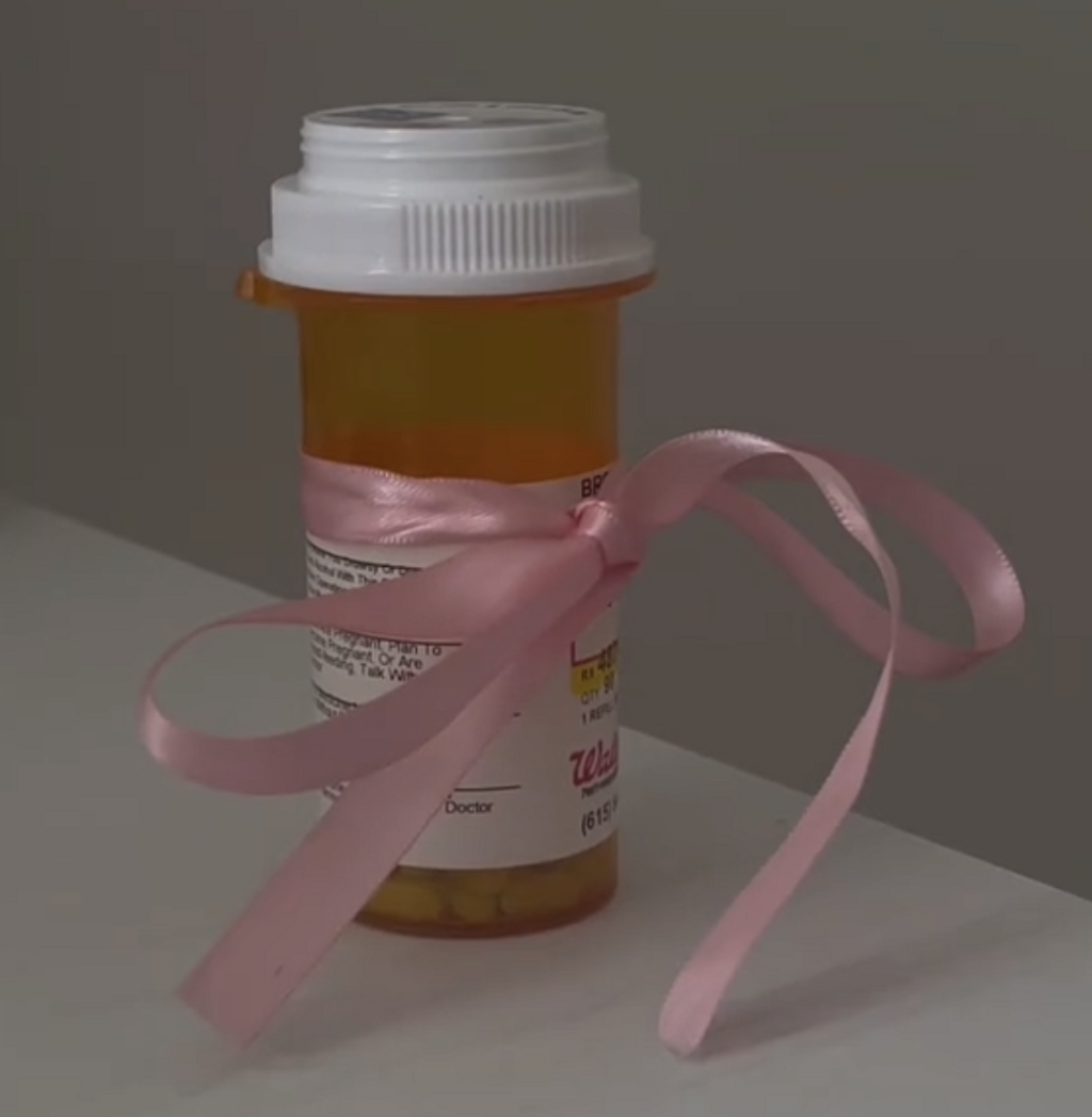
There’s a playfulness with the dark underside of girlish tropes that is key to true coquetry: something that bubbles up only with clear-eyed knowledge of the world’s threats against girls, producing a tangibly vengeful spirit in response. I’m thinking of anything from the critical hopskippery and gaze-play of figures like Nymphet Alumni; the unnervingly babyish combinations of Japanese designer Jenny Fax; to teenage girls on TikTok who tie satin ribbons around kitchen knives, deodorant bottles, and antidepressants. Due to the interaction of its aesthetics with its actual plotline, we can understand the use of Copperplate Script in Rosemary’s Baby’s title sequence in much the same way. An adaptation of the smash Ira Levin novel, it has long been deemed one of the most cursed movies ever made (never mind the later crimes of the director). But if the events of 1968 — a time when, as Joan Didion put it, “the jitters were setting in” — produces the perfect conditions for this movie about a woman impregnated by the devil, it’s also the ideal atmosphere for a little font coquetry.
@jennyfax.official
@brookechiro
@jennyfax.official
Title designer Wayne Fitzgerald’s use of Copperplate Script’s ornate formality is one ingredient among color, moving image and sound design that together sets up the plot of the film before it’s really begun. Employed in the title sequence only, rather than in its promotion (Rosemary’s Baby’s controversial campaign used, to my eye, Neue Haas Grotesk), viewers would have first come across the cursive title cards in their cinema seats: the shock of that pepto-bismol pink lettering, overlaid onto the recognisable Manhattan cityscape. As a title sequence, it’s best described as insistent: you can’t unhear Mia Farrow’s accompanying la la, la la la-lullaby, and you can’t unsee that pink lettering. Fluoro-colors didn’t even exist before the 1970s, so this pink — which is so pink — literally welcomes in a new decade.
But though this hot color flirts itself all the way into the future, the effect is no Marilyn Monroe open-mouthed kiss. The coquette font just doesn’t allow for that. In the end, the pink Copperplate Script credits moving against this grey, industrial cityscape are like a girl teasing the middle-aged banker in her DMs: refusal is one of her best-employed tools. She may indeed be “baby”, but — like the one in the cot at the end of the film — she is far from totally innocent.

we all baby
The success of Rosemary’s Baby birthed a cultural obsession with the occult: the anxiety of the domestic, of the ooze under the surface with which someone like David Lynch has described the mid-century. After it, the same title design is used in many other films which combine elements of trapped women, feminine trickery, and the blurring of lines between innocence and sexuality: Peter Weir’s Picnic at Hanging Rock (1975), The Story of Adele H (1975), and Lynch’s Blue Velvet (1986). In the 2010s, movies like Alex Ross Perry’s Queen of Earth (2015) or the cinematic feel of Mitski’s Puberty II (2016) also showcase a kind of indie-hipster girl throughline with the 1968 use of coquette font (both of those projects being about women who receive the hurts of adult women with the intensity of adolescent girls).
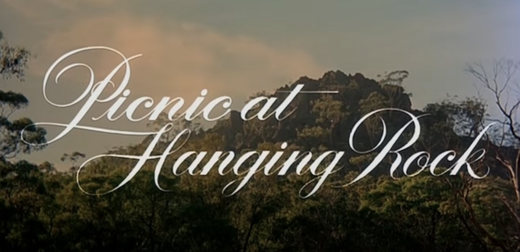
1975
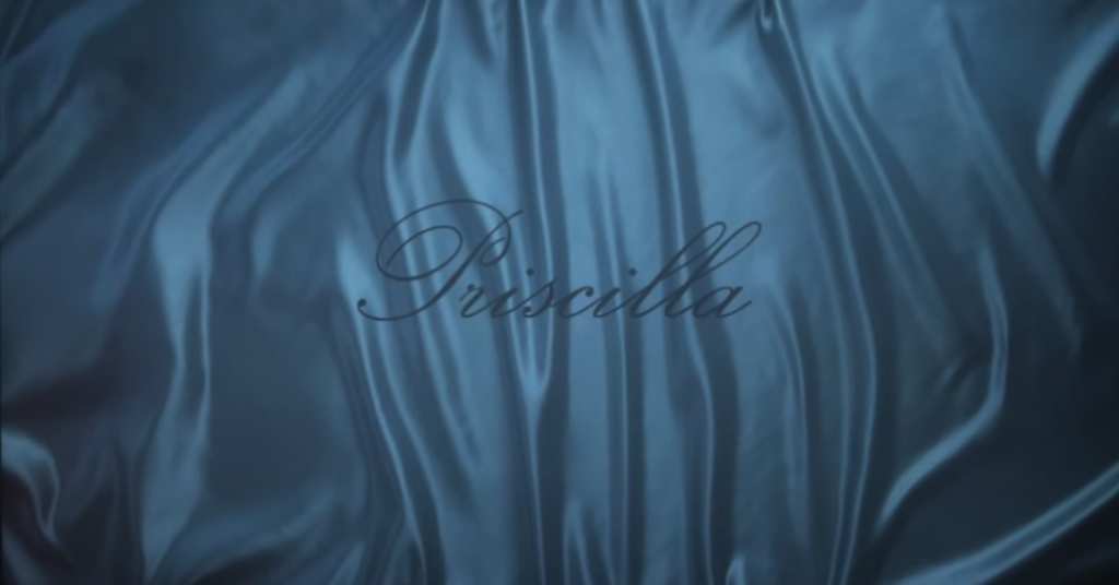
If by the 2010s, copperplate script had coagulated comfortably into its hyper-femme formula, there’s one director who is the undisputed queen of such formulas. If it feels repetitive by the time of Priscilla (2023) that Sofia Coppola is yet again using Copperplate Script for her title design, it is the fact that it is not pink that registers as fresh.
In the film’s title sequence, the black lettering stretches atop a blue satin background, cited by Coppola as inspired by the Sirkian aesthetics of the Alice Doesn’t Live Here Anymore title sequence, the Martin Scorsese film that she actually appeared in as a teenage girl.
For the most part, Coppola says pretty vague things in interviews when asked questions about these choices that belie the specificity of her craft — such as that she told longtime type designer Peter Miles “I just wanted a cursive” for Priscilla (the line in the recent Rachel Syme profile that says the director typically “gives people just enough rope to hang themselves with by not responding” is a fact that is devastatingly coquette).
2024
I tend to find this ambiguity hard to take at face value from a director famed for her attention to detail, whose colour palette for Marie Antoinette’s costumes were based on Ladurée macaroons. With the opening credits of The Beguiled, we’re somewhere between the creepy Don Siegel original and Rosemary’s Baby, again: a little girl’s aimless lullaby and cramped-in, coquette font title design in pink. But this time, one catches a foreboding blood-red drop-shadow on the script. It’s one example of how, much like the sharp edge of Priscilla Presley’s eyeliner flick, Coppola’s titles are always executed over her visuals with startling precision: she knows their importance. Copperplate Script works out for Coppola because her stories tell us that when something is tight, it suffocates. Then something else bursts out.
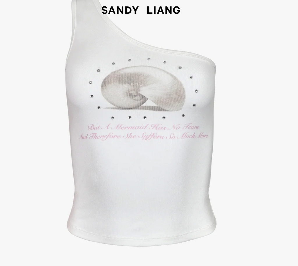
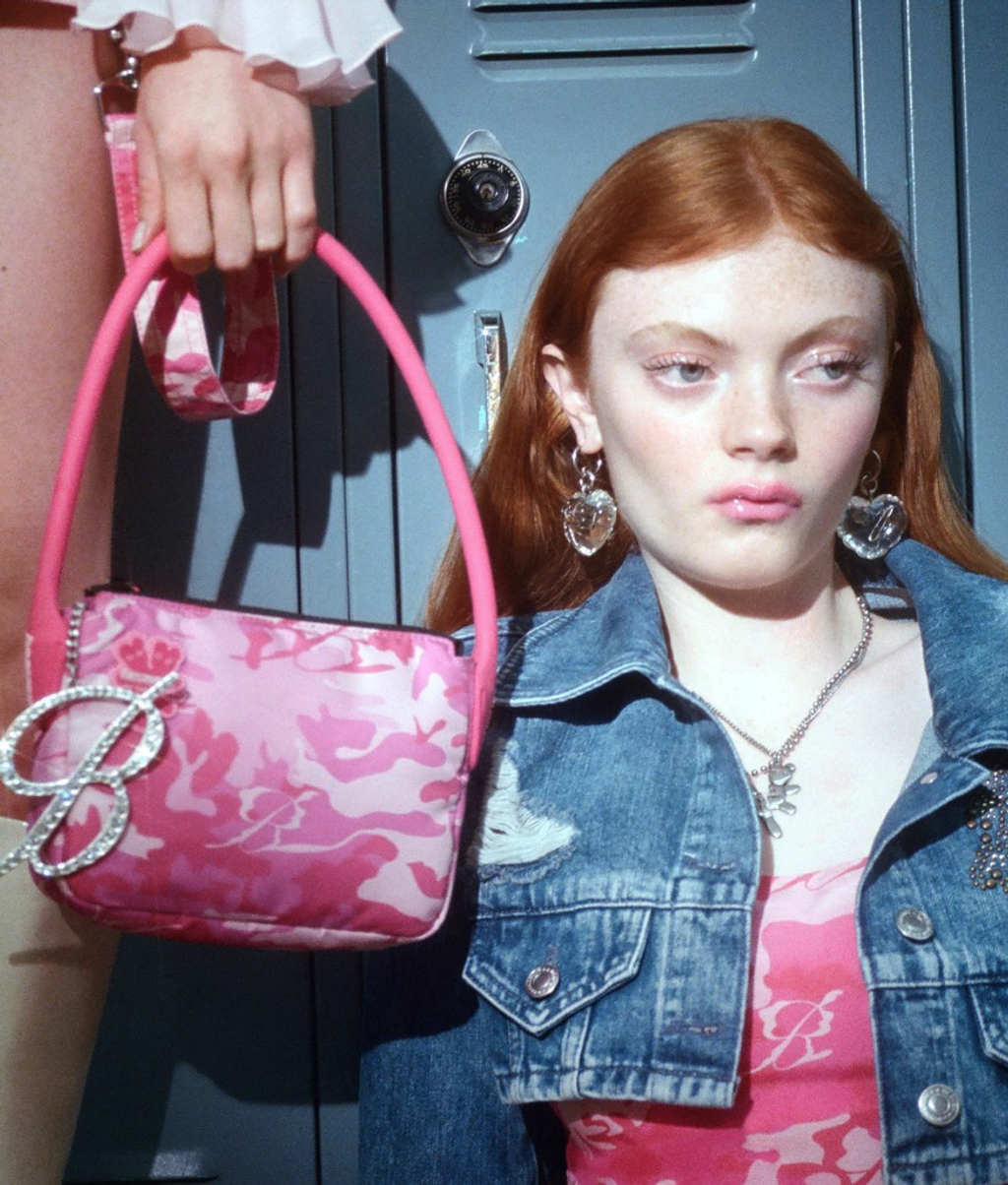
To ascertain where we are now, it’s useful to look to another of Coppola’s primary sources: fashion. And nothing summarises a malaise with a trend better than browsing one’s SSENSE wishlist once the sale rolls around. Shot through with Copperplate Script, mine is a roll call of the remnants of coquettish trends. The multi-conglomerate fashion company is known for a humorous, often pseudo-intellectual social media presence that conceals its hyper-algorithmic approach to the dissemination of clothing. Talk about iteration: for every Sandy Liang or Blumarine there are alternatives at a lower price point (they all, largely, share their fabrication in synthetic materials in common).
From...
...Claire’s...
...wishlist
As all young brands must do, purveyors of the girlhood trend are already looking at what’s next. Take the latest Heaven X Sandy Liang X New York City Ballet collection: offering graphics and a ribbon-inspired typeface by Eri Wakiyama and Donn Matus, it’s a throuple truly dreamed up in the fires of eternal girlhood (Three Tickets to Balanchine Mixed Bill, please). And at Blumarine — unique in a sea of Sans Serifs in its use of a Copperplate Script as its logo — the typeface has been de-emphasized across its latest wares from new (though short-lived) creative director Walter Chiaponni, who recently pivoted away from the Y2K inflection of his predecessor Nicola Brognano with a “plausibly wearable” collection (the coquettes, needless to say, are upset). Beyond clothing, the most Bargain bin example has to be Nicola Peltz Beckham’s film Lola (2024), which employs Copperplate in its marketing as shorthand for a Sofia Coppola stratum of dreaminess that it does not deserve.
It may be that I’ve been drowning in a cursive whirlpool of my own making for too long, or that there is something else going on here: because hasn’t it all just started to look a little tired? Even the wig-wearing men of the eighteenth century knew that if you repeat something enough times, something’s got to give — otherwise, it’s boring.
@sibliming.jpg
Title by Lenny Vigden of Studio Provoke
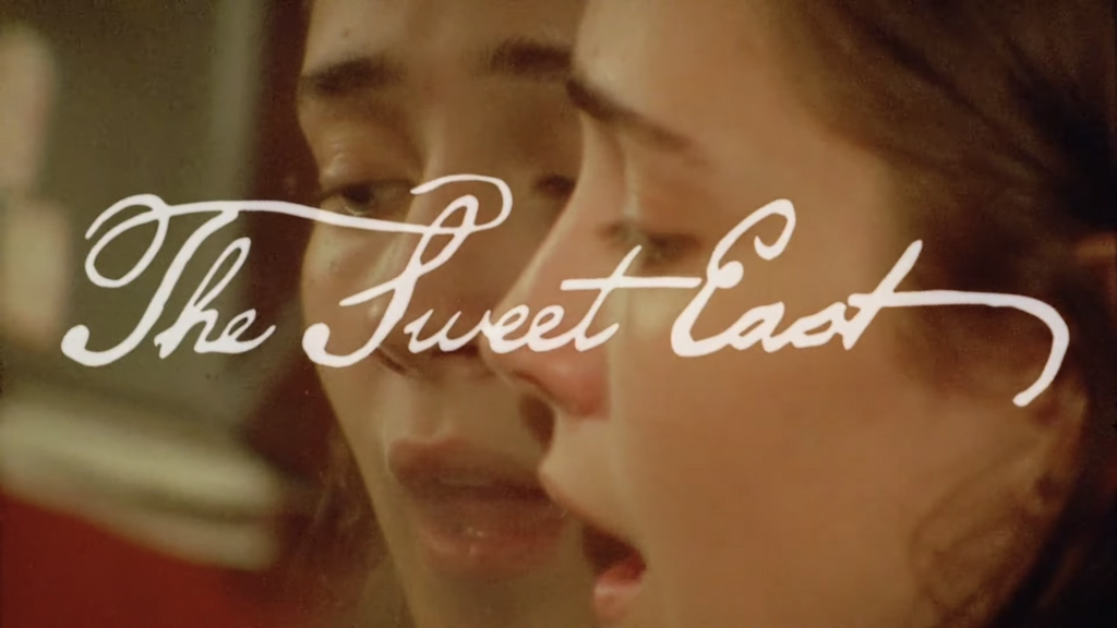
In fact, such an explosion in a fashion context — the trickle-down effect of which the sludgy run-off is a sea of dupes — is probably why some graphic designers for film and fashion are returning to a more hand-drawn feel of script lettering: something a little messier, a little less digital and taut. Take The Sweet East (2023), a film in which the premise and wide-eyed ingénue lead might lead one to have expected a straight-up Copperplate in title design, but instead stays true to its sideways glance at the shadier sides of coquettedom in its striking opening sequence.
Designed by Lenny Vigden of Studio Provoke, the lettering channels the handwriting of American founding fathers and DW Griffith’s intertitles (Olivia Rodrigo, an artist who has previously used Copperplate and whose branding is fine-tuned to the shifting tides of girlhood trends, hired the same designer for her last single, “Obsessed” with a similar, slightly fuzzier take on the signature coquette font). Elsewhere, as coffee shops, workspaces, beauty brands et al make mainstream work of girl-coded fonts, accounts like Tessa Forrest’s popular subliming.jpg project are embarking on their own experiments with Copperplate, returning to its calligraphic origins as a point of difference among the saturation of the digital feed.
Still, I have a feeling that, much like the girlhood trend itself, nothing will ever kill off the copperplate coquette for good. It’s hard to think of another genre that has engraved itself on 18th century and 21st century mindsets alike; seemingly appealing to both. It encompasses enough of the darker side of girlhood to remain relevant to any narrative of a young woman coming into self-knowledge: there’s a self-awareness to its formality that feels eternal. Besides, we would do well to remember that being bored is the secret super power of the girl. It’s how she becomes interesting.
Claire Marie Healy’s writing and curated projects explore film, art, fashion, and the internet. Working out of London and specialising in print publishing, she has edited publications on roller discos, dancefloors, and SFX makeup for places like IDEA Books and A24. Her ongoing research project, Girlhood Studies, explores how visual culture shapes the experiences of young women, and has encompassed a column, film screenings and an essay-book with the Tate.
