Custom Typeface and Bespoke Wordmark for Acqua di Parma
- Year:
- 2018
- Timing:
- 4 Months
- Team:
- Johannes Breyer
- Fabian Harb
- Robert Janes
- Domain:
- Arts & Culture
- Fashion
- Medium:
- Typeface
- Type Consulting
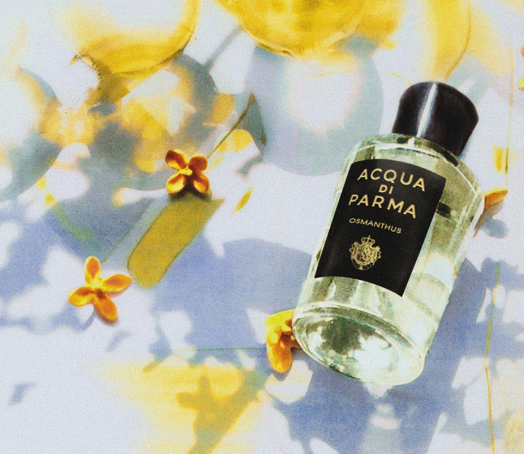
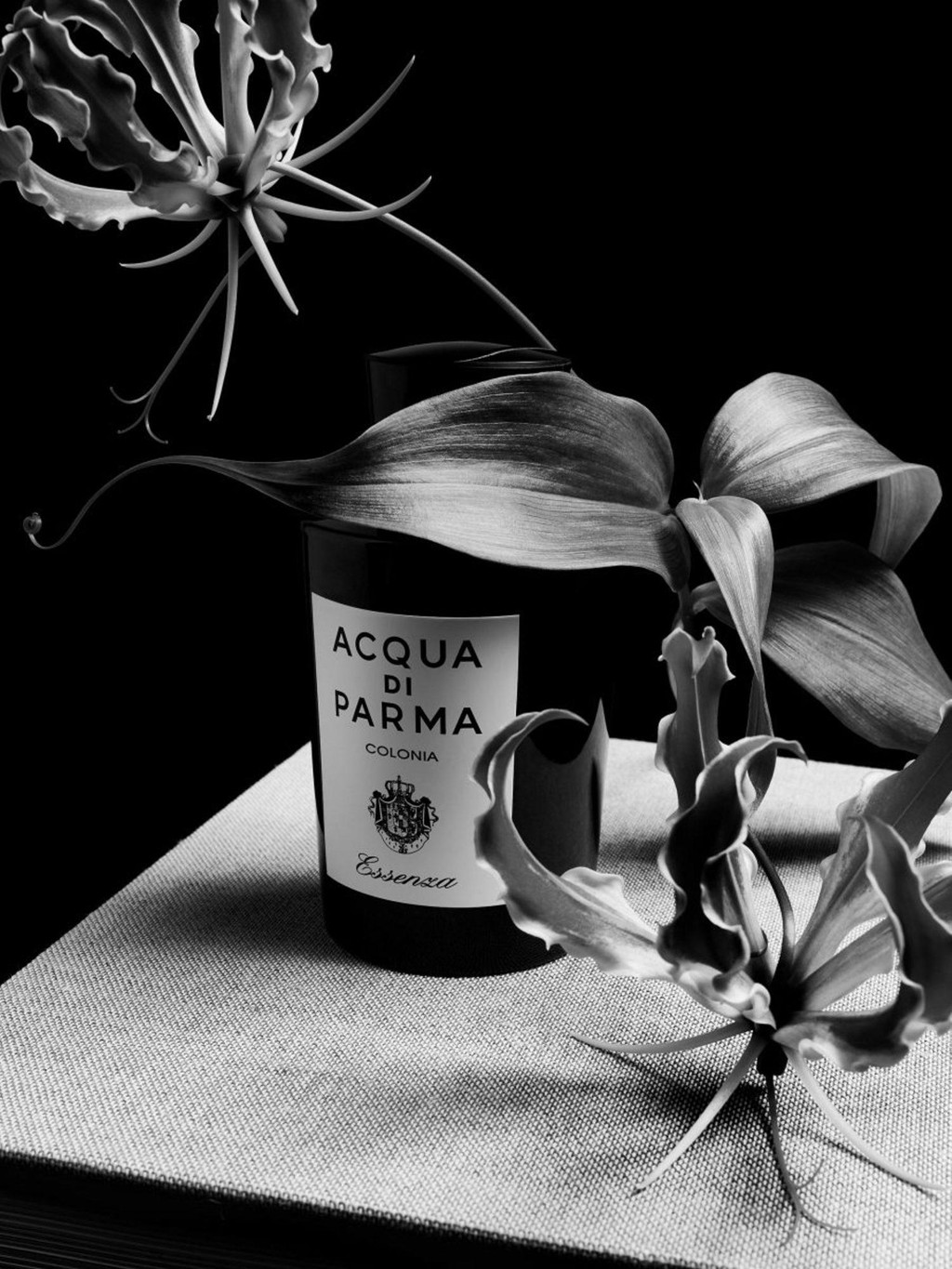
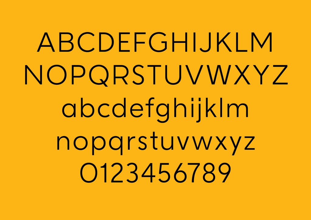
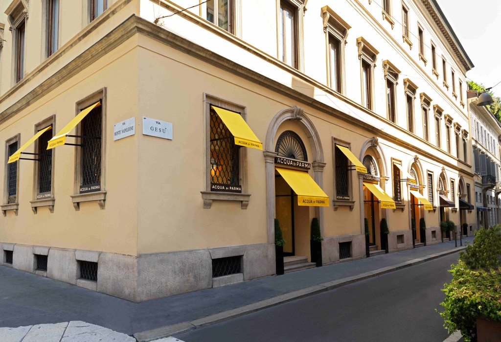
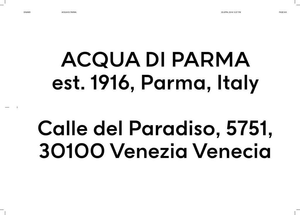
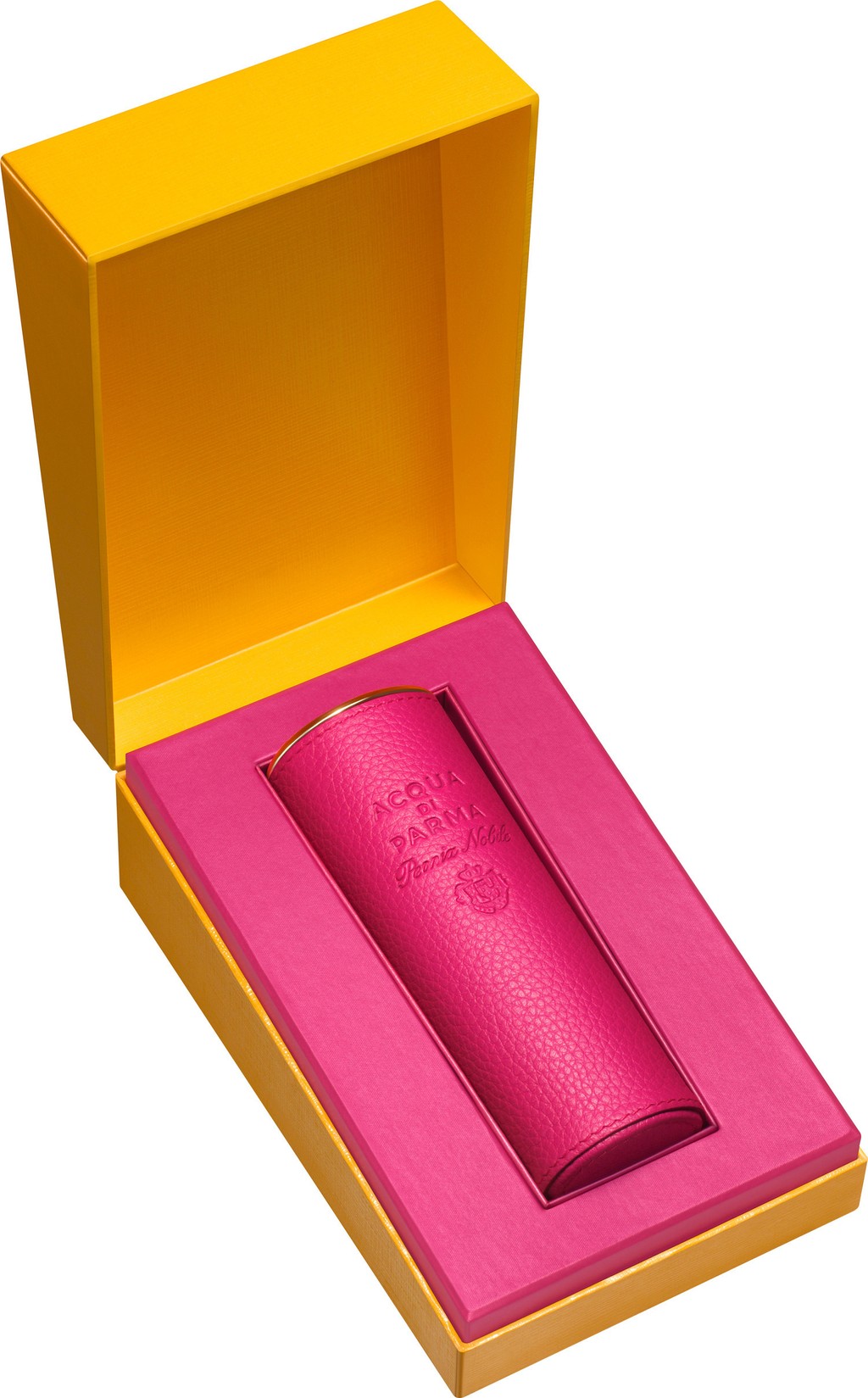
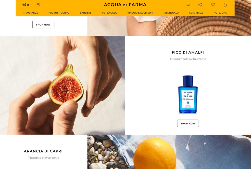
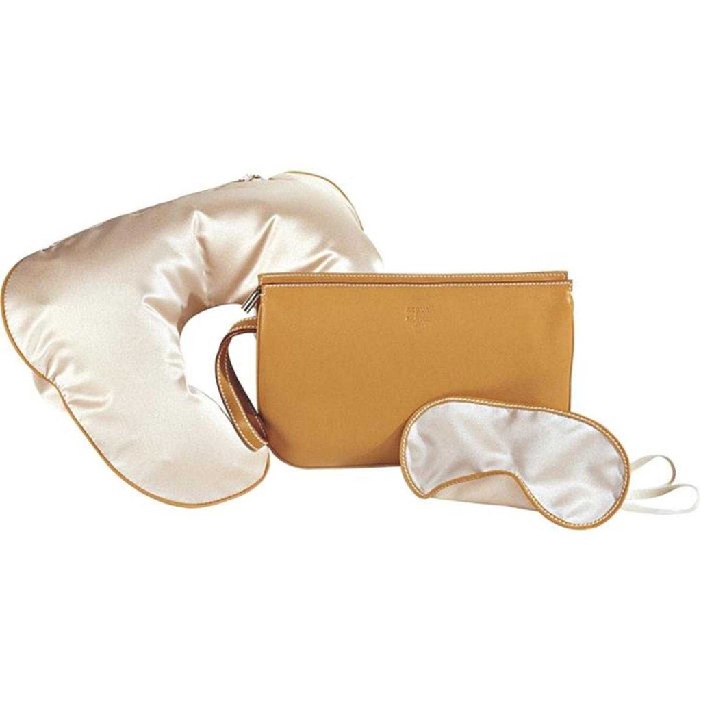
We developed a custom typeface for the Italian lifestyle and fashion brand Acqua di Parma in 2018. The company is best known for its fragrances and candles, and also produces bathrobes and leather accessories.
During the early stages of our creative process, we were drawn to the brand’s history: Its original fragrance Colonia, for instance, was created in 1916 by a small perfume factory in the heart of Parma’s old town. This northern city became the brand’s namesake, and although now a global enterprise based in Milan, a sense of tradition still unites its classic products.
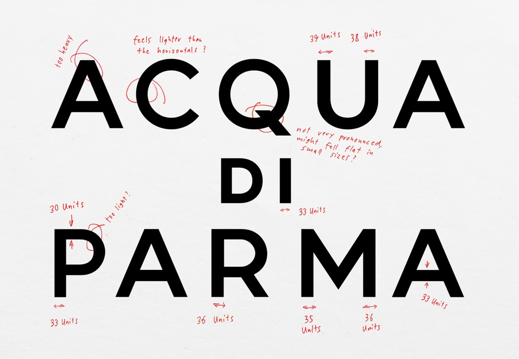
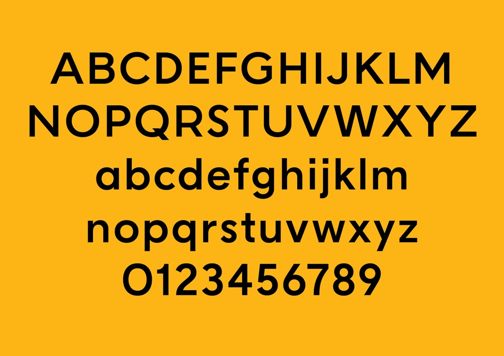
To develop the custom typeface, we began with an analysis of Acqua di Parma’s own logo. Early twentieth century geometric sans-serifs, including Erbar and Futura, became key sources of inspiration during our research phase, as was the more recent Super Grotesk. In mining the brand’s own history and taking into account modern applications, we devised of a Light and Bold weight for the storied label.


Credits
Creative Direction: Alexis Zurflüh and Federico Bardelli
Type Design: Dinamo (Johannes Breyer, Robert Janes, Fabian Harb)
Technical Support: Chi-Long Trieu
Photography: Acqua di Parma