San Francisco Symphony

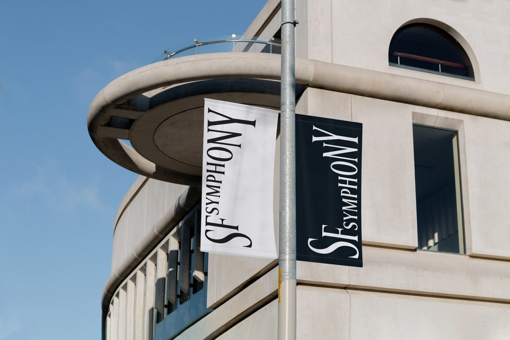
Collins commissioned us to create a bespoke Variable Font for the logo and identity of the San Francisco Symphony, which dropped in a whirlwind in early 2021.
The design and strategy company was brought in to reposition classical music for the 21st Century, given the symphony’s change in leadership and experiments with new technologies. Collins called on us to create a dynamic Variable Font for the identity that responds to sound, moving up and down like notes on a score.

Photography by Collins

Font modulator tool by Dinamo
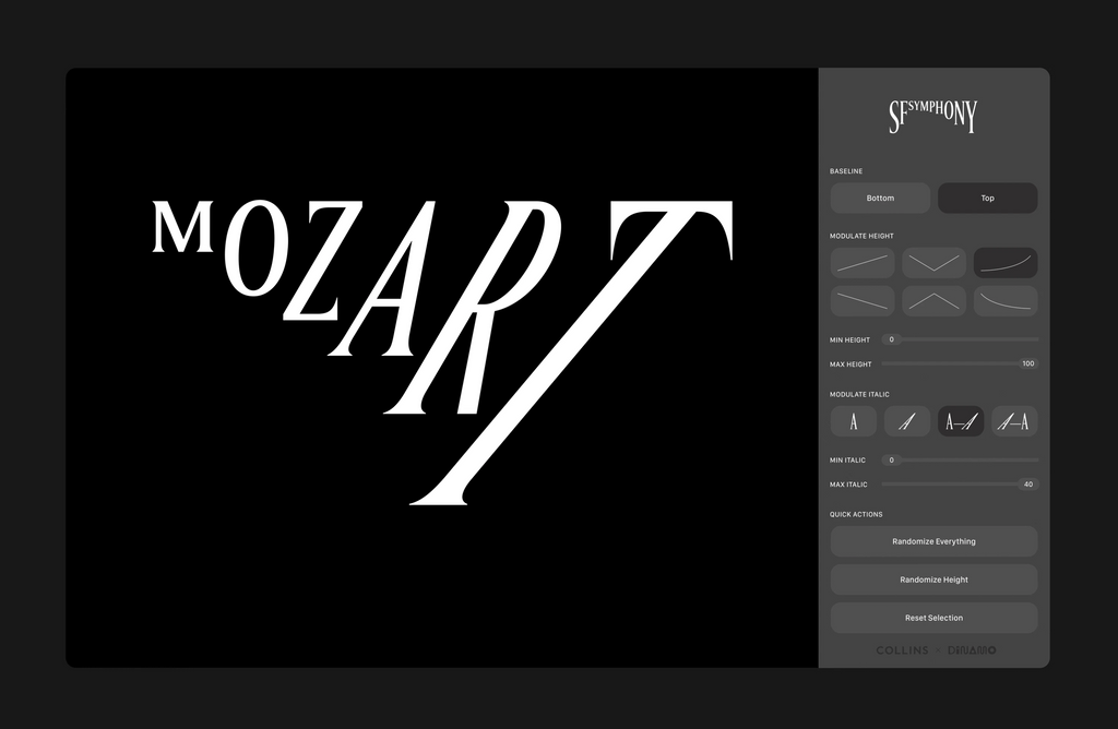
As well as the fluctuating serif based on our own ABC Arizona, we created a special font modulator tool, which lets designers generate moving posters or other assets entirely in-house. Head to the online Symphonizer to try it out yourself. With it, you can watch the typeface stretch to the sounds recorded by your microphone.
Collins are the kind of people that it’s nice to work and have tarot card readings with. These two activities don’t always fall together (we’ll make a diagram). Thank you Louis, Erik, Sidney, Karin, Christine, Ben, Tomas, Michael, Yeun, Mackenzie, Eric, Neil, and Ivan for letting us play a part in this beautiful project.