Variable Wordmark for Malone Souliers
- Year:
- 2021
- Team:
- Robert Janes
- Domain:
- Fashion
- Medium:
- Type Consulting
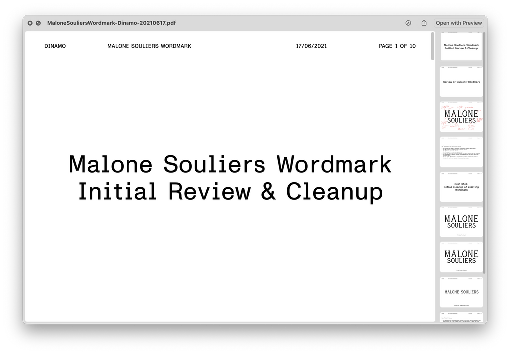
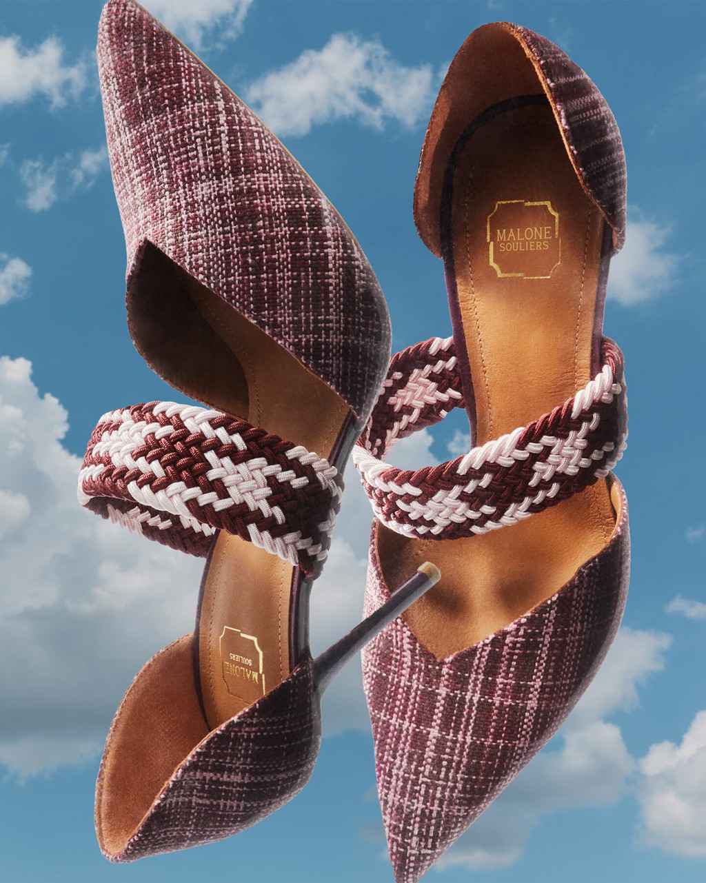
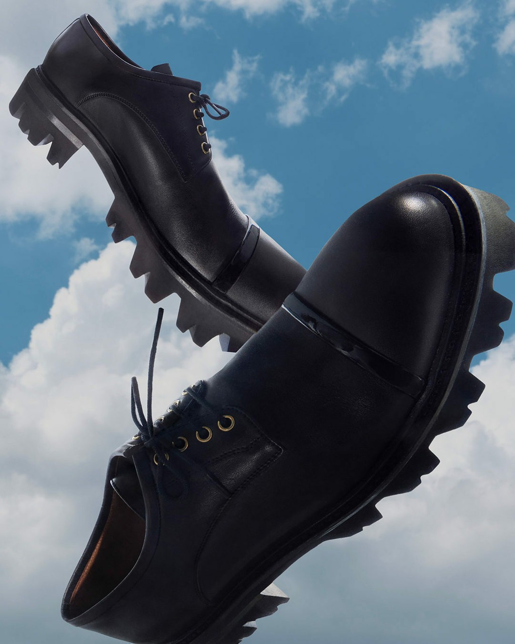
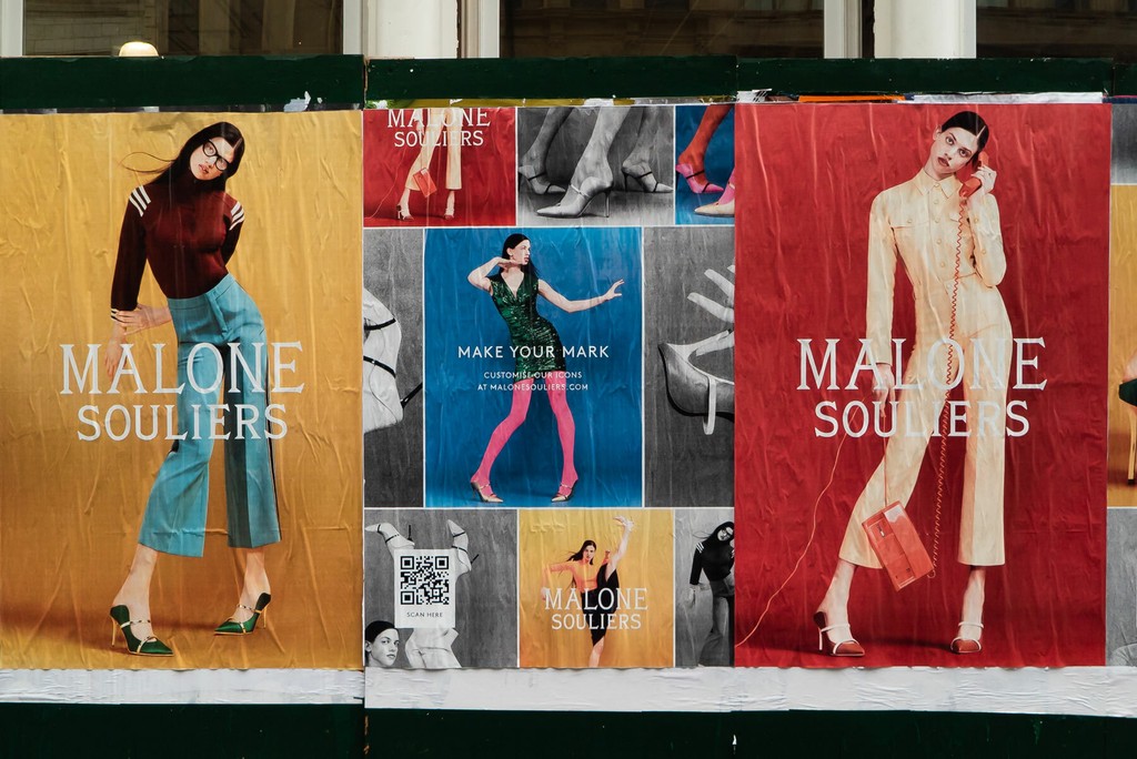
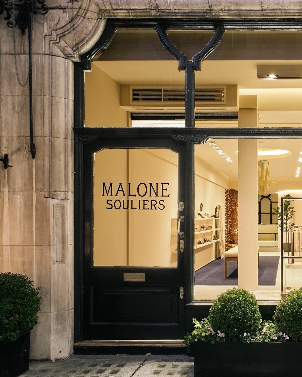
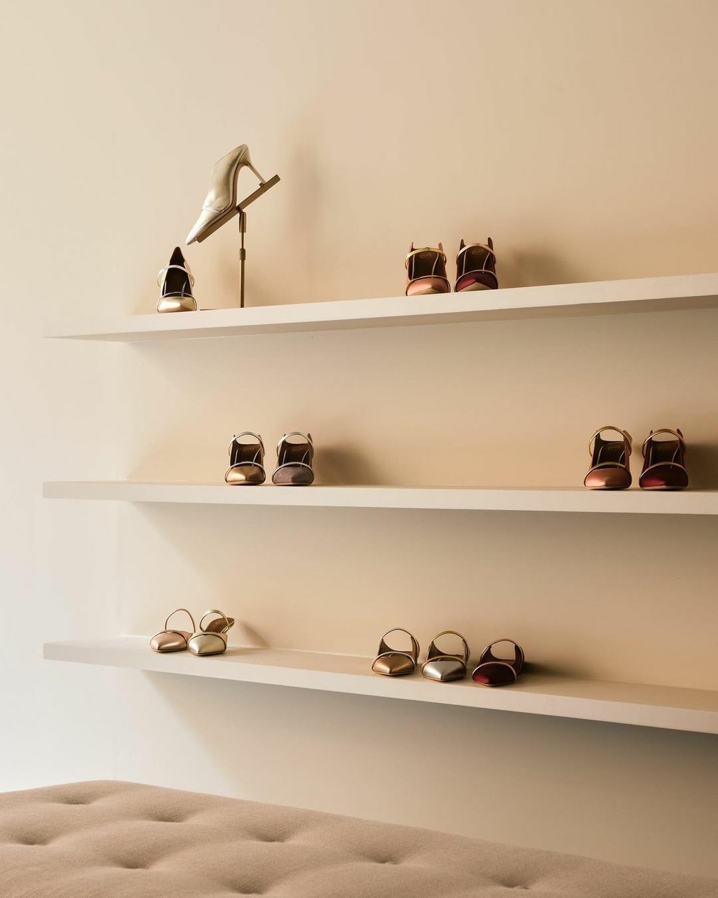
We developed a variable logo for the Malone Souliers, the London-based luxury footwear brand known for its sleek and elegant designs.
Creative studio Assembly London asked us to help redraw and refine the existing logo, which was in dire need of repair. It looked old-school and clunky—not exactly a match with the elegance of Malone Souliers’ products.
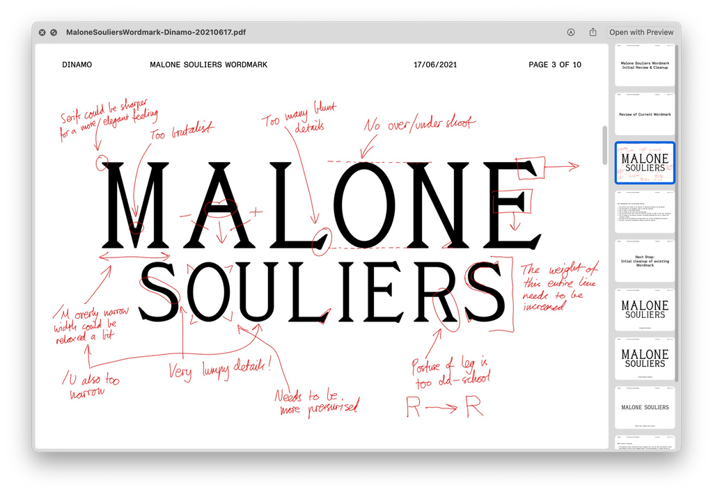
After an analysis of the existing logo, we redrew it from scratch. An important consideration was to balance the weight of the two lines, so the bottom line does not appear optically lighter than the top.
Assembly London expressed to us that they’d need different optically-sized versions of the logo with modified spacing for the various environments it’d appear in. It needed to look good whether embossed on the sole of the shoes, embedded on the website or printed in Vogue.
Our solution: we developed a variable font of the logo with axes to control the tracking and line spacing, so that Assembly could themselves modify and generate new versions of the logo.
Credits
Design Identity: Assembly London
Logo Design: Dinamo