Behind-the-Scenes with Art Directors Sascia + Mathias —

Welcome to the latest issue of our newsletter, where I’ll continue to share the latest ongoings at the studio. Take a look at our our archive.

Was this forwarded to you? Sign up now! (*◠‿◠)

Hey Friend,

A little over a year ago, our good friends Sascia Reibel and Mathias Lempart joined the Dinamo ship to take charge of our art direction. The collaboration has pushed our graphic design to new heights, so we wanted to dedicate a newsletter to their gorgeously detailed typeface campaigns.

To give you more insight into how they work, Maddy and Johannes visited Sascia and Mathias in their studio next to Kottbusser Tor in Berlin to reflect a little on recent poster designs. Scroll on for an excerpt of their conversation. Or read the whole thing on our site:

Maddy, Mathi, and Sascia

Maddy: What’s interesting is that each Dinamo typeface campaign is so visually different. We don’t have this one aesthetic running through all of them. Why is that?

Sascia: That actually happened by accident. We started with the Marist campaign, where we went down this route of creating an imaginary archive in the style of The Da Vinci Code or Indiana Jones. And then the next campaign was Walter, where we made all these New Yorker-style cartoons. Both approaches were so vastly different, and that immediately put out the fire of us coming up with one visual language for all typeface campaigns.

Johannes: It’s about creating a world around a font. Which can be silly or unrealistic. With the Repro campaign, the poster feels like this crazy photograph of some strange, secret laboratory. You start to imagine a story when you look at it. Is this a hidden area where this font was built, with a mad scientist walking around? We’re trying to create the seed of a narrative.

The third campaign: Repro

Repro is a flexible sans serif inspired by signage and digital operating systems. It’s a comprehensive toolkit, with its range of OpenType features, alternates, web glyphs, nine weights, and unique circle function. Our campaign shows that — with the encircle feature taking center stage on a photorealistic mock-up of a laboratory. Zoom in closer to see many other ways that Repro’s many weights and functions could appear.

Maddy: Some people might say that we should just showcase the font, because we don’t want to be too prescriptive about how the font should be used. Why do you not lean into that? Why create these type fictions instead?

Johannes: It’s just more fun. And it’s more interesting to talk about fonts like they’re people, or as if they’ve emerged from these weird universes.

Sascia: Also, it would reduce and take away a lot of the context around making a font if we just showed them in a blank way. Designing a font takes a lot of time. There’s a person behind a typeface. And there’s a personality behind the font. So why should it just be A-Z in green, blue, or yellow?

Studio Improvement 1

Artist Edition Toothbrush 10 Pack mock-up

Feedback on upcoming ROM campaign

Maddy: One of my personal favorite ways you brought out the context of a font is the Walter campaign. Because it adds this second layer of understanding to the whole thing. There are two Walter type families, one is old and one is more contemporary, so you’ve made two mascots, an old Walter and a young one. How did those characters come about?

Johannes: Omnigroup, who we co-designed the font with, would send around pictures of the source Walter was inspired by out in the wild in Switzerland. It became like a Where’s Walter? joke. A meme. So I said to Sascia and Mathias, let’s do a quick campaign based on this Where’s Walter joke. And then it became this huge, beautiful thing.

Maddy: But Mathi and Sascia are not illustrators. So who drew them?

Mathias: We both did!

Sascia: Mathi was better at doing the faces. So we split them.

Mathias: Often you’ll find the same face on different bodies. That’s why they look eerily similar.

Sascia: You can tell who did a body by looking at the legs. I made them wear pants. And Mathi’s are wearing leggings.

Studio Improvement 2

The second campaign: Walter

Walter comprises of Walter Alte and Walte Neue, two related yet ideologically opposed subfamilies celebrating design educator Walter Käch. The triple styles of Walter Alte are a faithful study of Käch’s lessons, while Walter Neue is an extension, update, and digitally-minded interpretation. Our cartoons take that literally, with the young and Walters helping each other in a bunch of situations.

Maddy: Is that usually how you work? By tossing a design back and forth?

Mathias: The idea is that we approach every project with an open outcome. So we allow it to become something we don’t know yet. We try to allow ourselves to be influenced by the content.

Sascia: We try to make use of the fact that we have two different brains. We have a lot in common but want to be very mindful of trusting each other when we diverge. Maybe one of us has an idea first, but we need to visualize it as it’s hard to explain in words. As soon as there is something there, we get into a conversation together. Exchange thoughts. And then switch it around. When one of us doesn’t know where to go anymore, we’ll hand the file over to the other.

Maddy: Let’s talk about Oracle. That campaign felt very research heavy.

Johannes: It began with me talking to Sascia and describing the world of the font. A place that felt almost like a temple.

Sascia: And I started diving into all these alternative music notation references, which I’ve always found very interesting but not yet gotten around to applying anywhere.

Studio Improvement 3

The fourth campaign: Oracle

Oracle is a double family, and its Triple version is an exploration of a strict rhythm with silly results. Taking the logic of monospaced letterforms to an extreme, its bounding box has been segmented into units of thirds. The family’s name is inspired by the Ancient Greek Oracle of Delphi, who made mystical predictions by breathing in vapors. For the typeface’s release campaign, the font and its namesake combine, with a mascot dancing in a 3D bounding box. She stretches into italics and moves her hands and feet in units of thirds.

Studio Improvement 4

Maddy: How do you know about them?

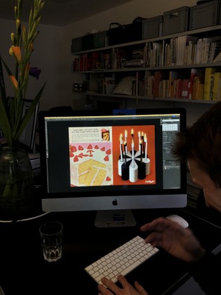
Sascia: I wouldn’t say I have an exceptionally great memory. People tell me that I know a little bit about a lot of things. Sometimes if I see something, it reminds me of what I already know but forgot about. I remember things through a prompt. So Johannes asked me: “What if aliens had the ten commandments?” And then all these references in my memory came back to me. For Oracle, I started looking at experiments in movement, astrology, and notation styles.

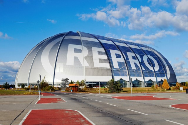
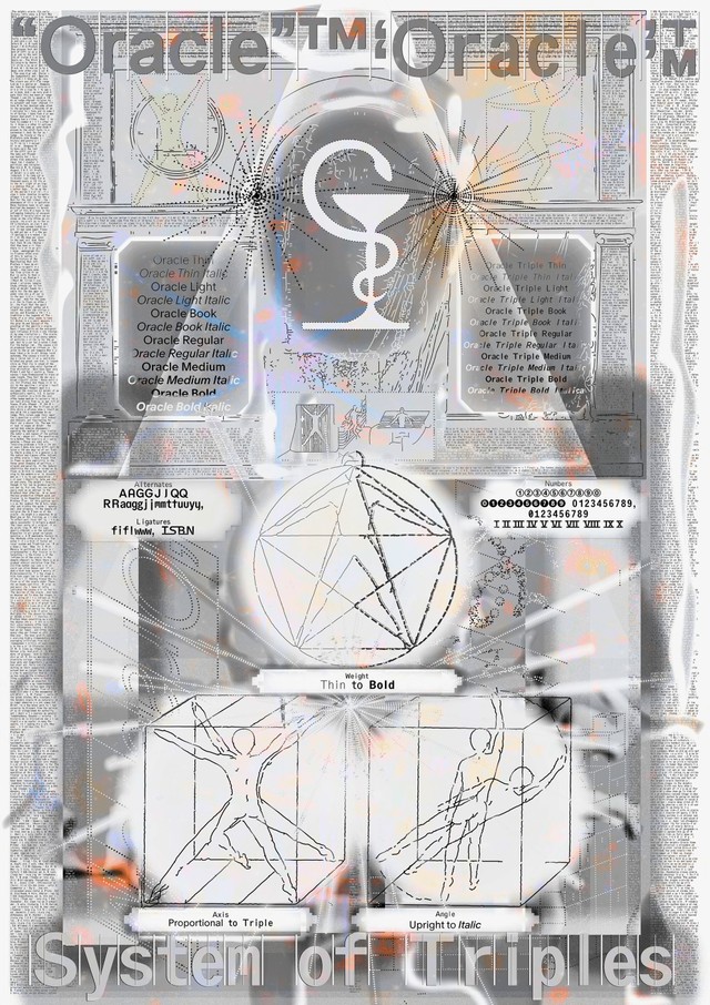
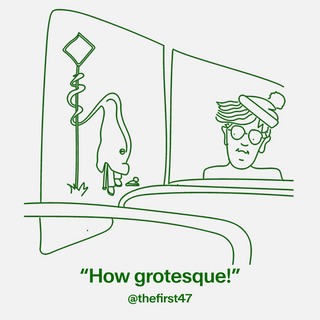
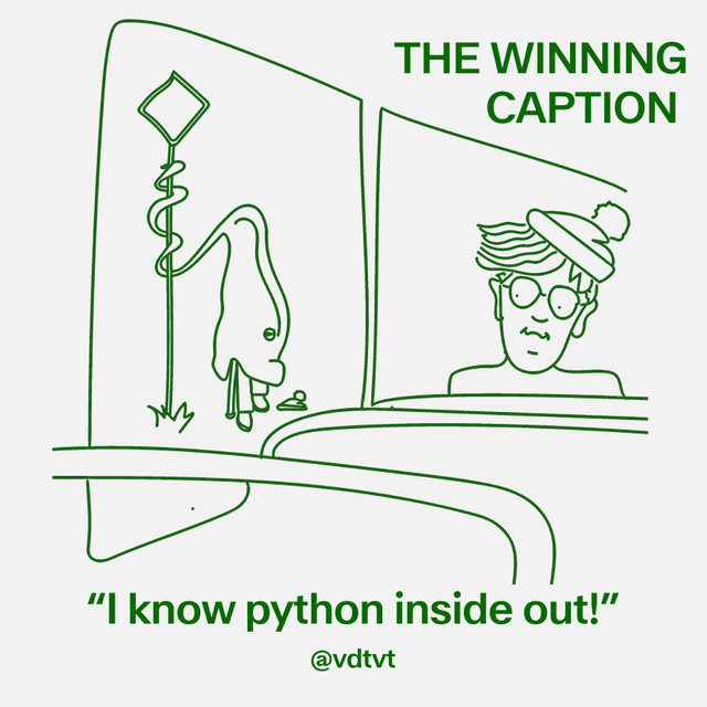
Mathias: Oracle is called Oracle in reference to the Oracle of Delphi in Ancient Greek mythology, who breathed in fumes to make her predictions. So that’s also where the campaign video’s smokiness came from. We also wondered: Could Oracle be an alien, too? And so we made it into this creature. That’s where the mascot came from, which you see in the poster.

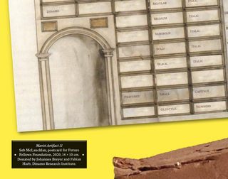
Sascia: So we reference the Ancient Greek aspect in a metaphor. But then we also show the technical aspect of how the font is drawn using the mascot, specifically the subfamily Oracle Triple, which has a bounding box that’s been segmented into units of thirds. Our mascot, she stands in three positions, taking up three units of space like the typeface. And she also moves from upright to italic, like the font.

Collab launch mural in Paramaribo

Campaign for our birthday artist toothbrush 10 pack

Studio Improvement 5

Maddy: You’ve been creating these campaigns for us and working as our ADs now for exactly a year. How do you reflect on the last year?

Mathias: One of the first campaigns we did together was the mural in Paramaribo, and that feels like a long time ago. But it was just last year, produced in a completely different continent. That’s what feels exciting – you’re open to ideas like that mural.

Over the last year, we’ve become really aware of how long fonts take to be designed and drawn. We want to give that effort a lot of space and attention. We’ve also learned each font is always a different story, deserving of a different outcome, and there’s a beauty in that.

The first campaign: Marist

Marist is a warm and robust re-examination of the Old Style genre first imagined by Nicolas Jenson in 1470. Imagine a quiet library with stained glass windows and stacks of books, a place where time seems to slow down and the mind has space for careful traveling. This is where designer Seb first uncovered Marist.

Studio Improvement 6

Walter Caption Contest

In each issue of The Dinamo Update, we provide a new Walter cartoon in need of a caption. You, the reader, can submit your caption by responding to this email or by commenting on our caption contest IG post. The best three responses win the complete Walter Alte. Scroll on for the last round’s winners — as well as the new contest.

THIS MONTH’S Contest

What are the Walters doing this time? Send us your caption to win.

ROUND 2 Finalists

🏆🏆🏆

Congratulations to Alex Synge, Stanisław Zieliński, and Nathan Lew. All three of you should have received your files of ABC Alte Walter.

Fonts in Use

Camera used by Andre Cruz studio

Gravity used by T.O.T for Nickzzy's new album campaign

Custom Maxi for the ICA in London, with design by Chris Chapman, David Kolbusz & Rebecca Lewism

New Studio using Diatype for its GoodMoney identity and campaign

ROM (coming soon) used by Dan Solbach for a Ida Ekblad catalog

P.S.

Tina shared some customer emails with us in our recent communication team meeting 💕 We take customer support very seriously and it’s nice to see how many conversations emerge from your queries. Keep writing to Tina! We love hearing what you think.

Thank you for checking in with the latest issue of The Dinamo Update. You can read all of the back issues in our archive.

Love,
Dinamo

Dinamo Typefaces GmbH, Glasower Str 44-47, 12051 Berlin
Copyright ©2024, All Rights Reserved