Plus a new Walter caption contest. Win the Alte family! —

Welcome to issue #18 of The Dinamo Update. In this edition, we’ll be continuing to share studio news in four or so parts.

Was this forwarded to you? Sign up now!

An Interview with Greg Mitchell 🆎🛡️

While bulletproofing our own licensing terms against daunting agency red-tape the last years, we’ve been sporadically in touch with Greg Mitchell of Font Shield Inc. Greg is truly the licensing consultant out there. And after a recent email, we realized that the former agency type director turned licensing specialist would make a great interview guest.

When you play the Game of Fonts you win or you die

Like us, Greg is fascinated by the small print of font licensing agreements—we've had enjoyable conversations with him about our own switch to a value-based pricing policy before. And so with licensing in mind, our team pooled together some questions and sent them to the expert for a special DU interview.

Greg’s business, Font Shield, is all about “shielding agencies and brands from risk” because, as he says, “No two fonts are identical. Neither are their End User License Agreements (EULAs).” His service, according to his website, proactively helps customers looking for typefaces avoid “costs, damaged reputation, and stress from copyright infringement.”

Greg Mitchell
FOUNDER & CEO

Pat Ratigan
SENIOR LICENSING CONSULTANT

There’s been some large-scale font lawsuits in the past (see below) and so Greg has made it his mission to guide his customers through confusing details to the light at the end of the font purchasing tunnel.

According to Font
Diner, Haribo didn't
appropriately upgrade its licence
when using its
Stovetop typeface for
Halloween packaging. Damages
sought: $150K.

Font Bros says their
Generation B font was used on My Little Pony toys, videos, advertising materials, and website without
permission. Damages
sought: $150K per
infringement.

Font Bureau vs NBC: According to Font Bureau, 3 of their fonts were used on multiple computers within NBC and were also distributed to parties outside of NBC. NBC had only purchased single user licensing for these fonts.
Damages sought: $2
Million.

We ourselves have been battling with confusing licensing agreements ever since Dinamo’s earliest days; it was our own confusion that led us to eventually shift from use-based to a value-based licensing model, which we hope feels less confusing for all of you. If anyone really appreciates the importance of licensing though, it’s Greg, as he proved throughout our conversation below. Thank you for sharing your wisdom and time with us, Greg!

Let’s dive in

You’ve worked in the type industry for over 40 years now, witnessing a huge amount of technological changes in how typefaces are made, used, and distributed. What have been the largest changes in font licensing that you’ve observed?

Desktop Publishing. It’s been responsible for the growth of the type design industry we know today. Prior to desktop publishing, typefaces and their use were only available to typesetting and printing companies, who used expensive proprietary equipment to set type. There were far fewer type designers back then. Desktop publishing allowed anyone to create and publish materials using fonts and apps on their own personal computers, spurring the need for the design of more fonts (using those same desktop computers and font editing apps). The primary license back then was desktop licensing.

The second change is the internet. It opened up an extensive range of additional font licensing models beyond the basic desktop. There’s now webfonts, mobile apps, social media, video, ebooks, email, digital ads, and more.

Why should companies care about fonts?

From a brand identity perspective, a well chosen font is an essential component in defining the tone and attitude of a brand going forward.

What’s the biggest licensing-related story (success or scandal!) that you can tell us about?

I’ve got a few famous cases listed here on the Font Shield website. Here’s just one: P22 alleged that their Cezanne font was used by NBC Universal and some of their manufacturers to create various Harry Potter themed souvenirs sold at Universal theme parks and through their website. It is also alleged that some of the manufacturers did not even purchase a basic license or any additional licensing required to create and sell commercial products. Damages sought: $1.5 Million + destruction of all relevant merchandise.

There’s also been this recent story about how a Pakistani corruption case hinges on a font. It’s not a font licensing-related story but I do find it intriguing.

According to the BBC, the team investigating a deed dated February 2006 say the document was typed in the Calibri font — despite the fact that Calibri wasn't commercially available until 2007.

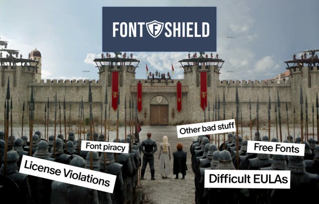
Do people break with licensing terms intentionally? Are there true type crooks out there?

I suppose there will always be “crooks” in any segment of our population. However, I do believe most commercial font licensing violations are inadvertent – much of it I attribute to the confusion around licensing.

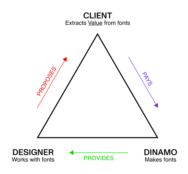
Can you share some high-level insights into your business model, which seems so special? How does it work?

As I’ve said, the font licensing space is VERY confusing. There’s a million plus fonts. Hundreds of type designers and foundries, each with their own unique EULA, which are often difficult to read and understand. There are multiple font licensing models depending on intended usage, and various purchasing options (perpetual, subscription/rental, enterprise, custom). There’s also questions like: Who exactly needs to be licensed, the agency, brand, or both? The industry is constantly in flux. Change is certain. Over time EULAs change too.

Fast paced advertising agencies, designers, and brands simply don’t have the time or resources to fully understand all these variables and still feel confident securing font licensing. They do want to properly license the fonts they use, but the confusion is unnerving.

Font Shield takes the confusion away from our clients and helps them secure the necessary font licensing required to produce their deliverables. We receive no commission from font foundries when our clients license their fonts. We do not sell font licensing or advocate for any one particular foundry. Our fees are paid by our clients and are based on our time spent exploring and presenting font licensing options based on the fonts they require. Clients purchase their own licensing directly from the foundries based on our recommendations.

Johannes and Maddy catching up with Greg

What do you think of free fonts?

Remember the old adage, “The best things in life are free”? Not always the case with free fonts. The web is full of “free” font websites. And other than Google fonts, fonts that fall under the OFL licensing model, or free fonts offered by reputable font foundries on their own websites, I lack trust in free fonts for commercial use. While some “free” font websites may be acceptable, it's really difficult to determine which sites are good (safe) and which are not.

Other factors to consider:

  • Quality is also often inferior. Poorly drawn letterforms, incomplete character sets and font families, poor kerning, etc.
  • Usage. Many of the fonts on these sites are for personal use only – not commercial use.
  • Copyright concerns. Are the fonts on these sites plagiarized or pirated versions of existing copyrighted fonts? Do the site owners vet each and every font added to these sites to ensure they are "safe" to use from a licensing standpoint? Does each font offer a corresponding EULA that is trustworthy?

What do you think about the fact that foundries have their own different EULAs, with their own logics and rules? Could you see value in creating more unified and standarized EULAs in the future that all foundries share?

I’ve heard this discussed many times over the years. I don’t see it happening. There are so many players and personalities (type designers/foundries) in the industry, each with their own methods of determining the value of their IP, what licensing models they offer, and what usage is permitted within each model.

What’s the last font you purchased for yourself?

Nexa Script from Fontfabric.

What license did you buy?

Desktop.

Where is the type industry at right now? Is it doomed? Flourishing?

Over the years we've seen smaller foundries purchased by larger foundries. I truly hope there continues to be a healthy choice of existing and new independent foundries.

What do you regret, work-wise?

I’ve been actively involved with fonts for 40+ years but regret not learning hands on, actual type design/production myself.

How we think the license-value-triangle works

As you know, two years ago we ourselves shifted from a use based model to a pricing system based on the size of a client (ie. the number of employees). What do you think about our model?

It’s an interesting model that is (as you've explained on your website) “based on the conclusion that the bigger the size and reach of a company, the bigger the commercial value extracted from a typeface.” Not right or wrong—just a different approach to licensing and pricing. Your website explains your rationale quite well.

I do like the idea that with this model, no metrics are required (monthly website page views, impressions, app downloads, followers on social media, etc.). These metrics are usually really hard to gather and it takes time. The only metric you require is the number of employees at a company. This makes the actual licensing process very simple. A big plus is that all licensing is perpetual.

What must be clearly understood about your terms is that the licensed fonts can only be used on a single brand and all licensing models must be purchased by the brand only—agencies and designers cannot license themselves. If fonts are to be used by a brand's agencies or designers, the brand must purchase an extension for third party use (agencies and designers can also download and test trial fonts for layout/comping purposes prior to brand purchasing any licensing).

We know most of you haven’t read our EULA the whole way through because there’s a prize at the end for those who do, which Ethan told me remains undownloaded 🥲

Rapid Fire Round 🚅

Commercial or underground?
Commercial.

Calls or texts?
Calls.

Success or good sleep?
Good sleep.

eBooks or paperbacks?
Paperbacks.

Daily or weekly updates?
Weekly.

Use-based or size-based?
Either.

Thank you again Greg — for generously sharing your words and thoughts with us!

NEW!! Walter Caption Contest

From now on, we will provide a new Walter cartoon in need of a caption in each issue of this newsletter. You, the reader, can submit your caption by responding to this email or by commenting on our caption contest IG post, and we will announce the winners in the next issue of the DU.

Since we released Walter Alte and Walter Neue into our Early Access space last month, the pair have found themselves in all sorts of unexpected situations courtesy of the hands and imaginations of Sascia and Mathias.

It’s time to pass the storytelling reigns to you. But first, here’s a reminder of some of the captions we’ve already featured:

Following in the historic footsteps of the weekly New Yorker caption contest

Some of IG’s favorite New Yorker cartoon captions

Caption contest: Round 1

What are the Walters doing this week? Send us your caption!

How to participate?
-> Reply to this email with your caption or comment on the IG post
-> The best 3 responses win the complete Walter Alte family 🏆 👀

Dinamo Hardware: Next level 📦🆙

Big team news! Our long-standing friend and sk8er boi Simon Merz has joined Dinamo as our first (and only) Head of Hardware. You might recognize his hand from the Vienna-based publishing label wtp.pp — it has personally saved me many-a-times when in need of a birthday, wedding, or divorce gift.

Simon’s inauguration speech live streamed into Sascia & Mathias’s office

Holding the keys to the hardware store

🐐 life

WIP stuff

Hardware FW 2022

Simon knows his stuff when it comes to the delicate act of composing (I didn’t want to say curating 🥱) a world of objects, and then designing, sourcing, and producing them. Supported by Sascia and Mathias, who are heading our graphic design department, Simon will be taking our hardware to new heights this Autumn.

Warehouse sale

While Simon is brewing his soup of new tasty things for our new AW22 Hardware launch, we’re doing a bit of end of summer cleaning to make more space in our tiny warehouse. Head to our Hardware store to bag a deal—we’ve lowered the prices on everything!

You didn’t ask, but Dinamo rents one small pallet of storage space on the outskirts of Berlin for a friendly €22.50 per month.

Studio Updates

These past weeks we were mostly vacationing, ie. taking a break from working on world-changing projects, but some things did happen!

We received the Marist campaign poster printing plate

You must unsee the Oracle poster at the bottom of this picture. It hasn’t launched yet 😁

😳 We then actually wanted to frame or at least lay-out-on-the-lunch-table the last three typeface campaigns designed by Sascia and Mathias...

😬 ...but all four frames we ordered arrived broken!!...

😩 ...Anyway, given how many people asked if they’re available for sale, we’re in the process of printing more posters.

Penélope Cruz, ehm I mean Rea, also came over from Frankfurt to help us make sense of numbers and learn to spell “biz strategy” properly.

And Vanessa, well I don’t really know what she’s doing with all those screens, but after she left our studio our accounting was in the best shape.

From San José, Fabiola completed Gravity Italics — and Olga has added beautiful Cyrillics to it. That means that Gravity has now doubled in size, from 12 to 24 styles.

Erkin has finished his masterpiece, Repro, which, rumor has it, silently tip-toed into our Early Access section. Release later this year!

Dinamo Family in The Hague 🧇

Dinamo: The gathering! The team came together last week for the Fontstand conference in The Hague. 17 Dinamo people poured in from far and wide, from Costa Rica (Fabi), Moscow (Olga), Lausanne (Chi-Long), Vienna (Simon), and London (Seb) — joined by the scary-in-numbers Berlin chapter (Johannes, Renan, Elias, Maddy, Tina, Vanessa, and Mathias). Cologne (Erkin) and our new satellite Porto (Fabian) made it, too. Seeing everybody again after years of no face2face contact was a true blessing. Crew love is true love.

Seb, Mathias, Simon, Olga, Johannes, Maddy, Elias, Mike, Ethan, Erkin, Fabiola, Renan, Tina, Fabian, Vanessa & Chi-Long

When you order a Guinness

How you feel after a Guinness

Working on this newsletter issue, thanks hotel IBIS couch

He brought an umbrella but he did not bring a charger

Oysters with alcohol free, canned beer ☝🏻

A long episode of “Mike in the middle” 📺

Simon & Elias

Johannes & Chi-Long

Long line

Hanging lamps

End of herring

Tina and Maddy making the most of our 7h wait inside Easyjet’s lime green themed terminal 🐉

Fonts in Use 🚁

Dinamo member Tina keeps her eyes on how our fonts get used each month and adds it all to our continually growing waterfall.

She’s asked me to let you know that your submissions are still always welcome and appreciated!! Just send over a picture and description of your project to tina@abcdinamo.com ✨ (maybe you’ll even get featured below). Here are Tina’s recent picks:

Posters and invitations for Room 6x8 designed by Work by Works studio

Gaisyr Mono used for @plygrnd_music and @nokiaa_nokiaa album cover, designed by Parissa Charghi with illustration by @ruffmercy

Monument Grotesk on giant totes for the 🅱️🅱️1️⃣2️⃣ @berlinbiennale!! designed by @fabianmaierbode and @martinwecke.de, and available at @kwinstitutefcontemporaryart 👛

@seb.mclauchlan's ABC Rom Narrow used by @impossibleobjects_ grid system w/ @vmragona @imranmatinkhan.xyz

Extra! Extra! Gravity and Arizona together. Design by Smuss Studio for Første utgave by Elise by Olsen & Morten Langeland. Edition of 50.000

P.S.

That’s it for now. Thank you for checking in with our latest issue of The Dinamo Update. You can read all of the back issues in our archive.

Speak soon,
Team Dinamo 🐮

Dinamo Typefaces GmbH, Glasower Str 44-47, 12051 Berlin
Copyright ©2024, All Rights Reserved