On
Customized Typeface
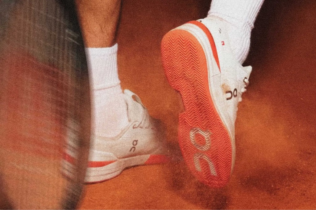
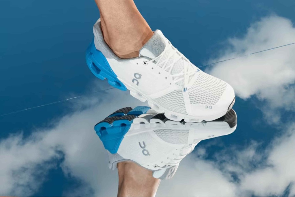
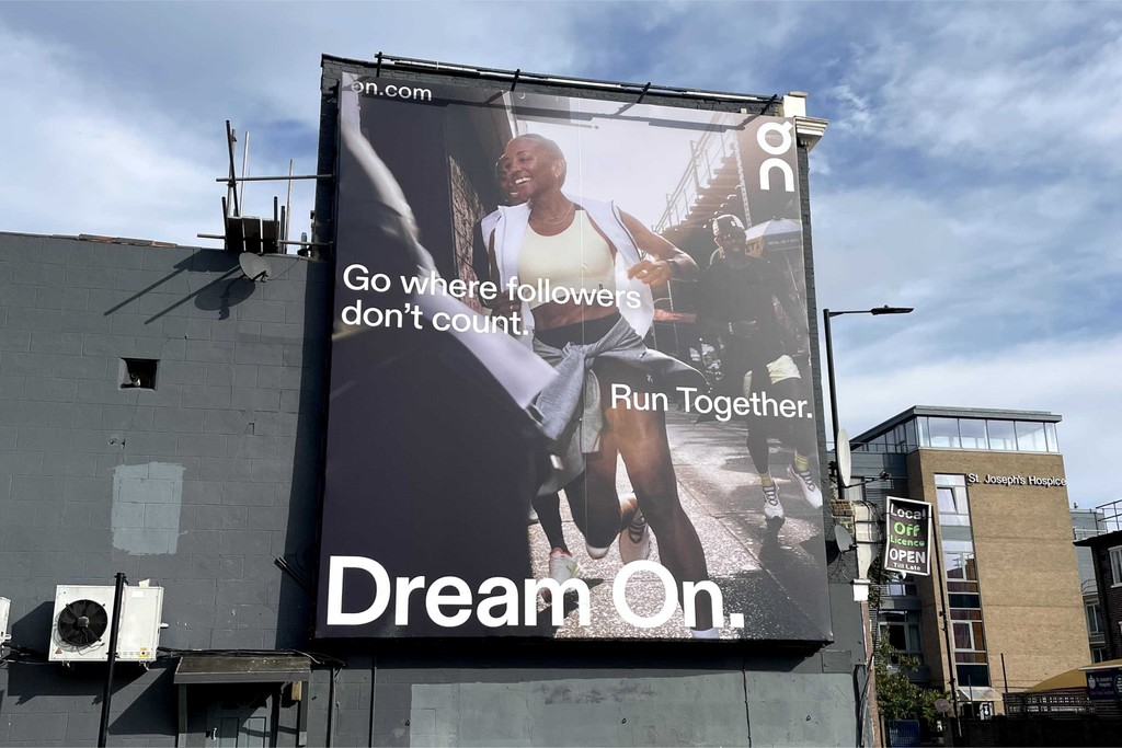
On got in touch with us to create a bespoke font customization of Diatype for its new branding. Given the sport brand’s goal to revolutionize the experience of running to make it feel like you’re floating on clouds, we tweaked Diatype’s characters to make them feel ultra smooth, airy, and extra round.
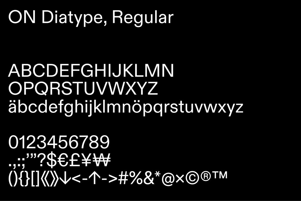
A company born in the Swiss Alps, On selected Diatype for its clean functionality, flexibility, and Swiss design roots. Our custom brand package includes regular, Mono, and Semi Mono cuts.
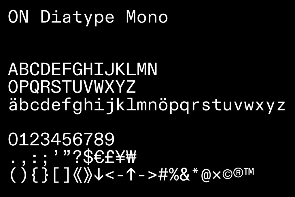
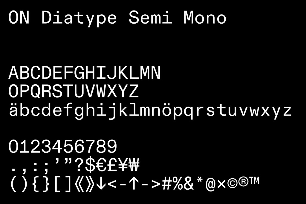
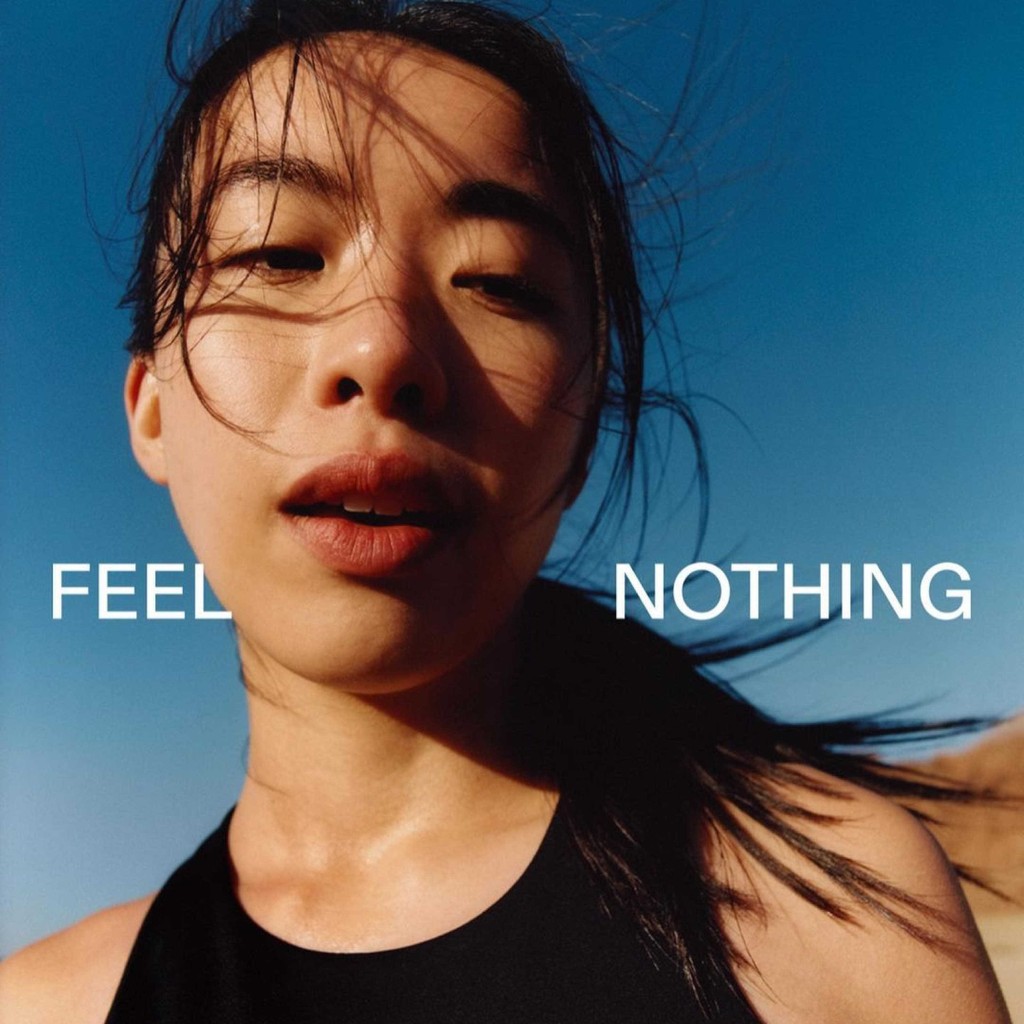
The Customization
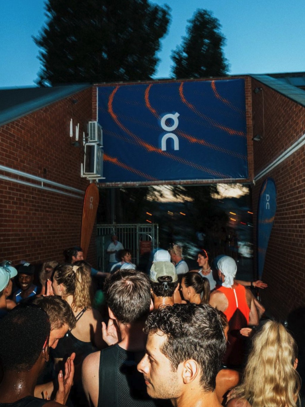
On’s logo features a geometric figure made from the horizontally stacked letters O and N. Its shapes are perfectly round and smooth.
Our customization echoes the shapes of On’s logo and brings them into Diatype. We rounded circular characters to the fullest, so that they form perfectly geometric circles. New simplified punctuation also adds an elegant, energetic feel to the brand typography.


Extended Weight Spectrum
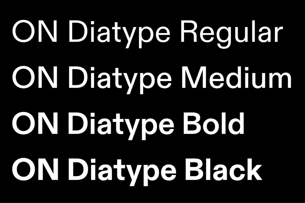
On requires a wide range of weights for its communications, so we extended On Diatype to also include Black.
Contextual Alternates
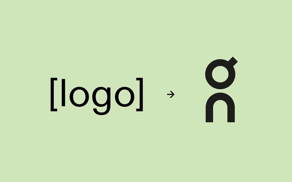
Type “logo” between square brackets and the On logo will automatically appear. This shortcut is baked into the font — helping On’s designers create assets quickly.
Language Translations
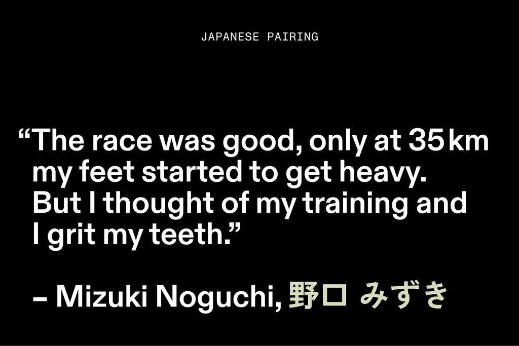
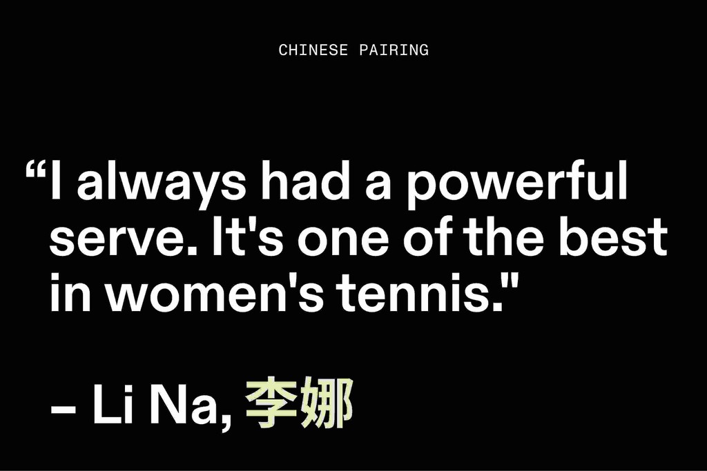
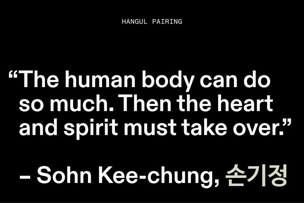
As a global brand, On speaks many languages. We advised the team on what Japanese, Chinese, and Hangul typefaces match the neutral, self-assured tone of On Diatype.
OFF magazine
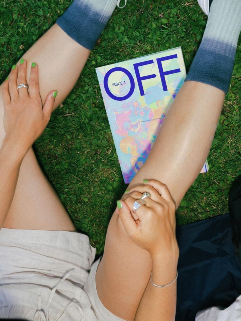
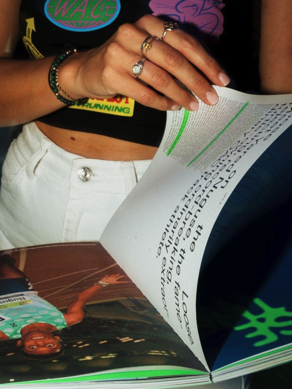
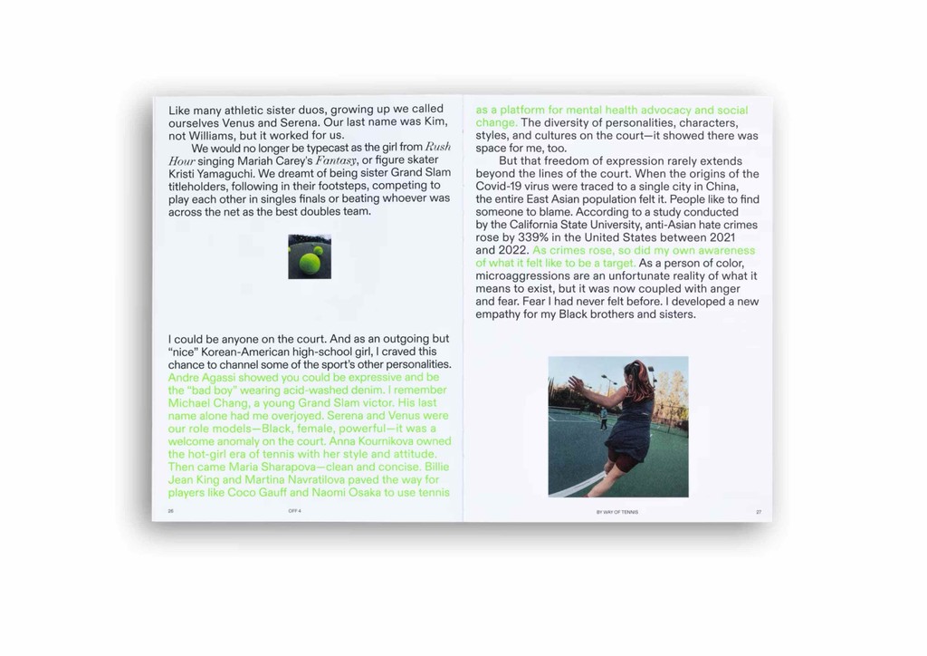
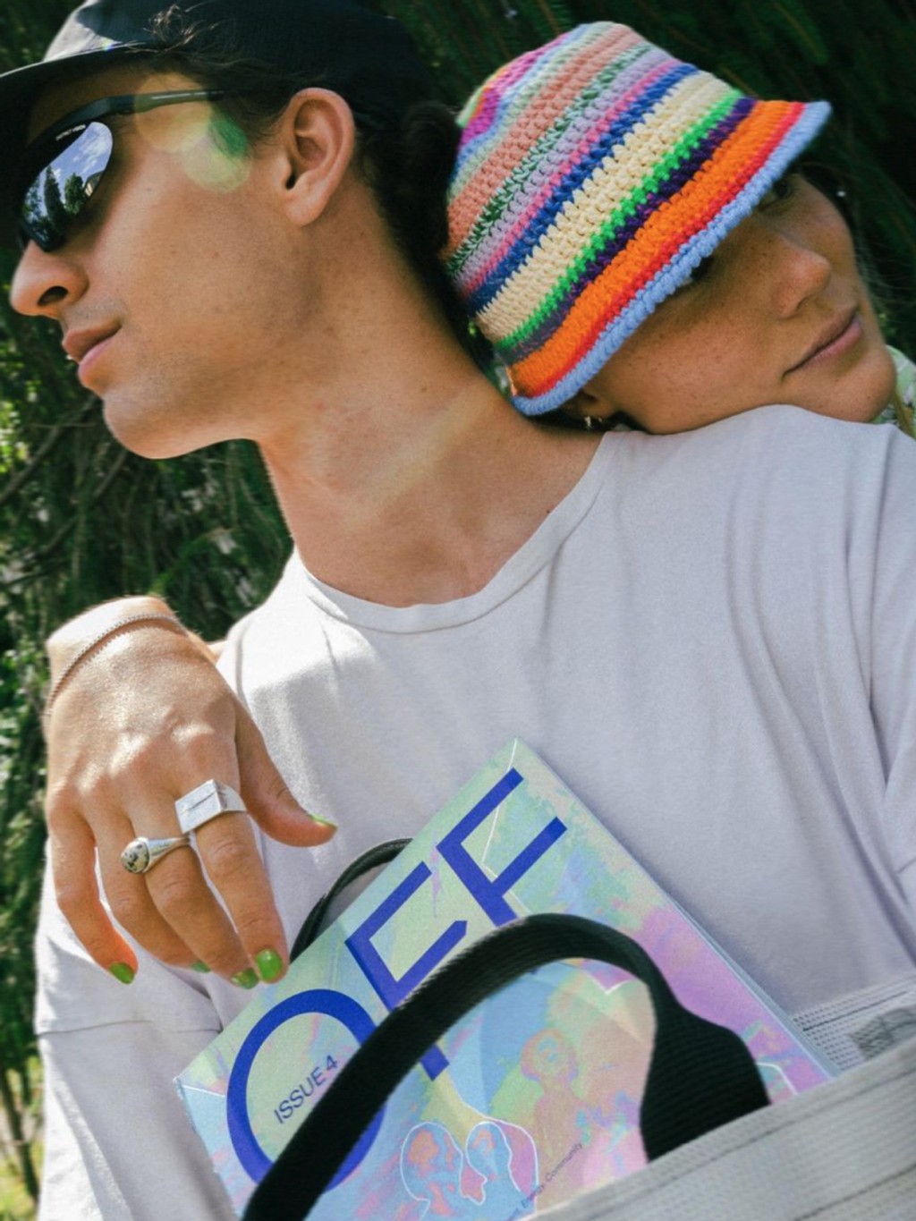
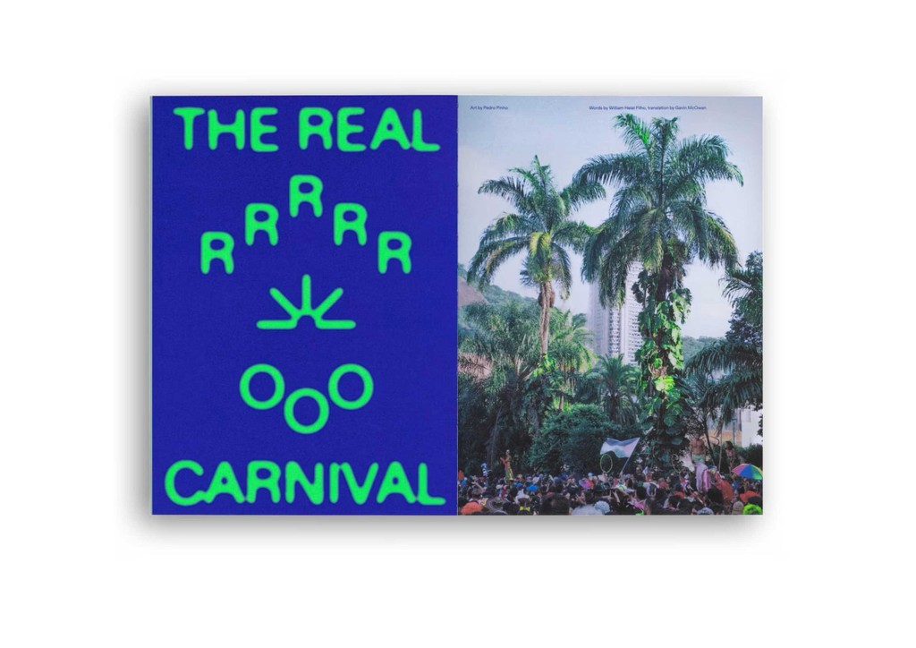
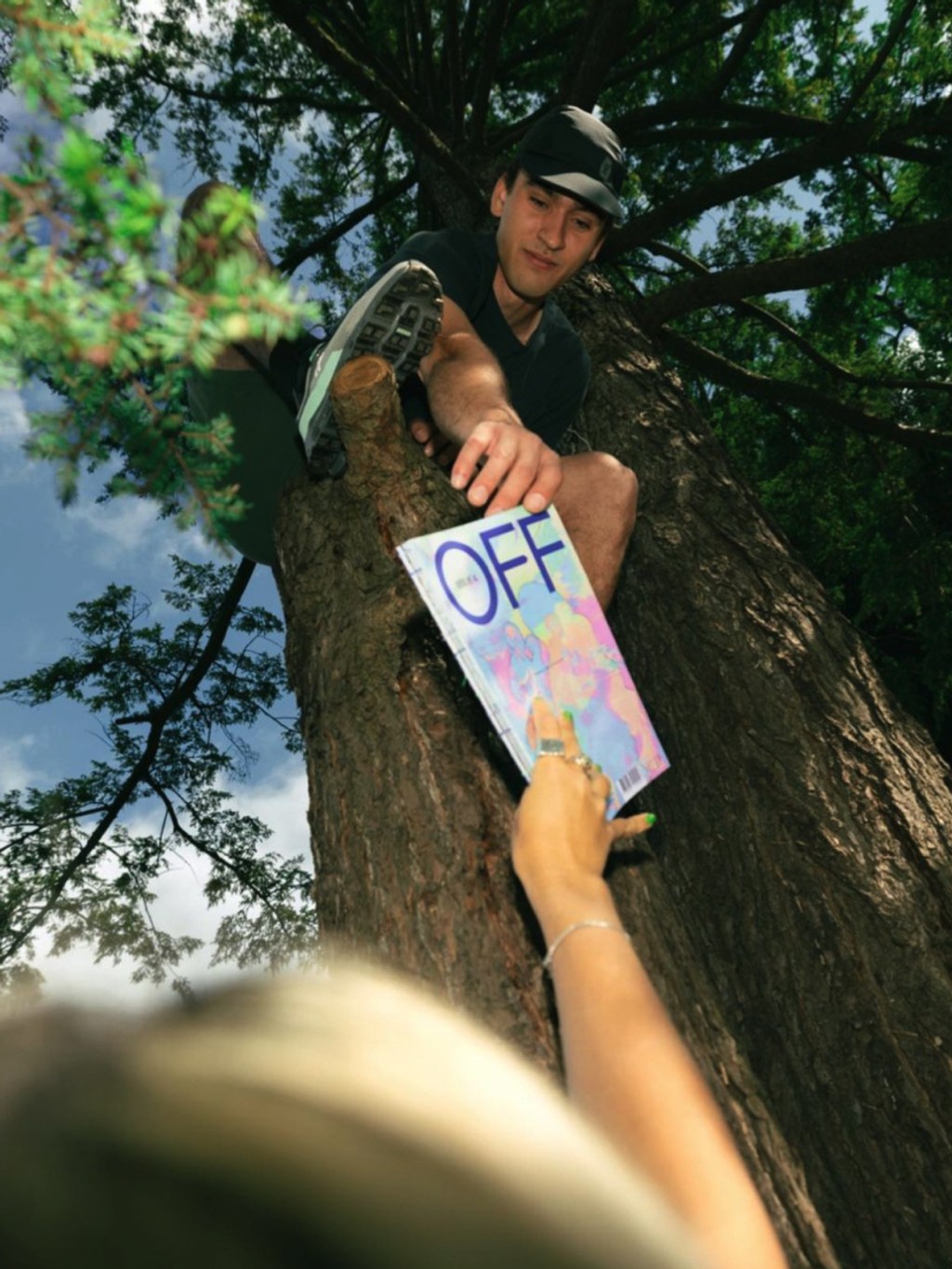
Since our partnership began, On’s in-house magazine has been using our fonts to tell stories about movement, nature, design, sustainability, and the human psyche. On Diatype features across OFF’s headlines, and our own ABC Arizona
Credits
Type Design: Dinamo (Renan Rosatti, Fabian Harb)
Art Direction and Design: John McCusker, Luke Kurbalija, Gerald Marolf, Carolina Sanches, Dominik Ulmann, Michele Brianza, Julia Seiter
Production: Dinamo (Renan Rosatti)
Case Study Design: Tina Lehmkuhl