Plus GQ Korea, a VF Honda supersport motorbike, new company motto + more 💚 —

Welcome to issue #10 of The Dinamo Update! In this monthly newsletter, we’ll be continuing to share the latest ongoings at the studio in a few parts.

Was this forwarded to you? Sign up now!

Dinamo x GQ Korea

In celebration of Hangul Day 2021 (this Sat 9th of October \(^o^)/(^。^) (^^)v !) as well as our own connections with Hangul type design and artists in the South Korean capital, we’ve just released a duo-language project page dedicated to our friend Kiyeol Kim and his use of Dinamo fonts at GQ Korea.

Random widths of ABC Gravity thrown together

We’ve been exchanging messages and pre-release font files with Kiyeol for a number of years now, and we’re always excited to see how the art director combines a Hangul core with surprising Latin counterparts. It was amazing to finally have dinner with him in Seoul when we visited the city for the launch of our first Hangul release, Favorit Hangul, in Oct 2019. It’s actually in the pages of GQ Korea that we first got to enjoy not only seeing Favorit Hangul, but also our own Camera, Maxi, and Favorit <3

Next up & look back

While our next Hangul typeface Whyte Hangul & Whyte Inktrap Hangul—also designed by Mingoo Yoon—is already in the making, we decided to send Kiyeol some questions about Hangul type design as well as his vision for GQ Korea more broadly.

😵

Work in progress of Whyte Hangul published in CA 258 “Unseen” issue

Read the full interview on our website—and a short excerpt below. Translation by the wonderful Young-Rong Choo, with special thanks to Aram Lee! ✨

GQ Korea’s 20th anniversary issue recently arrived in our letterbox. It has such character, and it’s exciting to see ABC Camera explored throughout! Why did you choose Camera for this issue?

Our anniversary trilogy of covers featured paintings by three artists, rather than our existing tradition of featuring models or celebrities on the front. I thought that the light trap holes of Camera would match nicely with this art project. It came together into something that many people have enjoyed. Among the spreads, there are also pages designed with the motif of a circle that emerged from Camera’s own holes. Then, I decided that it was not appropriate to put a cover line on covers featuring drawings by artists, so I came up with the idea that the readers themselves could decorate the cover with headlines if they wanted to. That’s where the alphabet stickers come in.

First real-life-meet-up with Kiyeol on the corner of an unnamed Tteokbokki store in Seoul, October 2019

3 hour long celebratory “Classics” playlist curated by Kiyeol for the after hours launch party at WRM Gallery, Seoul

You’ve also been one of our very first Favorit Hangul testers and feedbackers. How’s that going?

A lot of time-consuming challenges have basically been solved by using Favorit Hangul. Before, we were typesetting body copy by mixing Hangul and Latin typefaces together. There were some issues with this: For instance, when using Korean and Latin typefaces, you have to make lots of detailed adjustments in the weights and sizes so that they fit together. When I read the text after we'd adjusted two fonts like this, I often felt the subtle visual interruption. Plus it took a lot of time and effort to create an InDesign style list, and moving the document was slow due to the use of many greps.

With Favorit though, it’s now possible to set up harmonious and smooth copy in both Korea and Latin. And handling the document is far easier. Now, when we’re using Gothic typefaces for body copy, Favorit is always our first consideration.

Thank you to Kiyeol for this ongoing email exchange and for your special support of Dinamo over the last years!
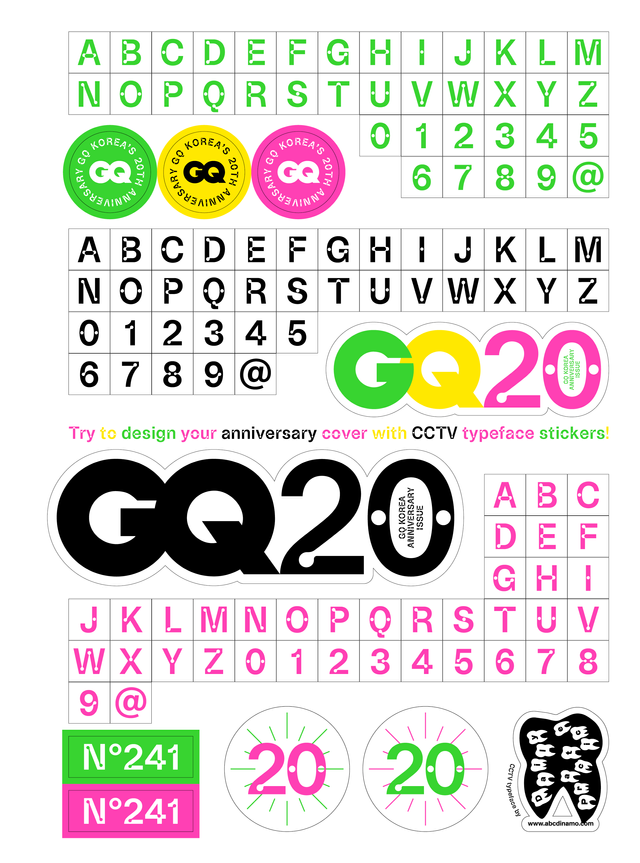
Double spread from the September 2020 issue

Cover star Kim Jung Gi with his still prestine Anniversary Issue

To further mark Hangul Day—when 15th Century Korean monarch Sejong the Great first proclaimed the invention of Hangul—we asked our own team member and Favorit Hangul designer Mingoo Yoon about the nuances of bi-script design:

“It’s quite challenging to harmonise two scripts with totally different natures. It cannot be done just by adjusting the stroke weights or the shape of the curves. For example, Hangul is not a baseline-based script, so aligning the line of the Latin and Hangul comes before starting the design. Adjust the letter size optically first, and then carefully start working on the various parts where the style of the typeface is formed, such as shape of the serif, the design patterns, and so on.”

Mingoo Yoon

NEW RELEASE: ABC SOCIAL

Extended

Normal

Condensed

Next to take the plunge into our retail library is ABC Social, a multi-people, multi-width mega collaboration made by many eyes and many players. As a friendly, smooth grotesque with Variable Font capabilities, it also fills a gap in our library, standing apart from our more constructed sans serifs both visually and technically.

Normal width, seven weights Hairline to Black

Social is a Variable Font spanning across Narrow, Extended, and Regular widths.

Rounded .:;!?“”

Employees of the month

Alternate punctuation

Alts for a and g

Meet the team:

Rob

Wei

Erkin

Fabiola

Malte

Dinamo’s co-founder Fabian Harb himself first penned ABC Social as the custom display font for The Monthly, Australia’s left leaning independent periodical covering politics, society, and culture. Over many years and many time zones, our super team has now extended it in all directions and for widespread release: Malte Bentzen worked on the very light styles, Fabiola Mejía on its monospaced family, Wei Huang on the regular and bold styles, Erkin Karamemet on Italics, with Rob Janes completing the mastering and production work.

The name “Social” nods to how the project first came about, and to how the designing process felt. If even more humans meet and connect through working with the font—be it spiritually, romantically, or platonically—we’d be more than happy.

-> Click here to view ABC Social yourself
-> And take a look at our custom font for The Monthly

We designed the TYPEFACE FOR ALICIA KEYS

In other studio news, we designed the custom typeface for the one and only Alicia Keys 😵 Massive thanks to the crew at Mouthwash Studio in LA, the masterminds behind the new identity and website, and to the Berlin and Amsterdam-based developers at antinomy. Also big appreciation to John Burgess for the typeface case study and animations 💜

Oh, hi

Alicia, if you read this, please return my calls!!!

For the typeface itself, we threw a selection of heavily stylised star characters—like the A, R, the constructed numbers, sharp comma, and quotation marks—into an otherwise sturdy and laid-back typographic structure. Those different stylistic references achieve a lively and quite powerful rhythm when woven together, which feels like the right expression for such a multifaceted artist.

AK is an unmatched force in entertainment, entrepreneurship, and activism—it was truly special to work with her team on this digital archive >> www.aliciakeys.com <<

NEW IN EARLY ACCESS: CAMERA + CAMERA PLAIN

Finally, ABC Camera is available in Early Access—slide the lock to request the font and find out more!

An example of great mastery of Photoshop’s healing brush

The studio’s favorite character

Double family overview

Words supposedly spoken during the design process 🙄

Camera includes 5 sets of alternates, like character variants or rounded punctuation

In-Use: Biennale Carbone by Service Local

In-Use: by Actual Source x New Tendency

In-Use: Closer by Alyar Aynetchi & ECAL

ABC Camera existed as a one style, one weight (medium) font for a number of years, living an obscure but happy life holed up (lol) and waiting to be picked up, reconsidered, and extended. Dinamo member Sascha Bente took up the task after relocating to Berlin from Lausanne. After a couple of intense months, and with Rob Janes finalizing the mastering and production work, Camera is now a full, five weight family with and without holes.

-> Visit and get lost in Camera 🕳️

PROJECT UPDATES

Last month, we drew the new logo for the no. 1 German magazine for students: Our redesign for the 15-year-old Zeit Campus sees the newspaper’s classic masthead paired with ABC Repro, a forthcoming release by the beloved Erkin Karamemet. We rarely produce graphic design anymore, but it was very nice indeed to work on six single letters. Shout out to the team at Zeit: Jan Lichte, Lea Pürling, Frauke Schnoor, and Martina Kix. 🦐🦞🦀

The final logo

In color: cover tests by the ZEIT team

In black: size grading tests by us

Writer Şeyda Kurt shot by Diana Pfammatter for the cover

Spreads using ABC Repro

In the heat of the moment, we also proposed a new name which eventually got, to my disappointment, rejected 🥂🍾

Please just look at this big, beautiful M everybody

STUDIO UPDATES

Coding 👨🏻‍🔬 while listening to the filthiest reggaeton imaginable 😳

Rob and Renan are busy developing the UI for our Proof Generator, a Glyphs plugin that allows for on-the-fly proof sheet generation. Various presets will assist with proofing drawing quality, kerning, and spacing (you’re welcome).

  • Erkin is currently picking up speed on the typeface we’re developing together with Stefan Marx—intense sketching sessions followed by manifold type technology experiments in the studio.
  • Elias Hanzer is working on Diatype Heavy, Black, and Ultra. We’re almost done and the new font files will be added to our retail library soon.
  • ABC Gaisyr—our beautiful text typeface with house-style Butterfly serifs—has been completed and will be available to request in Early Access soon.
  • Tina Lehmkuhl is still welcoming your font-in-use submissions, and our editor Madeleine Morley is contemplating how to commemorate 12 issues of The Dinamo Update. Should we turn our digital ramblings into a printed book?
  • We’ve welcomed Ethan Cohen to our family, a type designer from NYC living in Berlin. In his previous career, he was doing contracts and intellectual property things at a record label—now, Ethan will be supporting us with our own legal stuffs. As part of our mission to simplify font licensing to the max, Ethan rewrote our EULA, cutting it down from 12 pages to 4 🤯 and making everyone’s life far easier. It’s a work of art. Ethan also collects toothpaste.

Team AUTUMN Dinner 2021

We had a really beautiful Italian dinner in Berlin with our whole team last week, as Fabian was in town from Basel. We remember the early years when Dinamo consisted of just two. It was so boring! Fast forward to 2021, and we feel greatly humbled to see a dozen people sitting around a table enjoying one another’s company, new and old faces alike 💖 Renan, Immo, and Rea were dearly missed!

Two savages missed the no-phone memo, otherwise a pleasant evening 🕯🍷

WEBSITE UPDATE: LIBRARY BROWSING

Browse and compare fonts, with filters! Boring fonts only.

Our retail library has branched out since our launch last year, and so to better represent all of our current offerings, we’ve created a two column layout for comparing and exploring. The switch view option now collapses the bubbles—or you can toggle all the filter menu to see a range of necessary styles. These filters also remind us of where we need to grow—keep your eyes open for future serifs.

ABC SYNT HONDA CBR 600 F PC25

In Basel, Dinamo brother-in-law Kaj Lehmann showcased his special spatial installation at the Swiss Design Awards, featuring an actual Honda supersport motorbike that modulates ABC Synt’s various Italic angles on a screen.

Drawing from contemporary music, Synt itself is a radical embrace of rhythm in typography, with the vertical stems of letters sitting at predefined positions. Kaj is currently extending the font and adding a Monospace version, which follows Synt’s character unit-system. Also, he’s planning on adding a Medium and Bold weight in the future.

-> Slide the lock in our Early Access area for more on Synt 🔓

Fusing the tech to be able to control Synt’s Variable Font via the bike’s engine

Pretty much what fonts looked like 1000 years ago

Screen printing the stickers

New roommate, usually keeps quiet and to itself

Olga Prader & Friend

Sabrina & Laura

Giliane Cachin, who actually owns such a bike herself, and, tellingly, was the only one who knew how to operate it: sitting!

P.S.

Berlin Atonal “Metabolic Rift”

Launch of Present magazine

  • ABC Oracle was used by Zak Group in London for the identity of this year’s edition of Berlin electronic music festival Atonal: Metabolic Rift. And for more music font-in-use: Berlin’s finest live radio broadcaster HÖR is brought to you with ABC Monument Grotesk—a pleasant surprise when scanning its upcoming line-up (which includes some real bangers!!)
  • Our friends Sarah and Hugo launched issue two of their magazine about making, Present, in our project space in Berlin. We send them many happy wishes. Order your copy over at present.xxx, it contains a stunning bunch of contributors and the best energy.
  • We just backed the Kickstarter supporting the reopening of the London Center for Book Arts, which is asking for help to repair, rebuild, and reopen the studio after Covid-19. Everyone who loves books and is able to support should also considering backing!
  • We love the super sweet Feliciano Type newsletter—especially this last issue, a very personal timeline celebrating twenty years in the type business. Many happy returns to Mário and the FT milestone!
  • CA magazin from Korea dedicated our work-in-progress Whyte Hangul and Whyte Hangul Inktrap to a couple of very nice spreads—and they also conducted a small interview with us. Designed by Natalie Andruszkiewicz and Hyunho Choi. You can order your copy via @ca.books.
  • The great WELTFORMAT GRAPHIC DESIGN FESTIVAL opens this Saturday in Lucerne and runs for one week: 9 – 17.10.2021. Don’t miss it! Music by graphic designers for graphic designers sounds like a potentially terrible idea, but let’s hit the aftershow party and find out ;-)

Thank you for checking in with our latest issue of The Dinamo Update. You can read all of the back issues in our archive.

Speak soon,
Team Dinamo 🦌

Dinamo Typefaces GmbH, Glasower Str 44-47, 12051 Berlin
Copyright ©2024, All Rights Reserved