One elegant san serifs + an exploration of rhythm with silly results. Plus Walter Caption Contest winners announced. —

Welcome to the latest issue of our newsletter, where I’ll continue to share the latest ongoings at the studio. Take a look at our our archive.

Was this forwarded to you? Sign up now! (*◠‿◠)

Hey Friend,

Oracle is out today — a Dinamo double family with an elegant side and a rhythmic one. The typeface is the first (and perhaps the last) to be designed by our co-founder JB.

Campaign by Sascia and Mathias

Oracle consists of two styles that began in the same place but wandered off in entirely different directions...

Family I: Oracle is an elegant san serif with friendly, smooth contours and subtle contrast, available in six weights plus italics. It’s a highly customizable font with a range of alternates and stylistic sets that let you dress it up in a variety of ways.

Family II: Oracle Triple is an exploration of a strict rhythm with silly results. Taking the logic of monospaced letterforms to an extreme, its bounding box has been segmented into units of thirds — with characters taking up differing numbers of units.

Oracle Triple: The Rule

Uppercase take up 3/3

Lowercase take up
2/3

Punctuation takes up
1/3

Battling with a self-imposed system of triples has allowed us to arrive at new and unexpected character solutions and an intriguing rhythm that I haven’t seen before in our catalog. The entire making process — i.e. sticking to a design decision and allowing it to take us in strange and playful directions — feels like a very Dinamo way of working to me.

My application for @otherworldpod 🕯️

Family I: Oracle

Let’s take a look at Oracle’s general atmosphere and key characters. It’s overall tone is generous and smooth, with its full O, G, C and curling y, t, f. Compared to Favorit, we’re looking at a friendlier and less constructed design.

Not winning the line breaking contest with this one, am I?

Aspirational

LinkedIn

Haiku

The G-room where lava lamp g and sharp G finally meet

Double exclam and interrobang

Core character set

Not not having more than one A in this font!

Family II: Oracle Triple

In Oracle’s earliest days, Johannes began by playing around with monospace ideas, wondering what would happen if we segmented the design space into units of thirds. If mono (1), why not triple (3)? Could it be a nice problem to have (to quote Fabian), with surprising and rewarding results?

Oracle

Oracle Triple

The two fams share DNA but are built from different bones

YES to 1/3 + 2/3 + 3/3

Some characters of Oracle Triple had to be adjusted to fit the 2/3 space. Like the lowercase m. It has a shortened middle stem (we want it to print cleanly on paper). I believe that this unexpected, beautiful form can — and will — live on in its own right.

The inner gap helps the m stay legible — and it looks cool (which is even more important)

N jumping on top of the o...

...and the ellipsis reaching new heights!

T and M had to climb on top of each other...

...and our double quotation marks had to rethink their sitch (situation)

Other characters like the lowercase l and i sit within a lot of space when placed into units of 2/3. I like to think it justifies — and celebrates — the gaps between letters. But no worries, we also added versions of those glyphs with gap-filling feet attached to the stems ;-).

Double quotes simple

Gap filling feet

Double quotes curly

Alternates

We’ve packed this typeface with a number of individual alternates, which you can swap around using our Dinamo Font Customizer.

Vibe change at your fingertips

Curly or straight quotes

Various sets of numbers

Choose between Helvetica-like squareness or round elegance

Alternates: Flavor Sets

Oracle comes with three stylistic sets that you can switch on or off for three distinctive moods. A bit like the lighting in your smart home!

The Bauhaus set removes stems from characters like the single story a and u, mirroring the rounded, modern feel of something like the Braun logo. Our Vampyr set has sharp, distinctive tails and a witchy vibe with its elongated broom stems. The Schoolbook set is there if you’re looking for something a little more classic and simplified.

Bauwow

Vampyr

Schoolbook

Origins

Back in 2015, Johannes was trying to come up for a name for a techno party he was helping organize in Berlin. His parents had subjected him to Latin and Greek classes during high school, which he came to enjoy but only in secret, and now those lessons would finally prove useful.

In Ancient Greece, Pythia, the high priestess of Apollo, a.k.a. the Oracle of Delphi, would breathe in hallucinogenic vapors to inspire predictions. So — tapping into the ideas of getting high, fumes, and entering a different state of mind — the team settled on calling the party “Delphi’s Oracle”

The first letterforms of Oracle appeared on the party’s poster. The name and the font stuck around after that.

From 2017 onwards, Andree Paat assisted in completing the two families and developed Oracle’s normal variation. Chi-Long Trieu added his hand along the way to draw the hairline weights. The Vietnamese type designer Thy Hà then drew characters to support the font in Vietnamese (with Rob aiding the process). This language extension is a Dinamo first that I’m very excited about.

Oracle continued to slowly grow over the next years, patiently letting other fonts jump ahead of it in the pipeline queue. This being a foundry-made release, we felt we should give other artists the release space first. And so so we’ve been holding this project back for a while — though the spirit of Oracle has always been with me.

Oracle in (Early) Use:

Berlin Atonal 2022 — the Metabolic Rift. Design by ZAK Group.

Pochen Biennale. Design by Hannes Drißner & Simon Merz.

Perrrformat. Design by HOMI & Silvan Possa.

Universe

Seven years after laying Oracle’s first strokes onto the page, we feel ready to release the typeface into the wild, brought to life through a beautiful, mesmerizing campaign designed by our ADs Sascia and Mathias. Let's take a look at a couple of the details!

“Our Oracle mascot is an distillation of different movement studies; key here was the early 20th Century Labanotation method of visualizing dance movements” — Sascia

“The mascot moves in units of thirds from upright to italic…

...proportionate to triple...

and thin to bold” — Mathias

Their patience with Johannes during the campaign design process will secure Sascia and Mathias a seat up on Mount Olympus (-: And thanks to Fabian who always believed in and supported Oracle 💜

Walter Caption Contest

In each issue of The Dinamo Update, we provide a new Walter cartoon in need of a caption. You, the reader, can submit your caption by responding to this email or by commenting on our caption contest IG post. The best three responses win the complete Walter Alte.

Scroll on for the last round’s winners — as well as the new contest.

THIS MONTH’S Contest

What are the Walters doing this time? Send us your caption to win.

ROUND 2 Finalists

🏆🏆🏆

Congratulations to Patrick Zavadskis, Michael Chou, and Sebastian Haiss. All three of you should have received your files of ABC Alte Walter.

P.S.

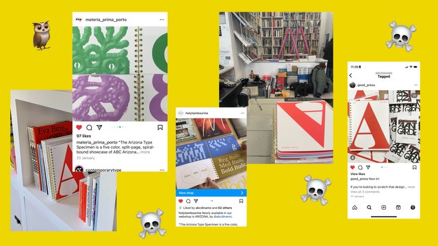
The Arizona Type Specimen has been travelling big distances and found new homes in many of my favorite bookstores.

You can now pick up the spiral monsters in MZIN (Leipzig), Yvon Lambert Libraire Editeur (Paris), Chandal (Barcelona), Tambourine (Madrid), Matéria Prima (Porto), Book Therapy (Prague), Tenderbooks (London), The Brand Identity (London), Good Press Gallery (Glasgow), AAVVGG (Toronto), Sans Serriffee (Amsterdam), Papercut (Stockholm), Actual Source (Provo, UT), Draw Down Books (Guilford, CT), The Book Society (Seoul), Post Poetics (Seoul), Pon Ding (Taipei), and ProQM (Berlin). Many thanks to our stockists for supporting our first Dinamo Editions title — we’re excited to reach new minds via your shelves!
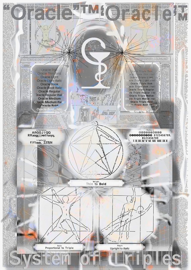
Thank you for checking in with the latest issue of The Dinamo Update. You can read all of the back issues in our archive.

Love,
Dinamo

Dinamo Typefaces GmbH, Glasower Str 44-47, 12051 Berlin
Copyright ©2024, All Rights Reserved