Here’s six instructions for our latest release. —

Welcome to the latest issue of our newsletter, where I’ll continue to share the latest ongoings at the studio. Take a look at our our archive.

Was this forwarded to you? Sign up now! (*◠‿◠)

Hey Friend,

ROM drops today. A sturdy, confident fusion of classic Grotesk and Gothic typeface styles, designed by our longstanding collaborator and dear friend Seb McLauchlan. It combines the rationalized lines of one genre with raw details from the other, resulting in moments both beautiful and dissonant.

Instructions for a ROM campaign. Follow them perfectly and you will be rewarded with a sense of accomplishment.

Taking inspiration from typeface applications in conceptual art catalogs from the ’60s and ’70s, ROM’s proportions are wide and generous in caps, and narrow and elegant in lowercase.

ROM contains six subfamilies, seven weights, italics, and also comes as a variable font file.

Core characters

6 Widths

7 Weights

I. Dig a hole in your garden & drop your thoughts inside. Let(’s) go.

origins

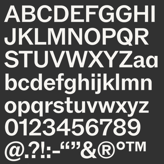
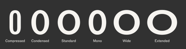
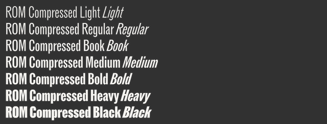
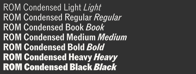
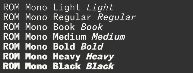
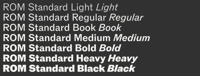
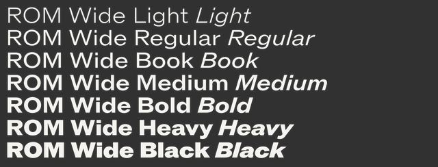
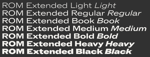
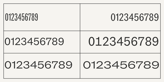
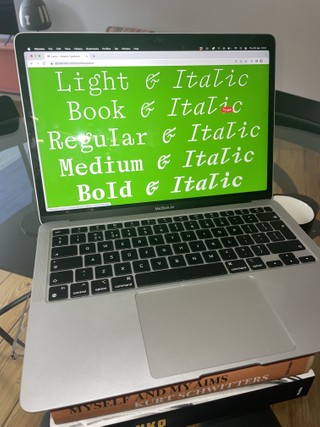
In true Dinamo style, Seb is a graphic designer first who makes fonts second. In search of a mature typeface in the spirit of Franklin Gothic, Bell Gothic, or Akzidenz-Grotesk for his own publishing projects — one with a complete weight range that he could use sparingly — Seb took to a blank page and started constructing ROM.

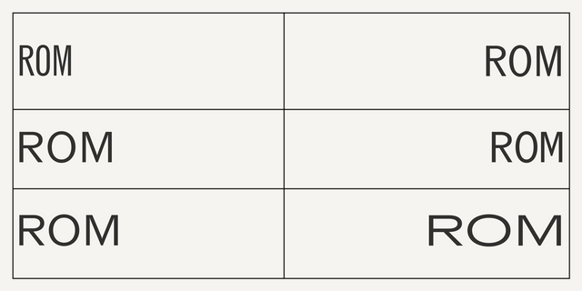
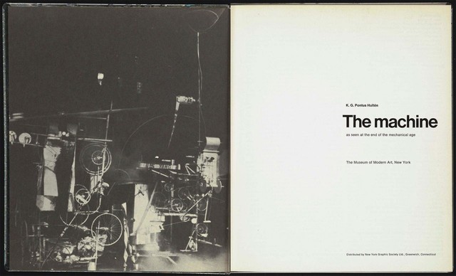
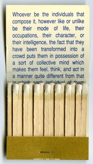
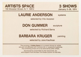
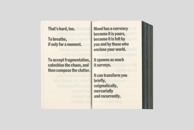
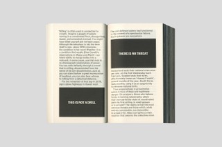
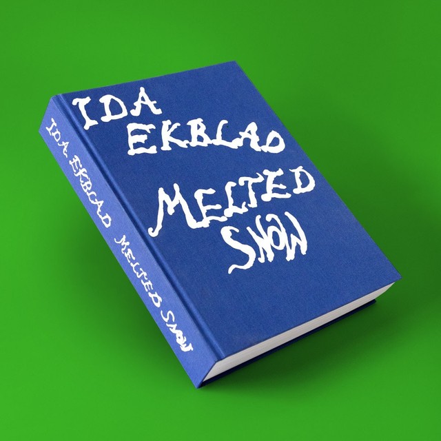
Below is inspiration from our joint archive.

The instructions for Sol LeWitt’s “Wall Drawing #118,” 1971.

Announcement for Louise Lawler and Sherrie Levine's “His gesture moved us to tears” at their ad hoc gallery, A Picture Is No Substitute for Anything, 1981.

Envelope for Announcement for Louise Lawler and Sherrie Levine's “His gesture moved us to tears” announcement, 1981.

K. G. Pontus Hultén, “The Machine as Seen at the End of the Mechanical Age,“ November 27, 1968 – February 9, 1969. Museum of Modern Art, catalog, 1968.

Louise Lawler. Matchbook for Carnegie International 1991, Carnegie Museum of Art, Pittsburgh, 1991.

Invitation to Laurie Anderson, Don Gummer, Barbara Kruger exhibition at Artists Space, New York, 1974.

II. Scroll for two epochs. Repeat. Do it again.

6 Widths

ROM features six subfamilies that flow gracefully from Compressed to Extended. Notice what happens to the O’s counter as it grows — shifting from diamond to rectangle to circle. It’s in these details that you can see ROM’s various influences and how they’ve been brought together under one variable roof.

Counter construction changes on the width axis

How many friends can the average person have?
What has come to be known as Dunbar’s number contends that humans are only cognitively able to maintain about 150 connections at once. That includes an inner circle of about six close friends, followed by larger concentric circles of more casual types of friends. Now if we apply – translate! – this to widths? All you need = six widths.

7 Weights

Believe me, we tested nine weights plus but ultimately settled on the best of seven. What’s possible (more) isn’t always what’s best. 😤

Compressed if you have a little space

Condensed if you have a bit of space

Mono if you want monospace

Standard if you have standard space 🙄

Wide if you have more space

Extended if you have a lot of space

III. Cut up this newsletter and let it get lost in the wind.

Vibe

ROM is ideal for amplifying messages in a powerful way. I think it works for a range of expressive applications too, especially in its extreme widths and weights. My tip would be to combine several widths of ROM in one, to create vibrant, rhythmic lettering!

IV. Reply to this message with seeds of any kind. Take note of what returns.

Alternates

ROM contains a thoughtful number of alternates, including a single story a, a schoolbook-style G, and a hook-nosed 1. Rounded punctuation departs from the source material for a friendlier feel.

Activate the rounded punctuation set if you want to speak in a soft, friendly, and rolling dialect

Compact setting

A compact setting option as well as small caps allow for a variety of layouts. They’ll help you fit lots of information into condensed areas, or achieve extra visual punch if needed. It’s a nod to that era of designer who wanted their letters to be tight not touching.

For tighter spacing situations

These characters come with design-space-eco-friendy (aka squashed) variations

Activate the Compact OpenType feature for shorter letterforms

MY LIFE IN CAPS LOCK!!!

Uppercase and small caps let you arrange letters in rigid or playful ways

Numbers

ROM’s character set contains a wide range of numerals, like superiors, inferiors, tabular numbers, and fractions.

V. Listen to the sound of your inbox emptying.

Early Use

ROM has already travelled some stretches, appearing on the many pages of OK-RM and James Taylor-Foster’s collaborative softspot project. The book contains a patchwork of prose, verse, and visual work that oscillate between the subjective and the objective; I enjoy how ROM’s voice helps shape the publication’s soft yet strong character. Published by InOtherWords.

406 pages, 136 x 75 x 86mm
ISBN 978-1-9160024-8-7

ROM also caught the eye of Dan Solbach when he designed the catalog for Norwegian artist Ida Ekblad, titled Melted Snow and published by Kunsthalle Zürich.

500 pages, 23.5 x 32 cm
ISBN 979-12-80579-35-5

I also like ROM Condensed and Narrow in this beautiful publication produced in close collaboration with conceptual artist Susan Morris and designed by Christopher Lawson. Made to accompany Morris’ six piece Jacquard tapestry installed in The Library and Study Centre at St John’s College, University of Oxford.

120 pages, 21 × 29.7 cm
ISBN 978-0-9933621-4-9

IV. Download the typeface. Use it where you can see the sky.

Campaign

Seb, generous as ever, gave our co-founder Johannes a first edition of Sol Lewitt’s Squares with Sides and Corners Torn Off for his [REDACTED] birthday, a full-circle-kinda-event that gave us the inspiration for the launch campaign of ROM.

Designed by Sascia & Mathias

We can’t wait to see what you do with it.

Walter Caption Contest

In each issue of The Dinamo Update, we provide a new Walter cartoon in need of a caption. You, the reader, can submit your caption by responding to this email or by commenting on our caption contest IG post. The best three responses win the complete Walter Alte.

Scroll on for the last round’s winners — as well as the new contest.

THIS MONTH’S Contest

What are the Walters doing this time? Send us your caption to win.

ROUND 4 Finalists

🏆🏆🏆

Congratulations to our winners. Your files of ABC Alte Walter are on their way!

Studio Updates

Laica Mono,the new monospaced cousin of Laica, is available — designed by Alessio D’Ellena

We designed the new logo for Bershka, its 90s inspired youth line, BSK (both based on ABC Whyte) as well as its first ever monogram that will be revealed soon. Thx to Daniel, Ruth, and Carmen!

Kimya Gandhi is in the last stages of finishing Favorit Devanagari. Here she is with Fabian and Maddy, preparing for the launch.

Simon has been package testing for a new Hardware season 👀

Ginto Greek is it the testing phase! Translated by the eyes of Panagiotis Haratzopoulos.

PS

AAVVGG is a beautiful design store in Toronto, and its people reached out to us a while back for a bespoke Monument Grotesque. You can now buy AAVVGG Monument Grotesque through its webstore; I like how the team see our fonts as beautiful objects in their own right, something to sit next to chairs and coffee tables. Last Friday, creative director Chris Hanz interviewed Johannes over SMS. You can read the whole thing here.

Thank you for checking in with the latest issue of The Dinamo Update. You can read all of the back issues in our archive.

Love,
Dinamo

Dinamo Typefaces GmbH, Glasower Str 44-47, 12051 Berlin
Copyright ©2024, All Rights Reserved