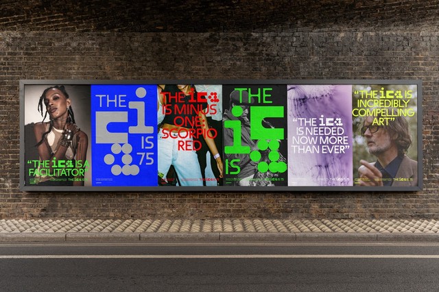
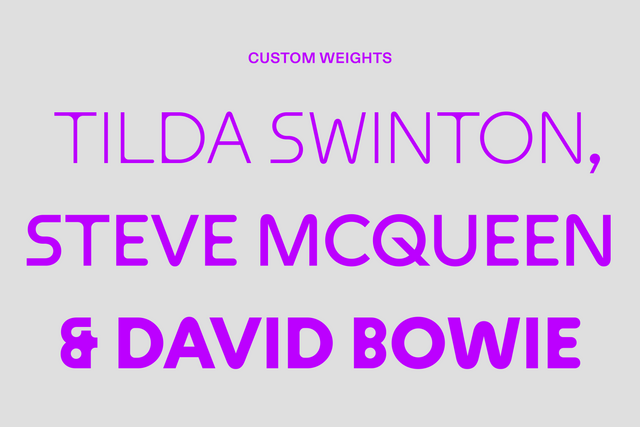
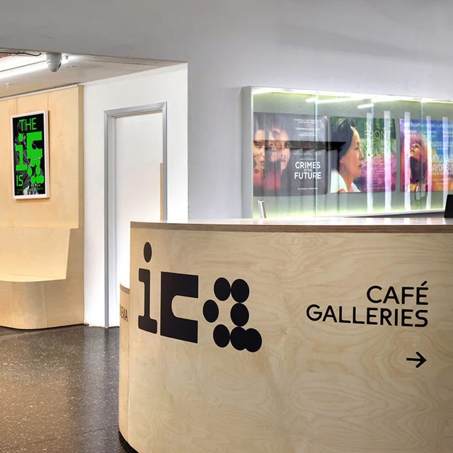
Plus a bespoke typeface for Harvard GSD, the next Walter Caption Contest, a peek of Whyte Hebrew + more —

Welcome to the latest issue of our newsletter, where I’ll continue to share the latest ongoings at the studio. Take a look at our our archive.

Was this forwarded to you? Sign up now! (*◠‿◠)

Hey Friend,

Our bespoke cut of Maxi Round for the Institute of Contemporary Art in London recently launched, commissioned by art director Chris Chapman. We’re excited to share it with you.

As a future-facing institution that stands for newness and difference, Maxi’s playful forms feel like a great partner for the ICA.

Chris asked us to tone down four key characters for his design: M, N, S, and g. This keeps the vibe of Maxi alive but lets other branding elements — like logo and photography — take centre stage.

Click here for the full case study. Or scroll on for highlights.

Photography by Philip Vile

Customized character set of ICA Maxi Round

The Customization

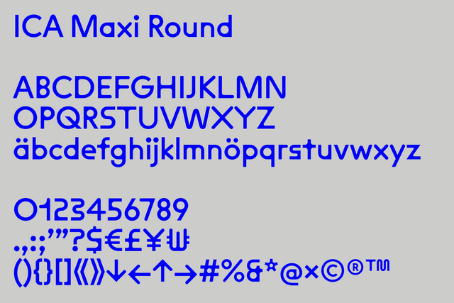
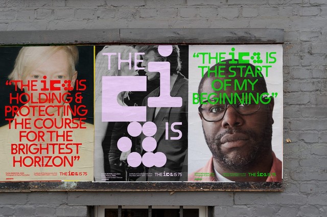
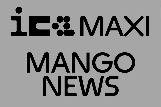
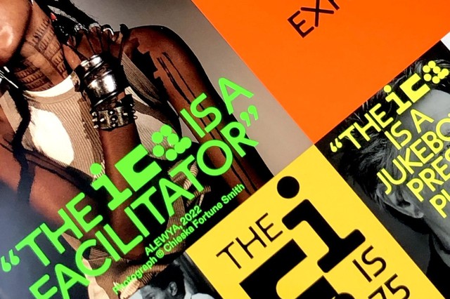
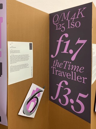
Maxi is a warm type system of spaghetti movements and angular strokes. Its underlying skeleton references mid-century and post modern Swiss design.

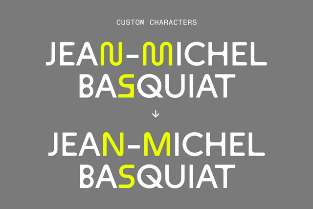
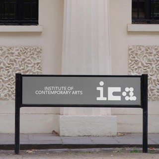
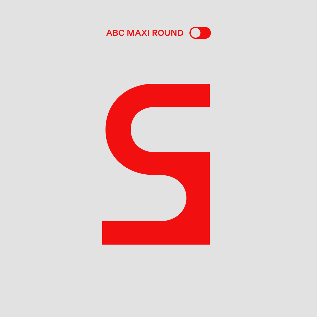
For ICA Maxi, we streamlined a couple of especially loud moments in the typeface, so that it could work in the broad range of contexts needed for the art and culture institution. We smoothed the bottom angles on the uppercase S and firmed up the corners of the uppercase M and N. Overall, the flavor of the font family is retained. But everything feels a little bit simpler.

Our new M is based on the same shape construction found in our original A and W

We also smoothed our box S into a snaking S

We pulled out the corners of the N to make it steeper

We also created a single-story g to replace our standard binocular version. We think it lends the typeface a cleaner, more direct feel.

Shout out to Tina for designing these gifs <3

Weights

The ICA uses ICA Maxi in three weights: Light, Normal, and Bold. So we added three weights to our custom characters, pumping up the rounded corners and thinning them out to complete both sides of the spectrum.

Bespoke Name

To help the ICA’s in-house designers keep track of their font files, we gave the new typeface a bespoke name: ICA Maxi. With the prefix “ICA” added to the font, it’s easy for everyone to find the correct files.

Font Pairing

We recommended our Diatype typeface as a solid pair for Maxi. The text friendly grotesque is warm and sharp, ideal for reading on screen. And we think its honest, raw shapes match nicely with similarly honest Maxi. The ICA uses Diatype across its identity for body copy.

A Note from the AD

The ICA is and has always been a progressive institution that brings together the different and new. We tried to reflect this in the logo, bringing together different forms, not fully synthesizing them. Maxi felt like a great fit as it also had composite forms, rounded and angular. But we knew that the font would have to work in a wide range of contexts so opted to standardise some characters.

Chris Chapman

Thank you Chris! And to designer Beatriz Cóias and creatives Rebecca Lewis and David Kolbusz. We feel truly blessed to see Maxi become the face of this world-renowned culture centre.

Walter Caption Contest

In each issue of The Dinamo Update, we provide a new Walter cartoon in need of a caption. You, the reader, can submit your caption by responding to this email or by commenting on our caption contest IG post. The best three responses win the complete Walter Alte.

Scroll on for the last round’s winners — as well as the new contest.

Walter Caption Contest

What are the Walters doing this time? Send us your caption to win.

Round 5 Finalists

🏆🏆🏆

Congratulations to our winners. Your files of Alte Walter are on their way!

Studio Updates

Our bespoke typeface for Harvard’s Graduate School of Design spotted in the wild. Many thanks for reaching out to us for this project, Chad!

Mathi and Sascia have something explosive planned for the upcoming release of Gaisyr

Another one from our weekly type design meeting :) Hello Ethan, Hugo, Samira, Fabi, Olga, and Fabian.

Congratulations to our former intern and close collaborator Samira for graduating from ECAL!

Dinamo Mexico meet-up: Fabi, Lira, and Johannes <3 <3 <3

Maddy and Tina color matching in Berlin

Fabian has been proofing Daniel’s new Whyte Hebrew in the garden

PS

Dearest Seb talked type design and education with Fontstand. Specifically his interest in an “alternative pathway that is not necessarily deeply rooted in academic history and builds out of personal interest + curiosity.” We’re proud to have him in our orbit ♡

Thank you for checking in with the latest issue of The Dinamo Update. You can read all of the back issues in our archive.

Love,
Dinamo

Dinamo Typefaces GmbH, Glasower Str 44-47, 12051 Berlin
Copyright ©2024, All Rights Reserved