Plus how to update your old licenses —

Welcome to the latest issue of our newsletter, where I’ll continue to share the latest ongoings at the studio. Take a look at our our archive.

Was this forwarded to you? Sign up now!

Hi Friend,

I have a few updates for you today: First, we’re releasing a new edition of our The Arizona Type Specimen, designed by our good friends at Studio HanLi. Next, there’s a new case study for our Snøhetta typeface online. Scroll on for all of that — plus Walter Caption Contest winners, Tina’s digital room for SuperInternet, and a few other bits and pieces.

The Arizona Type Specimen 2

With our first edition of The Arizona Type Specimen sold out in just under a year, we’re releasing a new and expanded second edition under our Dinamo Editions imprint.

Thank you to everyone who bought the first one — and to all of our independent stockists around the world. Hopefully this updated run will win itself a space on your bookshelves, too; it comes complete with a new Pantone color palette, a troupe of animals illustrated by Célestin Krier, and caterpillar green spiral binding.

290 x 230 mm, offset printed on 250g Arena White Smooth paper

Printed in 5 colors: Pantone 306U (blue), 375U (green), 266U (purple), 1585U (orange), and 724U (brown)

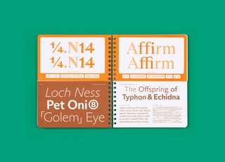
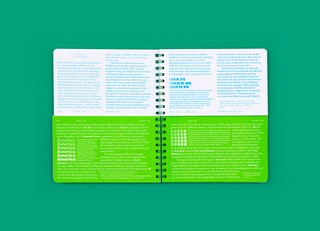
This five color, split-page specimen showcases ABC Arizona, the first ever sans-to-serif Variable Font that packages its five looks — Serif, Text, Mix, Flare, and Sans — into one single file.

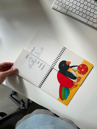
Designed by Studio HanLi, the book mirrors Arizona’s countless combinations through its split structure. You can mix and match the half pages to discover the typeface’s vast system, just like monster picture books for kids.

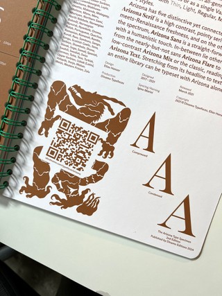
An essay by type historian Ferdinand Ulrich places ABC Arizona in conversation with other sans to serif experiments from the past, including Otl Aicher’s Rotis. And Célestin’s new illustrations let you create your own Frankenstein creations with mismatch animal bodies and legs.

Elias bts with photographer Nora Hollstein

Lucas & Elias of Studio HanLi

Mein erstes MIX MAX, aka the inspiration

HanLi hinterhof

Sneak peek for what’s next for Arizona

Reminder: Educators can reply directly to this email for free library copies of all our Dinamo Editions titles (while stocks last). And you can reply directly to this email if you’d like to stock The Arizona Type Specimen in your shop.

New Client Work

Norwegian transdisciplinary architectural practice Snøhetta reached out to us to create a font customization and bespoke wordmark for its recent identity overhaul.

We ended up rounding and tweaking core characters of our ABC Social, and also adding a new set of glyphs, creating a bespoke cut named Dovre Social. Discretionary ligatures including logomark are embedded straight into the font files.

Walter Caption Contest

In (most) issues of The Dinamo Update, we provide a new Walter cartoon in need of a caption. You, the reader, can submit your caption by responding to this email or by commenting on our caption contest IG post. The best three responses win the complete Walter Alte.

Scroll on for the last round’s winners — as well as the new contest. Or take a take a look at our Walter Caption Contest Hall of Fame for all our past winning submissions.

This Month’s Contest

What are the Walters doing this time? Send us your caption to win!

Round 11 Finalists

🏆🏆🏆

Congratulations to our winners! You should all have your font files of ABC Alte Walter.

Studio Updates

JB + Fabian gave a lecture at the Fashion Research Library in Oslo. Thank you Elise.

You can upgrade your font licenses at any time. Click for our new tutorial.

POV Daria finishing the details of Monument Grotesk Cyrillic with companion Giuseppe

Erkin, Tina, Hugo, Dan, Vanessa studio lunch

Olga working on her Gaisyr Cyrillic extension

Fabian managed to grow an avacado

PS

"I wish I could live here" — Tina

Our ’lil digital room for SuperInternet recently went live as part of the Wrong Biennale in Marsèll Paradise Milano. The team behind the project are trying to build a bottom up anti-metaverse where “users can be not-sad, or at least not exploited by design.” Our graphic designer Tina Lehmkuhl meticulously drew objects beginning with each letter of our name on every wall of our contribution. “The nose took longest to draw, I had to get the HEX codes on photoshop and then draw pixel by pixel,” she told me (the nose is 3 meters tall in VR). I highly recommend you take a stroll through the entirety of this new universe. Thanks to Gabriele & co. for the invite.

That’s everything for today. See you next time.

Love,
Dinamo x

Dinamo Typefaces GmbH, Glasower Str 44-47, 12051 Berlin
Copyright ©2024, All Rights Reserved