New Native Instruments MASCHINE DINAMO, Fonts in Use, Type Mystery Tunnel & More —

Welcome to issue #7 of The Dinamo Update! In this monthly newsletter, we’ll be continuing to share the latest ongoings at the studio in a few parts.

Was this forwarded to you? Sign up now!

MASCHINE DINAMO: Collab with Native Instruments

We’re excited to announce the release of a hardware project that’s been two years in the making: the Native Instruments MASCHINE Mk3 Dinamo. As a producer of code and tools ourselves, we continuously feel drawn to software, engineering, and the whole cosmos around these fields. And we’ve been feeling extremely humbled by this opportunity to produce the MASCHINE DINAMO, which features ABC Whyte Inktrap across every detail of the controller, laser-cut or printed in white, silver, and black. Limited to 750 units only.

We first met NI hardware designer Johannes Schroth at a dinner party seven or eight years ago—a long time in Berlin. A few years later, Schroth approached us with the idea of bringing type to the forefront of the MASCHINE storyline. We didn’t know that he was working on the product at the time and were completely blown away by the technology. As we have our Hardware sub label that’s dedicated to the production of tangible objects, it was an obvious, dream partnership for us.

NI interviewed us about MASCHINE DINAMO for its blog. Below is a small, edited excerpt, or you can read the whole thing online. 🌌

Clueless Dinamo representative with NI’s industrial designer Johannes Schroth

Renderings by Robert Fehse
Photos by Kasia Zacharko

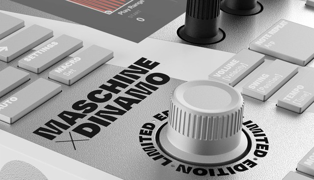
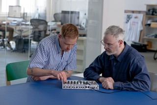
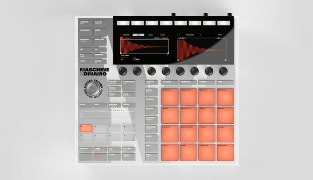
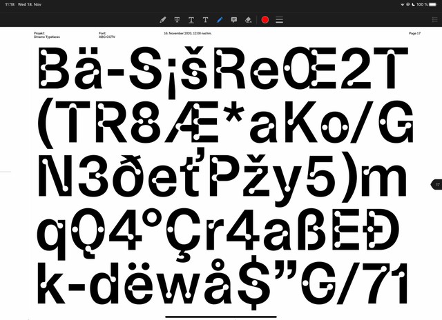
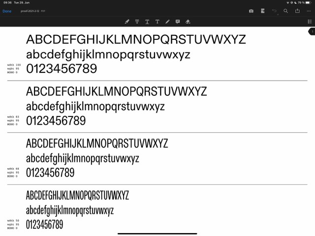
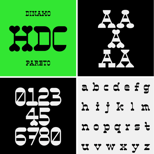
“One of the defining features of the typeface Dinamo and Schroth settled on for the MASCHINE collaboration has an anachronistic edge to it—with a surprising benefit. MASCHINE DINAMO’s typeface, ABC Whyte, uses the idea of ink traps. ‘Today, with high-res screens and modern printing, you don’t need ink traps—everything is super sharp,’ explain Dinamo. ‘So we wanted to look again at ink traps through the lens of modern technology.’

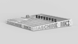
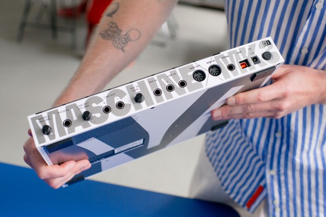
“As a variable font, designers can, for example, morph between having no ink traps at all and having huge ink traps that dominate the look of the glyphs at any size. And on close inspection, it’s clear that this adaptability is put to good use on the MASCHINE DINAMO—from the huge, squared-off M shape that sandwiches the the hardware, to the ‘ticker tape’ running around its edge and the tiny labels on each button and pad.

“‘What I find so interesting,’ Schroth says, ‘is that something that was designed to minimize ink bleed in a traditional printing press can also help minimize light bleed in a modern application. The function labels on Maschine’s buttons are lasered in, and the backlight shines through to make them readable. The ink traps actually serve to make those labels appear better defined than they otherwise would.’

“Dinamo was insistent that the overall design ought not to add anything extraneous, and rather ‘celebrate the object itself by labelling it. We think, often, in these kinds of collaborations you see people adding adjectives and so on—‘made in Berlin’ or whatever. We’re obviously not on board with any of that, we just wanted to call it what it is.’”

Read more about the MASCHINE DINAMO over at NI
Take a look at ABC Whyte yourself
Try out ABC Whyte as a Variable Font in our Gauntlet

M like Maschine

Dinamo Fonts in Use

Dinamo’s dear Tina Lehmkuhl has begun implementing new type in use sections at the bottom of our typeface pages. We feel it’s an exciting way to express gratitude to designers that have used our fonts.

Sometimes, such “Fonts in Use” pages can seem like they’re top-down showing people how they should design. We don’t want our section to feel that way—people who use our fonts know what they want to do with them. That’s why we’re featuring images not only of a final design object, but also of the production process, the people, and the places around a project. You know, the context and soul of the font’s new home. 🏡

Page size trigger warning: Lots of images loading at the same time

If you have a great application of one of our typefaces, please send it to us. To be featured, we need:

- High res photographs—the format doesn’t matter
- Images of and around the final object itself
- Photographs of the event or context it was designed for
- Insight into its production process, so maybe images of someone at the printer with ink buckets everywhere, someone else proofing colours, mounting, etc.

Send them to tina@abcdinamo.com 🙏

Tina

Adding examples of type in use to our website is an ongoing process, and we ultimately want a big collection of them! Thank you for contributing to it. And take a look at some of the sections we’ve already begun growing:

Arizona in Use
Favorit in Use
Marfa in Use
Diatype in Use


Type Design Updates

Believe it or not, we’ve now started a weekly “quick catch up call” 😩😵‍💫🤧 with everyone in our core design team. The first was a total disaster and took up half of the day, but we’re working on it. Why? We feel it’s important to see everyone and celebrate the great team that we have. This new scheduling comes at a time when we’ve got many new typefaces in different stages of development. Let’s give you a better idea of where things are at:

Past

ABC Camera (formerly CCTV)

  • ABC CCTV, which we’ve renamed as ABC Camera (because we’re not such big fans of surveillance, really), is with our font engineer Rob receiving its last technical touches, having been designed by Dinamo with Sascha Bente.
  • After six years and almost one lawsuit, ABC Oracle, drawn by Johannes Breyer with Andree Paat, is in its final stages. A campaign for its release is currently in the works, with the input of London-based illustrator and animator Gianluca Alla.
  • ABC Gaisyr, designed with Mike Nigra, is on its way. The small serif family will include Regular, Italic, Mono, and Semi-Mono weights. If Mike agrees to last night’s email—which we hope he will!!—we might even add a Bold weight ;-)

Present

Diatype Normal/ Condensed / Compressed

  • Fabian Harb and Renan Rosatti are currently working on ABC Diatype Condensed from our Basel satellite.
  • Erkin Karamemet is keeping busy in Cologne with both ABC Diatype Extended and Expanded, and, of course, he’s also working on his own ABC Repro.
  • From their studios in Tel Aviv, Daniel Grumer and Yanek Iontef are adding to Favorit’s ever-growing Favorit International family with the development of ABC Favorit Hebrew.

Future

ABC Gramercy

  • ABC Gramercy, which takes its namesake from both the park and tavern in NYC, is in development. It’s a serif—we’re currently pushing towards adding more of them to our library.
  • Rani Yasmine Putri, Giliane Cachin, and Margot Lévêque are each working on their own secret release—rest assured, their designs are all smart in concept and powerful in execution. We guess we’ll see these surface in and around 2022-23, and we’re glad they’ve joined the Dinamo roster!
  • ABC Walter Alte and Walter Neue, our joint research and design effort with Omni.Group, is finished with kerning and being reviewed one last time by many pairs of beautiful eyes.

Type Mystery Tunnel in Barcelona

Unpaid partnership

Some business insights

With his vaccine sorted, Johannes gave a lecture at ELISAVA, the Barcelona School of Design and Engineering, following Marc Panero’s kind invitation. His lecture, charting how Dinamo has developed over the years, is now streaming on YouTube, with an impromptu introduction by Hugo Hoppmann.

While in the city, Johannes also managed a trip to Folch Studio—many thanks to the team for the coffee and introduction to their varied indoor and outdoor activities.

  • This nice group picture and video featuring the results from our Variable Font workshop at the Vienna University of the Arts came in. Thanks again to Prof. Oliver Kartak & crew!

  • Our next travel stop in August is the Strelka Institute in Moscow, and we’re very much looking forward to that one.

Project Updates

We’re picking up a slow moving yet long lasting project with our good friend Stefan Marx, an artist that has always used words and typefaces in his drawings and paintings. The goal is to digitize three of his staple handwriting styles—a zig zag style, an outline one, and a monolinear pen style—turning them into fonts that both Stefan and others can use. It’s an interesting idea, opening up your own handwriting to public use. Lots of work has already been done by Tanja Modrakovic and Stefan, and we’re about half way done. An early version of the fonts, as well as ABC Oracle, feature in Stefan’s latest catalogue. Book design by Michael Satter. 🎨

IRL book signing at Kunsthalle Düsseldorf

VR online book signing

A beta version of Stefan’s typeface mixed into ABC Oracle

Bespoke Font Projects

  • Fabian and Renan are working heavily on a new project for online sneaker marketplace (and more) GOAT from Los Angeles. Cheers to Sam Weissler, Josh Webman, and Roberto Rodriguez! We’re developing a great vision with the GOATs and are excited to contribute to their journey and expansion.
  • More shoes! We’re also finishing up a bespoke font for on.shoes in Basel, a high-tech running shoe company. Many thanks to the design team including John McCusker, Luke Kurbalija, Dominik Ulmann, Michele Brianza, and Gerald Marolf!

GOAT’s usual, neat, and tech-smart display

On shoes. What’s up Roger

Aaaaand we helped design agency AKQA develop the new RTL logo. Yep, that happened. Throw back to our teenage years spent watching Gute Zeiten, Schlechte Zeiten. Thanks to Tine Knies, Ludvig Pehrson, Frederik Geisler, Caroline Seifert, and Julian Weiss for the good times, and everybody else who contributed to the 500 emails that revolved around those 3 letters. 😅

R T L 👌🏻 (Renan even manually hinted those 3 bad boys! Hopefully the last time at Casa Dinamo)

More Difficult Times Ahead

Difficult Times is the less optimistic, more realistic sibling of Different Times. We made the shirt when Trump came to power in 2016, and we haven’t done any editions of it yet. This first iteration is particularly special, as it’s a group effort between two collectives on either side of the Atlantic.

We teamed up with the LA-based, hyper-productive energy ball that is Mouthwash to produce a white-on-black special edition of Difficult Times. Comes with an extra-large, folded label.

Watch out for this drop. It will only be available via the Dinamo Hardware store and MOUTHWSH, the offbeat experiment of Mouthwash.Studio.

P.S.

Mini poster

Gravity exercise Theraband®

Thank you for checking in with our latest issue of The Dinamo Update. You can read all of the back issues in our archive.

Speak soon,
Team Dinamo 🐠

Dinamo Typefaces GmbH, Glasower Str 44-47, 12051 Berlin
Copyright ©2024, All Rights Reserved