ABC Arizona is a Sans, Serif, and Everything In-Between + Dinamo Family Rings and New Accents for Our Trials 💍 —

Welcome to issue #4 of The Dinamo Update! In our monthly newsletter, we’ll be continuing to share the latest ongoings at the studio in six or seven parts.

Was this forwarded to you? Sign up now! (◠‿◠)

Enter ABC Arizona: Five Fonts in One

After three years in the making, we’re very excited to finally release ABC Arizona into our Early Access area today. ABC Arizona is the first ever sans to serif superfamily that packages its five looks—Sans, Flare, Mix, Text, and Serif—into one single font file.

The idea for ABC Arizona took shape back in early 2018, when Variable Fonts (VF) first started to be used more regularly on the web. Type designers Elias Hanzer and Lucas Liccini found an old sketch drawn by Arizona-residing Tom Carnase, featuring letters built around serifs—so that the Bold only had small tails. Over the next years, Elias began building on design history’s fascination with bridging sans and serif in one project (like Otl Aicher’s Rotis), but with the additional hand of variable font technology.

Throughout the process, Elias kept designing on both ends of the spectrum, trying to make sure that all of the typeface’s parts could shine individually, while also chiming as a whole.

As a multi-purpose VF, ABC Arizona slides from one extreme to the other, allowing you to explore every step in-between. In other words, it’s a slim all-genres-in-one font happy-meal, versatile and adjustable for any context. To not get lost in the jungle-of-variable-possibilities, we also offer the five distinctive sub-families from the Arizona spectrum as static font files.

Distinctive design feature: in Arizona’s Italics, the end strokes remain vertically upright 🥵

Working on a project like this had its challenges. A considerable amount of brain power was required in order to focus on all the tiny details within each style, all the while keeping the overarching concept in sight. Each character needed to be drawn in a way that ensured every letter is “interpolatable,” so that it’s possible to segue from one of the font’s extremes to the other.

Every letter across the five families has the same amount of points, handles, and curves

Elias has been a core contributor to many of our past and ongoing projects, and for us it’s a real pleasure to see him carve out such a beautiful, massive, and technologically forward-thinking piece of design 💛

-> Read about the challenges of creating the mega family
-> or play with the Variable Font yourself 🔛

Arizona Out There

ABC Arizona made its debut as the only typeface used in the variable identity for font design software Glyphs. This was followed by guest appearances across the new Fashion Research Library platform, founded by Elise By Olsen with graphic design by Morteza Vaseghi and Eric Hu. We also used ABC Arizona as the basis for our custom font for the SF Symphony designed with Collins (and presented in our last newsletter).

Glyphs App

Fashion Research Library

San Francisco Symphony

Dinamo x Garb Rings

Towards end of 2020, we commissioned product studio Garb to make 15 custom silver Dinamo embossed rings as gifts for our core team members. Below, we catch up with the Garb founders Sophie Frances Coates and Eloise Harris to hear more about how they approached this project.

Fabiola in Costa Rica

You’ve been officially collaborating as a studio for just over a year now, yet you’ve created many objects already. Tell us about how Garb came about.

We met in 2010 in South East London, and were inseparable until divided by studies, careers, and seas in 2014, so we reunited in 2020 with Garb as the glue. Our first ever duo-object (in 2010... pre-Garb) was casting an exact replica of a football shin pad in Resin, which took days of hard labor. Neither of us can remember why. Garb then emerged during the first isolations in March 2020. We began crafting together as a way to actively check in on one another. We love to overcompensate with material tactility to make up for the physical distance between us.

What was your concept for the Dinamo rings?

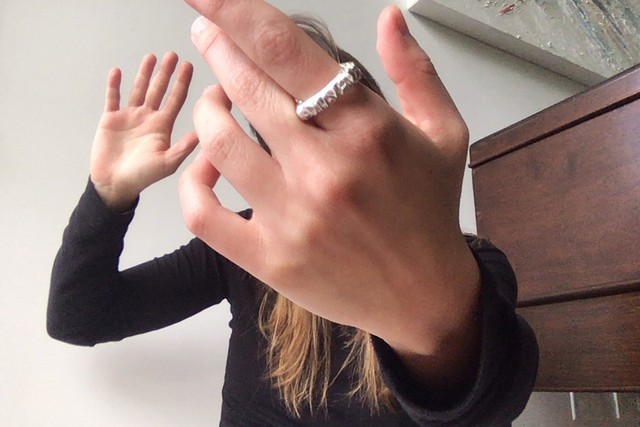
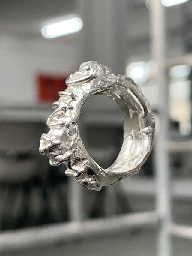
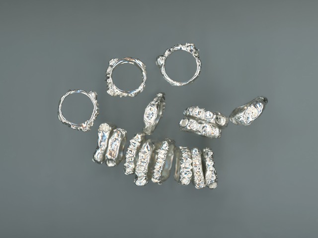
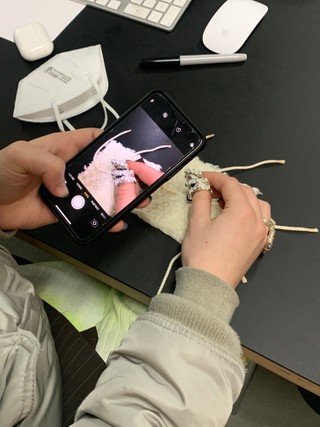
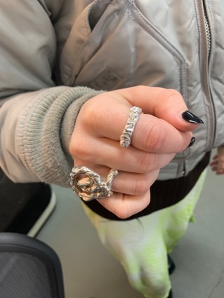
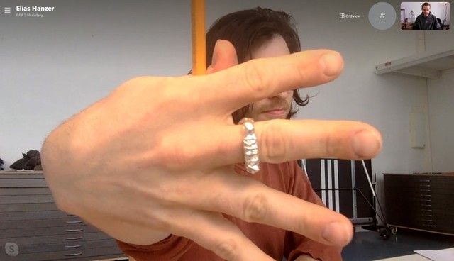
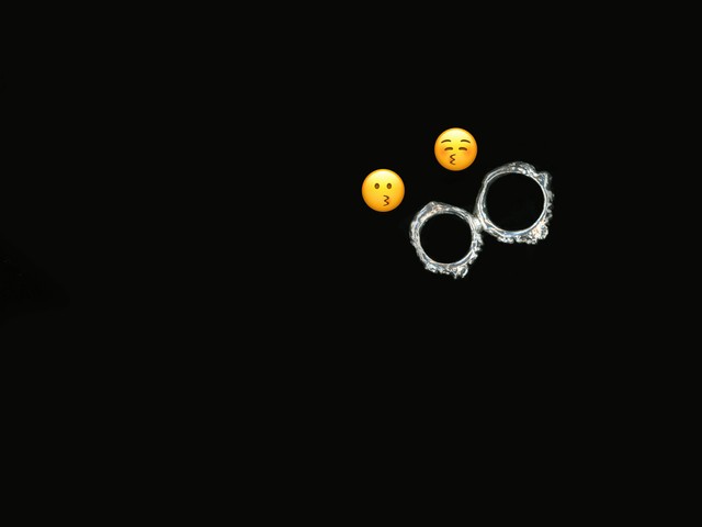
Fabian and Johannes asked for a family of rings, for the Dinamo members to own and cherish. A dream brief for Garb! It felt really familiar to us: Garb attempts to connect people through objects (especially as we’re also a cross-ocean studio). The rings connect to the next with little knobs and notches. When fitted together, they form a custom network. Each ring was hand moulded in wax, with a “Dinamo” emboss, and then cast in silver. Originally we were going to make mini engraved tags for each ring... Thankfully we didn’t though, as everyone would have had hanging jiggly bits on their rings! To soften their journeys, we wrapped each ring in cotton wool—our custom fabric wraps, adorned with Garb’s label in Marfa.

Tina in Norway

Elias in Berlin

All rings can be connected to each other, some say, they kiss

Garb’s rings have been shipped to several places around the globe! Dinamo members can connect their rings to each other whenever they meet in real life. Thank you Sophie & Eloise, for these beautiful artworks ⛓️

-> Dinamo x Garb rings aren’t available to buy, but other goods are

Multi-Language Trials 👉🏻 All Accents Included 👈🏻

For a while now, people have asked us to send them accents that weren’t included in our trial font packages so that they can test them. Quite regularly someone will want to, say, test a font for a project in Norway but they’re unable to properly try it out because the øs and ås are missing.

Designers need to be able to test our typefaces in as many languages as possible and with all potential accents readily available, and so we’ve now extended our font trials to include all available accented characters. 🚘

-> Test drive our Retail and Early Access fonts here

Show Our Prices in Your Local Currency

In the spirit of better inclusivity, we’ve also added a currency conversation tool during check out. Simply hover over your total to see the price in whichever currencies you may need when calculating between you and your clients’ time zones. Let us know if your currency is missing!

Work + Travel

  • We helped refine the new logo for German design publishing legend form magazine. The new direction is masterminded by Anton Rahlwes, Nina Sieverding, and Autostrada Studios. We love all characters the same but f, o, r, m now have a special place in our heart.
  • We’ve started to work closely with ON—the Swiss performance running shoe maker—on a new set of custom typefaces. Very excited about working with the team around Gérald Marolf, John McCusker, and Luke Kurbalija.

New Releases

  • We’ve just welcomed ABC Whyte Mono and Semi-Mono, as well as ABC Whyte Inktrap and Inktrap Semi-Mono, to the ABC Whyte family. Plus four corresponding Italics! Many thanks to Fabiola Mejía for finessing all the details of this extension.
  • ABC Asfalt has just completed its journey from Early Access to its final stop in our Retail typefaces library. The elongated design is based on road letters, which are stretched along highways to compensate for the low perspective of an approaching car.
  • In other Early Access news, you can now see all our typefaces that are ready to unlock in one place.

P.S.

  • We just backed Berlin art institution E-Werk Luckenwalde in its quest to bring the 2019 Venice Biennale’s Golden Lion-winning beach opera Sun & Sea to its site in a renewable power station. This could be the first time that the performance is shown with 100% CO2-neutral electricity, plus it’ll take place in a former and disused Bauhaus city pool. Supporting sustainable exhibition making AND new jobs for cultural workers. Greetings to the team Helen Turner, Lorenz Klingenbiel, and Katherine Thomson. E-Werk Luckenwalde’s identity is typeset in ABC Monument Grotesk.
  • Dinamo team member Fabiola Mejía has been busy not just with ABC Whyte extensions, but also in launching Supercontinente, a new studio for typefaces and other experiments. We hear that it’ll be offering retail typefaces soon, and first up is Montiac. Follow along for news on Instagram, and check out Montiac in motion courtesy of the Dinamo Font Gauntlet.
  • Futuress just announced Against the Grain, its new online course and free-of-charge Fellowship Program fostering critical perspectives on the designed past and democratizing access to design history writing. Starting on April 16, every Friday the program welcomes a different lecturer to share their unique research and insights. The fully-female line-up features: Uzma Rizvi, Edna Bonhomme, Franca López Barbera, Evan Nicole Brown, Tasheka Arceneux-Sutton, Bahia Shehab, Luiza Prado de O. Martins, and Sria Chatterjee—sign up, apply now!

Thank you for checking in with our latest issue of The Dinamo Update. You can read all of the back issues in our archive.

Speak soon,
Team Dinamo 🐋

Dinamo Typefaces GmbH, Glasower Str 44-47, 12051 Berlin
Copyright ©2024, All Rights Reserved