Plus Hangul and Japanese pairing recommendations, secret Porto news, a sticky Hardware drop + more —

Welcome to issue #15 of The Dinamo Update! In this monthly newsletter, we’ll be continuing to share the latest ongoings at the studio in five or six parts.

Was this forwarded to you? Sign up now!

New Release: Marist🥂

Designed by our core family member Seb McLauchlan, Marist is a warm and robust re-examination of the Old Style genre first imagined by Nicolas Jenson in 1470.

Forget the Metaverse for a moment. Imagine instead a quiet library with stained glass windows and stacks of books, a place where time seems to slow down and the mind has space for careful traveling. 🌹 Let’s take a closer look at this mystery serif.

Marist: The Gathering™

Uhm…? Better use those forensic tools sourced around Hermannplatz 😎

Tool 1: €8

Tool 2: €15

Tool 3: €600 🥴

Tool 4: €25

aha, now back to the books...

When French engraver Nicolas Jenson first developed his roman in 15th Century Venice, the highly legible typeface become famous for out performing everything else. In 19th Century London, William Morris then reinterpreted Jenson’s roman for his Golden Type, a celebration of craft aesthetics from the past and a typeface that questioned society’s reliance on technology.

Old Style serifs haven’t been as in vogue the last years (sharper, less historical serifs are more in favor), and so Marist picks up some of Morris and Jenson’s threads—fine tuning their forms for contemporary eyes and digital libraries.

Pretty proud of this one ngl

a little more serious, bitte? Just want to see the fonts!

Marist is a relaxed, reader-friendly font with prominent serifs and wide uppercase proportions that take their time. Small moments in the terminals gesture to the Old Style genre’s original inkwells, and certain characters—like the capital M—stand out with their distinctive double serifs.

Six weights & Italics. Definitely not Variable!

(yeah, yeah) 🎶

Cast

me

a

river…

😙 🎶

A note on the artist

Seb McLauchlan is an independent designer originally from New Zealand and based in London since 2015. He’s been one of our closest friends and collaborators since the early days of Dinamo, and he’s also the artist behind ABC Ginto and our upcoming ABC ROM. As well as designing type, Seb works as a graphic designer and currently teaches at Kingston School of Art.

Alongside receiving many notes on Marist from Dinamo’s Johannes and Fabian, Seb also thanks Kris Sowersby from Klim Type for his feedback and Rob for producing the font.

-> Crack open the Early Access lock and run!

Dinamo Variable Fonts Now on Cargo!

Precision font flexibility courtesy of our own Dinamo™ Variable Fonts© is now available at Cargo®. As part of the second stage of our partnership (read all about the first here), we teamed up with our friends in LA to bring the utility of VFs to site building contexts ⛳

Inside your Cargo, you can now flex and stretch:

  • ABC Arizona
  • ABC Diatype
  • ABC Favorit
  • ABC Gravity
  • ABC Monument Grotesk

Maybe don’t trust products that carry this logo.

How To Use Dinamo VFs on Cargo:

Cargo’s own Folkert, Matthew, Daniel & Josh described the new variable set up for us:

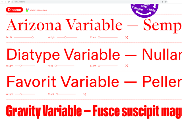
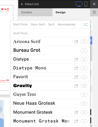
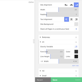
“A significantly lovely reason for using variable fonts on Cargo is that it reduces the amount of files required when loading a website. Non-variable fonts require each style (i.e. Regular, Bold, Italic, etc.) to be loaded as individual font files; with variable fonts, only one file is needed. Each style is now simply an instance—a point on a continuous range. Overall this makes the website transparent and light—which of course is what is wanted.”

Thank you to everyone at Cargo for this growing partnership!

“We were able to integrate the variable functionality pretty seamlessly—as ultimately it’s a natural extension of the typographic settings already in place. At the same time, we needed to signal that something new and special is going on with these particular families—so we added an icon to indicate a font’s variability.”

“We also use this icon to indicate the difference between a family’s pre-defined styles (i.e. Regular, Bold, Heavy, etc.) and when a different point on the range between these styles has been selected.”—Folkert, Matthew, Daniel & Josh

STUDIO UPDATES

We promised our editor to continue to transmit our Dinamo Updates in just five (or six) photos. This month we took our suitcase to Porto and continued to fine tune new translations.

Hangul + Japanese font pairing recommendations are now listed on several of our font pages. Many thanks to Min-Young Kim for the curation and expertise! Pic taken during our past exhibition in Seoul, Korea.

We’re working with Mike on adding weights to a second secret serif, ABC Gaisyr... Other weights can already be requested online & more styles are coming soon!

Still kinda secret but we’ve opened DINAMO PORTO! We’ll be looking for type designers to join our team there soon! 😉 🇵🇹 Also, maybe you can bring some proper grown-up-sized cups.

Bury me and my Excel sheet right here. Quarterly accounting meeting with Vani & Rea (Nea-Kosma) in one of Berlin’s finest graveyards.

Erkin proofing Repro & Repro Mono over the finishing line 🦦

New Hardware Drop

New sticky hardware just dropped. We should have done this a long time ago. 🐭 👻

Each pack is customised with a handwritten note from Mati, Johannes, Immo, or Sascia. Stickers look great on bright background and shitty on dark ones. Get them while stocks last.

-> Two stickers per pack
-> One in 3cm x 10cm and the other 1.5cm x 10cm.
-> Featuring ABC Maxi
-> Printed with transparent doming to maximise swag 🔥
-> €8 / $10 incl. shipping


Yes

No

No more jokes about Dinamo’s old age please.

Fonts in Use

Dinamo’s Tina keeps her eyes on how our fonts get used each month and adds them to our continually growing waterfall. Here are her most recent picks:

The Association NFT has partnered with the NBA to create dynamic NFTs for each player in the 2022 NBA Playoffs. Justin Montag @thisisfranchise pulled together a great team around Jacob Rochester, Sam Jayne, Stu Maingot, Justin Aziz, Hannah Chow, and Priscilla Young. Multiple widths of our Gravity in the game.

A double-wicked candle made out of 100% organic beewax and letterforms based on Monument Grotesk. Burn time is around 1h. Available via @wtp.pp in dark-teal, gold-yellow, & ice-blue. Handmade in Vienna by @elektrokobolt.

ABC Helveesti used for PeeledMaps.com, a website designed by @ungroup.group that lets you view tattooed body parts from a unique range of perspectives. Visitors are invited to contribute tattoos on their own bodies too. We can feel the spikes 🕷️

P.S.

Dinamo Variable Fonts Lab at Apple.

Johannes is giving a type design lecture and “first steps” workshop at the newly opened Apple store in Berlin. Amongst other things, it’ll explore how to develop fonts using the Apple Pencil and iPad. The event is open to everyone and you can RSVP via apple.co/dinamo-typefaces. Travel with J from Neukölln to scary Mitte and watch him sweat in his thrifted blue jeans and black turtle neck...

Thank you for checking in with our latest issue of The Dinamo Update. You can read all of the back issues in our archive.

Speak soon,
Team Dinamo 🐳

Dinamo Typefaces GmbH, Glasower Str 44-47, 12051 Berlin
Copyright ©2024, All Rights Reserved