A typewriter-inspired design, re-upholstered to ensure beautiful moments of long, untiring reading. —

Welcome to the latest issue of our newsletter, where I’ll continue to share the latest ongoings at the studio. Take a look at our archive.

Was this forwarded to you? Sign up now! (*◠‿◠)

ABC PUBLISHER, published!

Publisher is a typewriter-inspired design, re-upholstered for modern print and screen use. 

While embracing the genre’s mechanical honesty and authorial voice, Publisher’s letters are proportionally spaced to ensure beautiful moments of long, untiring reading.

MECHANICAL Warmth

The typewriter genre traces its roots to early monospaced designs such as Courier, defined by mechanical constraints and functional clarity. Later came proportional interpretations like ITC American Typewriter, which introduced a warmer, more expressive tone.

ABC Publisher continues this lineage with rounded, smooth edges that soften the mechanical structure and introduce a level of warmth nothing short of the comfort of true friendship.

family tree

Next to the classic typewriter-style Slab, we have the clean and elegant Sans companion. And between those, we have the playful Mix, a hybrid style that combines the best of both worlds.

All three subfamilies share the same underlying skeleton and design DNA, which means that you can mix and match them effortlessly across your work without tumbling into design-chaos.

alternates

With this one, we practiced maximum restraint (restraintmaxxing), including only four alternate characters. There’s a flamboyant double-storey g, a funky version of the a with a tail, a flat-top 3, and asymmetrical serifs for m, n and h.

As with all our fonts, you can use our free Font Customizer tool to create your own, custom version.

FLEXIBILITY

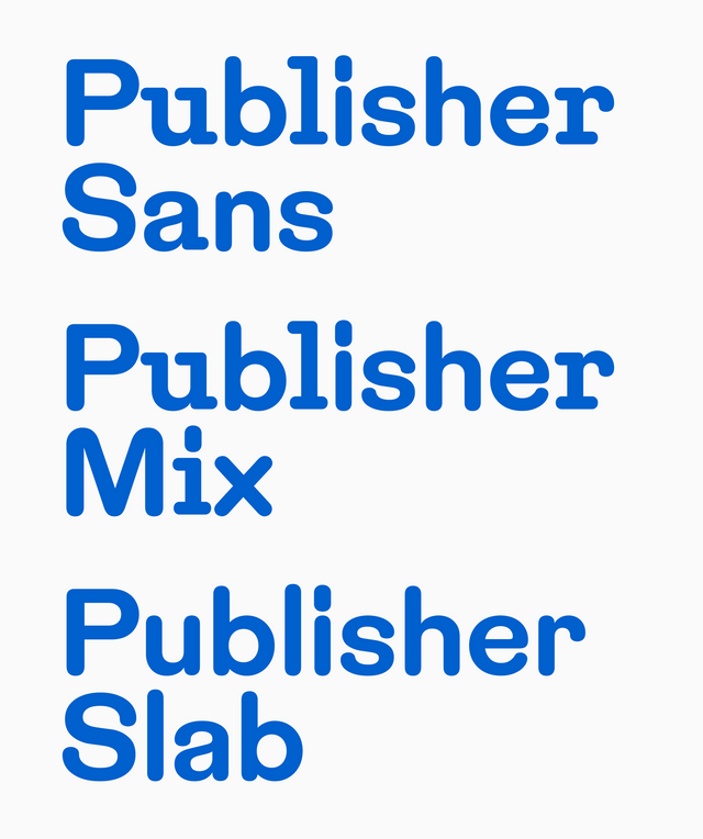
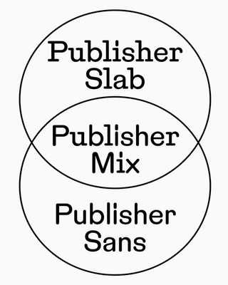
Spanning a broad design space from Condensed to Normal, across six weights with corresponding italics, the family offers exceptional flexibility for various types of text (body, compact, headline, etc), a capability rarely found in typewriter-inspired designs.

Everything is packaged into pocket-size variable fonts, allowing for fine-grained control of weights and widths.
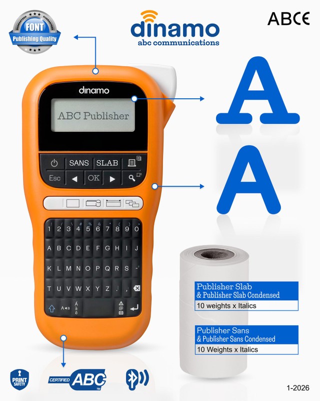
PEOPLE INVOLVED

Dinamo Designer (DD) Michelangelo Nigra led the development of the family, side-eyed by Fabian Harb, and accompanied by loyal supporter/saboteur Marc Rouault. Careful engineering by Roberto Arista and Hugo Jourdan followed, and a drop-shipped campaign by Johannes Breyer and Melanie Schmidt.

Happy Publishing!
Love, Dinamo

Dinamo Typefaces GmbH, Prinzenstraße 84, Aufgang 1, 10969 Berlin
Copyright ©2026, All Rights Reserved