Merging clean design with complex font engineering —

Just Circle It: ABC Repro ⚪ 🔘 ⚫️ ⭕️

Repro is our new friendly, flexible sans serif inspired by signage and digital operating systems; it’s a typeface that merges clean design with complex font engineering.

The extensive new family includes nine weights with italics as well as a monospaced variant and a variety of OpenType features, forming a comprehensive toolkit for users developing experiences both online or off. In addition to its range of sharp or soft alternates, Repro contains a unique tool for circled emphases, offering users a beautiful new way for creating visual hierarchy.

Our longest collaborator Erkin Karamemet has been developing this idea with us for over six years now. Everyone knows Erkin because his fingerprints are all over our typefaces—but this is his first artist release on the Dinamo label. 💀

-> Visit ABC Repro and try it out yourself, or doom-scroll with us!

Vibe check:

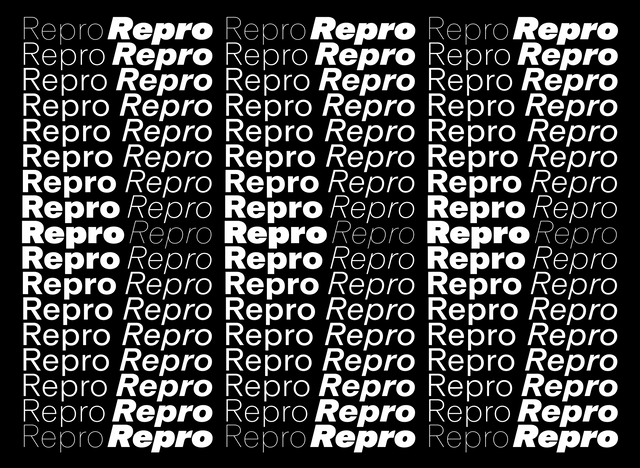
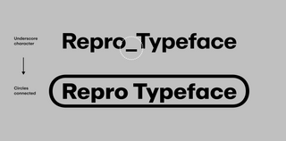
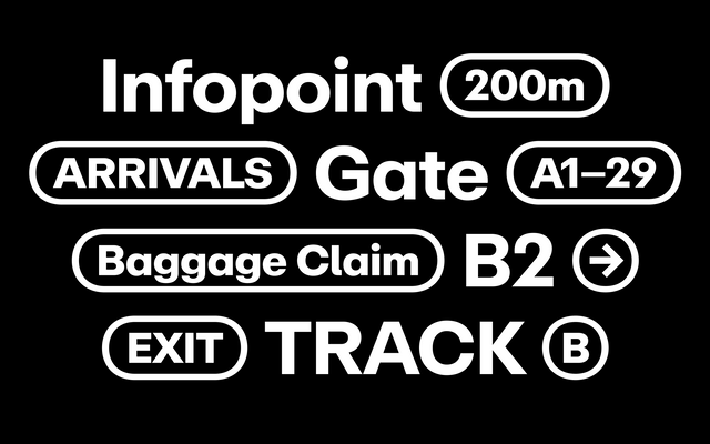
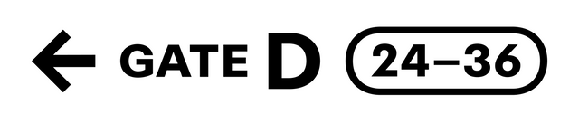
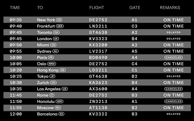
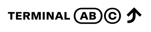
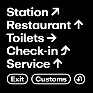
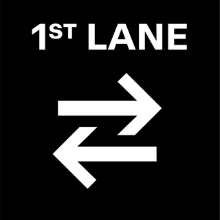
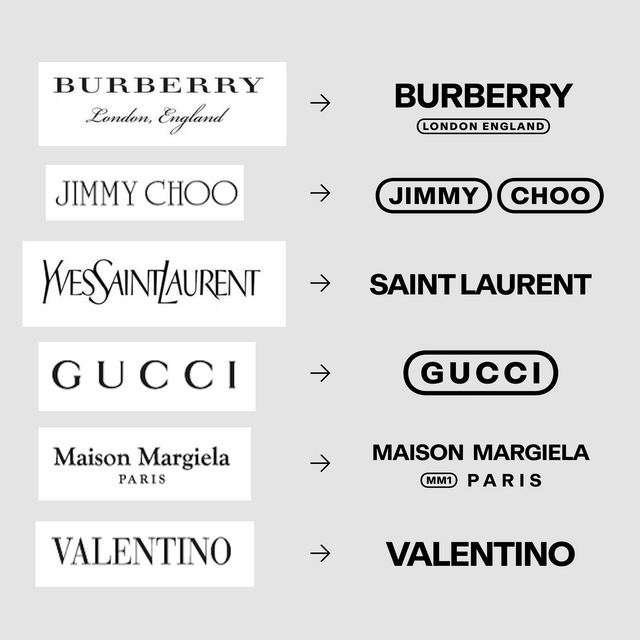
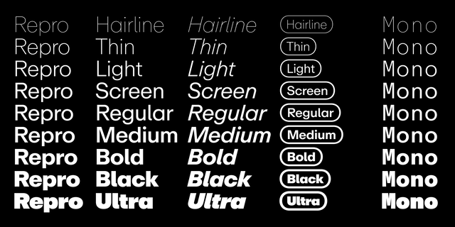
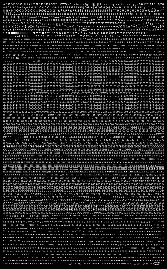
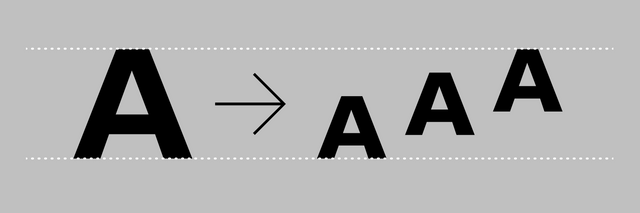
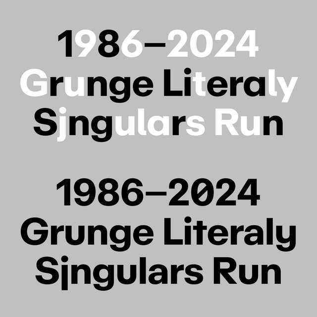
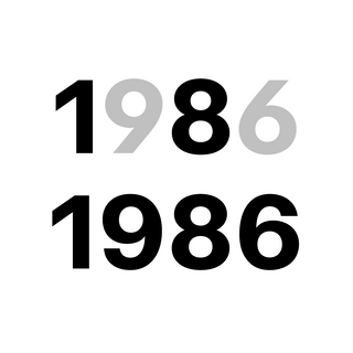
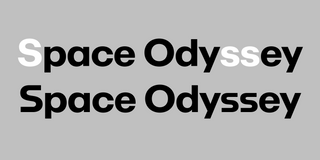
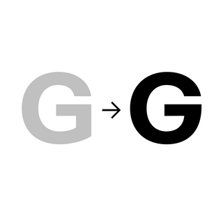
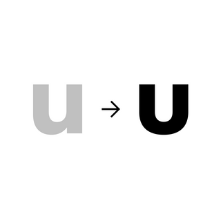
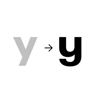
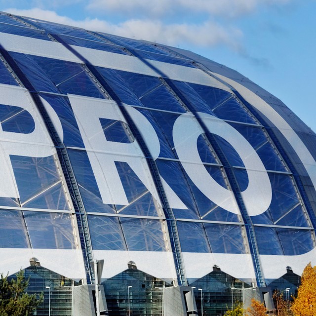
While it has a geometric feel, Repro is softer and more personable than the mechanical typefaces it shares a community garden with, such as Futura, Avant Garde, or Avenir.

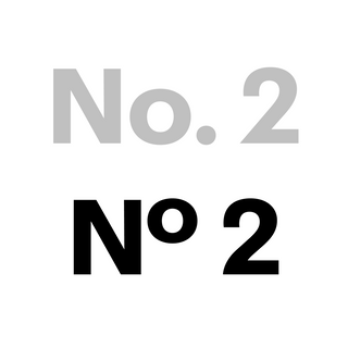
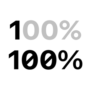
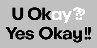
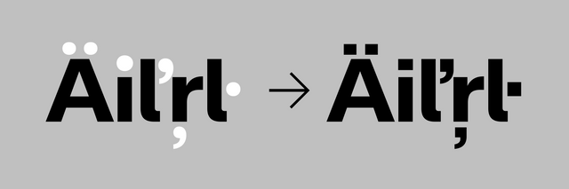
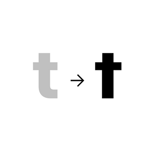
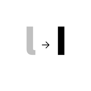
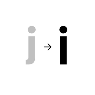
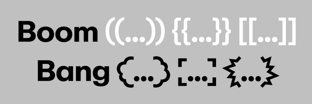
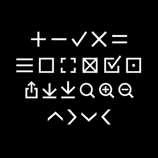
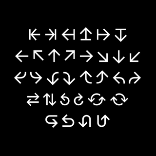
It’s bold, reliable, and recognizable, with a range of alternates that can be mix-and-matched to create a variety of different rhythms and flavors. As a flexible and customizable Variable Font, Repro is an open-ended toolbox with big system functionality and digital interfaces in mind.

Circle Function:

Think of the circle function like Repro’s own version of an italics, bold, or underline—it’s an emphasis dreamt up for digital eyes and contexts.

The markup is embedded straight into the font, which means that the entire character set (including numbers, accents, symbols, arrows, etc.) can be encircled. You can essentially create word marks (imagine the famous Nintendo one) with the click of a button, as well as complex way-finding systems.

The thickness of the circle outline adjusts according to the weight of the characters.

The first, middle, and final circle forms are automatically assigned to each of the characters as you type.

Circles separated

Circles connected

To use circle, write a message, select the circle function, and the font will automatically encircle the text. It all stays editable, so you can change everything as you go.

Deutsche Logodesigner hassen diesen Trick!

One-click-redesign using Repro circles

4th wave fashion house redesign alert 🤭

Family Overview & Character Set

Repro consists of 815 individually drawn characters, multiplied by eight to make for small size and encircled variations. Each weight has 6,529 characters in total.

Repro (9 weights with italics)
Repro Mono (9 weights)

You had me at U+2,665 🙄😘

(That wonderful smile of Erkin’s vanished quickly when his laptop kept crashing trying to export those XXL font files). Photo: Neven Cvijanovic

Repro small size

With its built-in “second size” glyphs, users can position smaller text either at the top, centre, or bottom of the baseline.

Repro small size

Standard and small sizes of Repro combined to cinematic effect

Alternates

Using the Dinamo Font Customizer (more on that here), you can customize Repro with bolder or more legible alternates to create your own personal remix.

Different alternates in the mix

Numbers: Repro comes with alternates for 2, 6, and 9, and also offers a slashed 0 depending on whether you’re looking for a tad more elegance or functionality.

Numbers

No, alt 2

Slashed Zero, alt %

Characters: The tight end strokes of the C, s and e, for example, create visual punch, and straight or curled stems on the l, t, and j can be selected depending on whether you’re going for the most readable, or most stylish, look. Alternates like our Space Odyssey S or the umbrella y are ideal for branding.

Alt R

Double ?? and !!

Alt space Ss

Alt G

Alt u

Alt y

Round punctuation

Alt t

Alt l

Alt j

Smart ligature cartoon bubbles

🐷 + ⭕️ = Repro circle pigs. Drawn for us by Bráulio Amado, a Portuguese graphic designer and illustrator living in New York.

Web 2.0/3.0 connoisseur stuff

Web specific forms: As a tool with digital interfaces and signage systems in mind, we’ve included a range of special characters inside Repro.

Arrows: Alongside an extended arrow set and Erkin-style glyphs.

Graphic symbols: And print production inspired shapes and rasters.

Screen weight for dark mode: Repro’s special screen weight has been optimized to perform perfectly on dark backgrounds, where the regular weight might feel too dense and heavy.

Italic angle: With an italic angle that slides to the extreme of a strong 14°, you can adjust the tilt to match the expressiveness or legibility you want.

Icons

Arrows

Graphic symbols

The hands behind repro

Erkin Karamemet working on Repro in Berlin. Photo: Neven Cvijanovic

Before moving to Berlin to become Dinamo’s first intern in 2014—and before starting his design studies at FH Bielefeld—Erkin worked as a pre-press technician, building and printing signage and adverts at a Werbetechnik production service in his hometown.

Erkin’s time spent thinking about the construction of signage and their type systems fed into the development of Repro—as did growing up around his father, a sign-maker (and Jujutsu black belt). Our own friendship and collaboration with Erkin began over eight years ago and continues to this day, spanning many Dinamo in-house projects, like the recently published Diatype Expanded or the typeface we’re currently creating with artist Stefan Marx.

Real recognize real

Erkin showed us his concept for Repro during our first years together. The initial seed for the typeface began with his idea for a circle function, and all stylistic choices and the design of characters grew from there. The typeface went through many sketches and iterations, growing and expanding over many years and conversations until it morphed into the Frankenstein’s monster you’re looking at today.

Life with Erkin <3

Erkin with focus

Erkin interrupted

Erkin with shoes delivered in the wrong size (twice)

Erkin so so happy

Repro in Early Use:

LIVE FROM EARTH, an independent music label and artist collective based in Berlin, which uses Repro for its identity. Shout outs to Max Rüting, Moritz Lösel, Lorenz Wirth, Tim Lindacher, Josh Schreiner, and the whole fam.

NOW YOU SEE ME MORIA [Action Book], which functions as a ready-made protest object. It includes 446 posters responding to photographs by residents of the Moria refugee camp in Greece. Designed by Raoul Gottschling & Christian Knöpfel.

BUDDEMUSIC, an independent and international music publishing company. Identity design by Workout Services (Marco Cucuiu, Seb Holl-Trieu, and Piotr Zapasnik). Website by Any Studio (Max Edelberg & Jakob Kornelli).

And that’s it!

Head this way to try Repro out yourself. We can’t wait to see what you do with it (:

Team Dinamo + Erkin Karamemet 🍁

Dinamo Typefaces GmbH, Glasower Str 44-47, 12051 Berlin
Copyright ©2024, All Rights Reserved