Modulate between three types of italics plus musical alternates —

Welcome to the latest issue of our newsletter, where I’ll continue to share the latest ongoings at the studio. Take a look at our our archive.

Was this forwarded to you? Sign up now!

Hi Friend,

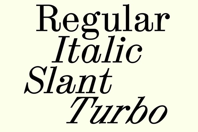
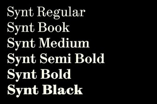
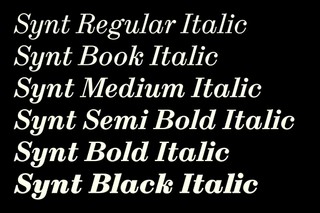
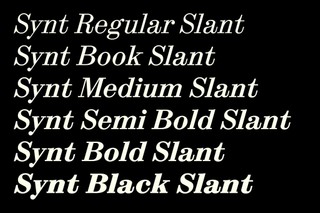
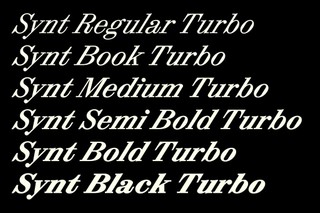
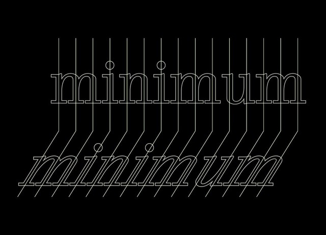
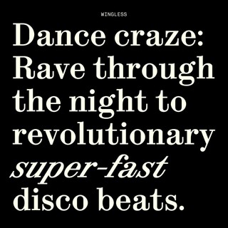
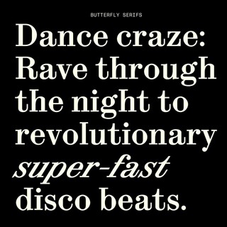
We’re excited to release the complete package of Synt today, a unitized reimagining of 19th Century modern faces for today’s fast-paced world of screens and streaming.

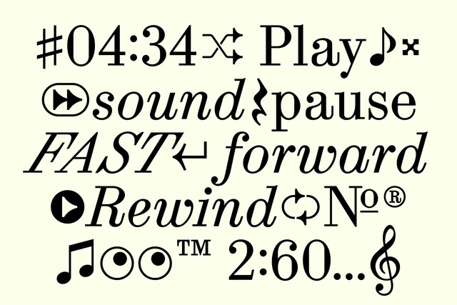
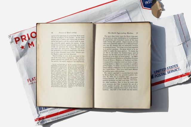
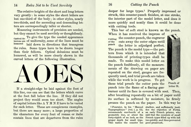
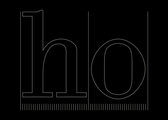
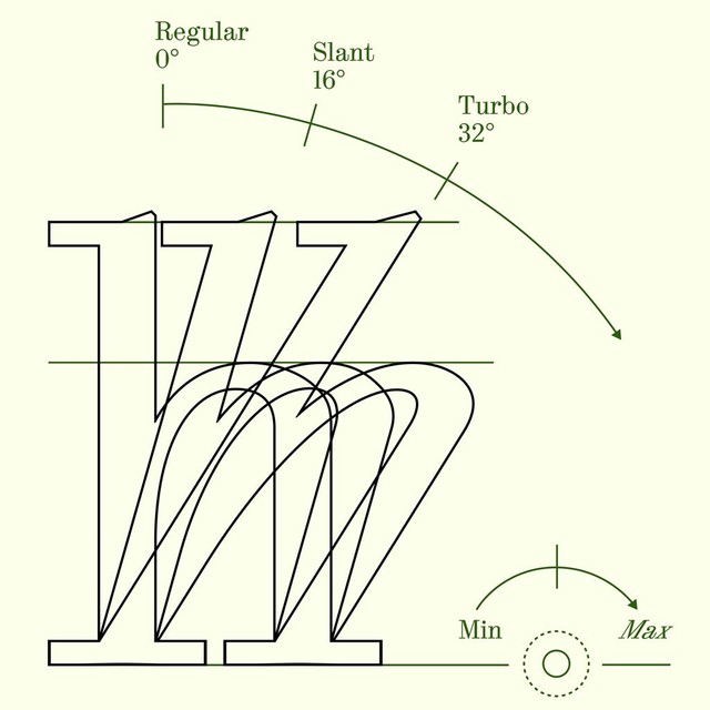
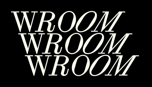
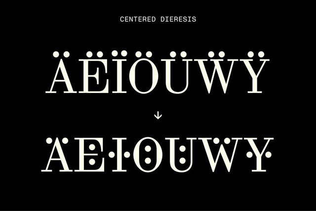
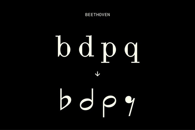
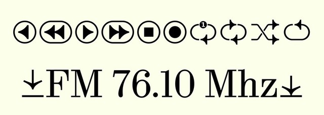
This beautiful font takes its logic and shapes from a typeface used in a 1900 book by influential commercial printer Theodore Low De Vinne and remixes them with special glyphs, variable slant modulation, and musical alternates ideal for apps, podcasting, and all spheres of audio culture.

Let's gooooooooo 🦇

The full family comes complete with six weights, a mono cut, and not one but three styles of italics: a True Italics, a Slanted variation, and a Turbo Slant for whenever you need to really emphasize something.

It’s also packed with stylistic sets, special features, and a variety of figure styles. Let’s dive in!

0° (regular)

16°

16°

32°

Synt has been with us for many years, developed and fine tuned by the eyes and mind of team member Kaj Lehmann. We’re proud to release his full family today on the occasion of the launch of the new issue of music magazine zweikommasieben, the pages of which Synt found its first home many moons ago 🥺

The first appearance of Synt in issue 17 of zweikommasieben

5 years later: The new issue of zweikommasieben, featuring all cuts of Synt. Designed by Kaj and Raphael Schoen.

Origins

In 1900, printer Theodore Low De Vinne classified typefaces with large ball terminals, horizontal serifs, sharp vertical axis, and high stroke contrast as “modern” in his book, The Practice of Typography: Plain Printing Types. Think of other early 20th Century faces ATF Bodoni and the Didone genre at large.

When young Kaj was a student in 2017 reading De Vinne’s words in the ECAL library, he noticed that they were set in a neat, modern typeface of their own. This unnamed body copy became the starting point for an exploration of modern faces, eventually leading Kaj to Synt’s base structure.

From Plain Printing Types

The De Vinne Press Building on 393-399 Lafayette Street in lower Manhattan (you’ll see why that’s important later)

🥵

You’ll notice Synt has a particular rhythm. Its unique flow comes from the fact its reference material was a form of unitized type: De Vinne often used metal-cast letters with specified widths to speed up the typesetting process, allowing typesetters to compose justified text by hand quickly.

Synt takes the functional logic of these systems into digital space, celebrating the unitized rhythm as a beautiful design feature in its own right (with the added bonus of translating seamlessly to pixels for hinting).

ASCII-Theo ♡

Special Features

RHYTHM

Synt has a “parametric” rhythm, meaning there’s an identical distance between and within every vertical stem. Its strict unitization plays a huge part of why the typeface feels so, ehem, staccato 🙄

Stems can align

Each letter is part of the same grid system 🥶

Speed

Turn up the speed of Synt with our variable slant modulator, moving between an exaggerated slanted cut of 32° and a still 0°. Like revving the handle of a motorbike.

I want you in my room 🤐

STYLISTIC SETS

Synt features a wide range of stylistic sets for modulating its look. Alternate dieresis lets a user typeset with narrower leading. And Beethoven alternates let you seamlessly toggle to musical notation. There’s also a schoolbook set plus Dinamo house-style Butterfly Serifs to choose from.

ohne

mit 🦇

Alternates

Synt comes packed with musical glyphs and streaming symbols that have been designed to suit the font’s vibe. There’s also a many angled eye roll and a “smashed beet” (naming c/o Tina) for other occasions.

Notes with variable slant too

SYNT IN USE

Sitting in our Early Access drawers for some time, Synt has already found itself in a variety of gorgeous in use situations beyond the pages of zweikommasieben — including for Manhattan’s 52 Walker gallery identity and the stage of a Louis Vuitton show in Seoul with all members of BTS.

Synt’s origin was born on Lafayette Street in the 1900s (remember?). Here is Synt over a century later, a 10 minute walk away from its metal cast ancestor, used in the identity of 52 Walker.

F/W with BTS. Film by Virgil Abloh 💕 Visual Direction by BeGood Studios.

zweikommasieben launch ❤️‍🔥

On Friday we celebrated the launch of issue 28 of zweikommasieben — and the release of Synt — at kwia bar in Berlin, a beautiful, queer listening room for modern rituals. Sharing some photos I took below:

kwia, neukölln. A dry cleaners nightmare.

Mathis & Remo, editors @ zweikommasieben

Malin & Fee

soft bar

Malin, Ondřej & Hugo 💙

cover glow

Click here to visit synt

That’s it for today. See you soon.

Love,
Dinamo 🐛

Dinamo Typefaces GmbH, Glasower Str 44-47, 12051 Berlin
Copyright ©2024, All Rights Reserved