Welcome to the latest issue of our newsletter, where I’ll continue to share the latest ongoings at the studio. Take a look at our archive.

Was this forwarded to you? Sign up now! (*◠‿◠)

Today we’re releasing Camera Rounded, the rounded companion to ABC Camera.

In doing so we’re continuing the slow but steady expansion of a typeface that started by looking closely at something that was … never meant to be seen 😳 🙄

(sorry)

concept

The idea behind ABC Camera is the reinterpretation of light traps, a typographic trick from the 60s and 70s that helped text survive the blur of early, low-res TV screens. The screen would fill in the gaps, making letters look complete. Today those traps are technically obsolete, but the circular holes were too beautiful to ignore, an unintentionally bold visual feature we decided to scale up and revisit for digital use today.

Aesthetics

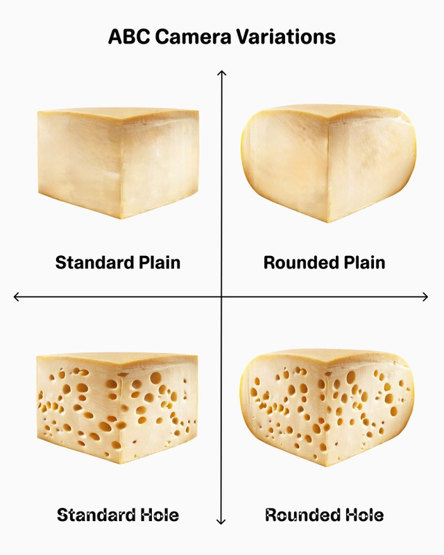
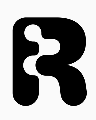
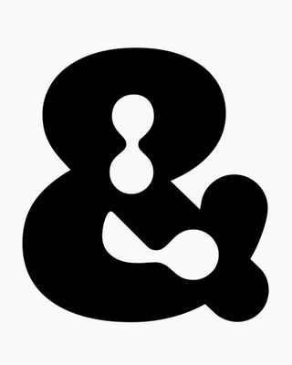
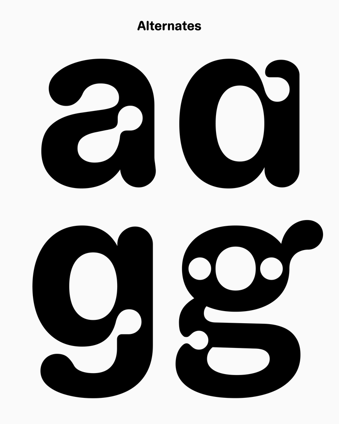
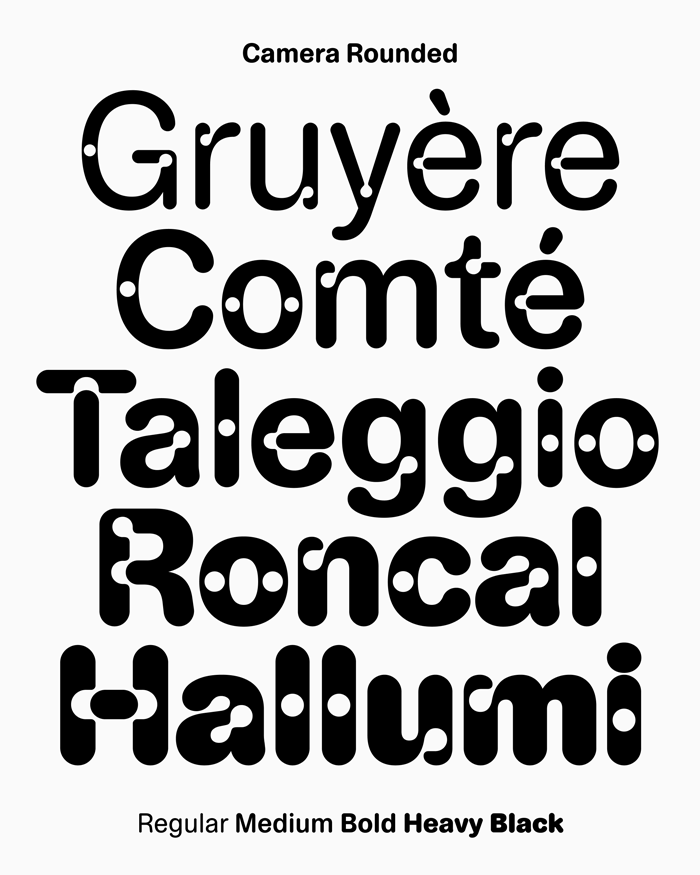
In terms of shape, Camera sits somewhere near a classic grotesque, but with a narrower body, freer proportions, and a slightly looser attitude. Camera Rounded takes this further by softening the outlines, taking the family toward a warmer, more playful place.

Along the way, we’ve also added monospace styles to both Camera and Camera Rounded, opening up the possibility of sprinkling in a bit of technical flavour. Plus, all versions are available without the holes, for those who prefer things a little more waterproof.

Practicalities

All of Camera’s subfamilies share the same underlying structure and DNA, which means they can be combined and thrown together beautifully. And there’s a couple of alternate glyphs baked into the fonts (a t G R) that you use to customize your own version using our free Font Customizer tool.

Backstory and credits

For a long time, Camera existed as a single style and weight only, quietly minding its own business before being picked up again and expanded. Dinamo member Sascha Bente led the extension of the family, with in-house italics master Fabiola Mejía chiseling away at its obliques. The rounded extensions published today went through the hands of Fabian Harb, Samira Schneuwly and Arnaud Chemin. With engineering by Roberto Arista and Hugo Jourdan, and a campaign by Johannes Breyer and Melanie Schmidt. A great team effort as always.

Happy holidays!
Love, Dinamo

Where I’m posting from

Dinamo Typefaces GmbH, Prinzenstraße 84, Aufgang 1, 10969 Berlin
Copyright ©2025, All Rights Reserved