A vast toolbox conceptually rooted in ideas of remixing —

Welcome to the latest issue of our newsletter, where I’ll continue to share the latest ongoings at the studio. Take a look at our our archive.

Was this forwarded to you? Sign up now!

Hi Friend,

We designed the new custom typeface for Spotify in collaboration with Spotify’s In-House Creative Team.

Spotify Mix is rooted conceptually in ideas of remixing and functions as a vast toolbox that allows for extreme typographic flexibility. This has been a gigantic, out-of-this-world project and we’re very excited that it’s begun its roll out!! 

The variable font has a large width and weight range and an array of alternate characters, enabling dynamic and expressive designs whether static or in motion. From now on, you’ll see Spotify Mix throughout Spotify’s in-app and desktop experiences as well as brand and marketing. 

Spotify Mix is, quite literally, a typographic remix. It combines elements you’d find in geometric, grotesque, and humanist typefaces and blends them together. The sharp flicks of humanist strokes combine with smoother curves found in grotesque letters, creating a unique flow and rhythm. 

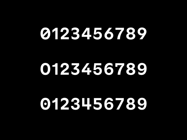
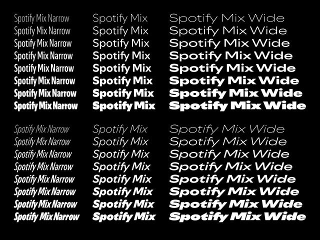
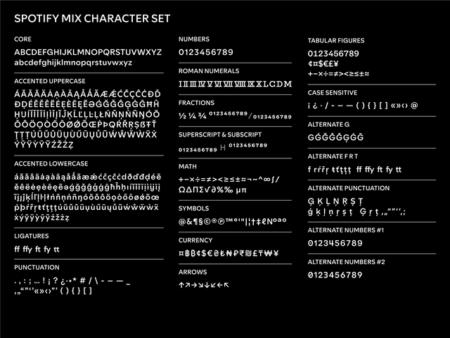
Mixing different typeface genres together reflects the vast range of music genres, artists, podcasts, and more that can be discovered on Spotify. Another key design feature in the mix is the almond-shaped counter found in letters like “p”, “d”, and “g”, which subtly allude to the transmission and expansion of audio waves. Lastly, three sets of numbers invite further play and variety.

We’re incredibly proud of the result of this special partnership and can’t wait to follow its journey!

Dinamo Typefaces GmbH, Glasower Str 44-47, 12051 Berlin
Copyright ©2024, All Rights Reserved