Plus a lengthy PS for the autumn and new social media licensing... 🍂 —

Welcome to issue #11 of The Dinamo Update! In this monthly newsletter, we’ll be continuing to share the latest ongoings at the studio in a few parts.

Was this forwarded to you? Sign up now!

New Release: Gravity

How wide can you go? ABC Gravity—a multifarious VF designed by Dinamo’s own Rob Janes—has officially been published today.

This relaxed, multi-width monster shares a community garden with the likes of Compacta, Information, and, dare we say, Impact. Its skeleton was inspired by titling typefaces from the ’60s and ’70s, which we worked to stretch out and compress into extreme widths.

All of Gravity is packaged as one Variable Font file. That means the output can be modulated seamlessly from XXXX Compressed to Wide. As a fallback, we’ve also defined 12 separate font styles that can be used separately.

Variable font spectrum

Several styles mixed together

Where my Gs at 🥴

As a special addition to the font, we also implemented features that allow you to arrange and shift the characters: You can make them jump over the baseline or hang from the top.

Positioning features 🔞

Gravity in Early, Pre-Release Use

Our dear font caught the eyes and talented hands of many, from the established design connoisseurs Tim Lindacher and Johannes Schreiner in Neukölln, Berlin to the young businesswoman Kendall Jenner in Beverly Hills, California.

Bau Mich Auf (a.k.a. Sauf mich aus) festival by Live From Earth

Classy: where the rave went down

Nice use of Gravity’s positioning features

Design by Yosh Schreiner and Tim Lindacher <3

Kiyeol Kim, the creative director of GQ Korea who we featured in issue #10 of this newsletter used Gravity in a different way: applying different widths to individual letters to creating dynamic titles.

Random widths of Gravity thrown together

Cover of the GQ Style issue

Hot foil stamps

Ehm, guys, this is a lot of images? Yes.

Gravity aged gracefully in our Early Access section for about eight months before its widespread release today. The projects shown here were created during that time: their designers followed our Early Access process of requesting the font with a tiny project description, after which we unlocked it for them to use. We know it’s kind of demanding, but we believe it’s important to “protect” a typeface from being swallowed up too quickly. It’s nice to see that so many good designers are happy to put in the effort.

Design by Alessio Avventuroso

Withdrawing $ to then...

...spend on this magazine

The Chinese rapper Jackson Wang talks Buzz Lightyear, carving out a fashion empire with COOKIES, launching his new band PANTHE PACK, and more in the first episode of The dA-Zed Guide To Being:

Dazed China

At least 50% of Team Dinamo don’t have a driving license. That’s why we’re extra appreciative that Kendall has produced this lovely Gravity float for us:

Kendall Jenner about to get lit. Identity design by Zak Group.

Dinamo company car dream

Dinamo company car reality

Matter Of designed a truly variable identity for the exhibition “State and Nature” at Kunsthalle Baden-Baden, using the complete range of 12 widths across its different applications:

Design by Matter Of

Kunst für Alle

Art Director: Fine, but can you make this poster variable?

For those who prefer more analogue means to stretch, our Dinamo x Matter Of x TheraBand collab packages Gravity as one easy to use resistance band, proven to increase range of motion and add tension to common house hold exercises. Designed and conceptualized by our friends at Matter Of studio in Stuttgart.

LICENSE TERMS: Next Level

As part of our ongoing mission to simplify font licensing to the max, we’ve cut down our License Terms from 12 pages to 4 and planted a free-font for you to find. 😎

Over the years, our EULA (industry slang for End User License Agreement) evolved into a many-headed monster, something between a diary, a time capsule, and a contract. To be clear, we were incredibly proud of our Eula 2.0 (while looking down from peak Mount Stupid) and considered it a beautiful piece of commercial-poetic writing—until we learned better.

With our newest team member Ethan Cohen joining the studio to help us with the legal side of selling fonts, we realized it was time to streamline this all important document. We want everyone—that means designer, client, and the whole team at Dinamo—to understand what purchasing our typefaces means, and why our model is different (and better, sorry!) than others.

We think that a foundry’s EULA is not just a necessary legal document—it’s an expression of values, outlining how a foundry envisions its relationship to its community. But often, we find that EULAs can be overly formal and archaic—not reflective of an ethos at all. They’re often written by lawyers or copy and pasted from online templates (we’ve done this ourselves in the past). Yet most people cannot—and should not have to—understand legal speak. We want the people using our fonts to be making things instead of pushing paperwork around, so we’ve rewritten our agreement in a way that’s hopefully more like an easy going conversation.

“We also find that a lot of EULAs tell you what you NEVER do with a font. Instead of focusing on what someone can’t do, we focus on what you can do. That’s the most important thing: You don’t walk into a candy store with a list of what you can’t buy, you see what’s on the shelf and pick up the snicker bar you want. Buying a font should be an exciting moment, not something confusing where you’re scared of doing the wrong thing.”

Ethan

You can click here to take a look at the new contract in full. Below, we’ve summarized the biggest changes to our EULA:

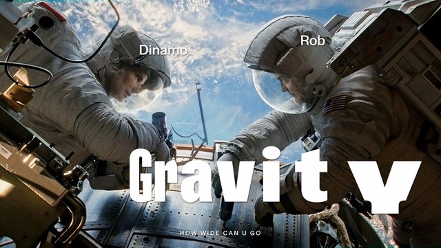
ONE METRIC TO RULE THEM ALL

The only metric that you need to know to buy a license from Dinamo is the company size. That’s it—no other metric is needed.

Over the past year though, this guiding rule of ours didn’t include social media licenses, which we calculated by number of followers. We realize that it was the only moment in our EULA where things were not crystal clear.

And so now, all you need to know is company size—for every type of license including social media. We feel this is much more in our spirit. If you’re a small company or individual with a large following, you’ll now get our typefaces for a relatively small fee—and we’re more than happy for your success. 😉

LICENSE OWNER

At Dinamo, the designer doesn’t need to buy a license. The License Owner is the client—i.e. the business entity that commissions the design work. It’s not the agency or individual creative producing work. We’ve edited our EULA so this is hopefully even clearer than it was before. Whoever owns the design work, owns the typeface.

MYSTERY PRIZE

There’s something else embedded in our EULA. We’re not saying where—but if you find it, we feel you’ve done something amazing and should be rewarded. Pro tip: Read the EULA until the end! It might be a free font, and it might be good looking…

INTERNAL: DINAMO PROOF GENERATOR

We use proofs to study, refine, and stare at the letters we’re working on. But to produce proofing sheets—often by hand—takes time that could be better spent elsewhere. In another attempt to simplify work life at the studio, Renan Rosatti of Team Basel and Rob Janes of Team Berlin have been developing a tool that allows us to speedily generate on-the-fly proofing sheets. Both will receive Christmas presents this year.

How it works

1) Select preset

2) Generate pages

3) 5-10 seconds later—voilà

The presets we currently use allow for various layouts, including one that help us with cross-style glyph comparison, another for observing multi-column body copy, a third for inspecting full character sets, and another to display beautiful individual letters as largely as possible.

Watching the program work. Moments of shared joy and outfits.

Simple A-Z overview displayed in all available styles

Punctuation

Multi-column comparison

Full character set

We’ve long been tired of using InDesign to create proofs—it’s manual, boring work. Not really feeling supporting the extortionate, slow-moving kraken that is Adobe anyway. And so Rob and Renan created this automated workflow based on drawBot. 🙏💗

We can now generate a huge array of proofing sheets—including the specimens users download from our website—with just a few clicks. Big thank yous to the two Rs for putting all the technical pieces together!

We hope to one day release the plugin as an open access tool via our Darkroom. For now, we’ll be testing it ourselves and with our collaborators. 🌝

Work + Travel

Felt cute...

...hope not to cross paths again later

We went on a hike with Sophie, Joshua, Giliane, and Chi-Long in the Swiss mountains of Verbier, near to Lake Geneva. In a separate journey, both Giliane Cachin and Chi-Long Trieu will release typefaces with us in 2022. Here’s a preview of Chi-Long’s ABC Displayy.

ABC Displayy is a neo-grotesque typeface that first saw the light of day in 2017. Its starting point was a series of lettering discovered in a mid-century architecture book about Harry Seidler’s work and designed by Cornel Swen in the 1960s. The sturdy expressiveness found in the letters “a” and “y” were a solid foundation for the rest of the alphabet, which has been developed into a very extensive range of weights and widths.

What Else: Studio Stuff

Streaming live from the type mad house

Thanks 2 everybody who joined!

A new project we showed: randomised dot font for Sarina Scheidegger, Kathrin Siegrist & Franziska Baumgartner and their performance “To call on the birds” at Kunstmuseum Basel

Fabian and Renan gave a virtual lecture by invitation of Jack Hands and Tom Collins of Stockholm/New York-based agency KurppaHosk, showing mostly new experimental fonts we’ve been developing as part of our internal research.

  • Johannes visited the Basel campus last week—time was mostly spent plant watching and making a plan for the year to come. 🌱 Looks like we’ll spend most of 2022 developing new typefaces, working on only few select bespoke projects, or staying the hell away from our computers and anything that can be cloud-stored.
  • Tina has been improving our presence on Fonts in Use. Please contribute, if you want to! Special thanks to Juliette Duhé, Matthijs Sluiter, and Florian Hardwig from the moderation team.
  • We gave a talk at monthly get-together Type Thursday in Berlin, in the best company of Margarita Fray who also showed her impressive work and gave very personal insights into her artistic practice. We haven’t given too many talks in Berlin before so we felt especially emotional about this one. Thanks to Martha Mox, Rob Keller, and Paula Ahn for inviting us.
  • The Dinamo team keeps strengthening with numbers. We’re excited that Fabiola Mejía—who has already supported us with ABC Whyte and ABC Social—has agreed to join Dinamo on a regular basis, which she’ll be doing alongside building up her own outlet for type experiments, Super Continente.
  • In other studio news, ABC Favorit Hebrew and Tifinagh are close to the finish line, and Alessio D’Ellena is finessing the details of an ABC Laica update with Mike Nigra.

P.S.

Hey naaa wie geht’s

  • A very telling and in-depth article on the recent acquisition of the Hoefler empire by industry giant Monotype is up on Quartz. We already made our comment on the events in few words.
  • Speaking of industry domination, corporate swagger, and evil takeovers, we’ve had our eyes glued to the new season of SUCCESSION as of late. Take a read of this great New Yorker portrait on the show’s maker, Jesse Armstrong, or join us in wondering at the world of beige cashmere wraps and padded vests as outlined in this and this fashion story.
  • Congratulations to Dinamo members Tina Lehmkuhl (a.k.a. Avery Longday) and Rob Janes on this SPELLBINDING new website recapping The Digital Self, a workshop held at Berlin’s AMD (Academy for Fashion & Design). The site features our own ABC Arizona alongside an upcoming release. 🤫
  • The legendary DJ Stingray just founded a new label, Micron Audio, featuring ABC Camera across its identity by Onlab Studio.
  • In other music news, the latest BadBadNotGood album, Talk Memory, uses ABC Arizona, with artwork and design by Virgil Abloh’s studio Alaska-Alaska.
  • If you click on only one link this Dinamo Update, let it be this one. A MUST watch. Furthermore, if you play Phil Collins’ ‘In the Air Tonight’ at exactly 11:56:40 on December 31st, the drum break will sound when the clock strikes midnight. 😌

Basel Studio View

The tiled walls come in handy whenever it gets a lil' messy in Type Land

Thank you for checking in with our latest issue of The Dinamo Update. You can read all of the back issues in our archive.

Speak soon,
Team Dinamo 🐯

Was this forwarded to you?
Sign up to receive the next issue!

Dinamo Typefaces GmbH, Glasower Str 44-47, 12051 Berlin
Copyright ©2024, All Rights Reserved