Arena + Dinamo + Arial = Areal —

Welcome to the latest issue of our newsletter, where I’ll continue to share the latest ongoings at the studio. Take a look at our archive.

Was this forwarded to you? Sign up now! (*◠‿◠)

Over the past year, we’ve been working with Are.na on a custom typeface for them. Starting this week, the typeface you’ll see on Are.na is Areal, a “revival” of Arial, entirely redrawn and rebuilt from the ground up.

Areal, of course, isn’t to be confused with Arial — though the goal is that you’ll hardly notice the difference. Looking at Arial and Areal should feel like refreshing a browser page. It’s the same, but it isn’t. A good deal of our excitement has to do with the process and the thinking behind the project. The conversation linked below–recorded and edited by Are.na’s Meg Miller–gets into all of that:

A bit more backstory

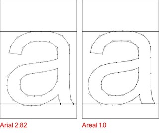
Unlike the older analog typefaces that typically get the type revival treatment, Arial has always been a digital typeface, born in the computer age. In 1982, it was commissioned by IBM and designed by Robin Nicholas and Patricia Saunders at Monotype. (As the story goes, IBM wanted a typeface similar to Helvetica for their new laser printer, because Helvetica, designed by Linotype, was being used by Xerox on their new laser printer.) In 1992, Arial was included on the Windows 3.1 operating system, making it a default font on millions of the first personal computers. And in 1996, Arial 2.82 was selected by Microsoft to be one of the “core fonts for the web,” subsequently becoming one of few font choices for early web designers.

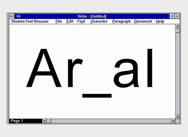
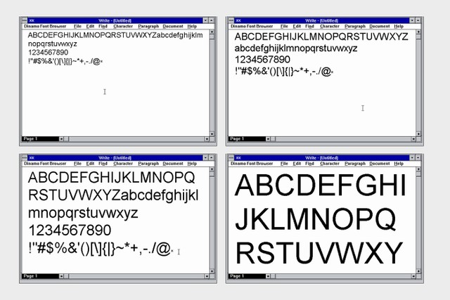
It was this web version of Arial that we decided to use as the starting place and digital blueprint for Areal.

Screenshots as a virtual blueprint for our digitisation

To find this specific version of Arial, we had to work with computer technology archivists to get access to some of the first personal computers and operating systems. In the end we found a tool that allowed us to boot up Windows 2000 on our own laptops and we were able to take screenshots of Arial in its initial internet version. We digitally traced the characters we could access and used them as the basis for Areal.

Another way we’ve been thinking about the project is that, just as we traced Arial back to its first internet version, we’ve now created another snapshot of the font with Areal in 2025. Whenever you make a font, it’s also a snapshot of the technology of the time, the environment you work in, your design principles, and your working conditions. Maybe this is just another snapshot in a much longer timeline.

The internet, today

Areal is especially suited for Are.na and how we use websites today. Stem thicknesses were streamlined, design consistency improved, special characters added (**), mono and semi-mono versions created, and a dark mode axis introduced for a better dark mode experience. Good job everyone (😁).

Areal designspace

Are.na in the dark

Thanks to our friends Cab, Daniel, Damon, and Meg at Are.na for inviting us into their world. This project was special — all the stars aligned so we could revisit this piece of font history with exactly the right partners.

They also created this wonderful microsite — a digital Ouija board that invites you to explore and play with the typeface in multiplayer mode. Please hit the button below.

Love,
Din-a(real)-mo (😮‍💨)

Dinamo Typefaces GmbH, Prinzenstraße 84, Aufgang 1 10969 Berlin
Copyright ©2025, All Rights Reserved