Serif Populism, Hyperpolitics and the Diminishing Returns of Graphic Design Culture —

Welcome to the latest issue of our newsletter, where I’ll continue to share the latest ongoings at the studio. Take a look at our archive.

Was this forwarded to you? Sign up now! (*◠‿◠)

Welcome to a new guest takeover issue. For these special mailings, we invite artists, writers, and other friends to think about design and fonts from a cultural or social perspective.

And this time, Lisbon-based ★ Silvio Lorusso ★ shows how graphic design’s symbols now generate heat faster than they produce meaning. Let’s go!

Serif Populism, Hyperpolitics and the Diminishing Returns of Graphic Design Culture

by Silvio Lorusso

Goodbye Uncle Herschel

Cracker Barrel is an American chain of restaurants specializing in country food – something that I, an Italian living in Portugal, had no idea about. This was until the news spread worldwide that the chain’s stock had plummeted because of a new logo. In a regrettable rebranding, Uncle Herschel (the chain’s own Colonel Sanders) and the eponymous cracker barrel were dropped, giving way to a flat, rather dull, generically modern emblem. As a result, no one was happy, except perhaps those who believe in “the power of design” – the power to make you instantly lose $100 million in market value.

On the left, Cracker Barrel’s old logo; on the right, the new one.

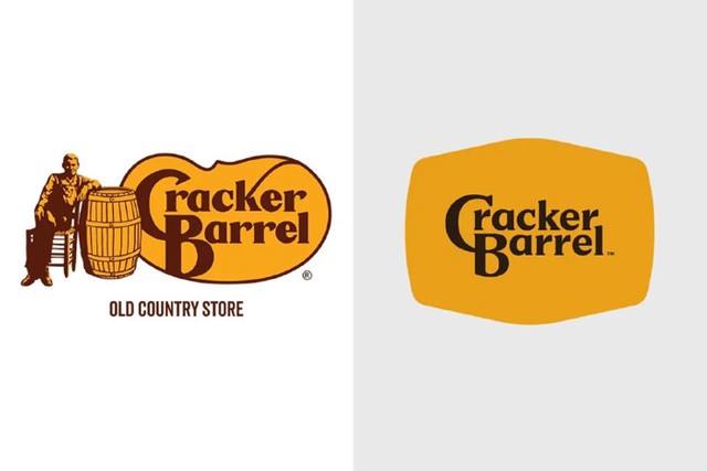
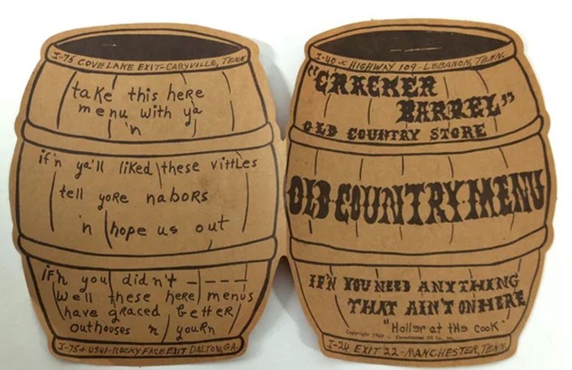
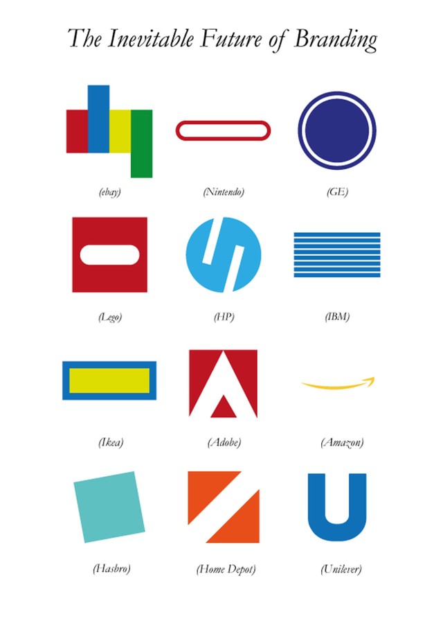
How did that happen? A newly appointed president and CEO, Julie Felss Masino, concluded the restaurants needed an update, so she initiated a complete overhaul (code name: “All the More”) featuring country musician Jordan Davis and spanning the menu, the decor and, of course, the brand identity. It was the latter, in particular, that critics ferociously attacked. To them, the new logo no longer represented the chain, but rather the cabal of corporate drones and marketing firms now in charge of it. On X, Matt Walsh, a conservative commentator, pointed out that “Cracker Barrel enlisted THREE marketing agencies to come up with their new logo and remodel. Three agencies collaborated for months to make their brand more generic. Like I said, the marketing industry is completely fake. It’s a 500 billion dollar scam”.

In the days that followed, the logo suffered the usual crowdsmashing destiny, but the outrage was unprecedented: Cracker Barrel was cast as a staple of U.S. identity, prompting a deluge of now all-too-common “woke” accusations. Suddenly, what was at stake was no longer a design controversy but the eternal struggle between the people and the elite. Eventually, the President of the United States himself weighed in, calling for the reinstatement of the old design: “Make Cracker Barrel a WINNER again”. So, after just one week, the chain issued a statement reassuring customers (“We said we would listen, and we have”) and rolled back the old logo. The CEO took the fall, if only symbolically, as Masino declared she felt as though she was “fired by America”. She wasn’t the only scapegoat, though: Cracker Barrel investors were also advised to oust a board member with expertise in DEI (diversity, equity and inclusion), who was seen as one of the marketing figures responsible. Unfortunately, hitting the rewind button could not prevent all the damage, which amounted to a 5.7% loss in the first quarter. Still, the chain got some free visibility, namely an AI-generated video where Trump dances with the restaurant’s “old timer”. Uncle Herschel is so back.

An Uncle Herschel meme posted on X.

A Bland Nothing

Another old timer, Tommy Lowe, took on the rebrand in a pretty moving NewsChannel 5 interview. Asked about the logo, the co-founder of Cracker Barrel, 93, called it “a bland nothing. It is pitiful”. And, quite frankly, it is hard not to agree after seeing the original handmade, barrel-shaped menu designed by the other founder, Dan Evins. Some trivia on the chain’s website shed light on its design:

“The menu’s handwriting had intentional misspellings and folksy phrases, which was Dan’s idea. His original vision was to make them look like a brown paper bag, reminiscent of those you would get at a country store. Guests could take the menus with them as souvenirs and something they could pass along to others.”

This is about as “vernacular” as it gets, with all due respect to Tibor Kalman, Alexander Isley and Restaurant Florent.

The original Cracker Barrel menu from 1969.

Whereas veteran patrons, red-pilled podcasters and terminally online conservatives hated the new logo, branding and design experts were fine with it. According to Brand New’s Armin Vit, “by any objective standard of what proper logo design is, there was nothing good about the old logo and there is nothing wrong with the new logo.” Nothing good about the old logo?! Cracker Barrel itself made a convincing case for it: “The ‘K’ in ‘Cracker’ has a charming flourish that flows into the pinto bean shape, tying it all together”. I, for one, can see the charm, which is totally gone in the new version.

Cracker Barrel co-founder Tommy Lowe interviewed by NewsChannel 5’s Carrie Sharp, 2025.

The thing is, almost nothing absolute can be said about a visual artifact; any claim only holds in relation to particular schools of thought, or ideologies, if you will. Vit’s ideology – what he calls “proper logo design” – is one that values simplification (or perhaps reduction, as the word “simplicity” is already ideological). He’s not alone: Kelly O’Keefe, a brand strategist at Brand Federation, argued that the redesign clears up an “overly complex logo”. Now, speaking of simplification is itself a simplification because, as Charles Jencks and Nathan Silver put it in Adhocism (1972), “The present environment is tending towards both extreme visual simplicity and extreme functional complexity. This double and opposite movement is eroding our emotional transaction with and comprehension of the environment.” In other words, the superficial simplicity of a logo is complemented by the complexity of its outputs, which involve a kaleidoscope of artifacts, media, devices and platforms, and extend to the public’s reaction.

“Deconstructed Fried Rice” by pixieshit¹, 2023.

For simplification to operate at all, it has to adopt a particular way of looking at an artifact: it has to label it complex in order to simplify it, while sweeping all the chaos it cannot simplify (such as Uncle Herschel) under the rug of history. Without doing this, it would be jobless. The army knife of visual simplification has several tools, such as element reduction, non-redundancy, abstraction, avoidance of depth, and a preference for the discrete over the continuous. All of these no-gos are present in the new-now-old Cracker Barrel logo. But they all rest on a broader ambition, which I would put as follows: The promise of simplification is to maintain, or even increase, semantic depth through synthesis. When synthesis is missing, what you get is blandness.

The Inevitable Future of Branding, 2012. Source unknown

All these aspects seem to conform to the general rule of contemporary branding, but I believe they also lie at the heart of graphic design culture. Portuguese design critic Mário Moura puts it concisely: graphic design is a style turned into a discipline, “a style that deliberately detached itself from art history because it suited a number of purposes”. This style cloaked itself in pseudo-general principles and rule of thumbs, now crystallized in software that allows them to be broken with ease. That’s what makes it possible for me to say, “this is so graphic design,” or, when I want to feel the thrill of youth, “woah, graphic designcore!”. Of course, there are exceptions, but they function exactly as exceptions, as subconscious reflexes to the simplifying norm. Beyond those, what you get is either professional decorum or emulative blandness. Muriel Cooper, the Vignellis, Paul Rand… the American Gods are still upon us, but they’re old and tired.

Instagram logo evolution.

About the author

Silvio Lorusso is an Italian writer, artist and designer based in Lisbon, Portugal. He published Entreprecariat (Onomatopee) in 2019 and What Design Can’t Do (Set Margins’) in 2023. Lorusso is an assistant professor at the Lusófona University in Lisbon and a tutor at the Information Design department of Design Academy Eindhoven. He holds a Ph.D. in Design Sciences from the Iuav University of Venice.

FURTHER READING

Here’s a couple of cool things that Silvio has been watching, reading, playing unrelated to the article:

  • Return of the Obra Dinn, “an insurance adventure videogame with minimal color” (I was already sold with this one-liner)
  • Orb: On the Movements of the Earth, an anime series about heliocentrism and heresy. As a friend of mine put it, “it’s rare because the protagonist is not a person but an idea”
  • Branding Fiction, a sort of encyclopedia of fictional brands, such as Mr Robot's E-Corp or Severance’s Lumon

💻 Link Glossary

¹ pixieshit
² comment on this piece

Thank you, Silvio!

That‘s all for today. See you next time.

Love,
Dinamo x

Dinamo Typefaces GmbH, Prinzenstraße 84, Aufgang 1, 10969 Berlin
Copyright ©2026, All Rights Reserved