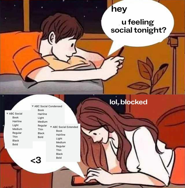
A multi-people, multi-width, smooth variable grotesque —

Hello Friend,

Before ABC Social makes the first steps in its upcoming release journey, we wanted to share its font files with you.

Social is a multi-people, multi-width mega collaboration made by many eyes and many players. As a friendly, smooth grotesque with Variable Font capabilities, it also fills a gap in our library, standing apart from our more constructed sans serifs both visually and technically.


Download Pre-Release VIP Package:
-> Click here for your exclusive drawer filled with full font files.
-> Click here for the (secret) link to the typeface page.


What’s up

Extended

Condensed

Normal

Widths
The project spans three different widths. Each width has seven weights & Italics. We also produced a Variable Font, which combines them all into one file.

● Social Condensed
● Social Normal
● Social Normal Mono (soon)
● Social Extended
● Social All Variable Font


Styles
• Thin + Italic
• Light + Italic
• Book + Italic
• Regular + Italic
• Medium + Italic
• Bold + Italic
• Black + Italic


Origins:
ABC Social found its first home in the pages of The Monthly, Australia’s left leaning independent periodical covering politics, society, and culture.

Under the art direction of Paul Mylecharane and Žiga Testen, our custom display font—drawn by the father of Dinamo himself, Fabian Harb—reinterpreted grotesque typefaces used in Australia during the early 20th century. We embraced the consistent inconsistencies of these hot metal fonts, allowing their quirks to take centre stage across Social’s narrow and stretched out weights.

-> Take a look at the custom project

Photo: Agnieszka Chabros

Studio of Public Office, Melbourne

www.themonthly.com.au

Original set of three fonts

Once the project launched and the dust settled, we started planning the extension and were lucky enough to pull together an all-star team.

Extension Cast:
Malte Bentzen (DK)
Wei Huang (AU)
Robert Janes (AU)
Erkin Karamemet (DE)
Fabiola Mejía (CR)


Rob

Wei

Erkin

Fabiola

Malte

Who Did What?
As we began extending ABC Social for widespread release, we polished its lines so that it’s suitable for both text and headline use.

Then, over many years and many time zones, our super team extended it in all directions: Malte Bentzen worked on the very light styles, Fabiola Mejía on its monospaced family, Wei Huang on the regular and bold styles, Erkin Karamemet on Italics, and Rob Janes finalized the mastering and production work.

The Name:
“Social” nods both to how the project came about and how designing it felt. If even more humans meet and connect through working with the font—be it spiritually, romantically, or platonically—we’d be more than happy.

Project Timeline:
All in all, the project took four years to complete, from 2017 to 2021.
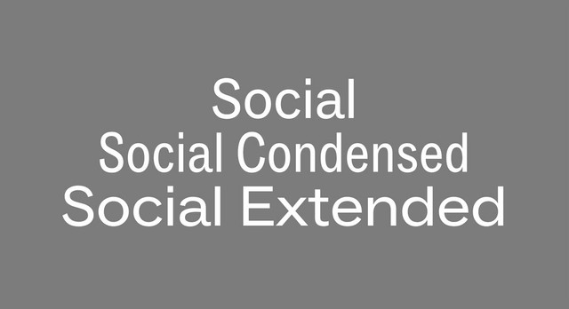
Design Features:
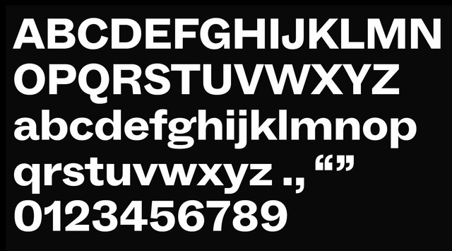
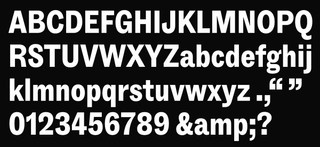
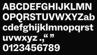
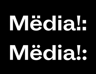
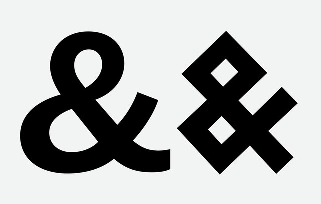
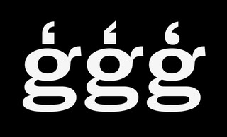
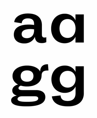
ABC Social has a sense of humor, with its freely designed forms and rounded shapes. The dynamic s and double storey a are particularly close to our hearts. And the g may become the most loved or hated character. Social also contains three different forms of punctuation: square, round, and angled.

Social’s family tree

Weights: Hairline to Black

Rounded .:;!?“”

Alt Ampersand

Alternate punctuation

Alts for a and g

We’d love to hear what you think! Reply directly for more details about pre-licensing, pricing, discounts, etc.

Talk soon,
Dinamo x