🛡️ A typeface inspired the long history of the overlooked Old Style genre 🛡️ —

Hello Friend,

We’re sending you today the font files of our next release, ABC Marist, before we share it with anyone else.

Designed by our core team member Seb McLauchlan, Marist is a warm and robust re-examination of the Old Style genre first imagined by Nicolas Jenson in 1470. Forget the Metaverse for a moment. Now imagine instead a quiet library with stained glass windows and stacks of books, a place where time seems to slow down and the mind has space for careful traveling. 🌹 This is where our newest serif first began its journey.

-> Click here for the hidden typeface page
-> This way for your full font files

6 Upright & 6 Italic styles

Story:

Marist is inspired by afternoons spent in archives investigating the long history of the overlooked Old Style, and more specifically, two prominent fonts within that genre: Nicolas Jenson’s roman and William Morris’s Golden. 🛡️

Etch it like Jenson

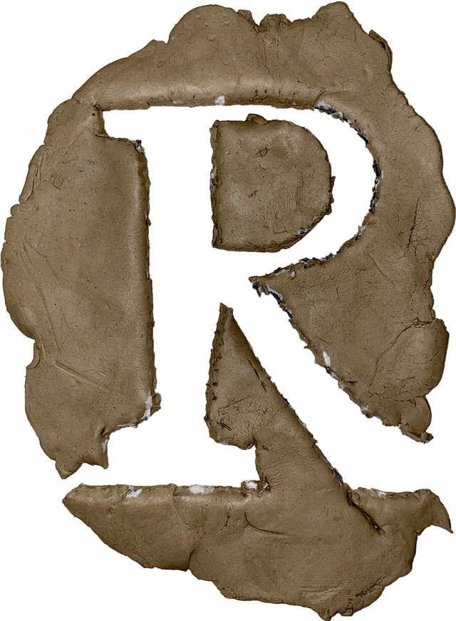
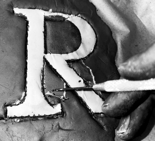
When French engraver Nicolas Jenson first developed his roman in 15th Century Venice, the highly legible typeface became famous for out performing everything else—its beautiful capitals were even said to “summon the spirit of Rome.” In 19th Century London, William Morris reinterpreted Jenson’s roman for his Golden Type, a celebration of craft aesthetics from the past and a typeface that questioned society’s reliance on technology.

Old Style serifs haven’t been as in vogue the last years (sharper, less historical serifs are more in favor), and so Marist picks up some of Morris and Jenson’s threads—fine tuning their forms for contemporary eyes and digital libraries.

Name:

A “Marist” is a devoted member of the Church of Mary, which felt right for a typeface devoted to the Old Stye. But also, the typeface’s name is a homage to Seb’s wife of many years to come, whose last name is Marchessault. 🙏 Thank you Lyson.

Star Characters:

Marist is a warm, reader-friendly font with prominent serifs and wide uppercase proportions that take their time. Small moments in the terminals gesture to the Old Style genre’s original inkwells, and certain characters—like the capital M—stand out with their distinctive double serifs. If you were to ask, we’d point to the E, F, R, a, g, and gorgeous & as especially notable.

Features:

How I like my Italics 🥰

Marist’s italics echo their roman equivalents, but their condensed proportions also make them pop from the page. The typeface also comes with a full set of Small Caps if you’re into more classic layouts for titles, places, and authors. The Dinamo pig was designed by João Drumond.

How I like my pigs! Drawn by João Drumond

Author:

Seb McLauchlan is an independent designer originally from New Zealand and based in London since 2015. He’s been one of our closest friends and collaborators since the early days of Dinamo, and he’s also the artist behind ABC Ginto and our upcoming ABC ROM. As well as designing type, Seb works as a graphic designer and currently teaches at Kingston School of Art.

Alongside receiving many notes on Marist from Dinamo’s Johannes and Fabian, Seb also thanks Kris Sowersby from Klim Type for his feedback and Rob Janes for producing the font.

Marist in Early Use:

Marist used in “Bricks from the Kiln”—a magazine edited by Andrew Walsh-Lister & Matthew Stuart.

Marist used by Dan Solbach & Johannes Bissinger for the
“Best Book Design from all over the world.”

Embossed shapes outside.

Microtypo party inside 🤪

Marist used by Taylor Giali for the tiles of “A Blazing World.”

A film by Carlson Young...

...starring Udo Kier, Dermot Mulroney, and Vinessa Shaw.

And that’s it 😤

Would love to hear what you think. Reply directly for more details about pre-licensing, pricing, discounts, etc.

With love,
Dinamo x