Full Fonts & material
-> This link will lead you to our VIP Dropbox folder with full font files
-> We built a feature overview page
–> Secret link to the typeface page itself
Let’s begin:
Stylistically, Gravity shares a community garden with Compacta, Information, and dare we say, Impact. Our dream was to synthesize the confident flavors of heavy display grotesks from the 60s and 70s, and translate them into extreme widths, but with a more relaxed tone. Drawing only in Black weight helped us to focus for now, but more weights still might come.
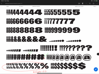
Star characters!
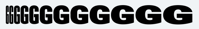
The curved Y and y are close to our hearts, and pair well with obvious stand outs like G, a, and R. The industrial faucet-like r, the spiky diagonals of the Q, K, and k, and the block-nosed 1 are other important ingredients I’d mention in an elevator pitch.
Additional characters!!
Some boomers say that adding a bunch of alternative glyphs to a typeface is a sign of poor character. But I don’t think that’s true today. With Gravity, we absolutely want to embrace the extra spice that “unnecessary” (😤) variations like an extra /one, or additional /comma or even the alternate /paragraph (we didn’t do that) might add to the typographic atmosphere.
Also, settings!
We implemented features that allow you to arrange and shift the characters: you can make them jump over the baseline, or hang from the top. This way, you can set multiple rows of text really tightly, with no air in-between, or you can make a bunch of dry text look ridiculously interesting. You unchain the glyphs from their defined position: work with and not against the typeface.
Variable width-control & style overview
All of Gravity is packaged in one Variable Font file. That means the output can be modulated seamlessly from XXXX Compressed to Wide. As a fall back, we also defined 12 font styles:
- ABC Gravity XXXX Compressed
- ABC Gravity XXX Compressed
- ABC Gravity XX Compressed
- ABC Gravity X Compressed
- ABC Gravity Compressed
- ABC Gravity Extra Condensed
- ABC Gravity Condensed
- ABC Gravity SemiCondensed
- ABC Gravity Normal
- ABC Gravity Extended
- ABC Gravity Expanded
- ABC Gravity Wide
A word on the author
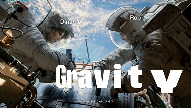
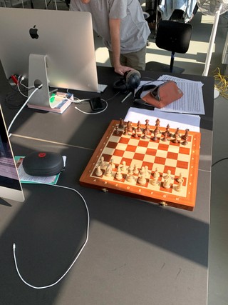
Rob joined the Dinamo team in Berlin three years ago and quickly took control over all tech and production work (lucky for us), as well as the chess board (humiliating for me). Truly committed, Rob moved here all the way from Melbourne and even—if only very, very briefly—attended German classes. Anyway, Gravity is his first Dinamo release (we wouldn’t have known where to begin). We’re terribly excited.
Let us know what you think. And get in touch for Gravity pre-release licensing as well as discounts, if necessary!
Best wishes,
!!!!
Dinamo + Rob