A beautiful typeface with house-style Butterfly Serifs 🦋 —

Hello Friend,

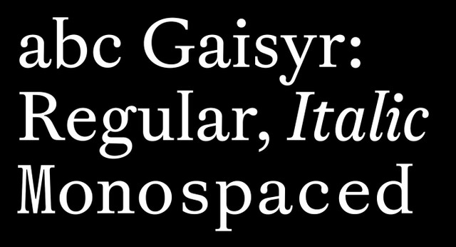
We’re sending you today the exclusive font files of our upcoming release, ABC Gaisyr, before it makes its way into our Early Access arena.

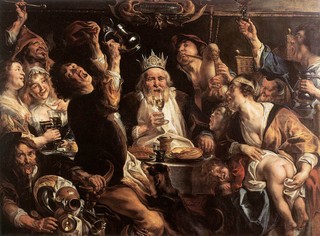
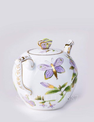
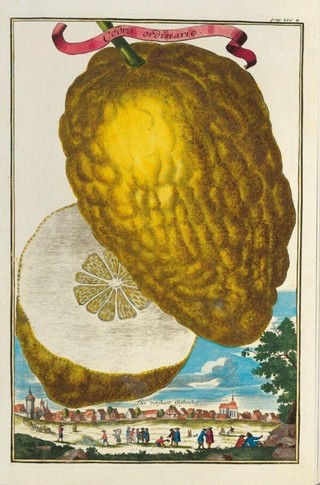
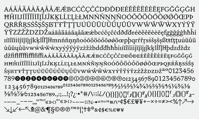
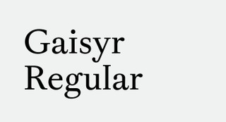
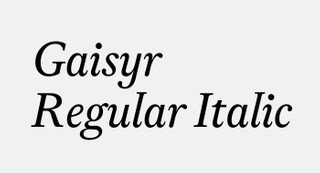
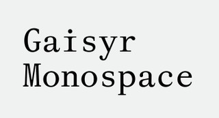
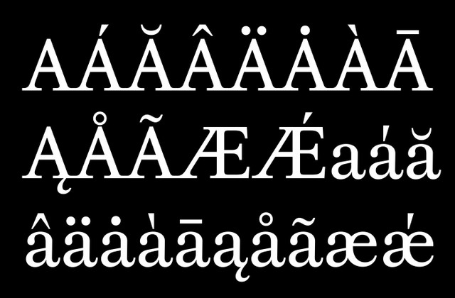
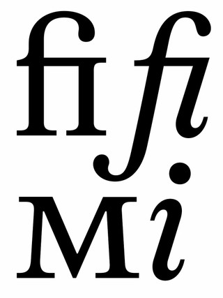
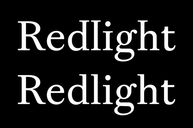
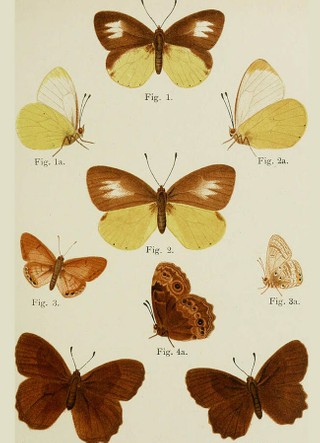
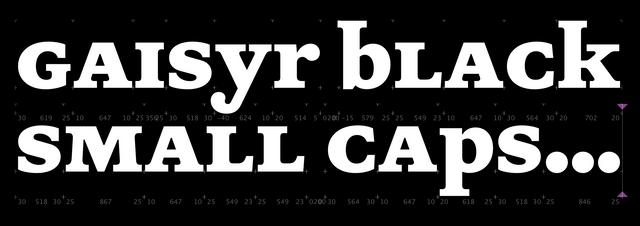
Gaisyr is, well, a beautiful typeface with Dinamo house-style Butterfly Serifs. It takes its point de départ from sketches by the early 18th Century royal typographer for King Louis XIV, Jacques Jaugeon. Close your eyes and imagine the King sitting in his garden, maybe a bit sunburned, surrounded by butterflies and low hanging citrus fruit, sipping on a (glass bottle) of Coke®.

You’ve successfully entered the world of Gaisyr:

We’ve long thought of adding a new serif to our library, as a less represented genre in our catalogue. Gaisyr, with its wide proportions and pronounced detailing, felt like the natural fit—it’s suitable for longer texts, but loud enough that it’s not just another Times.


Pre-Release VIP Package:
-> This way for your stack of full font files
-> Click here for the hidden typeface page


Available styles:

  • Gaisyr Regular
  • Gaisyr Regular Italic
  • Gaisyr Regular Mono

Currently in the making:

  • Gaisyr Medium
  • Gaisyr Medium Italic
  • Gaisyr Medium Mono
  • Gaisyr Bold
  • Gaisyr Bold Italic
  • Gaisyr Bold Mono
  • Gaisyr Black
  • Gaisyr Black Italic
  • Gaisyr Black Mono

Origins:
ABC Gaisyr resides in the neighbourhood of “Romain Du Roi,” the typeface of King Louis XIV—or the King’s own 'lil custom font, one might say. The heavily rational design was drawn by Jacques Jaugeon, based on a grid and with geometric construction. But the punch cutters who produced the font were still in the mindset of free-styling: They translated the sketches onto metal by eye, and with rudimentary measuring.

It’s this tension between strict geometry and a loopy, hand-held interpretation (think of the King after an evening inspecting his distillery) that lives on our own lines for ABC Gaisyr.

Extra sharp accents

Love this one

Youthful ligatures and spring like Small Caps


Features:
ABC Gaisyr is performance-driven while featuring less-toned down moments. Its Butterfly Serifs are one of its highlights, seen in typically overlooked characters like the lowercase i and l. And as we’ve explored in other Dinamo fonts like ABC Arizona, the Italics of Gaisyr skew rightwards while its serifs stay upright.

We’re currently working on additional weights, streamlined serifs without the wings, and maybe even Mono Italics.

Spot the difference 👆🏻

Tired: Butterflies

Wired: Butterfly Serifs

Team:
Together with our France-stemming intern Louis Brousseaud, Fabian spent some time stalking the archives of the Musee de L'Imprimerie Lyon and the Imprimerie National in Paris, sourcing documents and beginning to draw Gaisyr’s first digital shape. In the year that followed, both Risto Kujanpää and Fabiola Mejía occasionally extended on the interpretation, before we finally asked Michelangelo Nigra to unearth Gaisyr once and for all from our drawers.

Michelangelo—the angel he is—completed the set with both Italics and a corresponding Mono styles which we’re sharing with you today. He’s now extending Gaisyr into a full family with several weights, italics, and everything else required for a retail typeface spectacle.

Michelangelo aka Mobile Mike working on the Monos and Bolds

Sneak peak of what’s next 🤫

Gaisyr in Use:
Gaisyr has appeared on the cover and pages of Vogue Czechoslovakia, courtesy of Jakub Straka. And while still in development, Harry Bennett used Gaisyr across a publication released by The Brand Identity blog. On the occasion of the exhibition Dorian Sari. Post-Truth at Kunstmuseum Basel, Philippe Karrer recently set the show’s accompanying publication in both Regular and Mono.

The Brand Identity: The Interviews by Studio Ground Floor

VOGUE by Jakub Straka

Dorian Sari “Post Truth”, by Philippe Karrer

As always, we’d love to hear what you think. Reply directly for more details about pre-licensing, pricing, discounts, etc.

All best,
Dinamo x